
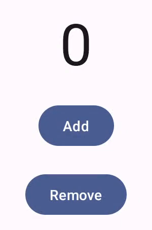
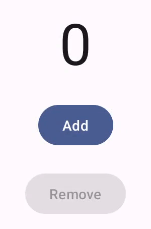
사용자 인터페이스 구성요소는 사용자 상호작용에 반응하는 방식으로 기기 사용자에게 피드백을 제공합니다. 모든 구성요소에는 상호작용에 반응하는 고유한 방식이 있으므로 상호작용으로 무슨 일이 벌어지고 있는지 사용자가 파악할 수 있습니다. 예를 들어, 사용자가 기기의 터치스크린에 있는 버튼을 터치하면 강조표시 색상이 추가되는 등의 방식으로 버튼이 변경될 수 있습니다. 이 변경을 통해 사용자는 자신이 버튼을 터치한 것을 인식할 수 있습니다. 사용자가 버튼을 터치하려는 것이 아니었다면 손가락을 떼기 전에 손가락을 버튼 밖으로 드래그하면 됩니다. 그러지 않으면 버튼이 활성화됩니다.
Compose 동작 문서에서는 Compose 구성요소가 포인터 이동 및 클릭과 같은 하위 수준 포인터 이벤트를 처리하는 방법을 다룹니다. Compose는 즉시 이러한 하위 수준 이벤트를 상위 수준 상호작용으로 추상화합니다. 예를 들어, 일련의 포인터 이벤트가 버튼 누르기 및 해제에까지 추가될 수 있습니다. 더 높은 수준의 추상화를 이해하면 UI가 사용자에게 반응하는 방식을 맞춤설정하는 데 도움이 됩니다. 예를 들어, 사용자가 구성요소와 상호작용할 때 구성요소의 외양이 변경되는 방식을 맞춤설정할 수 있고 또는 이러한 사용자 작업의 로그를 유지관리할 수도 있습니다. 이 문서에서는 표준 UI 요소를 수정하거나 직접 디자인하는 데 필요한 정보를 제공합니다.
Interactions
대부분의 경우 Compose 구성요소가 사용자 상호작용을 해석하는 방법을 알 필요는 없습니다. 예를 들어, Button은 Modifier.clickable을 통해 사용자가 버튼을 클릭했는지 파악합니다. 앱에 일반 버튼을 추가하는 경우 버튼의 onClick 코드를 정의할 수 있고 Modifier.clickable은 적절한 시기에 이 코드를 실행합니다. 즉, 사용자가 화면을 탭했는지 또는 키보드로 버튼을 선택했는지 알 필요가 없습니다. Modifier.clickable은 사용자가 클릭했는지 파악하고 onClick 코드를 실행하여 응답합니다.
그러나 사용자의 동작에 맞게 UI 구성요소의 응답을 맞춤설정하려면 내부에서 무슨 일이 일어나는지 더 자세히 알 필요가 있습니다. 이 섹션에서는 이와 관련된 정보를 일부 제공합니다.
사용자가 UI 구성요소와 상호작용하면 시스템은 다양한 Interaction 이벤트를 생성하여 동작을 표현합니다. 예를 들어 사용자가 버튼을 터치하면 버튼은 PressInteraction.Press를 생성합니다.
사용자가 버튼 내에서 손가락을 떼면 클릭이 완료되었음을 버튼이 알 수 있도록 PressInteraction.Release가 생성됩니다. 반면, 사용자가 버튼 밖으로 손가락을 드래그한 다음 손가락을 떼면 버튼은 PressInteraction.Cancel을 생성하여 버튼을 누른 것이 취소되었고 완료되지 않았음을 나타냅니다.
이러한 상호작용은 독단적이지 않습니다. 즉, 이러한 하위 수준 상호작용 이벤트는 사용자 작업 또는 작업 시퀀스의 의미를 해석하려고 하지 않습니다. 또한, 어떤 사용자 작업이 더 우선순위가 높은지 해석하지 않습니다.
일반적으로 이러한 상호작용은 시작과 끝이 있는 쌍으로 구성됩니다. 두 번째 상호작용에는 첫 번째 상호작용에 관한 참조가 포함됩니다. 예를 들어, 사용자가 버튼을 터치한 후 손가락을 떼면 터치 동작으로 PressInteraction.Press 상호작용이 생성되고 해제 동작으로 PressInteraction.Release 상호작용이 생성됩니다. Release는 앞선 PressInteraction.Press를 인식할 수 있도록 press 속성을 포함합니다.
InteractionSource를 관찰하여 특정 구성요소의 상호작용을 확인할 수 있습니다. InteractionSource는 Kotlin 흐름을 기반으로 빌드되므로 다른 흐름에서와 같은 방식으로 상호작용을 수집할 수 있습니다. 이 설계 결정에 관한 자세한 내용은 상호작용 강조 블로그 게시물을 참고하세요.
상호작용 상태
상호작용을 직접 추적하여 구성요소의 내장 기능을 확장할 수도 있습니다. 예를 들어 버튼을 눌렀을 때 버튼 색상이 변경되도록 할 수 있습니다. 상호작용을 추적하는 가장 간단한 방법은 적절한 상호작용 상태를 관찰하는 것입니다. InteractionSource는 다양한 상호작용의 상황을 상태로 나타내는 여러 메서드를 제공합니다. 예를 들어, 특정 버튼이 눌렸는지 확인하려면 버튼의 InteractionSource.collectIsPressedAsState() 메서드를 호출하면 됩니다.
val interactionSource = remember { MutableInteractionSource() } val isPressed by interactionSource.collectIsPressedAsState() Button( onClick = { /* do something */ }, interactionSource = interactionSource ) { Text(if (isPressed) "Pressed!" else "Not pressed") }
Compose는 collectIsPressedAsState() 외에 collectIsFocusedAsState(), collectIsDraggedAsState(), collectIsHoveredAsState()를 제공합니다. 이러한 메서드는 실제로 하위 수준의 InteractionSource API를 기반으로 빌드된 편의 메서드입니다. 어떤 경우에는 이러한 하위 수준 함수를 직접 사용하는 것이 좋습니다.
예를 들어, 버튼을 누르고 있는지 그리고 드래그하고 있는지 알아야 하는 상황을 가정해 보겠습니다. collectIsPressedAsState()와 collectIsDraggedAsState()를 모두 사용하는 경우 Compose가 많은 중복 작업을 실행하고 모든 상호작용을 올바른 순서로 가져온다는 보장이 없습니다. 이 같은 경우에는 InteractionSource를 직접 사용하는 것이 좋습니다. InteractionSource로 직접 상호작용을 추적하는 방법에 대한 자세한 내용은 InteractionSource 사용을 참고하세요.
다음 섹션에서는 InteractionSource 및 MutableInteractionSource를 사용하여 상호작용을 각각 소비하고 내보내는 방법을 설명합니다.
Interaction 사용 및 내보내기
InteractionSource는 Interactions의 읽기 전용 스트림을 나타내며 Interaction를 InteractionSource에 내보낼 수는 없습니다. Interaction를 내보내려면 InteractionSource에서 확장되는 MutableInteractionSource를 사용해야 합니다.
수정자와 구성요소는 Interactions를 소비하거나, 내보내거나, 소비하고 내보낼 수 있습니다.
다음 섹션에서는 수정자와 구성요소 모두에서 상호작용을 사용하고 내보내는 방법을 설명합니다.
수정자 사용 예시
포커스 상태의 테두리를 그리는 수정자의 경우 Interactions만 관찰하면 되므로 InteractionSource를 허용할 수 있습니다.
fun Modifier.focusBorder(interactionSource: InteractionSource): Modifier { // ... }
함수 서명에서 이 수정자가 소비자임을 알 수 있습니다. Interaction를 소비할 수는 있지만 내보낼 수는 없습니다.
생산 수정자 예시
Modifier.hoverable와 같은 마우스 오버 이벤트를 처리하는 수정자의 경우 Interactions를 내보내고 MutableInteractionSource를 매개변수로 허용해야 합니다.
fun Modifier.hover(interactionSource: MutableInteractionSource, enabled: Boolean): Modifier { // ... }
이 수정자는 생성자입니다. 제공된 MutableInteractionSource를 사용하여 마우스를 가져가거나 마우스를 떼면 HoverInteractions를 방출할 수 있습니다.
소비하고 생성하는 구성요소 빌드
Material Button와 같은 상위 수준 구성요소는 생산자와 소비자 역할을 모두 합니다. 입력 및 포커스 이벤트를 처리하고 이러한 이벤트에 따라 모양을 변경합니다(예: 리플 표시 또는 고도 애니메이션). 따라서 MutableInteractionSource를 매개변수로 직접 노출하여 기억된 인스턴스를 직접 제공할 수 있습니다.
@Composable fun Button( onClick: () -> Unit, modifier: Modifier = Modifier, enabled: Boolean = true, // exposes MutableInteractionSource as a parameter interactionSource: MutableInteractionSource? = null, elevation: ButtonElevation? = ButtonDefaults.elevatedButtonElevation(), shape: Shape = MaterialTheme.shapes.small, border: BorderStroke? = null, colors: ButtonColors = ButtonDefaults.buttonColors(), contentPadding: PaddingValues = ButtonDefaults.ContentPadding, content: @Composable RowScope.() -> Unit ) { /* content() */ }
이렇게 하면 구성요소에서 MutableInteractionSource를 호이스팅하고 구성요소에서 생성된 모든 Interaction를 관찰할 수 있습니다. 이를 사용하여 해당 구성요소 또는 UI의 다른 구성요소의 모양을 제어할 수 있습니다.
자체 대화형 상위 수준 구성요소를 빌드하는 경우 MutableInteractionSource을 이러한 방식으로 매개변수로 노출하는 것이 좋습니다. 상태 호이스팅 권장사항을 따르는 것 외에도 이를 통해 다른 종류의 상태 (예: 사용 설정된 상태)를 읽고 제어할 수 있는 것과 동일한 방식으로 구성요소의 시각적 상태를 쉽게 읽고 제어할 수 있습니다.
Compose는 계층화된 아키텍처 접근 방식을 따르므로 상위 수준 Material 구성요소는 리플 및 기타 시각적 효과를 제어하는 데 필요한 Interaction를 생성하는 기본 빌딩 블록 위에 빌드됩니다. 기반 라이브러리는 Modifier.hoverable, Modifier.focusable, Modifier.draggable과 같은 상위 수준 상호작용 수정자를 제공합니다.
마우스 오버 이벤트에 응답하는 구성요소를 빌드하려면 Modifier.hoverable를 사용하고 MutableInteractionSource를 매개변수로 전달하면 됩니다.
구성요소에 마우스를 가져가면 HoverInteraction가 방출되며 이를 사용하여 구성요소의 표시 방식을 변경할 수 있습니다.
// This InteractionSource will emit hover interactions val interactionSource = remember { MutableInteractionSource() } Box( Modifier .size(100.dp) .hoverable(interactionSource = interactionSource), contentAlignment = Alignment.Center ) { Text("Hello!") }
이 구성요소를 포커스 가능하게 만들려면 Modifier.focusable를 추가하고 동일한 MutableInteractionSource를 매개변수로 전달하면 됩니다. 이제 HoverInteraction.Enter/Exit와 FocusInteraction.Focus/Unfocus가 모두 동일한 MutableInteractionSource를 통해 방출되며, 동일한 위치에서 두 가지 유형의 상호작용의 모양을 맞춤설정할 수 있습니다.
// This InteractionSource will emit hover and focus interactions val interactionSource = remember { MutableInteractionSource() } Box( Modifier .size(100.dp) .hoverable(interactionSource = interactionSource) .focusable(interactionSource = interactionSource), contentAlignment = Alignment.Center ) { Text("Hello!") }
Modifier.clickable은 hoverable 및 focusable보다 훨씬 높은 수준의 추상화입니다. 구성요소가 클릭 가능하려면 암시적으로 마우스 오버 가능해야 하며 클릭 가능한 구성요소는 포커스 가능해야 합니다. Modifier.clickable를 사용하면 하위 수준 API를 결합하지 않고도 마우스 오버, 포커스, 누르기 상호작용을 처리하는 구성요소를 만들 수 있습니다. 구성요소를 클릭 가능하게 만들려면 hoverable 및 focusable을 clickable로 바꾸면 됩니다.
// This InteractionSource will emit hover, focus, and press interactions val interactionSource = remember { MutableInteractionSource() } Box( Modifier .size(100.dp) .clickable( onClick = {}, interactionSource = interactionSource, // Also show a ripple effect indication = ripple() ), contentAlignment = Alignment.Center ) { Text("Hello!") }
InteractionSource 사용
구성요소와의 상호작용에 관한 하위 수준의 정보가 필요한 경우 구성요소의 InteractionSource에 맞게 표준 흐름 API를 사용하면 됩니다.
예를 들어, InteractionSource의 누르기 및 드래그 상호작용 목록을 유지하려고 한다고 가정해 보겠습니다. 이 코드는 버튼을 누를 때 새 누르기 작업을 목록에 추가하여 작업의 절반을 실행합니다.
val interactionSource = remember { MutableInteractionSource() } val interactions = remember { mutableStateListOf<Interaction>() } LaunchedEffect(interactionSource) { interactionSource.interactions.collect { interaction -> when (interaction) { is PressInteraction.Press -> { interactions.add(interaction) } is DragInteraction.Start -> { interactions.add(interaction) } } } }
하지만 새 상호작용을 추가하는 것 외에 종료된 상호작용도 삭제해야 합니다 (예: 사용자가 구성요소에서 손가락을 떼는 경우). 종료 상호작용에는 항상 연결된 시작 상호작용의 참조가 포함되어 있으므로 상호작용을 삭제하기는 쉽습니다. 이 코드는 종료된 상호작용을 삭제하는 방법을 보여줍니다.
val interactionSource = remember { MutableInteractionSource() } val interactions = remember { mutableStateListOf<Interaction>() } LaunchedEffect(interactionSource) { interactionSource.interactions.collect { interaction -> when (interaction) { is PressInteraction.Press -> { interactions.add(interaction) } is PressInteraction.Release -> { interactions.remove(interaction.press) } is PressInteraction.Cancel -> { interactions.remove(interaction.press) } is DragInteraction.Start -> { interactions.add(interaction) } is DragInteraction.Stop -> { interactions.remove(interaction.start) } is DragInteraction.Cancel -> { interactions.remove(interaction.start) } } } }
이제 구성요소를 누르고 있는지 또는 드래그하고 있는지 알려면 interactions가 비어 있는지만 확인하면 됩니다.
val isPressedOrDragged = interactions.isNotEmpty()
가장 최근의 상호작용을 알고 싶다면 목록의 마지막 항목을 보면 됩니다. 예를 들어, 아래 코드는 Compose 물결 효과 구현이 최근 상호작용에 사용할 적절한 상태 오버레이를 파악하는 방법을 보여줍니다.
val lastInteraction = when (interactions.lastOrNull()) { is DragInteraction.Start -> "Dragged" is PressInteraction.Press -> "Pressed" else -> "No state" }
모든 Interaction가 동일한 구조를 따르므로 다양한 유형의 사용자 상호작용을 사용할 때 코드에 큰 차이가 없습니다. 전반적인 패턴은 동일합니다.
이 섹션의 이전 예에서는 State를 사용하는 상호작용의 Flow를 나타냅니다. 상태 값을 읽으면 리컴포지션이 자동으로 발생하므로 업데이트된 값을 쉽게 관찰할 수 있습니다. 하지만 컴포지션은 프레임 전에 일괄 처리됩니다. 즉, 상태가 변경된 후 동일한 프레임 내에서 다시 변경되면 상태를 관찰하는 구성요소는 변경사항을 확인할 수 없습니다.
이는 상호작용에 중요합니다. 상호작용은 동일한 프레임 내에서 정기적으로 시작되고 종료될 수 있기 때문입니다. 예를 들어 Button을 사용하여 이전 예시를 사용하면 다음과 같습니다.
val interactionSource = remember { MutableInteractionSource() } val isPressed by interactionSource.collectIsPressedAsState() Button(onClick = { /* do something */ }, interactionSource = interactionSource) { Text(if (isPressed) "Pressed!" else "Not pressed") }
누르기가 동일한 프레임 내에서 시작되고 종료되면 텍스트가 '눌림'으로 표시되지 않습니다. 대부분의 경우 이는 문제가 되지 않습니다. 이렇게 짧은 시간 동안 시각적 효과를 표시하면 깜박임이 발생하고 사용자에게 눈에 띄지 않습니다. 리플 효과나 유사한 애니메이션을 표시하는 경우와 같이 버튼을 더 이상 누르지 않으면 즉시 중지하는 대신 최소한의 시간 동안 효과를 표시하는 것이 좋습니다. 이렇게 하려면 상태에 쓰는 대신 collect 람다 내부에서 애니메이션을 직접 시작하고 중지하면 됩니다. 애니메이션 테두리가 있는 고급 Indication 빌드 섹션에 이 패턴의 예가 있습니다.
예: 맞춤 상호작용 처리를 사용하여 구성요소 빌드
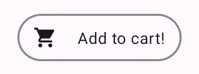
다음은 수정된 버튼의 예로, 입력에 맞춤 응답을 사용하는 구성요소의 빌드 방법을 보여줍니다. 이 경우 누르기에 관한 응답으로 모양을 변경하는 버튼을 만든다고 가정해 보겠습니다.
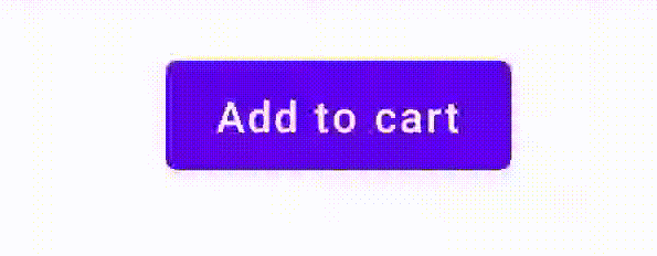
이렇게 하려면 Button을 기반으로 맞춤 컴포저블을 빌드하고 추가 icon 매개변수를 사용하여 아이콘을 그립니다(이 경우에는 장바구니임). collectIsPressedAsState()를 호출하여 사용자가 버튼 위에 마우스 오버 중인지 추적합니다. 마우스가 버튼 위에 있다면 아이콘을 추가합니다. 코드는 다음과 같습니다.
@Composable fun PressIconButton( onClick: () -> Unit, icon: @Composable () -> Unit, text: @Composable () -> Unit, modifier: Modifier = Modifier, interactionSource: MutableInteractionSource? = null ) { val isPressed = interactionSource?.collectIsPressedAsState()?.value ?: false Button( onClick = onClick, modifier = modifier, interactionSource = interactionSource ) { AnimatedVisibility(visible = isPressed) { if (isPressed) { Row { icon() Spacer(Modifier.size(ButtonDefaults.IconSpacing)) } } } text() } }
새로운 컴포저블을 사용하는 모습은 다음과 같습니다.
PressIconButton( onClick = {}, icon = { Icon(Icons.Filled.ShoppingCart, contentDescription = null) }, text = { Text("Add to cart") } )
이 새로운 PressIconButton은 기존 머티리얼 Button을 기반으로 빌드되었으므로 모든 일반적인 방식으로 사용자 상호작용에 반응합니다. 사용자가 버튼을 누르면 일반 머티리얼 Button과 마찬가지로 불투명도가 약간 달라집니다.
Indication로 재사용 가능한 맞춤 효과 만들기 및 적용
이전 섹션에서는 눌렀을 때 아이콘을 표시하는 등 다양한 Interaction에 따라 구성요소의 일부를 변경하는 방법을 알아봤습니다. 이와 동일한 접근 방식을 사용하여 구성요소에 제공하는 매개변수의 값을 변경하거나 구성요소 내에 표시되는 콘텐츠를 변경할 수 있지만 이는 구성요소별로만 적용됩니다. 애플리케이션이나 디자인 시스템에는 스테이트풀 시각 효과를 위한 일반 시스템이 있는 경우가 많습니다. 스테이트풀 시각 효과는 모든 구성요소에 일관된 방식으로 적용되어야 하는 효과입니다.
이러한 디자인 시스템을 빌드하는 경우 다음과 같은 이유로 하나의 구성요소를 맞춤설정하고 다른 구성요소에 이 맞춤설정을 재사용하기 어려울 수 있습니다.
- 디자인 시스템의 모든 구성요소에는 동일한 상용구가 필요합니다.
- 새로 빌드된 구성요소와 맞춤 클릭 가능 구성요소에 이 효과를 적용하는 것을 잊기 쉽습니다.
- 맞춤 효과를 다른 효과와 결합하기 어려울 수 있습니다.
이러한 문제를 방지하고 시스템 전반에서 맞춤 구성요소를 쉽게 확장하려면 Indication를 사용하면 됩니다.
Indication는 애플리케이션 또는 디자인 시스템의 구성요소에 적용할 수 있는 재사용 가능한 시각 효과를 나타냅니다. Indication은 두 부분으로 나뉩니다.
IndicationNodeFactory: 구성요소의 시각적 효과를 렌더링하는Modifier.Node인스턴스를 만드는 팩토리입니다. 구성요소 간에 변경되지 않는 더 간단한 구현의 경우 싱글톤 (객체)일 수 있으며 전체 애플리케이션에서 재사용할 수 있습니다.이러한 인스턴스는 스테이트풀(stateful) 또는 스테이트리스(stateless)일 수 있습니다. 구성요소별로 생성되므로 다른
Modifier.Node와 마찬가지로CompositionLocal에서 값을 검색하여 특정 구성요소 내에서 표시되거나 작동하는 방식을 변경할 수 있습니다.Modifier.indication: 구성요소의Indication를 그리는 수정자입니다.Modifier.clickable및 기타 상위 수준 상호작용 수정자는 표시 매개변수를 직접 허용하므로Interaction를 내보낼 뿐만 아니라 내보내는Interaction의 시각적 효과를 그릴 수도 있습니다. 따라서 간단한 경우에는Modifier.indication없이Modifier.clickable만 사용하면 됩니다.
효과를 Indication로 대체
이 섹션에서는 하나의 특정 버튼에 적용된 수동 크기 조절 효과를 여러 구성요소에서 재사용할 수 있는 동등한 표시로 대체하는 방법을 설명합니다.
다음 코드는 누르면 아래로 확장되는 버튼을 만듭니다.
val interactionSource = remember { MutableInteractionSource() } val isPressed by interactionSource.collectIsPressedAsState() val scale by animateFloatAsState(targetValue = if (isPressed) 0.9f else 1f, label = "scale") Button( modifier = Modifier.scale(scale), onClick = { }, interactionSource = interactionSource ) { Text(if (isPressed) "Pressed!" else "Not pressed") }
위 스니펫의 크기 조절 효과를 Indication로 변환하려면 다음 단계를 따르세요.
크기 조절 효과를 적용하는
Modifier.Node만들기 연결되면 노드는 이전 예와 마찬가지로 상호작용 소스를 관찰합니다. 여기서 유일한 차이점은 수신되는 상호작용을 상태로 변환하는 대신 애니메이션을 직접 실행한다는 것입니다.노드는
ContentDrawScope#draw()를 재정의하고 Compose의 다른 그래픽 API와 동일한 그리기 명령어를 사용하여 스케일 효과를 렌더링할 수 있도록DrawModifierNode를 구현해야 합니다.ContentDrawScope수신기에서 사용할 수 있는drawContent()를 호출하면Indication를 적용해야 하는 실제 구성요소가 그려지므로 스케일 변환 내에서 이 함수를 호출하기만 하면 됩니다.Indication구현이 항상 특정 시점에drawContent()을 호출하는지 확인하세요. 그렇지 않으면Indication을 적용하는 구성요소가 그려지지 않습니다.private class ScaleNode(private val interactionSource: InteractionSource) : Modifier.Node(), DrawModifierNode { var currentPressPosition: Offset = Offset.Zero val animatedScalePercent = Animatable(1f) private suspend fun animateToPressed(pressPosition: Offset) { currentPressPosition = pressPosition animatedScalePercent.animateTo(0.9f, spring()) } private suspend fun animateToResting() { animatedScalePercent.animateTo(1f, spring()) } override fun onAttach() { coroutineScope.launch { interactionSource.interactions.collectLatest { interaction -> when (interaction) { is PressInteraction.Press -> animateToPressed(interaction.pressPosition) is PressInteraction.Release -> animateToResting() is PressInteraction.Cancel -> animateToResting() } } } } override fun ContentDrawScope.draw() { scale( scale = animatedScalePercent.value, pivot = currentPressPosition ) { this@draw.drawContent() } } }
IndicationNodeFactory만들기 제공된 상호작용 소스에 대한 새 노드 인스턴스를 만드는 것만 담당합니다. 표시를 구성하는 매개변수가 없으므로 팩토리는 객체일 수 있습니다.object ScaleIndication : IndicationNodeFactory { override fun create(interactionSource: InteractionSource): DelegatableNode { return ScaleNode(interactionSource) } override fun equals(other: Any?): Boolean = other === ScaleIndication override fun hashCode() = 100 }
Modifier.clickable는 내부적으로Modifier.indication를 사용하므로ScaleIndication로 클릭 가능한 구성요소를 만들려면Indication을clickable에 매개변수로 제공하기만 하면 됩니다.Box( modifier = Modifier .size(100.dp) .clickable( onClick = {}, indication = ScaleIndication, interactionSource = null ) .background(Color.Blue), contentAlignment = Alignment.Center ) { Text("Hello!", color = Color.White) }
또한 맞춤
Indication를 사용하여 재사용 가능한 상위 수준 구성요소를 쉽게 빌드할 수 있습니다. 버튼은 다음과 같이 표시될 수 있습니다.@Composable fun ScaleButton( onClick: () -> Unit, modifier: Modifier = Modifier, enabled: Boolean = true, interactionSource: MutableInteractionSource? = null, shape: Shape = CircleShape, content: @Composable RowScope.() -> Unit ) { Row( modifier = modifier .defaultMinSize(minWidth = 76.dp, minHeight = 48.dp) .clickable( enabled = enabled, indication = ScaleIndication, interactionSource = interactionSource, onClick = onClick ) .border(width = 2.dp, color = Color.Blue, shape = shape) .padding(horizontal = 16.dp, vertical = 8.dp), horizontalArrangement = Arrangement.Center, verticalAlignment = Alignment.CenterVertically, content = content ) }
그런 다음 다음과 같은 방법으로 버튼을 사용할 수 있습니다.
ScaleButton(onClick = {}) { Icon(Icons.Filled.ShoppingCart, "") Spacer(Modifier.padding(10.dp)) Text(text = "Add to cart!") }
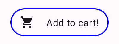
Indication로 빌드된 버튼애니메이션 테두리가 있는 고급 Indication 빌드
Indication는 구성요소의 크기 조절과 같은 변환 효과에만 국한되지 않습니다. IndicationNodeFactory는 Modifier.Node를 반환하므로 다른 그리기 API와 마찬가지로 콘텐츠 위나 아래에 모든 종류의 효과를 그릴 수 있습니다. 예를 들어 구성요소를 누르면 구성요소 주위에 애니메이션 테두리를 그리고 구성요소 위에 오버레이를 그릴 수 있습니다.
Indication로 그려진 애니메이션 테두리 효과입니다.여기서 Indication 구현은 이전 예시와 매우 유사합니다. 일부 매개변수가 있는 노드를 만들기만 합니다. 애니메이션 테두리는 Indication가 사용되는 구성요소의 모양과 테두리에 따라 달라지므로 Indication 구현에서는 모양과 테두리 너비도 매개변수로 제공해야 합니다.
data class NeonIndication(private val shape: Shape, private val borderWidth: Dp) : IndicationNodeFactory { override fun create(interactionSource: InteractionSource): DelegatableNode { return NeonNode( shape, // Double the border size for a stronger press effect borderWidth * 2, interactionSource ) } }
Modifier.Node 구현도 개념적으로는 동일합니다. 그리기 코드가 더 복잡하더라도 마찬가지입니다. 이전과 마찬가지로 연결되면 InteractionSource를 관찰하고 애니메이션을 실행하며 DrawModifierNode를 구현하여 콘텐츠 위에 효과를 그립니다.
private class NeonNode( private val shape: Shape, private val borderWidth: Dp, private val interactionSource: InteractionSource ) : Modifier.Node(), DrawModifierNode { var currentPressPosition: Offset = Offset.Zero val animatedProgress = Animatable(0f) val animatedPressAlpha = Animatable(1f) var pressedAnimation: Job? = null var restingAnimation: Job? = null private suspend fun animateToPressed(pressPosition: Offset) { // Finish any existing animations, in case of a new press while we are still showing // an animation for a previous one restingAnimation?.cancel() pressedAnimation?.cancel() pressedAnimation = coroutineScope.launch { currentPressPosition = pressPosition animatedPressAlpha.snapTo(1f) animatedProgress.snapTo(0f) animatedProgress.animateTo(1f, tween(450)) } } private fun animateToResting() { restingAnimation = coroutineScope.launch { // Wait for the existing press animation to finish if it is still ongoing pressedAnimation?.join() animatedPressAlpha.animateTo(0f, tween(250)) animatedProgress.snapTo(0f) } } override fun onAttach() { coroutineScope.launch { interactionSource.interactions.collect { interaction -> when (interaction) { is PressInteraction.Press -> animateToPressed(interaction.pressPosition) is PressInteraction.Release -> animateToResting() is PressInteraction.Cancel -> animateToResting() } } } } override fun ContentDrawScope.draw() { val (startPosition, endPosition) = calculateGradientStartAndEndFromPressPosition( currentPressPosition, size ) val brush = animateBrush( startPosition = startPosition, endPosition = endPosition, progress = animatedProgress.value ) val alpha = animatedPressAlpha.value drawContent() val outline = shape.createOutline(size, layoutDirection, this) // Draw overlay on top of content drawOutline( outline = outline, brush = brush, alpha = alpha * 0.1f ) // Draw border on top of overlay drawOutline( outline = outline, brush = brush, alpha = alpha, style = Stroke(width = borderWidth.toPx()) ) } /** * Calculates a gradient start / end where start is the point on the bounding rectangle of * size [size] that intercepts with the line drawn from the center to [pressPosition], * and end is the intercept on the opposite end of that line. */ private fun calculateGradientStartAndEndFromPressPosition( pressPosition: Offset, size: Size ): Pair<Offset, Offset> { // Convert to offset from the center val offset = pressPosition - size.center // y = mx + c, c is 0, so just test for x and y to see where the intercept is val gradient = offset.y / offset.x // We are starting from the center, so halve the width and height - convert the sign // to match the offset val width = (size.width / 2f) * sign(offset.x) val height = (size.height / 2f) * sign(offset.y) val x = height / gradient val y = gradient * width // Figure out which intercept lies within bounds val intercept = if (abs(y) <= abs(height)) { Offset(width, y) } else { Offset(x, height) } // Convert back to offsets from 0,0 val start = intercept + size.center val end = Offset(size.width - start.x, size.height - start.y) return start to end } private fun animateBrush( startPosition: Offset, endPosition: Offset, progress: Float ): Brush { if (progress == 0f) return TransparentBrush // This is *expensive* - we are doing a lot of allocations on each animation frame. To // recreate a similar effect in a performant way, it would be better to create one large // gradient and translate it on each frame, instead of creating a whole new gradient // and shader. The current approach will be janky! val colorStops = buildList { when { progress < 1 / 6f -> { val adjustedProgress = progress * 6f add(0f to Blue) add(adjustedProgress to Color.Transparent) } progress < 2 / 6f -> { val adjustedProgress = (progress - 1 / 6f) * 6f add(0f to Purple) add(adjustedProgress * MaxBlueStop to Blue) add(adjustedProgress to Blue) add(1f to Color.Transparent) } progress < 3 / 6f -> { val adjustedProgress = (progress - 2 / 6f) * 6f add(0f to Pink) add(adjustedProgress * MaxPurpleStop to Purple) add(MaxBlueStop to Blue) add(1f to Blue) } progress < 4 / 6f -> { val adjustedProgress = (progress - 3 / 6f) * 6f add(0f to Orange) add(adjustedProgress * MaxPinkStop to Pink) add(MaxPurpleStop to Purple) add(MaxBlueStop to Blue) add(1f to Blue) } progress < 5 / 6f -> { val adjustedProgress = (progress - 4 / 6f) * 6f add(0f to Yellow) add(adjustedProgress * MaxOrangeStop to Orange) add(MaxPinkStop to Pink) add(MaxPurpleStop to Purple) add(MaxBlueStop to Blue) add(1f to Blue) } else -> { val adjustedProgress = (progress - 5 / 6f) * 6f add(0f to Yellow) add(adjustedProgress * MaxYellowStop to Yellow) add(MaxOrangeStop to Orange) add(MaxPinkStop to Pink) add(MaxPurpleStop to Purple) add(MaxBlueStop to Blue) add(1f to Blue) } } } return linearGradient( colorStops = colorStops.toTypedArray(), start = startPosition, end = endPosition ) } companion object { val TransparentBrush = SolidColor(Color.Transparent) val Blue = Color(0xFF30C0D8) val Purple = Color(0xFF7848A8) val Pink = Color(0xFFF03078) val Orange = Color(0xFFF07800) val Yellow = Color(0xFFF0D800) const val MaxYellowStop = 0.16f const val MaxOrangeStop = 0.33f const val MaxPinkStop = 0.5f const val MaxPurpleStop = 0.67f const val MaxBlueStop = 0.83f } }
여기서 주요 차이점은 이제 animateToResting() 함수를 사용한 애니메이션의 최소 지속 시간이 있으므로 누르기를 즉시 해제하더라도 누르기 애니메이션이 계속된다는 것입니다. animateToPressed 시작 시 여러 번의 빠른 누르기에 대한 처리도 있습니다. 기존 누르기 또는 휴식 애니메이션 중에 누르기가 발생하면 이전 애니메이션이 취소되고 누르기 애니메이션이 처음부터 시작됩니다. 여러 동시 효과 (예: 새 리플 애니메이션이 다른 리플 위에 그려지는 리플)를 지원하려면 기존 애니메이션을 취소하고 새 애니메이션을 시작하는 대신 목록에서 애니메이션을 추적하면 됩니다.
추천 서비스
- 참고: JavaScript가 사용 중지되어 있으면 링크 텍스트가 표시됩니다.
- 동작 이해하기
- Jetpack Compose용 Kotlin
- Material 구성요소 및 레이아웃