
사용자가 앱과 상호작용할 때는 화면의 요소를 터치하는 경우가 많습니다. 하지만 이것이 유일한 상호작용 형태는 아닙니다. 다른 상호작용 형태로는 다음이 있습니다.
- ChromeOS 사용자는 실제 키보드의 화살표 키 를 사용하여 화면을 탐색할 수 있습니다.
- 게임을 하는 사용자는 연결된 게임 컨트롤러 를 사용하여 게임의 메뉴를 탐색할 수 있습니다.
- 모바일 앱 사용자는 터치 키보드 를 사용하여 요소를 순환할 수 있습니다.
이러한 경우 특정 시점에 활성 상태인 구성요소를 추적하는 것이 중요합니다. 이를 포커스 라고 합니다. 화면의 요소는 논리적 순서로 포커스가 맞춰져야 합니다. Jetpack Compose에는 대부분의 경우 올바른 포커스 처리 기본 방법이 있습니다. 하지만 경우에 따라 이 기본 동작을 수정해야 할 수 있습니다.
다음 페이지에서는 앱에서 포커스를 사용하는 방법을 설명합니다.
- 포커스 순회 순서 변경: 기본 포커스 순서를 변경하고, 포커스 그룹을 추가하고, 구성 가능한 항목의 포커스를 사용 중지하는 방법을 설명합니다.
- 포커스 동작 변경: 포커스를 요청, 캡처, 해제하는 방법과 화면에 들어갈 때 포커스를 리디렉션하는 방법을 설명합니다.
- 포커스에 반응: 포커스 변경에 반응하고, 요소에 시각적 신호를 추가하고, 요소의 포커스 상태를 이해하는 방법을 설명합니다.
기본 포커스 순회 순서
포커스 검색의 기본 동작을 살펴보기 전에 계층 구조에서 수준 의 개념을 이해하는 것이 중요합니다. 일반적으로 두 Composables가 형제일 때, 즉 부모가 같을 때 동일한 수준에 있다고 말할 수 있습니다. 예를 들어 Column 내의 요소는 동일한 수준에 있습니다. 수준을 올리는 것은 하위 요소에서 Composable 부모로 이동하거나, 동일한 예시를 유지하면서 항목에서 항목을 포함하는 Column으로 돌아가는 것을 의미합니다. 수준을 내리는 것은 그 반대로 Column 부모에서 포함된 항목으로 이동하는 것입니다. 이 개념은 다른 Composables를 포함할 수 있는 모든 Composable
에 적용할 수 있습니다.
UI 탐색은 여러 가지 방법으로 이루어질 수 있으며, 대부분의 사용자는 이미 알고 있을 것입니다.
- 탭: 1차원 탐색으로 앞으로 또는 뒤로 이동합니다. 탭 탐색은 포커스를 계층 구조의 다음 또는 이전 요소로 이동합니다. 기본적으로 Compose는
Composables의 선언을 따릅니다. 단방향 탐색은 키보드의tab키 또는 시계의 회전 베젤을 통해 이루어질 수 있으며, 이러한 종류의 포커스 검색은 화면의 각 요소를 방문합니다. - 화살표 키: 2차원 탐색으로 왼쪽, 오른쪽, 위쪽 또는 아래쪽으로 이동합니다. 2차원 탐색은 TV의 D패드 또는 키보드의 화살표 키를 통해 이루어질 수 있으며, 순회 순서는 지정된 수준의 요소만 방문합니다. D패드 중앙 버튼과 뒤로가기 버튼을 사용하여 다른 수준으로 내려가거나 다시 올라갈 수 있습니다.
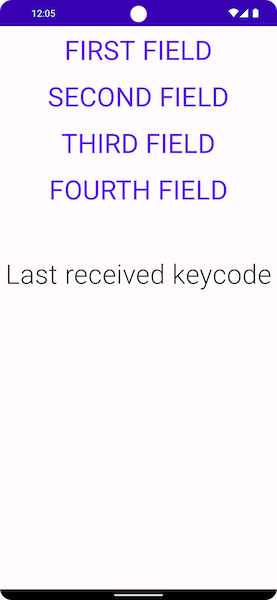
아래 스크린샷을 예로 들어 보겠습니다. 여기에는 4개의 버튼이 하나씩 아래에 있으며, 표시 순서대로 모두 순환하고 싶습니다.
Jetpack Compose는 이 동작을 기본적으로 제공합니다. 툴킷을 사용하면 tab 키를 사용하여 위에서 아래로 세로 순서로 각 구성 가능한 항목을 순환하거나 위쪽 또는 아래쪽 화살표를 눌러 포커스를 이동할 수 있습니다.
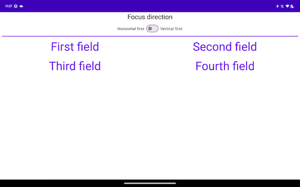
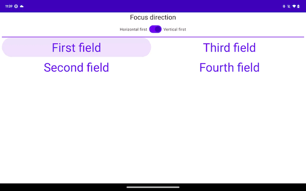
다른 종류의 레이아웃으로 전환하면 상황이 약간 달라집니다. 아래 레이아웃과 같이 레이아웃에 두 개 이상의 열이 있는 경우 Jetpack Compose를 사용하면 코드를 추가하지 않고도 탐색할 수 있습니다. tab 키를 누르면 Jetpack Compose가 선언 순서대로 첫 번째부터 네 번째까지 항목을 자동으로 강조표시합니다. 키보드의 화살표 키를 사용하면 선택이 2D 공간에서 원하는 방향을 따릅니다.
Column { Row { TextButton({ }) { Text("First field") } TextButton({ }) { Text("Second field") } } Row { TextButton({ }) { Text("Third field") } TextButton({ }) { Text("Fourth field") } } }
Composables는 두 개의 Rows에 선언되고 포커스 요소는 첫 번째부터 네 번째까지 순서대로 선언됩니다. tab 키를 누르면 다음과 같은 포커스 순서가 생성됩니다.
아래 스니펫에서는 Rows가 아닌 Columns에 항목을 선언합니다.
Row { Column { TextButton({ }) { Text("First field") } TextButton({ }) { Text("Second field") } } Column { TextButton({ }) { Text("Third field") } TextButton({ }) { Text("Fourth field") } } }
이 레이아웃은 화면 시작부터 끝까지 위에서 아래로 항목을 세로로 순회합니다.
이전 두 샘플은 단방향 탐색에서는 다르지만 2차원 탐색에서는 동일한 환경을 제공합니다. 이는 일반적으로 화면의 항목이 두 예시에서 모두 동일한 지리적 위치를 갖기 때문입니다. 첫 번째 Column에서 오른쪽으로 탐색하면 포커스가 두 번째로 이동하고 첫 번째 Row에서 아래로 탐색하면 포커스가 아래에 있는 항목으로 이동합니다.
추천 서비스
- 참고: JavaScript가 사용 중지되어 있으면 링크 텍스트가 표시됩니다.
- 포커스 동작 변경
- Compose의 ConstraintLayout
- Compose의 흐름 레이아웃