
TextField allows users to enter and modify text. There are two types
of text fields you can use: state-based text fields and
value-based text fields. Select the type you want to display content
for:
We recommend using state-based text fields, as they provide a more complete and
reliable approach to managing the state of a TextField. The following table
outlines differences between these types of text fields, and includes the key
advantages state-based text fields offer:
Feature |
Value-based text fields |
State-based text fields |
State-based benefit |
|---|---|---|---|
State management |
Updates text field state with the |
Explicitly uses a |
|
Visual transformation |
Uses |
Uses |
|
Line limits |
Accepts |
Uses |
|
Secure text field |
N/A |
|
|
This page describes how
you can implement TextField, style TextField input, and configure
other TextField options, like keyboard options and visually transforming
user input.
Choose TextField implementation
There are two levels of TextField implementation:
TextFieldis the Material Design implementation. We recommend you choose this implementation as it follows Material Design guidelines:BasicTextFieldenables users to edit text using the hardware or software keyboard, but provides no decorations like hint or placeholder.
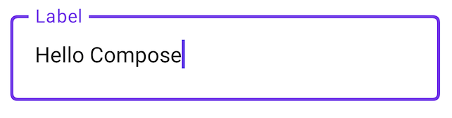
TextField( state = rememberTextFieldState(initialText = "Hello"), label = { Text("Label") } )

OutlinedTextField( state = rememberTextFieldState(), label = { Text("Label") } )
Style TextField
TextField and BasicTextField share many common parameters for customization.
The complete list for TextField is available in the
TextField source code. This is a non-exhaustive list of some of the
useful parameters:
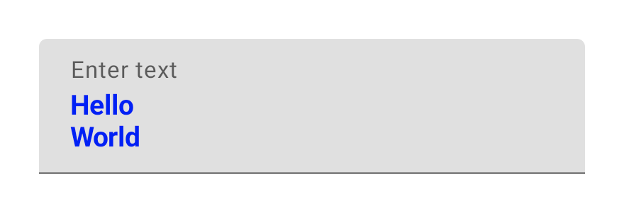
textStylelineLimits
TextField( state = rememberTextFieldState("Hello\nWorld\nInvisible"), lineLimits = TextFieldLineLimits.MultiLine(maxHeightInLines = 2), placeholder = { Text("") }, textStyle = TextStyle(color = Color.Blue, fontWeight = FontWeight.Bold), label = { Text("Enter text") }, modifier = Modifier.padding(20.dp) )
We recommend TextField over BasicTextField when your design calls for a
Material TextField or OutlinedTextField. However, BasicTextField should be
used when building designs that don't need the decorations from the Material
spec.
Configure line limits
TextField composables support scrolling along a single axis. The scrolling
behavior is determined by the lineLimits parameter. TextFields configured
for a single line scroll horizontally, while multi-line TextFields scroll
vertically.
Use TextFieldLineLimits to choose the appropriate line configuration for your
TextField:
TextField( state = rememberTextFieldState(), lineLimits = TextFieldLineLimits.SingleLine )

The SingleLine configuration has the following characteristics:
- The text never wraps, and doesn't allow for new lines.
TextFieldalways has a fixed height.- If the text overflows, it scrolls horizontally.
TextField( state = rememberTextFieldState("Hello\nWorld\nHello\nWorld"), lineLimits = TextFieldLineLimits.MultiLine(1, 4) )

The MultiLine configuration has the following characteristics:
- Accepts two parameters:
minHeightInLinesandmaxHeightInLines. - The text field is at least
minHeightInLinestall. - If the text overflows, it will wrap.
- If the text requires more lines, the field grows until it is
maxHeightInLinestall, and scrolls vertically.
Style input with Brush API
You can use the Brush API for more advanced styling in your TextField.
The following section describes how you can use a Brush to add a colored
gradient to TextField input.
For more information about using the Brush API to style text, see Enable advanced styling with Brush API.
Implement colored gradients using TextStyle
To implement a colored gradient as you type within a TextField, set your brush
of choice as a TextStyle for your TextField. In this example, we use a
built-in brush with a linearGradient to view the rainbow gradient effect as
text is typed into the TextField.
val brush = remember { Brush.linearGradient( colors = listOf(Color.Red, Color.Yellow, Color.Green, Color.Blue, Color.Magenta) ) } TextField( state = rememberTextFieldState(), textStyle = TextStyle(brush = brush) )

TextField content.Manage text field state
TextField uses a dedicated state holder class called TextFieldState for its
content and selection. TextFieldState is designed to be hoisted
wherever it fits in your architecture. There are 2 main properties that are
provided by TextFieldState:
initialText: Contents of theTextField.initialSelection: Indicates where the cursor or the selection is.
What differentiates TextFieldState from other approaches, like the
onValueChange callback, is that TextFieldState fully encapsulates the entire
input flow. This includes using the correct backing data structures, inlining
filters and formatters, and also synchronizing all edits coming from different
sources.
You can use TextFieldState() to hoist state in TextField. For this, we
recommend using the rememberTextFieldState() function.
rememberTextFieldState() creates the TextFieldState instance in your
composable, makes sure the state object is remembered, and provides
built-in save and restore functionality:
val usernameState = rememberTextFieldState() TextField( state = usernameState, lineLimits = TextFieldLineLimits.SingleLine, placeholder = { Text("Enter Username") } )
rememberTextFieldState can have a blank parameter or have an initial value
passed in to represent the text's value on initialization. If a different value
is passed in a subsequent recomposition, the value of the state is not updated.
To update the state after it's initialized, call edit methods on
TextFieldState.
TextField( state = rememberTextFieldState(initialText = "Username"), lineLimits = TextFieldLineLimits.SingleLine, )

TextField with "Username" as the initial text.Modify text with TextFieldBuffer
A TextFieldBuffer serves as an editable text container, similar in function to
a StringBuilder. It holds both the text content and information about the
selection.
You often encounter TextFieldBuffer as a receiver scope on functions like
TextFieldState.edit, InputTransformation.transformInput, or
OutputTransformation.transformOutput. In these functions, you can read or
update the TextFieldBuffer as needed. Afterwards, these changes are either
committed to TextFieldState, or passed down to the rendering pipeline in the
case of OutputTransformation.
You can use standard editing functions like append, insert, replace, or
delete to modify the buffer's contents. To change the selection state, either
directly set its selection: TextRange variable, or use utility functions such
as placeCursorAtEnd or selectAll. The selection itself is represented by a
TextRange, where the start index is inclusive and the end index is exclusive.
A TextRange with identical start and end values, like (3, 3), signifies a
cursor position with no characters selected.
val phoneNumberState = rememberTextFieldState("1234567890") TextField( state = phoneNumberState, keyboardOptions = KeyboardOptions( keyboardType = KeyboardType.Phone ), inputTransformation = InputTransformation.maxLength(10).then { if (!asCharSequence().isDigitsOnly()) { revertAllChanges() } }, outputTransformation = OutputTransformation { if (length > 0) insert(0, "(") if (length > 4) insert(4, ")") if (length > 8) insert(8, "-") } )
Edit text in TextFieldState
There are several methods that allow you to edit the state directly through your state variable:
edit: Lets you edit the state contents and gives youTextFieldBufferfunctions so you can use methods likeinsert,replace,append, and more.// Initial textFieldState text passed in is "I love Android" // textFieldState.text : I love Android // textFieldState.selection: TextRange(14, 14) textFieldState.edit { insert(14, "!") } // textFieldState.text : I love Android! // textFieldState.selection: TextRange(15, 15) textFieldState.edit { replace(7, 14, "Compose") } // textFieldState.text : I love Compose! // textFieldState.selection: TextRange(15, 15) textFieldState.edit { append("!!!") } // textFieldState.text : I love Compose!!!! // textFieldState.selection: TextRange(18, 18) textFieldState.edit { selectAll() } // textFieldState.text : I love Compose!!!! // textFieldState.selection: TextRange(0, 18)
setTextAndPlaceCursorAtEnd: Clears the current text, replaces it with the given text, and sets the cursor at the end.textFieldState.setTextAndPlaceCursorAtEnd("I really love Android") // textFieldState.text : I really love Android // textFieldState.selection : TextRange(21, 21)
clearText: Clears all text.textFieldState.clearText() // textFieldState.text : // textFieldState.selection : TextRange(0, 0)
For other TextFieldState functions, see the TextFieldState reference.
Modify user input
The following sections describe how to modify user input.
Input transformation
lets you filter TextField input while the user is typing, while output
transformation formats user input before it's displayed
on-screen.
Filter user input with input transformations
An input transformation lets you filter input from the user. For example, if
your TextField takes in an American phone number, you only want to accept 10
digits. The results of the InputTransformation are saved in the
TextFieldState.
There are built-in filters for common InputTransformation use cases. To limit
length, call InputTransformation.maxLength():
TextField( state = rememberTextFieldState(), lineLimits = TextFieldLineLimits.SingleLine, inputTransformation = InputTransformation.maxLength(10) )
Custom input transformations
InputTransformation is a single function interface. When implementing your
custom InputTransformation, you need to override
TextFieldBuffer.transformInput:
class CustomInputTransformation : InputTransformation { override fun TextFieldBuffer.transformInput() { } }
For a phone number, add a custom input transformation that only allows digits
to be typed into the TextField:
class DigitOnlyInputTransformation : InputTransformation { override fun TextFieldBuffer.transformInput() { if (!asCharSequence().isDigitsOnly()) { revertAllChanges() } } }
Chain input transformations
To add multiple filters on your text input, chain InputTransformations using
the then extension function. Filters are executed sequentially. As a
best practice, apply the most selective filters first to avoid unnecessary
transformations on data that would ultimately be filtered out.
TextField( state = rememberTextFieldState(), inputTransformation = InputTransformation.maxLength(6) .then(CustomInputTransformation()), )
After adding input transformations, the TextField input accepts 10 digits
maximum.
Format input before it's displayed
OutputTransformations let you format user input before it is rendered on the
screen. Unlike InputTransformation, the formatting done through the
OutputTransformation is not saved in the TextFieldState. Building on the
previous phone number example, you need to add parentheses and dashes in
the appropriate places:

This is the updated way of handling VisualTransformations in value-based
TextFields, with a key difference being that you don't have to calculate
their offset mappings.
OutputTransformation is a single abstract method interface. In order to
implement a custom OutputTransformation, you need to override the
transformOutput method:
class CustomOutputTransformation : OutputTransformation { override fun TextFieldBuffer.transformOutput() { } }
To format a phone number, add an opening parentheses at index 0, a closing
parentheses at index 4, and a dash at index 8 to your OutputTransformation:
class PhoneNumberOutputTransformation : OutputTransformation { override fun TextFieldBuffer.transformOutput() { if (length > 0) insert(0, "(") if (length > 4) insert(4, ")") if (length > 8) insert(8, "-") } }
Next, add your OutputTransformation to TextField:
TextField( state = rememberTextFieldState(), outputTransformation = PhoneNumberOutputTransformation() )
How transformations work together
The following diagram shows the flow from text input to transformation to output:

- Input is received from the input source.
- The input is filtered through an
InputTransformation, which gets saved in the TextFieldState. - The input is passed through an
OutputTransformationfor formatting. - The input is presented in the
TextField.
Set keyboard options
TextField lets you set keyboard configurations options, such as the keyboard
layout, or enable the autocorrect if it's supported by the keyboard. Some
options may not be guaranteed if the software keyboard doesn't comply with the
options provided here. Here is the list of the supported keyboard
options:
capitalizationautoCorrectkeyboardTypeimeAction
The KeyboardOptions class now includes a new boolean parameter,
showKeyboardOnFocus, which you use specifically for TextField components
that are integrated with TextFieldState. This option governs the behavior of
the software keyboard when the TextField acquires focus through means other
than direct user interaction (for example, programmatically).
When KeyboardOptions.showKeyboardOnFocus is set to true, the software keyboard
does not automatically appear if the TextField gains focus indirectly. In
such cases, the user is required to explicitly tap on the TextField itself to
reveal the keyboard.
Define keyboard interaction logic
The action button on Android's software keyboard allows for interactive responses within your application. For more information about configuring the action button, see the Set keyboard options section.

To define what occurs when a user taps this action button, use the
onKeyboardAction parameter. This parameter accepts an optional functional
interface named KeyboardActionHandler. The KeyboardActionHandler interface
contains a single method, onKeyboardAction(performDefaultAction: () -> Unit).
By providing an implementation for this onKeyboardAction method, you can
introduce custom logic that executes when a user presses the keyboard's action
button.
Several standard keyboard action types come with built-in default behaviors.
For example, selecting ImeAction.Next or ImeAction.Previous as the action
type will, by default, shift focus to the subsequent or preceding input field,
respectively. Similarly, an action button set to ImeAction.Done typically
dismisses the software keyboard. These default functionalities are executed
automatically and don't require you to supply a KeyboardActionHandler.
You can also implement custom behavior in addition to these default actions.
When you provide your KeyboardActionHandler, its onKeyboardAction method
receives a performDefaultAction function. You can call this
performDefaultAction() function at any point within your custom logic to also
trigger the standard default behavior associated with the current IME action.
TextField( state = textFieldViewModel.usernameState, keyboardOptions = KeyboardOptions(imeAction = ImeAction.Next), onKeyboardAction = { performDefaultAction -> textFieldViewModel.validateUsername() performDefaultAction() } )
This snippet illustrates a common use case on a registration screen
featuring a username field. For this field, ImeAction.Next is selected for
its keyboard action button. This choice enables quick, seamless navigation to
the subsequent password field.
In addition to this standard navigation, there's a requirement to initiate a
background validation process for the username as the user proceeds to enter
their password. To make sure that the default focus-switching behavior inherent
to ImeAction.Next is retained alongside this custom validation logic, the
performDefaultAction() function is invoked. Calling performDefaultAction()
implicitly triggers the underlying focus management system to move the focus to
the next appropriate UI element, preserving the expected navigational flow.
Create a secure password field
SecureTextField is a composable built on top of state-based text fields
for writing a password field. We recommend using SecureTextField for creating
password text fields, as it hides character input by default and disables cut
and copy actions.
SecureTextField has a textObfuscationMode, which controls how the user sees
character input. textObfuscationMode has the following options:
Hidden: Hides all input. Default behavior on desktop platforms.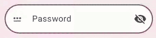
Visible: Shows all input.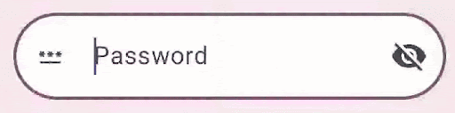
RevealLastTyped: Hides all input except the last character. Default behavior on mobile devices.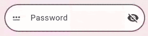
Additional resources
- Auto-format a phone number in a text field
- Show or hide password based on a user toggle
- Validate input as the user types