語義
透過集合功能整理內容
你可以依據偏好儲存及分類內容。
Compose 中的 UI 測試使用語意與 UI 階層互動。
「語意」一詞的意思是指定 UI 的意義。在這種情況下,「使用者介面 (或元素)」是指單一組合和全螢幕的任何元素。語意樹狀結構會隨 UI 階層一起產生,並描述該階層。
如要進一步瞭解語意,請參閱「Compose 中的語意」。
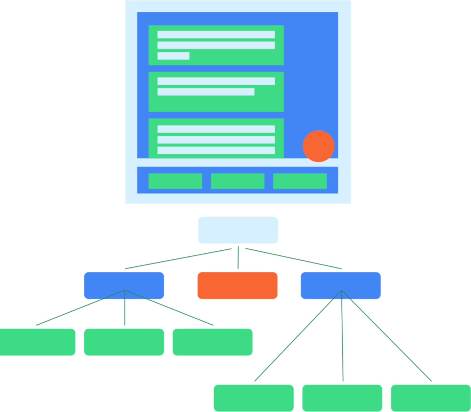
圖 1。一般 UI 階層及其語意樹狀結構。
語意架構主要用於無障礙功能,因此測試能利用語意相關 UI 階層所揭露的資訊。開發人員可自行決定要公開的內容及程度。
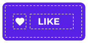
圖 2。包含圖示和文字的一般按鈕。
舉例來說,假設有個按鈕像上圖一樣有圖示和文字元素,預設的語意樹狀結構中只會包含「喜歡」文字標籤。這是因為某些可編譯的物件 (例如 Text
) 已經對語意樹狀結構公開部分屬性。您可以使用 Modifier
將屬性新增至語意樹狀結構。
MyButton(
modifier = Modifier.semantics { contentDescription = "Add to favorites" }
)
其他資源
- 在 Android 上測試應用程式:這個主要的 Android 測試到達網頁,提供更廣泛的測試基礎知識和技術。
- 測試基礎知識:進一步瞭解測試 Android 應用程式背後的概念。
- 本機測試:您可以在自己的工作站上,在本機執行部分測試。
- 檢測設備測試:建議您也執行檢測設備測試。也就是直接在裝置上執行的測試。
- 持續整合:
持續整合可讓您將測試整合至部署管道。
- 測試不同螢幕大小:使用者可選擇的裝置種類繁多,因此您應測試不同螢幕大小。
- Espresso:雖然 Espresso 是專為以 View 為基礎的 UI 設計,但您仍可運用相關知識,進行部分 Compose 測試。
這個頁面中的內容和程式碼範例均受《內容授權》中的授權所規範。Java 與 OpenJDK 是 Oracle 和/或其關係企業的商標或註冊商標。
上次更新時間:2025-08-21 (世界標準時間)。
[[["容易理解","easyToUnderstand","thumb-up"],["確實解決了我的問題","solvedMyProblem","thumb-up"],["其他","otherUp","thumb-up"]],[["缺少我需要的資訊","missingTheInformationINeed","thumb-down"],["過於複雜/步驟過多","tooComplicatedTooManySteps","thumb-down"],["過時","outOfDate","thumb-down"],["翻譯問題","translationIssue","thumb-down"],["示例/程式碼問題","samplesCodeIssue","thumb-down"],["其他","otherDown","thumb-down"]],["上次更新時間:2025-08-21 (世界標準時間)。"],[],[],null,["# Semantics\n\nUI tests in Compose use *semantics* to interact with the UI hierarchy.\nSemantics, as the name implies, give meaning to a piece of UI. In this context,\na \"piece of UI\" (or element) can mean anything from a single composable to a\nfull screen. The *semantics tree* is generated alongside the UI hierarchy and\ndescribes the hierarchy.\n\nYou can learn more about semantics generally in [Semantics in Compose](/develop/ui/compose/accessibility/semantics).\n\n**Figure 1.** A typical UI hierarchy and its semantics tree.\n\nThe semantics framework is primarily used for accessibility, so tests take\nadvantage of the information exposed by semantics about the UI hierarchy.\nDevelopers decide what and how much to expose.\n\n**Figure 2.** A typical button containing an icon and text.\n\nFor example, given a button like this that consists of an icon and a text\nelement, the default semantics tree only contains the text label \"Like\". This is\nbecause some composables, such as `Text`, already expose some properties to the\nsemantics tree. You can add properties to the semantics tree by using a\n`Modifier`. \n\n MyButton(\n modifier = Modifier.semantics { contentDescription = \"Add to favorites\" }\n )\n\nAdditional Resources\n--------------------\n\n- **[Test apps on Android](/training/testing)**: The main Android testing landing page provides a broader view of testing fundamentals and techniques.\n- **[Fundamentals of testing](/training/testing/fundamentals):** Learn more about the core concepts behind testing an Android app.\n- **[Local tests](/training/testing/local-tests):** You can run some tests locally, on your own workstation.\n- **[Instrumented tests](/training/testing/instrumented-tests):** It is good practice to also run instrumented tests. That is, tests that run directly on-device.\n- **[Continuous integration](/training/testing/continuous-integration):** Continuous integration lets you integrate your tests into your deployment pipeline.\n- **[Test different screen sizes](/training/testing/different-screens):** With some many devices available to users, you should test for different screen sizes.\n- **[Espresso](/training/testing/espresso)**: While intended for View-based UIs, Espresso knowledge can still be helpful for some aspects of Compose testing."]]