
تستخدِم اختبارات واجهة المستخدم في Compose الدلالات للتفاعل مع هيكلية واجهة المستخدم. تمنح الدلالات، كما يوحي الاسم، معنى لجزء من واجهة المستخدم. في هذا السياق، يمكن أن يشير مصطلح "جزء من واجهة المستخدم" (أو عنصر) إلى أي شيء، بدءًا من عنصر واحد قابل للإنشاء إلى شاشة كاملة. يتم إنشاء شجرة الدلالات إلى جانب التسلسل الهرمي لواجهة المستخدم، وهي تصف هذا التسلسل.
يمكنك الاطّلاع على مزيد من المعلومات حول الدلالات بشكل عام في مقالة الدلالات في Compose.
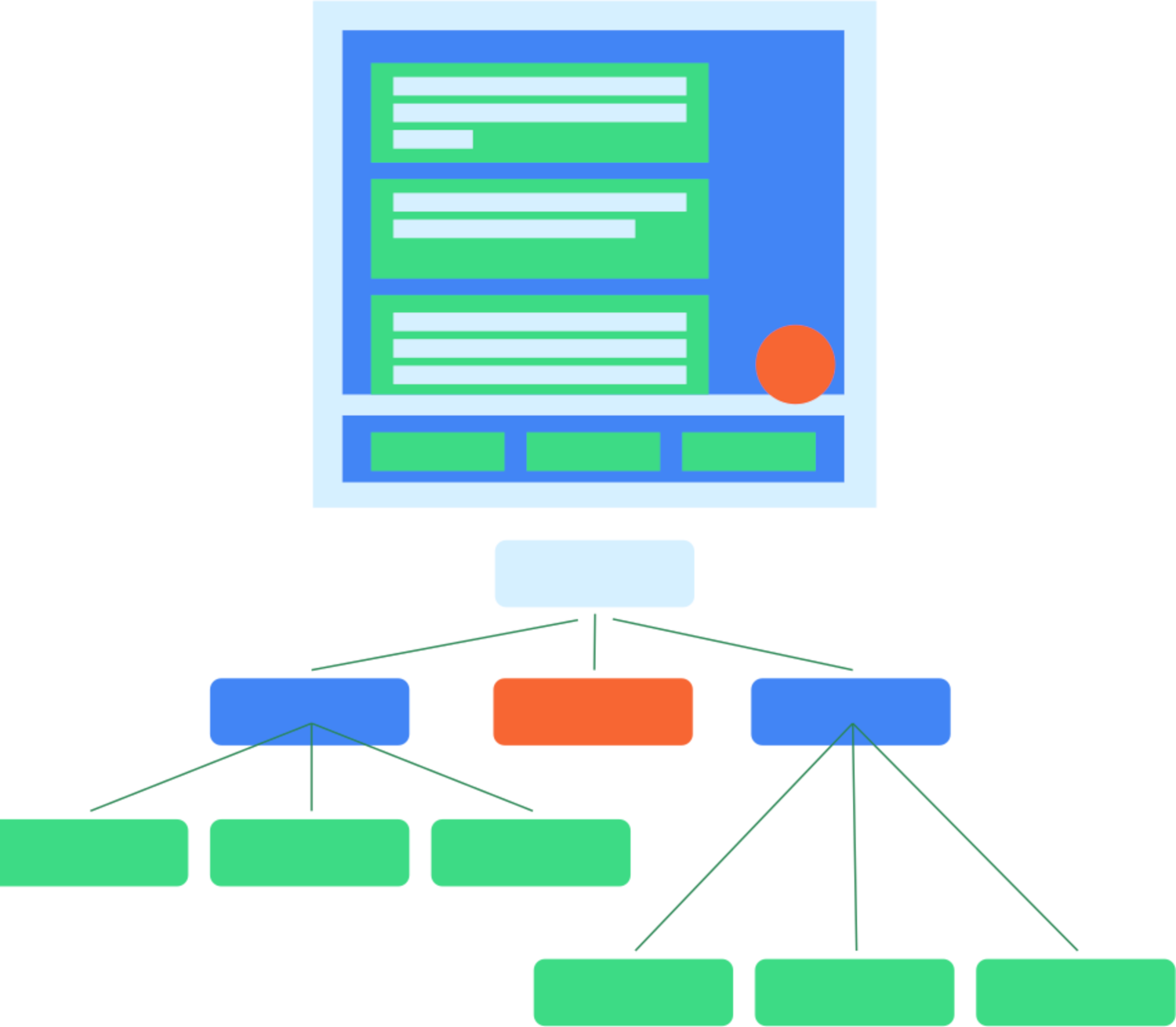
الشكل 1: هيكل نموذجي لواجهة المستخدم وشجرة الدلالات الخاصة به
يُستخدَم إطار عمل الدلالات بشكل أساسي لتسهيل الاستخدام، لذا تستفيد الاختبارات من المعلومات التي تعرضها الدلالات حول التسلسل الهرمي لواجهة المستخدم. يحدّد المطوّرون البيانات التي سيتم عرضها ومقدارها.

الشكل 2: زر عادي يحتوي على رمز ونص
على سبيل المثال، عند توفّر زر مثل هذا يتألف من رمز وعنصر نصي، لن تحتوي شجرة الدلالات التلقائية إلا على التصنيف النصي "أعجبني". ويرجع ذلك إلى أنّ بعض العناصر القابلة للإنشاء، مثل Text، تعرض بعض الخصائص لشجرة الدلالات. يمكنك إضافة خصائص إلى شجرة الدلالات باستخدام Modifier.
MyButton(
    modifier = Modifier.semantics { contentDescription = "Add to favorites" }
)
موارد إضافية
- اختبار التطبيقات على Android: تقدّم الصفحة المقصودة الرئيسية لاختبار Android نظرة أوسع على أساسيات الاختبار وأساليبه.
- أساسيات الاختبار: مزيد من المعلومات عن المفاهيم الأساسية لاختبار تطبيق Android
- الاختبارات المحلية: يمكنك إجراء بعض الاختبارات محليًا على محطة العمل الخاصة بك.
- اختبارات لقياس حالة التطبيق: من الممارسات الجيدة أيضًا إجراء اختبارات لقياس حالة التطبيق. أي الاختبارات التي يتم إجراؤها مباشرةً على الجهاز.
- التكامل المستمر: يتيح لك التكامل المستمر دمج اختباراتك في مسار النشر.
- اختبار أحجام الشاشات المختلفة: بما أنّ المستخدمين يتوفّر لديهم العديد من الأجهزة، عليك اختبار أحجام الشاشات المختلفة.
- Espresso: على الرغم من أنّ Espresso مُصمَّمة لواجهات المستخدم المستندة إلى العرض، إلا أنّ معرفة أدوات Espresso يمكن أن تكون مفيدة في بعض جوانب اختبار Compose.