
창 크기 클래스는 반응형/적응형 레이아웃을 디자인하고 개발 및 테스트할 수 있는 체계적인 표시 영역 중단점입니다. 중단점은 레이아웃의 단순성과 고유한 사례에 맞게 앱을 최적화하는 유연성 사이의 균형을 유지합니다.
창 크기 클래스는 앱에서 사용할 수 있는 디스플레이 영역을 소형, 중형, 확장, 대형, 특대형으로 분류합니다. 사용 가능한 너비와 높이는 개별적으로 분류되므로 언제라도 앱에는 두 가지 창 크기 클래스(너비 창 크기 클래스, 높이 창 크기 클래스)가 있습니다. 세로 스크롤이 보편적이기 때문에 사용 가능한 너비가 사용 가능한 높이보다 더 중요한 경우가 많습니다. 따라서 너비 창 크기 클래스가 앱의 UI와 더 관련이 있을 수 있습니다.
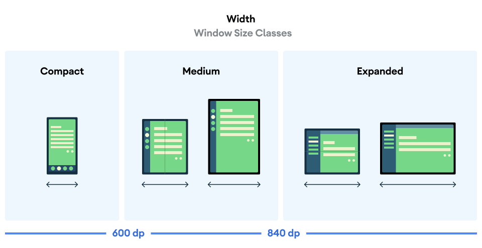
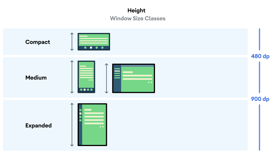
그림에 시각화된 것처럼 중단점을 사용하면 기기 및 구성 측면에서 레이아웃을 계속 고려할 수 있습니다. 각 크기 클래스 중단점은 일반적인 기기 시나리오의 대부분의 사례를 나타내며 중단점 기반 레이아웃의 디자인을 고려할 때 유용한 참조 기준일 수 있습니다.
| 크기 클래스 | 중단점 | 기기 표현 |
|---|---|---|
| 좁은 너비 | 너비 < 600dp | 세로 모드 휴대전화의 99.96% |
| 중간 너비 | 600dp ≤ 너비 < 840dp | 세로 모드 태블릿의 93.73%
세로 모드의 펼친 대형 내부 디스플레이 |
| 확장 후 너비 | 840dp ≤ 너비 < 1200dp | 가로 모드 태블릿의 97.22%
가로 모드의 대부분의 펼친 대형 내부 디스플레이는 최소한 확장된 너비입니다. |
| 큰 너비 | 1200dp ≤ 너비 < 1600dp | 대형 태블릿 디스플레이 |
| 매우 큰 너비 | 너비 ≥ 1600dp | 데스크톱 디스플레이 |
| 낮은 높이 | 높이 < 480dp | 가로 모드 휴대전화의 99.78% |
| 중간 높이 | 480dp ≤ 높이 < 900dp | 가로 모드 태블릿의 96.56%
세로 모드 휴대전화의 97.59% |
| 확장 후 높이 | 높이 ≥ 900dp | 세로 모드 태블릿의 94.25% |
크기 클래스를 실제 기기로 시각화하는 것이 유용할 수 있지만 창 크기 클래스는 기기 화면의 크기에 의해 명시적으로 결정되지 않습니다. 창 크기 클래스는 isTablet 유형 로직에 적합하지 않습니다. 대신 창 크기 클래스는 앱이 실행되는 기기 유형과 관계없이 애플리케이션에서 사용할 수 있는 창 크기에 따라 결정됩니다. 이에 따른 중요한 두 가지 결과가 있습니다.
실제 기기는 특정 창 크기 클래스를 보장하지 않습니다. 앱에서 사용할 수 있는 화면 공간은 여러 가지 이유로 인해 기기의 화면 크기와 다를 수 있습니다. 휴대기기에서 화면 분할 모드는 두 애플리케이션 간에 화면을 분할할 수 있습니다. ChromeOS에서 Android 앱은 임의로 크기를 조절할 수 있는 데스크톱 유형 창에 표시될 수 있습니다. 폴더블에는 기기를 접거나 펼쳐서 개별적으로 액세스할 수 있는 두 가지 크기의 화면이 있을 수 있습니다.
창 크기 클래스는 앱의 전체 기간 동안 변경될 수 있습니다. 앱이 실행되는 동안 기기 방향을 변경하거나, 멀티태스킹하거나, 접거나 펼칠 때 사용 가능한 화면 공간이 변경될 수 있습니다. 따라서 창 크기 클래스는 동적이며 이에 맞게 앱의 UI가 조정되어야 합니다.
창 크기 클래스는 Material Design 레이아웃 안내의 소형, 중형, 확장 중단점에 매핑됩니다. 또한 데스크톱 및 연결된 디스플레이를 더 효과적으로 타겟팅할 수 있도록 대형 및 특대형 중단점이 추가되었습니다.
창 크기 클래스를 사용하면 추가 화면 공간을 활용하기 위해 특정 표준 레이아웃을 사용할지 결정하는 등 애플리케이션 레이아웃을 대략적으로 결정할 수 있습니다.
androidx.compose.material3.adaptive 라이브러리의 currentWindowAdaptiveInfo() 최상위 함수를 사용하여 현재 WindowSizeClass를 계산합니다. 이 함수는 windowSizeClass가 포함된 WindowAdaptiveInfo 인스턴스를 반환합니다. 대형 및 특대형 중단점을 지원하려면 true로 설정된 supportLargeAndXLargeWidth 매개변수를 함수 호출에 추가합니다. 다음 예에서는 창 크기 클래스를 계산하고 창 크기 클래스가 변경될 때마다 업데이트를 받는 방법을 보여줍니다.
val windowSizeClass = currentWindowAdaptiveInfo().windowSizeClass
창 크기 클래스를 사용하여 레이아웃 관리하기
창 크기 클래스를 사용하면 앱 레이아웃을 디스플레이 공간으로 변경할 수 있습니다. 예를 들어 기기를 접거나 펼칠 때 앱이 변경되면 기기 방향이 변경되거나 앱 창의 크기가 멀티 윈도우에서 조절됨 있습니다.
창 크기를 전달하여 디스플레이 크기 변경을 처리하는 로직 현지화 다른 앱 상태와 마찬가지로 클래스를 상태로 중첩된 컴포저블로 축소합니다.
@Composable fun MyApp( windowSizeClass: WindowSizeClass = currentWindowAdaptiveInfo(supportLargeAndXLargeWidth = true).windowSizeClass ) { // Decide whether to show the top app bar based on window size class. val showTopAppBar = windowSizeClass.isHeightAtLeastBreakpoint(WindowSizeClass.HEIGHT_DP_MEDIUM_LOWER_BOUND) // MyScreen logic is based on the showTopAppBar boolean flag. MyScreen( showTopAppBar = showTopAppBar, /* ... */ ) }
창 크기 클래스 테스트
레이아웃을 변경할 때 모든 창 크기에서, 특히 소형, 중형, 확장 중단점 너비에서 레이아웃 동작을 테스트하세요.
소형 화면의 기존 레이아웃이 있는 경우 확장 후 너비 크기 클래스에 맞게 레이아웃을 최적화합니다. 이 크기 클래스는 추가 콘텐츠와 UI 변경을 위한 가장 많은 공간을 제공하기 때문입니다. 그런 다음 중간 너비 크기 클래스에 적합한 레이아웃을 확인하고 특수한 레이아웃을 추가하는 것이 좋습니다.
다음 단계
창 크기 클래스를 사용하여 반응형/적응형 레이아웃을 만드는 방법을 자세히 알아보려면 다음을 참고하세요.
Compose 기반 레이아웃: 다양한 디스플레이 크기 지원
뷰 기반 레이아웃: 뷰를 사용한 반응형/적응형 디자인
모든 기기와 화면 크기에서 훌륭하게 작동하는 앱의 요소를 자세히 알아보려면 다음을 참고하세요.