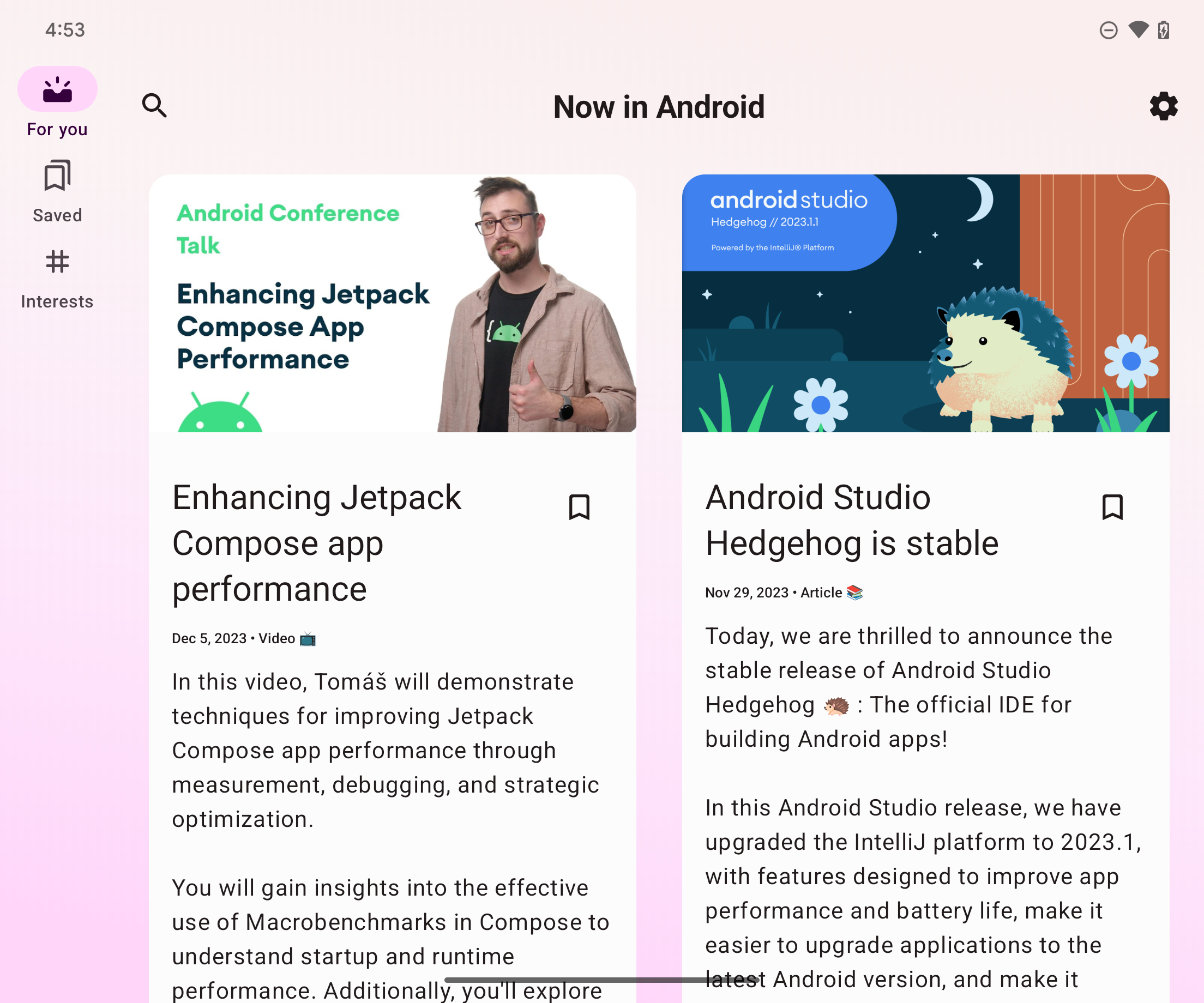
Most apps have a few top-level destinations that are accessible through the app's primary navigation UI. In compact windows, such as a standard phone display, the destinations are typically displayed in a navigation bar at the bottom of the window. In an expanded window, such as a full screen app on a tablet, a navigation rail alongside the app is usually a better choice since the navigation controls are easier to reach while holding the left and right sides of the device.
NavigationSuiteScaffold simplifies switching
between navigation UIs by displaying the appropriate navigation UI composable
based on WindowSizeClass. This includes dynamically
changing the UI during runtime window size changes. The default behavior is to
show either of the following UI components:
- Navigation bar if the width or height is compact or if the device is in tabletop posture
- Navigation rail for everything else

NavigationSuiteScaffold displays a navigation bar in compact windows.

NavigationSuiteScaffold displays a navigation rail in expanded windows.
Add dependencies
NavigationSuiteScaffold is part of the
Material3 adaptive navigation suite
library. Add a dependency for the library in the build.gradle file of your app
or module:
Kotlin
implementation("androidx.compose.material3:material3-adaptive-navigation-suite")
Groovy
implementation 'androidx.compose.material3:material3-adaptive-navigation-suite'
Create a scaffold
The two main parts of NavigationSuiteScaffold are the navigation suite items
and the content for the selected destination. You can directly define the
navigation suite items in a composable, but it's common to have these defined
elsewhere, for example, in an enum:
enum class AppDestinations( @StringRes val label: Int, val icon: ImageVector, @StringRes val contentDescription: Int ) { HOME(R.string.home, Icons.Default.Home, R.string.home), FAVORITES(R.string.favorites, Icons.Default.Favorite, R.string.favorites), SHOPPING(R.string.shopping, Icons.Default.ShoppingCart, R.string.shopping), PROFILE(R.string.profile, Icons.Default.AccountBox, R.string.profile), }
To use NavigationSuiteScaffold, you must track the current destination, which
you can do by using rememberSaveable:
var currentDestination by rememberSaveable { mutableStateOf(AppDestinations.HOME) }
In the following example, the navigationSuiteItems parameter (type
NavigationSuiteScope) uses its item function
to define the navigation UI for an individual destination. The destination UI is
used across navigation bars, rails, and drawers. To create navigation items, you
loop over your AppDestinations (defined in the preceding snippet):
NavigationSuiteScaffold( navigationSuiteItems = { AppDestinations.entries.forEach { item( icon = { Icon( it.icon, contentDescription = stringResource(it.contentDescription) ) }, label = { Text(stringResource(it.label)) }, selected = it == currentDestination, onClick = { currentDestination = it } ) } } ) { // TODO: Destination content. }
Within the destination content lambda, use the currentDestination value to
decide what UI to display. If you use a navigation library in your app, use it
here to display the appropriate destination. A when statement can suffice:
NavigationSuiteScaffold( navigationSuiteItems = { /*...*/ } ) { // Destination content. when (currentDestination) { AppDestinations.HOME -> HomeDestination() AppDestinations.FAVORITES -> FavoritesDestination() AppDestinations.SHOPPING -> ShoppingDestination() AppDestinations.PROFILE -> ProfileDestination() } }
Change colors
NavigationSuiteScaffold creates a Surface over the entire area
the scaffold occupies, typically the full window. On top of that, the scaffold
draws the particular navigation UI, such as a NavigationBar.
Both the surface and the navigation UI use the values specified in your app's
theme, but you can override the theme values.
The containerColor parameter specifies the color of the surface. The default
is the background color of your color scheme. The contentColor parameter
specifies the color of content on that surface. The default is the "on" color
of whatever is specified for containerColor. For example, if containerColor
uses the background color, then contentColor uses the onBackground color.
See Material Design 3 theming in Compose
for more details about how the color system works. When overriding these values,
use values defined in your theme so your app supports dark and light display
modes:
NavigationSuiteScaffold( navigationSuiteItems = { /* ... */ }, containerColor = MaterialTheme.colorScheme.primary, contentColor = MaterialTheme.colorScheme.onPrimary, ) { // Content... }
The navigation UI is drawn in front of the NavigationSuiteScaffold surface.
The default values for the UI colors are provided by
NavigationSuiteDefaults.colors(), but you
can override these values as well. For example, if you want the background of
the navigation bar to be transparent but the other values to be the defaults,
override navigationBarContainerColor:
NavigationSuiteScaffold( navigationSuiteItems = { /* ... */ }, navigationSuiteColors = NavigationSuiteDefaults.colors( navigationBarContainerColor = Color.Transparent, ) ) { // Content... }
Ultimately, you can customize each item in the navigation UI. When calling the
item function, you can pass in an instance of
NavigationSuiteItemColors. The class specifies
the colors for items in a navigation bar, navigation rail, and navigation
drawer. That means you can have identical colors across each navigation UI type,
or you can vary the colors based on your needs. Define the colors at the
NavigationSuiteScaffold level to use the same object instance for all items
and call the NavigationSuiteDefaults.itemColors() function to override only
the ones you want to change:
val myNavigationSuiteItemColors = NavigationSuiteDefaults.itemColors( navigationBarItemColors = NavigationBarItemDefaults.colors( indicatorColor = MaterialTheme.colorScheme.primaryContainer, selectedIconColor = MaterialTheme.colorScheme.onPrimaryContainer ), ) NavigationSuiteScaffold( navigationSuiteItems = { AppDestinations.entries.forEach { item( icon = { Icon( it.icon, contentDescription = stringResource(it.contentDescription) ) }, label = { Text(stringResource(it.label)) }, selected = it == currentDestination, onClick = { currentDestination = it }, colors = myNavigationSuiteItemColors, ) } }, ) { // Content... }
Customize navigation types
The default behavior of NavigationSuiteScaffold changes the navigation UI
based on window size classes. However, you may want to override this
behavior. For example, if your app shows a single large pane of content for a
feed, the app could use a permanent navigation drawer for expanded windows but
still fall back to the default behavior for compact and medium window size
classes:
val adaptiveInfo = currentWindowAdaptiveInfo() val customNavSuiteType = with(adaptiveInfo) { if (windowSizeClass.isWidthAtLeastBreakpoint(WIDTH_DP_EXPANDED_LOWER_BOUND)) { NavigationSuiteType.NavigationDrawer } else { NavigationSuiteScaffoldDefaults.calculateFromAdaptiveInfo(adaptiveInfo) } } NavigationSuiteScaffold( navigationSuiteItems = { /* ... */ }, layoutType = customNavSuiteType, ) { // Content... }
Additional resources
Material Design guidance:
androidx.compose.material3library components:
