
Le sezioni seguenti descrivono come creare un widget app di base con Glance.
Dichiara AppWidget nel manifest
Dopo aver completato i passaggi di configurazione, dichiara l'AppWidget e i relativi
metadati nella tua app.
Estendi il ricevitore
AppWidgetdaGlanceAppWidgetReceiver:class MyAppWidgetReceiver : GlanceAppWidgetReceiver() { override val glanceAppWidget: GlanceAppWidget = TODO("Create GlanceAppWidget") }
Registra il fornitore del widget dell'app nel file
AndroidManifest.xmle nel file di metadati associato:<receiver android:name=".glance.MyReceiver" android:exported="true"> <intent-filter> <action android:name="android.appwidget.action.APPWIDGET_UPDATE" /> </intent-filter> <meta-data android:name="android.appwidget.provider" android:resource="@xml/my_app_widget_info" /> </receiver>
Aggiungere i metadati AppWidgetProviderInfo
A questo punto, segui la guida Crea un widget per creare e definire le informazioni del widget dell'app nel file @xml/my_app_widget_info.
L'unica differenza per Glance è che non esiste un file XML initialLayout, ma devi definirne uno. Puoi utilizzare il layout di caricamento predefinito fornito nella
libreria:
<appwidget-provider xmlns:android="http://schemas.android.com/apk/res/android"
android:initialLayout="@layout/glance_default_loading_layout">
</appwidget-provider>
Dichiarare il file XML AppWidgetProviderInfo
L'oggetto AppWidgetProviderInfo definisce le qualità essenziali del widget. Definisci AppWidgetProviderInfo nel file di risorse dei metadati XML (res/xml/my_app_widget_info.xml) all'interno di un elemento <appwidget-provider>:
<appwidget-provider xmlns:android="http://schemas.android.com/apk/res/android"
    android:minWidth="40dp"
    android:minHeight="40dp"
    android:targetCellWidth="1"
    android:targetCellHeight="1"
    android:maxResizeWidth="250dp"
    android:maxResizeHeight="120dp"
    android:updatePeriodMillis="86400000"
    android:description="@string/example_appwidget_description"
    android:previewLayout="@layout/example_appwidget_preview"
    android:initialLayout="@layout/glance_default_loading_layout"
    android:configure="com.example.android.ExampleAppWidgetConfigurationActivity"
    android:resizeMode="horizontal|vertical"
    android:widgetCategory="home_screen"
    android:widgetFeatures="reconfigurable|configuration_optional">
</appwidget-provider>
Attributi di dimensionamento dei widget
Per impostazione predefinita, la schermata Home posiziona i widget nella finestra in base a una griglia di celle con altezza e larghezza definite. La maggior parte delle schermate Home consente ai widget di assumere dimensioni che sono multipli interi delle celle della griglia, ad esempio due celle in orizzontale per tre celle in verticale.
Gli attributi di dimensionamento dei widget ti consentono di specificare una dimensione predefinita per il widget e di fornire limiti inferiori e superiori per le dimensioni del widget. In questo contesto, le dimensioni predefinite di un widget sono quelle che assume quando viene aggiunto per la prima volta alla schermata Home.
La tabella seguente descrive gli attributi <appwidget-provider> relativi
al dimensionamento dei widget:
| Attributi e descrizione | |
|---|---|
targetCellWidth e
targetCellHeight (Android 12),
minWidth e minHeight |
targetCellWidth e
targetCellHeight, e minWidth e
minHeight, in modo che la tua app possa ricorrere all'utilizzo di
minWidth e minHeight se il dispositivo dell'utente
non supporta targetCellWidth e
targetCellHeight. Se supportati, gli attributi
targetCellWidth e targetCellHeight
hanno la precedenza sugli attributi minWidth e minHeight.
|
minResizeWidth e
minResizeHeight |
Specifica le dimensioni minime assolute del widget. Questi valori specificano le dimensioni al di sotto delle quali il widget è illeggibile o inutilizzabile. L'utilizzo di questi attributi consente all'utente di ridimensionare il widget a una dimensione inferiore a quella predefinita. L'attributo minResizeWidth viene ignorato se è maggiore di minWidth o se il ridimensionamento orizzontale non è attivato. Vedi resizeMode. Allo stesso modo, l'attributo minResizeHeight viene ignorato se è maggiore di minHeight o se il ridimensionamento verticale non è attivato. |
maxResizeWidth e
maxResizeHeight |
Specifica le dimensioni massime consigliate del widget. Se i valori non sono
un multiplo delle dimensioni della cella della griglia, vengono arrotondati per eccesso alle dimensioni
della cella più vicine. L'attributo maxResizeWidth viene ignorato se è
inferiore a minWidth o se il ridimensionamento orizzontale non è
abilitato. Vedi resizeMode. Allo stesso modo,
l'attributo maxResizeHeight viene ignorato se è inferiore
a minHeight o se il ridimensionamento verticale non è abilitato.
Introdotta in Android 12. |
resizeMode |
Specifica le regole in base alle quali è possibile ridimensionare un widget. Puoi utilizzare questo
attributo per rendere i widget della schermata Home ridimensionabili orizzontalmente, verticalmente
o su entrambi gli assi. Gli utenti toccano e tengono premuto un widget per visualizzare i punti di manipolazione per il ridimensionamento,
poi trascinano i punti di manipolazione orizzontali o verticali per modificarne le dimensioni nella
griglia del layout. I valori per l'attributo resizeMode includono
horizontal, vertical e none. Per
dichiarare un widget come ridimensionabile orizzontalmente e verticalmente, utilizza
horizontal|vertical. |
Esempio
Per illustrare in che modo gli attributi nella tabella precedente influiscono sul dimensionamento dei widget, supponiamo le seguenti specifiche:
- Una cella della griglia è larga 30 dp e alta 50 dp.
- Viene fornita la seguente specifica dell'attributo:
<appwidget-provider xmlns:android="http://schemas.android.com/apk/res/android"
    android:minWidth="80dp"
    android:minHeight="80dp"
    android:targetCellWidth="2"
    android:targetCellHeight="2"
    android:minResizeWidth="40dp"
    android:minResizeHeight="40dp"
    android:maxResizeWidth="120dp"
    android:maxResizeHeight="120dp"
    android:resizeMode="horizontal|vertical" />
A partire da Android 12:
Utilizza gli attributi targetCellWidth e targetCellHeight come dimensioni predefinite
del widget.
Per impostazione predefinita, le dimensioni del widget sono 2x2. Il widget può essere ridimensionato fino a 2x1 o fino a 4x3.
Android 11 e versioni precedenti:
Utilizza gli attributi minWidth e minHeight per calcolare la dimensione predefinita del widget.
La larghezza predefinita = Math.ceil(80 / 30) = 3
Altezza predefinita = Math.ceil(80 / 50) = 2
Per impostazione predefinita, le dimensioni del widget sono 3x2. Il widget può essere ridimensionato fino a 2x1 o a schermo intero.
Attributi aggiuntivi del widget
La tabella seguente descrive gli attributi <appwidget-provider> relativi
a qualità diverse dal dimensionamento dei widget.
| Attributi e descrizione | |
|---|---|
updatePeriodMillis |
Definisce la frequenza con cui il framework dei widget richiede un aggiornamento da GlanceAppWidgetReceiver chiamando il metodo di callback onUpdate(). Ti consigliamo di eseguire gli aggiornamenti il meno frequentemente possibile, non più di una volta all'ora, per risparmiare batteria.
Per maggiori dettagli, consulta la sezione Quando aggiornare i widget in Gestione dello stato di Glance. |
initialLayout |
Indica la risorsa di layout che definisce il layout di caricamento del widget prima del rendering delle composizioni dell'interfaccia utente Glance. Puoi utilizzare il layout di caricamento predefinito fornito nella libreria: @layout/glance_default_loading_layout. |
configure |
Definisce l'attività di configurazione che viene avviata quando l'utente aggiunge il widget. Consulta la sezione Implementare un'attività di configurazione del widget in questa pagina. |
description |
Specifica la descrizione del selettore di widget da visualizzare per il widget. Introdotto in Android 12. |
previewLayout (Android 12)
e previewImage (Android 11 e versioni precedenti) |
|
autoAdvanceViewId |
Specifica l'ID visualizzazione della sottovista del widget che viene avanzata automaticamente dall'host del widget. |
widgetCategory |
Dichiara se il widget può essere visualizzato nella schermata Home
(home_screen), nella schermata di blocco (keyguard) o in entrambe. Per Android 5.0 e versioni successive, è valido solo home_screen. |
widgetFeatures |
Dichiara le funzionalità supportate dal widget. Ad esempio, se la configurazione del widget è facoltativa, specifica sia configuration_optional che reconfigurable. |
Definisci GlanceAppWidget
Crea una nuova classe che estenda
GlanceAppWidgeted esegui l'override del metodoprovideGlance. Questo è il metodo in cui puoi caricare i dati necessari per il rendering del widget:class MyAppWidget : GlanceAppWidget() { override suspend fun provideGlance(context: Context, id: GlanceId) { // In this method, load data needed to render the AppWidget. // Use `withContext` to switch to another thread for long running // operations. provideContent { // create your AppWidget here Text("Hello World") } } }
Istanzialo in
glanceAppWidgetsul tuoGlanceAppWidgetReceiver:class MyAppWidgetReceiver : GlanceAppWidgetReceiver() { // Let MyAppWidgetReceiver know which GlanceAppWidget to use override val glanceAppWidget: GlanceAppWidget = MyAppWidget() }
Ora hai configurato un AppWidget utilizzando Glance.
Utilizza la classe GlanceAppWidgetReceiver per gestire le trasmissioni dei widget
Il widget delle coordinate GlanceAppWidgetReceiver trasmette gli aggiornamenti dello stato della piattaforma e delle trasmissioni estendendo AppWidgetProvider sottostante. Riceve gli eventi della piattaforma quando il widget viene aggiornato, eliminato, attivato o disattivato, traducendoli in richieste del ciclo di vita di Compose.
Dichiarare un widget nel manifest
Dichiara la sottoclasse della classe GlanceAppWidgetReceiver come broadcast receiver nel file AndroidManifest.xml:
<receiver android:name="ExampleAppWidgetReceiver"
          android:exported="false">
    <intent-filter>
        <action android:name="android.appwidget.action.APPWIDGET_UPDATE" />
    </intent-filter>
    <meta-data android:name="android.appwidget.provider"
               android:resource="@xml/my_app_widget_info" />
</receiver>
L'elemento <receiver> richiede l'attributo android:name, che specifica
la classe del destinatario. Il destinatario deve accettare l'azione di trasmissione ACTION_APPWIDGET_UPDATE
all'interno di <intent-filter>.
L'elemento <meta-data> deve identificare il proprio nome come
android.appwidget.provider e l'attributo android:resource deve puntare alla
risorsa di metadati XML AppWidgetProviderInfo (@xml/my_app_widget_info).
Implementa la classe GlanceAppWidgetReceiver
In Glance, estendi GlanceAppWidgetReceiver anziché
AppWidgetProvider direttamente. Implementalo collegando il ricevitore all'istanza
GlanceAppWidget. I callback principali disponibili in
GlanceAppWidgetReceiver funzionano nel seguente modo:
onUpdate(): sostituito automaticamente da Glance per eseguire gli aggiornamenti della composizione. Se esegui l'override manuale dionUpdate, devi chiamaresuper.onUpdateper consentire a Glance di avviare correttamente i thread di composizione.onAppWidgetOptionsChanged(): viene chiamato quando il widget viene posizionato o ridimensionato per la prima volta. Glance legge gli elementi del bundle di opzioni in background, in modo che il layout si adatti perfettamente in base alle dimensioni di runtime.onDeleted(Context, IntArray): viene richiamato ogni volta che un utente elimina un'istanza di un widget specifico.onEnabled(Context): attivato quando viene creata correttamente la prima istanza del widget. Ideale per eseguire migrazioni globali.onDisabled(Context): chiamato quando viene rimossa l'ultima istanza attiva del provider.onReceive(Context, Intent): intercetta ogni trasmissione della piattaforma prima di metodi di callback specifici. Devi assicurarti che qualsiasi logica del ricevitore personalizzato che scrivi chiamisuper.onReceive(context, intent)e non deve mai chiamaregoAsyncautonomamente, poiché Glance instrada automaticamente il lavoro in modo asincrono.
Ricevere intent di trasmissione dei widget
GlanceAppWidgetReceiver filtra e gestisce i seguenti intent di trasmissione dei widget della piattaforma di base:
ACTION_APPWIDGET_UPDATEACTION_APPWIDGET_DELETEDACTION_APPWIDGET_ENABLEDACTION_APPWIDGET_DISABLEDACTION_APPWIDGET_OPTIONS_CHANGED
Crea UI
Il seguente snippet mostra come creare la UI:
/* Import Glance Composables In the event there is a name clash with the Compose classes of the same name, you may rename the imports per https://kotlinlang.org/docs/packages.html#imports using the `as` keyword. import androidx.glance.Button import androidx.glance.layout.Column import androidx.glance.layout.Row import androidx.glance.text.Text */ class MyAppWidget : GlanceAppWidget() { override suspend fun provideGlance(context: Context, id: GlanceId) { // Load data needed to render the AppWidget. // Use `withContext` to switch to another thread for long running // operations. provideContent { // create your AppWidget here MyContent() } } @Composable private fun MyContent() { Column( modifier = GlanceModifier.fillMaxSize(), verticalAlignment = Alignment.Top, horizontalAlignment = Alignment.CenterHorizontally ) { Text(text = "Where to?", modifier = GlanceModifier.padding(12.dp)) Row(horizontalAlignment = Alignment.CenterHorizontally) { Button( text = "Home", onClick = actionStartActivity<MyActivity>() ) Button( text = "Work", onClick = actionStartActivity<MyActivity>() ) } } } }
L'esempio di codice precedente esegue queste operazioni:
- Nel livello superiore
Column, gli elementi sono posizionati verticalmente uno dopo l'altro. Columnaumenta le dimensioni per adattarsi allo spazio disponibile (tramiteGlanceModifier) e allinea i contenuti alla parte superiore (verticalAlignment) e li centra orizzontalmente (horizontalAlignment).- I contenuti di
Columnvengono definiti utilizzando la lambda. l'ordine è importante.- Il primo elemento in
Columnè un componenteTextcon12.dpdi spazio interno. - Il secondo elemento è un
Row, in cui gli elementi sono posizionati orizzontalmente uno dopo l'altro, con dueButtonscentrati orizzontalmente (horizontalAlignment). La visualizzazione finale dipende dallo spazio disponibile. L'immagine seguente mostra un esempio di come potrebbe apparire:
- Il primo elemento in
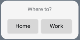
Puoi modificare i valori di allineamento o applicare valori di modificatore diversi (ad esempio il padding) per modificare il posizionamento e le dimensioni dei componenti. Consulta la documentazione di riferimento per un elenco completo di componenti, parametri e modificatori disponibili per ogni classe.
Implementare angoli arrotondati
Android 12 introduce parametri di sistema per personalizzare dinamicamente i raggi degli angoli dei widget delle app:
system_app_widget_background_radius: Specifica il raggio dell'angolo del contenitore dello sfondo del widget (mai superiore a 28 dp).- Raggio interno:per evitare il ritaglio dei contenuti, calcola un raggio proporzionale per i contenuti interni in base al contorno dello sfondo del sistema:
systemRadiusValue - widgetPadding
In Glance, puoi applicare dinamicamente le proprietà di dimensionamento del raggio d'angolo nella
composizione utilizzando
GlanceModifier.cornerRadius(android.R.dimen.system_app_widget_background_radius).
Per la compatibilità con le versioni precedenti sui dispositivi con Android 11 (livello API 30) o versioni precedenti, implementa gli attributi personalizzati e i fallback delle risorse dei temi personalizzati:
/values/attrs.xml<resources> <attr name="backgroundRadius" format="dimension" /> </resources>/values/styles.xml<resources> <style name="MyWidgetTheme"> <item name="backgroundRadius">@dimen/my_background_radius_dimen</item> </style> </resources>/values-31/styles.xml<resources> <style name="MyWidgetTheme" parent="@android:style/Theme.DeviceDefault.DayNight"> <item name="backgroundRadius">@android:dimen/system_app_widget_background_radius</item> </style> </resources>/drawable/my_widget_background.xml<shape xmlns:android="http://schemas.android.com/apk/res/android" android:shape="rectangle"> <corners android:radius="?attr/backgroundRadius" /> </shape>