
Material은 권장되는 디자인 시스템이며 Jetpack Compose는 Material 구현을 제공하지만, 이 시스템을 사용해야 하는 것은 아닙니다. Material은 전적으로 공개 API를 기반으로 빌드되었기 때문에, 동일한 방식으로 자체 디자인 시스템을 만들 수 있습니다.
다음과 같은 몇 가지 접근 방식을 취할 수 있습니다.
- 추가 테마 설정
값으로
MaterialTheme을 확장합니다. - 하나 이상의 Material 시스템(
Colors,Typography또는Shapes)을 맞춤 구현으로 바꾸고 나머지는 유지합니다. - 완전한 맞춤 디자인 시스템을 구현하여
MaterialTheme을 대체합니다.
맞춤 디자인 시스템과 함께 Material 구성요소도 계속 사용하고자 할 수도 있습니다. 이 작업은 가능하지만 취한 접근 방식에 맞게 염두에 두어야 할 사항이 있습니다.
MaterialTheme
및 맞춤 디자인 시스템에 사용되는 하위 수준 구성과 API에 관한 자세한 내용은 Compose 내 테마 분석 가이드를 확인하세요.
Material Theming 확장
Compose Material은 Material Theming을 면밀하게 모델링하므로 간단하고 유형 안전성을 갖추는 방식으로 Material 가이드라인을 따를 수 있습니다. 그러나 색상, 서체, 도형 세트를 추가 값으로 확장할 수 있습니다. 가장 간단한 접근 방식은 확장 속성을 추가하는 것입니다.
// Use with MaterialTheme.colorScheme.snackbarAction val ColorScheme.snackbarAction: Color @Composable get() = if (isSystemInDarkTheme()) Red300 else Red700 // Use with MaterialTheme.typography.textFieldInput val Typography.textFieldInput: TextStyle get() = TextStyle(/* ... */) // Use with MaterialTheme.shapes.card val Shapes.card: Shape get() = RoundedCornerShape(size = 20.dp)
그러면 MaterialTheme 사용 API와 일관성을 유지하게 됩니다. Compose 자체에서 정의한 이 예는 고도에 따라 사용해야 하는 표면 색상을 결정하는
surfaceColorAtElevation입니다.
또 다른 접근 방식은 MaterialTheme 및 그 값을 '래핑'하는 확장 테마를 정의하는 것입니다.
기존의 Material 색상을 유지하면서 caution과 onCaution(약간 위험한 작업에 사용되는 노란색)의 두 가지 색상을 추가하고자 한다고 가정해 보겠습니다.
@Immutable data class ExtendedColors( val caution: Color, val onCaution: Color ) val LocalExtendedColors = staticCompositionLocalOf { ExtendedColors( caution = Color.Unspecified, onCaution = Color.Unspecified ) } @Composable fun ExtendedTheme( /* ... */ content: @Composable () -> Unit ) { val extendedColors = ExtendedColors( caution = Color(0xFFFFCC02), onCaution = Color(0xFF2C2D30) ) CompositionLocalProvider(LocalExtendedColors provides extendedColors) { MaterialTheme( /* colors = ..., typography = ..., shapes = ... */ content = content ) } } // Use with eg. ExtendedTheme.colors.caution object ExtendedTheme { val colors: ExtendedColors @Composable get() = LocalExtendedColors.current }
이는 MaterialTheme 사용 API와 유사합니다. 또한 MaterialTheme과 동일한 방식으로 ExtendedTheme을 중첩할 수 있으므로 여러 개의 테마도 지원합니다.
Material 구성요소 사용
Material Theming을 확장할 경우 기존 MaterialTheme 값은 유지되고 Material 구성요소는 계속해서 적합한 기본값을 갖습니다.
구성요소에 확장된 값을 사용하려면, 자체 구성 가능한 함수로 값을 래핑하고 변경하려는 값을 직접 설정하며 포함하는 컴포저블에 매개변수로 다른 매개변수를 노출합니다.
@Composable fun ExtendedButton( onClick: () -> Unit, modifier: Modifier = Modifier, content: @Composable RowScope.() -> Unit ) { Button( colors = ButtonDefaults.buttonColors( containerColor = ExtendedTheme.colors.caution, contentColor = ExtendedTheme.colors.onCaution /* Other colors use values from MaterialTheme */ ), onClick = onClick, modifier = modifier, content = content ) }
그런 다음 적절한 경우 Button 사용을 ExtendedButton으로 바꿉니다.
@Composable fun ExtendedApp() { ExtendedTheme { /*...*/ ExtendedButton(onClick = { /* ... */ }) { /* ... */ } } }
Material 하위 시스템 대체
Material Theming을 확장하는 대신, 하나 이상의 시스템(Colors, Typography 또는 Shapes)을 맞춤 구현으로 대체하고 나머지는 유지하려는 경우가 있을 수 있습니다.
색상 시스템을 유지하면서 유형 및 도형 시스템을 대체하고자 한다고 가정해 보겠습니다.
@Immutable data class ReplacementTypography( val body: TextStyle, val title: TextStyle ) @Immutable data class ReplacementShapes( val component: Shape, val surface: Shape ) val LocalReplacementTypography = staticCompositionLocalOf { ReplacementTypography( body = TextStyle.Default, title = TextStyle.Default ) } val LocalReplacementShapes = staticCompositionLocalOf { ReplacementShapes( component = RoundedCornerShape(ZeroCornerSize), surface = RoundedCornerShape(ZeroCornerSize) ) } @Composable fun ReplacementTheme( /* ... */ content: @Composable () -> Unit ) { val replacementTypography = ReplacementTypography( body = TextStyle(fontSize = 16.sp), title = TextStyle(fontSize = 32.sp) ) val replacementShapes = ReplacementShapes( component = RoundedCornerShape(percent = 50), surface = RoundedCornerShape(size = 40.dp) ) CompositionLocalProvider( LocalReplacementTypography provides replacementTypography, LocalReplacementShapes provides replacementShapes ) { MaterialTheme( /* colors = ... */ content = content ) } } // Use with eg. ReplacementTheme.typography.body object ReplacementTheme { val typography: ReplacementTypography @Composable get() = LocalReplacementTypography.current val shapes: ReplacementShapes @Composable get() = LocalReplacementShapes.current }
Material 구성요소 사용
MaterialTheme의 하나 이상의 시스템이 대체되었을 때 Material 구성요소를 그대로 사용하면 원치 않는 Material 색상이나 유형 또는 도형 값이 생길 수 있습니다.
구성요소에 대체 값을 사용하려면, 자체 구성 가능한 함수로 값을 래핑하고 관련 시스템에 값을 직접 설정하며 포함하는 컴포저블에 매개변수로 다른 매개변수를 노출합니다.
@Composable fun ReplacementButton( onClick: () -> Unit, modifier: Modifier = Modifier, content: @Composable RowScope.() -> Unit ) { Button( shape = ReplacementTheme.shapes.component, onClick = onClick, modifier = modifier, content = { ProvideTextStyle( value = ReplacementTheme.typography.body ) { content() } } ) }
그런 다음 적절한 경우
Button 사용을 ReplacementButton으로 바꿉니다.
@Composable fun ReplacementApp() { ReplacementTheme { /*...*/ ReplacementButton(onClick = { /* ... */ }) { /* ... */ } } }
완전한 맞춤 디자인 시스템 구현
Material Theming을 완전 맞춤 디자인 시스템으로 대체하고자 할 수 있습니다.
MaterialTheme이 다음과 같은 시스템을 제공한다고 가정해 보겠습니다.
Colors,Typography및Shapes: Material Theming 시스템TextSelectionColors:Text및TextField에서 텍스트 선택에 사용되는 색상Ripple및RippleTheme:Indication의 Material 구현
Material 구성요소를 계속 사용하려면 원치 않는 동작을 방지하기 위해 맞춤 테마에서 시스템 중 일부를 대체하거나 구성요소의 시스템을 처리해야 합니다.
그러나 디자인 시스템은 Material에 필요한 개념으로 제한되지 않습니다. 기존 시스템을 수정하고 새 클래스와 유형으로 완전히 새로운 시스템을 도입하는 방식으로 다른 개념을 테마와 호환되도록 만들 수 있습니다.
다음 코드에서는 경사(List<Color>)가 포함된 맞춤 색상 시스템을 모델링하고, 유형 시스템을 포함하며, 새 고도 시스템을 도입하고, MaterialTheme에서 제공하는 다른 시스템을 제외합니다.
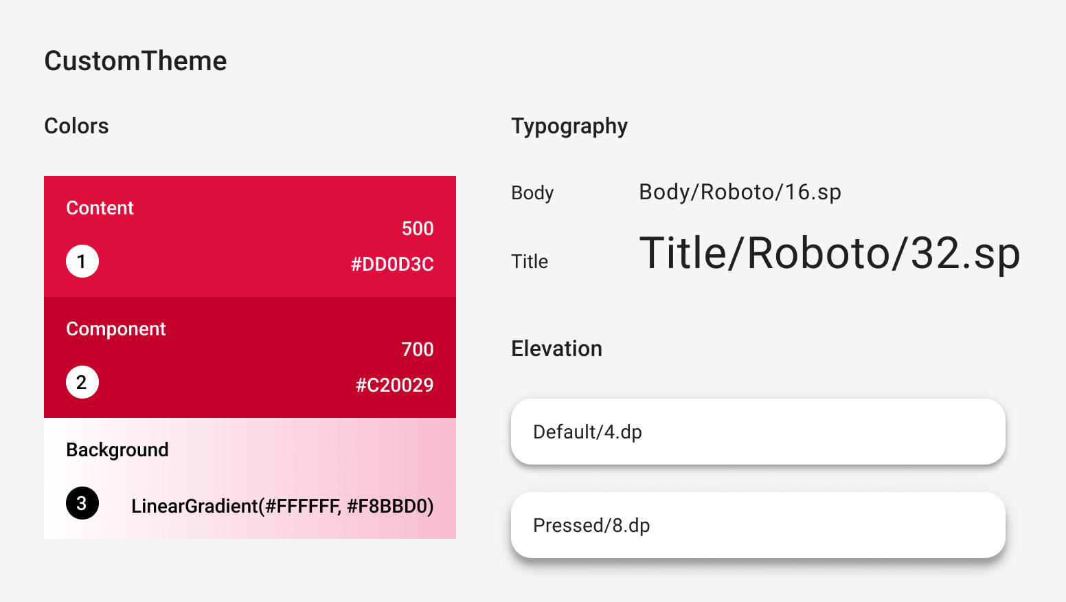
@Immutable data class CustomColors( val content: Color, val component: Color, val background: List<Color> ) @Immutable data class CustomTypography( val body: TextStyle, val title: TextStyle ) @Immutable data class CustomElevation( val default: Dp, val pressed: Dp ) val LocalCustomColors = staticCompositionLocalOf { CustomColors( content = Color.Unspecified, component = Color.Unspecified, background = emptyList() ) } val LocalCustomTypography = staticCompositionLocalOf { CustomTypography( body = TextStyle.Default, title = TextStyle.Default ) } val LocalCustomElevation = staticCompositionLocalOf { CustomElevation( default = Dp.Unspecified, pressed = Dp.Unspecified ) } @Composable fun CustomTheme( /* ... */ content: @Composable () -> Unit ) { val customColors = CustomColors( content = Color(0xFFDD0D3C), component = Color(0xFFC20029), background = listOf(Color.White, Color(0xFFF8BBD0)) ) val customTypography = CustomTypography( body = TextStyle(fontSize = 16.sp), title = TextStyle(fontSize = 32.sp) ) val customElevation = CustomElevation( default = 4.dp, pressed = 8.dp ) CompositionLocalProvider( LocalCustomColors provides customColors, LocalCustomTypography provides customTypography, LocalCustomElevation provides customElevation, content = content ) } // Use with eg. CustomTheme.elevation.small object CustomTheme { val colors: CustomColors @Composable get() = LocalCustomColors.current val typography: CustomTypography @Composable get() = LocalCustomTypography.current val elevation: CustomElevation @Composable get() = LocalCustomElevation.current }
Material 구성요소 사용
MaterialTheme이 없을 때 Material 구성요소를 그대로 사용하면 원치 않는 Material 색상, 유형, 도형 값과 표시 동작이 발생합니다.
구성요소에 맞춤 값을 사용하려면, 자체 구성 가능한 함수로 값을 래핑하고 관련 시스템에 값을 직접 설정하며 포함하는 컴포저블에 매개변수로 다른 매개변수를 노출합니다.
맞춤 테마에서 설정한 값에 액세스하는 것이 좋습니다.
또는 테마에서 Color, TextStyle, Shape 또는 다른 시스템을 제공하지 않는 경우 이들을 하드코딩할 수 있습니다.
@Composable fun CustomButton( onClick: () -> Unit, modifier: Modifier = Modifier, content: @Composable RowScope.() -> Unit ) { Button( colors = ButtonDefaults.buttonColors( containerColor = CustomTheme.colors.component, contentColor = CustomTheme.colors.content, disabledContainerColor = CustomTheme.colors.content .copy(alpha = 0.12f) .compositeOver(CustomTheme.colors.component), disabledContentColor = CustomTheme.colors.content .copy(alpha = 0.38f) ), shape = ButtonShape, elevation = ButtonDefaults.elevatedButtonElevation( defaultElevation = CustomTheme.elevation.default, pressedElevation = CustomTheme.elevation.pressed /* disabledElevation = 0.dp */ ), onClick = onClick, modifier = modifier, content = { ProvideTextStyle( value = CustomTheme.typography.body ) { content() } } ) } val ButtonShape = RoundedCornerShape(percent = 50)
경사를 나타내는 List<Color> 같은 새로운 클래스 유형을 도입한 경우, 구성요소를 래핑하는 대신 처음부터 구성요소를 구현하는 것이 더 나을 수 있습니다. 예를 살펴보려면
JetsnackButton
Jetsnack 샘플에서 확인하세요.
추천 서비스
- 참고: JavaScript가 사용 중지되어 있으면 링크 텍스트가 표시됩니다.
- Compose의 Material Design 3
- Compose의 Material 2에서 Material 3으로 이전
- Compose 내 테마 분석