با مجموعهها، منظم بمانید
ذخیره و طبقهبندی محتوا براساس اولویتهای شما.
برگه ها به شما امکان می دهند گروه هایی از محتوای مرتبط را سازماندهی کنید. دو نوع تب وجود دارد:
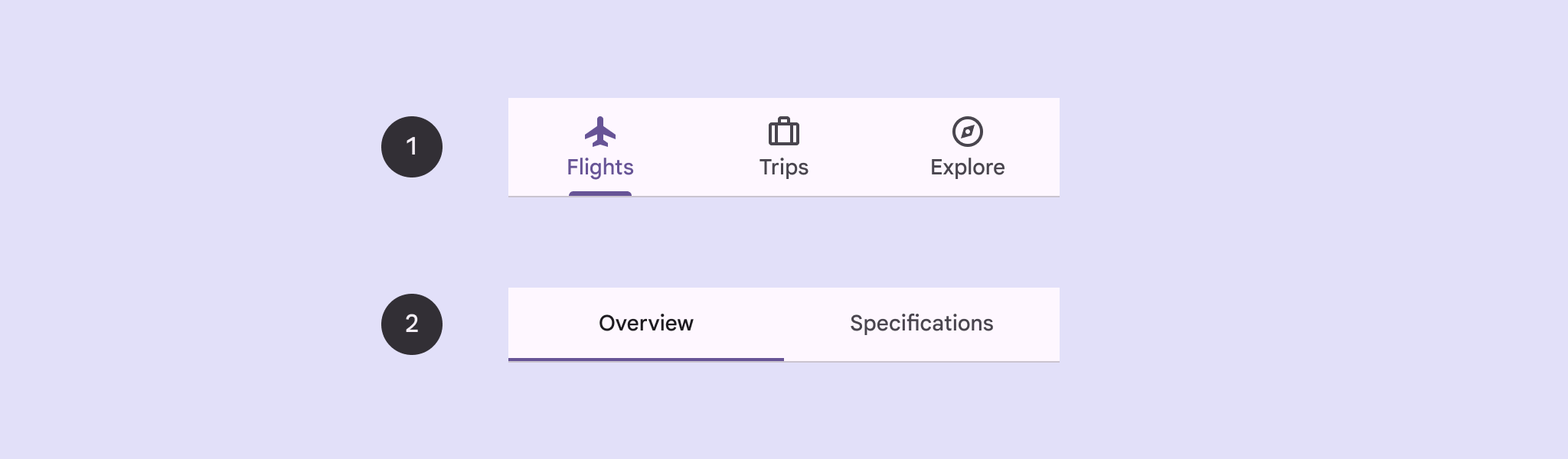
برگه های اصلی : در بالای صفحه محتوا در زیر نوار بالای برنامه قرار می گیرد. آنها مقصدهای محتوای اصلی را نمایش می دهند و باید در مواقعی که فقط به یک مجموعه از برگه ها نیاز است استفاده شوند.
برگه های ثانویه : در یک منطقه محتوا برای جداسازی بیشتر محتوای مرتبط و ایجاد سلسله مراتب استفاده می شود. آنها زمانی ضروری هستند که یک صفحه به بیش از یک سطح تب نیاز دارد.
شکل 1. زبانه های اولیه (1) و زبانه های ثانویه (2).
این صفحه نحوه نمایش برگه های اصلی در برنامه خود را با صفحه های مرتبط و پیمایش اولیه نشان می دهد.
سطح API
برای پیاده سازی زبانه ها از Tab ، PrimaryTabRow و SecondaryTabRow composable استفاده کنید. Tab composable یک برگه مجزا در ردیف را نشان میدهد و معمولاً در داخل یک PrimaryTabRow (برای برگههای نشانگر اولیه) یا SecondaryTabRow (برای برگههای نشانگر ثانویه) استفاده میشود.
Tab شامل پارامترهای کلیدی زیر است:
selected : تعیین می کند که آیا برگه فعلی به صورت بصری برجسته شده است یا خیر.
onClick() : یک تابع لامبدا مورد نیاز است که عملی را که باید هنگام کلیک کاربر روی برگه انجام شود را مشخص می کند. این جایی است که معمولاً رویدادهای ناوبری را مدیریت می کنید، وضعیت برگه انتخابی را به روز می کنید یا محتوای مربوطه را بارگیری می کنید.
text : متن را در برگه نمایش می دهد. اختیاری.
icon : نمادی را در برگه نمایش می دهد. اختیاری.
enabled : کنترل می کند که آیا برگه فعال باشد و بتوان با آن تعامل کرد. اگر روی false تنظیم شود، برگه در حالت غیرفعال ظاهر می شود و به کلیک ها پاسخ نمی دهد.
مثال: ناوبری مبتنی بر برگه
قطعه زیر یک نوار پیمایش بالا با برگهها را برای پیمایش بین صفحههای مختلف در یک برنامه پیادهسازی میکند:
محتوا و نمونه کدها در این صفحه مشمول پروانههای توصیفشده در پروانه محتوا هستند. جاوا و OpenJDK علامتهای تجاری یا علامتهای تجاری ثبتشده Oracle و/یا وابستههای آن هستند.
تاریخ آخرین بهروزرسانی 2025-08-28 بهوقت ساعت هماهنگ جهانی.
[[["درک آسان","easyToUnderstand","thumb-up"],["مشکلم را برطرف کرد","solvedMyProblem","thumb-up"],["غیره","otherUp","thumb-up"]],[["اطلاعاتی که نیاز دارم وجود ندارد","missingTheInformationINeed","thumb-down"],["بیشازحد پیچیده/ مراحل بسیار زیاد","tooComplicatedTooManySteps","thumb-down"],["قدیمی","outOfDate","thumb-down"],["مشکل ترجمه","translationIssue","thumb-down"],["مشکل کد / نمونهها","samplesCodeIssue","thumb-down"],["غیره","otherDown","thumb-down"]],["تاریخ آخرین بهروزرسانی 2025-08-28 بهوقت ساعت هماهنگ جهانی."],[],[],null,["Tabs allow you to organize groups of related content. There are two types of\ntabs:\n\n- **Primary tabs**: Placed at the top of the content pane under a top app bar. They display the main content destinations, and should be used when just one set of tabs are needed.\n- **Secondary tabs**: Used within a content area to further separate related content and establish hierarchy. They are necessary when a screen requires more than one level of tabs.\n\n**Figure 1.** Primary tabs (1) and secondary tabs (2).\n\nThis page shows how to display primary tabs in your app with related screens and\nbasic navigation.\n\nAPI surface\n\nUse the [`Tab`](/reference/kotlin/androidx/compose/material3/package-summary#Tab(kotlin.Boolean,kotlin.Function0,androidx.compose.ui.Modifier,kotlin.Boolean,kotlin.Function0,kotlin.Function0,androidx.compose.ui.graphics.Color,androidx.compose.ui.graphics.Color,androidx.compose.foundation.interaction.MutableInteractionSource)), [`PrimaryTabRow`](/reference/kotlin/androidx/compose/material3/package-summary#PrimaryTabRow(kotlin.Int,androidx.compose.ui.Modifier,androidx.compose.ui.graphics.Color,androidx.compose.ui.graphics.Color,kotlin.Function1,kotlin.Function0,kotlin.Function0)), and [`SecondaryTabRow`](/reference/kotlin/androidx/compose/material3/package-summary#SecondaryTabRow(kotlin.Int,androidx.compose.ui.Modifier,androidx.compose.ui.graphics.Color,androidx.compose.ui.graphics.Color,kotlin.Function1,kotlin.Function0,kotlin.Function0)) composables\nto implement tabs. The `Tab` composable represents an individual tab within the\nrow, and is typically used inside of a `PrimaryTabRow` (for primary indicator\ntabs) or `SecondaryTabRow` (for secondary indicator tabs).\n\n`Tab` includes the following key parameters:\n\n- `selected`: Determines whether the current tab is visually highlighted.\n- `onClick()`: A required lambda function that defines the action to be performed when the user clicks on the tab. This is where you typically handle navigation events, update the selected tab state, or load corresponding content.\n- `text`: Displays text within the tab. Optional.\n- `icon`: Displays an icon within the tab. Optional.\n- `enabled`: Controls whether the tab is enabled and can be interacted with. If set to false, the tab appears in a disabled state and won't respond to clicks.\n\nExample: Tab-based navigation\n\nThe following snippet implements a top navigation bar with tabs to navigate\nbetween different screens in an app:\n| **Note:** The [full source code](https://github.com/android/snippets/blob/main/compose/snippets/src/main/java/com/example/compose/snippets/components/Navigation.kt) includes the code that establishes the basic navigation structure for the following example.\n\n\n```kotlin\n@Composable\nfun NavigationTabExample(modifier: Modifier = Modifier) {\n val navController = rememberNavController()\n val startDestination = Destination.SONGS\n var selectedDestination by rememberSaveable { mutableIntStateOf(startDestination.ordinal) }\n\n Scaffold(modifier = modifier) { contentPadding -\u003e\n PrimaryTabRow(selectedTabIndex = selectedDestination, modifier = Modifier.padding(contentPadding)) {\n Destination.entries.forEachIndexed { index, destination -\u003e\n Tab(\n selected = selectedDestination == index,\n onClick = {\n navController.navigate(route = destination.route)\n selectedDestination = index\n },\n text = {\n Text(\n text = destination.label,\n maxLines = 2,\n overflow = TextOverflow.Ellipsis\n )\n }\n )\n }\n }\n AppNavHost(navController, startDestination)\n }\n}https://github.com/android/snippets/blob/7a0ebbee11495f628cf9d574f6b6069c2867232a/compose/snippets/src/main/java/com/example/compose/snippets/components/Navigation.kt#L186-L213\n```\n\n\u003cbr /\u003e\n\nKey points\n\n- `PrimaryTabRow` displays a horizontal row of tabs, with each tab corresponding to a `Destination`.\n- `val navController = rememberNavController()` creates and remembers an instance of [`NavHostController`](/reference/androidx/navigation/NavHostController), which manages the navigation within a [`NavHost`](/reference/androidx/navigation/NavHost).\n- `var selectedDestination by rememberSaveable {\n mutableIntStateOf(startDestination.ordinal) }` manages the state of the selected tab.\n - `startDestination.ordinal` gets the numerical index (position) of the `Destination.SONGS` enum entry.\n- When you click a tab, the `onClick` lambda calls `navController.navigate(route = destination.route)` to navigate to the corresponding screen.\n- The `onClick` lambda of the `Tab` updates the `selectedDestination` state to visually highlight the clicked tab.\n- It calls the `AppNavHost` composable, passing the `navController` and `startDestination`, to display the actual content of the selected screen.\n\nResult\n\nThe following image shows the result of the previous snippet:\n**Figure 2.** 3 tabs--- Songs, Album, and Playlist--- arranged horizontally.\n\nAdditional resources\n\n- [Material 3 - Tabs](https://m3.material.io/components/tabs/guidelines)\n- [Navigation with Compose](/develop/ui/compose/navigation)"]]