
تتيح لك علامات التبويب تنظيم مجموعات من المحتوى ذي الصلة. هناك نوعان من علامات التبويب:
- علامات التبويب الأساسية: يتم وضعها في أعلى جزء المحتوى أسفل شريط التطبيق العلوي. تعرض هذه الروابط وجهات المحتوى الرئيسية، ويجب استخدامها عند الحاجة إلى مجموعة واحدة فقط من علامات التبويب.
- علامات التبويب الثانوية: تُستخدَم ضمن مساحة المحتوى لزيادة الفصل بين المحتوى ذي الصلة وإنشاء تسلسل هرمي. وتكون ضرورية عندما تتطلّب الشاشة أكثر من مستوى واحد من علامات التبويب.
توضّح هذه الصفحة كيفية عرض علامات التبويب الأساسية في تطبيقك مع الشاشات ذات الصلة وعناصر التنقّل الأساسية.
مساحة عرض واجهة برمجة التطبيقات
استخدِم العناصر القابلة للإنشاء Tab وPrimaryTabRow وSecondaryTabRow
لتنفيذ علامات التبويب. يمثّل العنصر المركّب Tab علامة تبويب فردية ضمن الصف، ويُستخدَم عادةً داخل PrimaryTabRow (لعلامات تبويب المؤشر الأساسي) أو SecondaryTabRow (لعلامات تبويب المؤشر الثانوي).
تتضمّن Tab المَعلمات الرئيسية التالية:
selected: تحدّد هذه السمة ما إذا كان سيتم تمييز علامة التبويب الحالية بصريًا.onClick(): دالة lambda مطلوبة تحدّد الإجراء الذي سيتم تنفيذه عندما ينقر المستخدم على علامة التبويب. وهذا هو المكان الذي تتعامل فيه عادةً مع أحداث التنقّل أو تعدّل حالة علامة التبويب المحدّدة أو تحمّل المحتوى ذي الصلة.text: لعرض النص داخل علامة التبويب اختيارية:icon: يعرض رمزًا داخل علامة التبويب. اختيارية:-
enabled: تتحكّم هذه السمة في ما إذا كانت علامة التبويب مفعّلة ويمكن التفاعل معها. إذا تم ضبطها على "خطأ"، ستظهر علامة التبويب في حالة غير مفعّلة ولن تستجيب للنقرات.
مثال: التنقّل المستند إلى علامات التبويب
ينفّذ المقتطف التالي شريط تنقّل علويًا يتضمّن علامات تبويب للتنقّل بين الشاشات المختلفة في أحد التطبيقات:
@Composable fun NavigationTabExample(modifier: Modifier = Modifier) { val navController = rememberNavController() val startDestination = Destination.SONGS var selectedDestination by rememberSaveable { mutableIntStateOf(startDestination.ordinal) } Scaffold(modifier = modifier) { contentPadding -> PrimaryTabRow(selectedTabIndex = selectedDestination, modifier = Modifier.padding(contentPadding)) { Destination.entries.forEachIndexed { index, destination -> Tab( selected = selectedDestination == index, onClick = { navController.navigate(route = destination.route) selectedDestination = index }, text = { Text( text = destination.label, maxLines = 2, overflow = TextOverflow.Ellipsis ) } ) } } AppNavHost(navController, startDestination) } }
النقاط الرئيسية
- تعرض
PrimaryTabRowصفًا أفقيًا من علامات التبويب، وتتوافق كل علامة تبويب معDestination. - تنشئ
val navController = rememberNavController()وتتذكّر مثيلاً منNavHostController، الذي يدير عملية التنقّل داخلNavHost. - تُدير
var selectedDestination by rememberSaveable {
mutableIntStateOf(startDestination.ordinal) }
حالة علامة التبويب المحدّدة.- تعرض
startDestination.ordinalالفهرس الرقمي (الموضع) لإدخال التعدادDestination.SONGS.
- تعرض
- عند النقر على علامة تبويب، تستدعي دالة
onClickLambda الدالةnavController.navigate(route = destination.route)للانتقال إلى الشاشة المناسبة. - تعدِّل دالة
onClickLambda الخاصة بـTabالحالةselectedDestinationلتسليط الضوء بشكل مرئي على علامة التبويب التي تم النقر عليها. - يتم استدعاء الدالة البرمجية القابلة للإنشاء
AppNavHost، مع تمريرnavControllerوstartDestination، لعرض المحتوى الفعلي للشاشة المحدّدة.
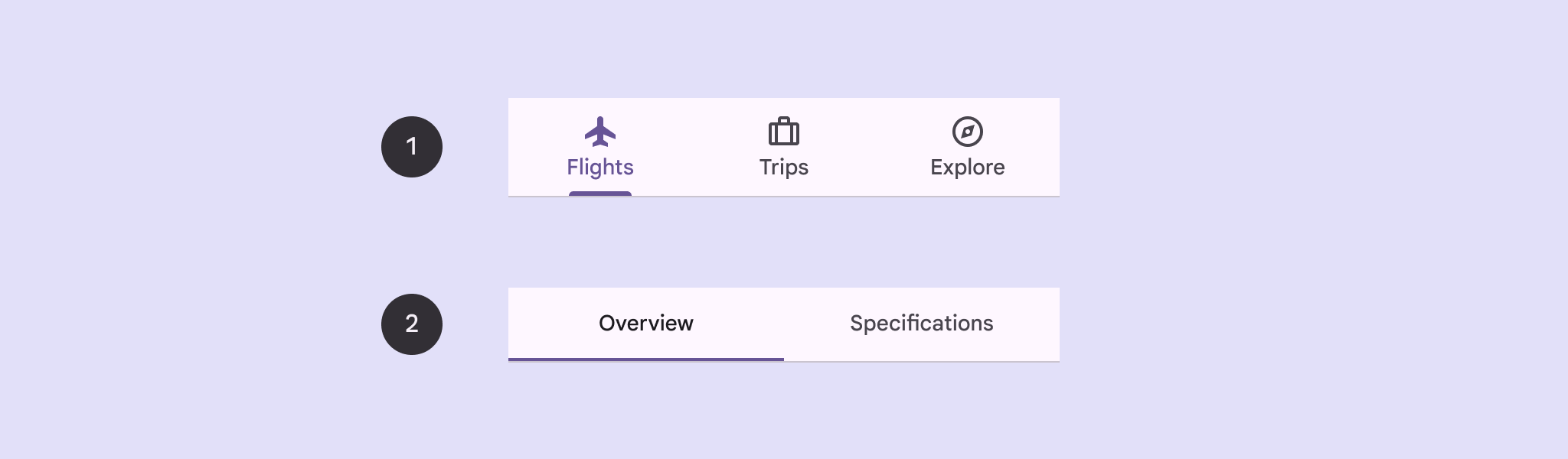
النتيجة
تعرض الصورة التالية نتيجة المقتطف السابق:
.png?authuser=4&hl=ar)