يتيح عنصر Switch للمستخدمين التبديل بين حالتين: تم التحقّق من صحة البيانات
ولم يتم التحقّق من صحة البيانات. في تطبيقك، يمكنك استخدام مفتاح تبديل للسماح للمستخدم بتنفيذ أحد الإجراءات التالية:
- فعِّل أحد الإعدادات أو أوقِفه.
- تفعيل ميزة أو إيقافها
- حدِّد خيارًا.
يتكوّن المكوّن من جزأين: الإبهام والمسار. المقبض هو الجزء القابل للسحب في زر التبديل، والمسار هو الخلفية. يمكن للمستخدم سحب الإبهام إلى اليسار أو اليمين لتغيير حالة مفتاح التبديل. يمكنهم أيضًا النقر على زر التبديل للتحقّق من إيقافها أو تفعيلها.

التنفيذ الأساسي
اطّلِع على مرجع Switch للحصول على تعريف كامل لواجهة برمجة التطبيقات. في ما يلي بعض المَعلمات الرئيسية التي قد تحتاج إلى استخدامها:
checked: تمثّل هذه السمة الحالة الأولية للمفتاح.-
onCheckedChange: دالة ردّ يتم استدعاؤها عند تغيُّر حالة زر التبديل. enabled: ما إذا كان مفتاح التبديل مفعَّلاً أو غير مفعَّل.colors: الألوان المستخدَمة للمفتاح
المثال التالي هو عملية تنفيذ بسيطة للدالة البرمجية القابلة للإنشاء Switch.
@Composable fun SwitchMinimalExample() { var checked by remember { mutableStateOf(true) } Switch( checked = checked, onCheckedChange = { checked = it } ) }
يظهر عنصر التنفيذ هذا على النحو التالي عندما يكون بلا علامة:
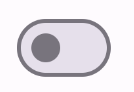
إليك الشكل الذي يظهر به عند وضع علامة عليه:

التنفيذ المتقدّم
في ما يلي المَعلمات الأساسية التي قد تحتاج إلى استخدامها عند تنفيذ عملية تبديل أكثر تقدّمًا:
thumbContent: استخدِم هذه السمة لتخصيص مظهر زر التحكّم عندما يكون محدّدًا.colors: استخدِم هذه السمة لتخصيص لون المسار وزر التحكّم.
الصورة المصغّرة المخصّصة
يمكنك تمرير أي عنصر قابل للإنشاء إلى المَعلمة thumbContent لإنشاء صورة مصغّرة مخصّصة. في ما يلي مثال على مفتاح تبديل يستخدم رمزًا مخصّصًا لزر التبديل:
@Composable fun SwitchWithIconExample() { var checked by remember { mutableStateOf(true) } Switch( checked = checked, onCheckedChange = { checked = it }, thumbContent = if (checked) { { Icon( imageVector = Icons.Filled.Check, contentDescription = null, modifier = Modifier.size(SwitchDefaults.IconSize), ) } } else { null } ) }
في هذا التنفيذ، يكون المظهر بدون علامة مطابقًا للمثال الوارد في القسم السابق. ومع ذلك، عند وضع علامة في المربّع، يظهر التنفيذ على النحو التالي:
ألوان مخصصة
يوضّح المثال التالي كيفية استخدام مَعلمة colors لتغيير لون زر التبديل ومساره، مع الأخذ في الاعتبار ما إذا كان زر التبديل محدّدًا أم لا.
@Composable fun SwitchWithCustomColors() { var checked by remember { mutableStateOf(true) } Switch( checked = checked, onCheckedChange = { checked = it }, colors = SwitchDefaults.colors( checkedThumbColor = MaterialTheme.colorScheme.primary, checkedTrackColor = MaterialTheme.colorScheme.primaryContainer, uncheckedThumbColor = MaterialTheme.colorScheme.secondary, uncheckedTrackColor = MaterialTheme.colorScheme.secondaryContainer, ) ) }
تظهر عملية التنفيذ هذه على النحو التالي: