Thành phần kết hợp Slider cho phép người dùng lựa chọn trong một phạm vi các giá trị. Bạn có thể dùng một thanh trượt để cho phép người dùng làm những việc sau:
- Điều chỉnh các chế độ cài đặt sử dụng một dải giá trị, chẳng hạn như âm lượng và độ sáng.
- Lọc dữ liệu trong biểu đồ, chẳng hạn như khi đặt một khoảng giá.
- Thông tin đầu vào của người dùng, chẳng hạn như việc đặt điểm xếp hạng trong bài đánh giá.
Thanh trượt bao gồm một đường đánh dấu, ngón tay cái, nhãn giá trị và dấu đánh dấu:
- Track (Đường chạy): Đường chạy là thanh ngang biểu thị phạm vi giá trị mà thanh trượt có thể nhận.
- Ngón tay cái: Ngón tay cái là một phần tử điều khiển có thể kéo trên thanh trượt, cho phép người dùng chọn một giá trị cụ thể trong phạm vi do đường đánh dấu xác định.
- Dấu đánh dấu: Dấu đánh dấu là các chỉ báo hoặc dấu hiệu trực quan không bắt buộc xuất hiện dọc theo đường trượt của thanh trượt.
Cách triển khai cơ bản
Hãy xem tài liệu tham khảo về Slider để biết định nghĩa đầy đủ về API. Sau đây là một số tham số chính cho thành phần kết hợp Slider:
value: Giá trị hiện tại của thanh trượt.onValueChange: Một hàm lambda được gọi mỗi khi giá trị thay đổi.enabled: Giá trị boolean cho biết người dùng có thể tương tác với thanh trượt hay không.
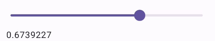
Ví dụ sau đây là một thanh trượt đơn giản. Điều này cho phép người dùng chọn một giá trị từ 0.0 đến 1.0. Vì người dùng có thể chọn bất kỳ giá trị nào trong phạm vi đó, nên thanh trượt là liên tục.
@Preview @Composable fun SliderMinimalExample() { var sliderPosition by remember { mutableFloatStateOf(0f) } Column { Slider( value = sliderPosition, onValueChange = { sliderPosition = it } ) Text(text = sliderPosition.toString()) } }
Phương thức triển khai có dạng như sau:
Cách triển khai nâng cao
Khi triển khai một thanh trượt phức tạp hơn, bạn cũng có thể sử dụng các tham số sau.
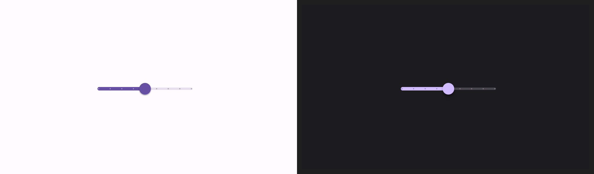
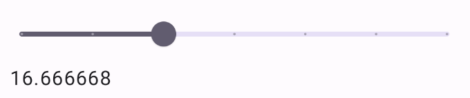
colors: Một thực thể củaSliderColorscho phép bạn kiểm soát màu sắc của thanh trượt.valueRange: Phạm vi giá trị mà thanh trượt có thể nhận.steps: Số lượng khấc trên thanh trượt mà ngón tay cái sẽ di chuyển đến.
Đoạn mã sau đây triển khai một thanh trượt có 3 bước, với phạm vi từ 0.0 đến 50.0. Vì ngón tay cái sẽ di chuyển nhanh đến từng bước, nên thanh trượt này là rời rạc.
@Preview @Composable fun SliderAdvancedExample() { var sliderPosition by remember { mutableFloatStateOf(0f) } Column { Slider( value = sliderPosition, onValueChange = { sliderPosition = it }, colors = SliderDefaults.colors( thumbColor = MaterialTheme.colorScheme.secondary, activeTrackColor = MaterialTheme.colorScheme.secondary, inactiveTrackColor = MaterialTheme.colorScheme.secondaryContainer, ), steps = 3, valueRange = 0f..50f ) Text(text = sliderPosition.toString()) } }
Phương thức triển khai có dạng như sau:
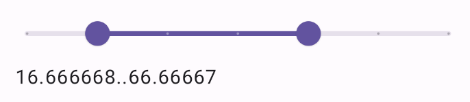
Thanh trượt phạm vi
Bạn cũng có thể dùng thành phần kết hợp RangeSlider chuyên dụng. Điều này cho phép người dùng chọn 2 giá trị. Điều này có thể hữu ích trong các trường hợp như khi người dùng muốn chọn giá tối thiểu và tối đa.
Ví dụ sau đây là một ví dụ tương đối đơn giản về một thanh trượt phạm vi liên tục.
@Preview @Composable fun RangeSliderExample() { var sliderPosition by remember { mutableStateOf(0f..100f) } Column { RangeSlider( value = sliderPosition, steps = 5, onValueChange = { range -> sliderPosition = range }, valueRange = 0f..100f, onValueChangeFinished = { // launch some business logic update with the state you hold // viewModel.updateSelectedSliderValue(sliderPosition) }, ) Text(text = sliderPosition.toString()) } }