רכיב ה-Slider composable מאפשר למשתמשים לבחור מתוך טווח של ערכים. אפשר להשתמש בפס הזזה כדי לאפשר למשתמשים:
- לשנות הגדרות שמשתמשות בטווח ערכים, כמו עוצמת הקול והבהירות.
- סינון נתונים בתרשים, כמו בעת הגדרת טווח מחירים.
- קלט מהמשתמש, כמו הגדרת דירוג בביקורת.
רכיב ה-Slider מכיל פס, ידית, תווית ערך וסימני חלוקה:
- פס: הפס הוא העמודה האופקית שמייצגת את טווח הערכים שהסליידר יכול לקבל.
- האגודל: האגודל הוא רכיב בקרה שאפשר לגרור על פס ההזזה, והוא מאפשר למשתמש לבחור ערך ספציפי בטווח שמוגדר על ידי הפס.
- סימני ביקורת: סימני ביקורת הם סמנים או אינדיקטורים ויזואליים אופציונליים שמופיעים לאורך פס ההזזה.
הטמעה בסיסית
הגדרה מלאה של ה-API מופיעה בהפניה אל Slider. אלה כמה מהפרמטרים העיקריים של הרכיב הקומפוזבילי Slider:
-
value: הערך הנוכחי של פס ההזזה. -
onValueChange: פונקציית lambda שמופעלת בכל פעם שהערך משתנה. -
enabled: ערך בוליאני שמציין אם המשתמש יכול ליצור אינטראקציה עם פס ההזזה.
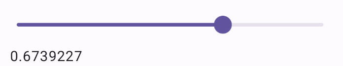
הדוגמה הבאה היא של פס הזזה פשוט. כך המשתמש יכול לבחור ערך מ-0.0 עד 1.0. המשתמש יכול לבחור כל ערך בטווח הזה, ולכן המחוון הוא רציף.
@Preview @Composable fun SliderMinimalExample() { var sliderPosition by remember { mutableFloatStateOf(0f) } Column { Slider( value = sliderPosition, onValueChange = { sliderPosition = it } ) Text(text = sliderPosition.toString()) } }
ההטמעה הזו נראית כך:
הטמעה מתקדמת
כשמטמיעים רכיב slider מורכב יותר, אפשר להשתמש גם בפרמטרים הבאים.
-
colors: מופע שלSliderColorsשמאפשר לשלוט בצבעים של פס ההזזה. -
valueRange: טווח הערכים שהסליידר יכול לקבל. -
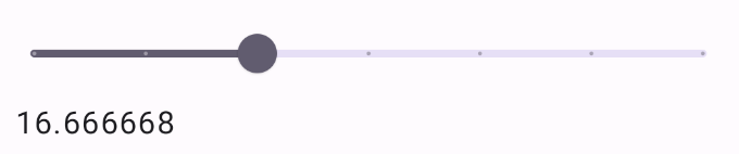
steps: מספר השנתות בסרגל ההזזה שאליהן האגודל קופץ.
בקטע הקוד הבא מוטמע פס הזזה עם שלושה שלבים, בטווח שבין 0.0 ל-50.0. הפס הזה הוא דיסקרטי כי האגודל קופץ לכל שלב.
@Preview @Composable fun SliderAdvancedExample() { var sliderPosition by remember { mutableFloatStateOf(0f) } Column { Slider( value = sliderPosition, onValueChange = { sliderPosition = it }, colors = SliderDefaults.colors( thumbColor = MaterialTheme.colorScheme.secondary, activeTrackColor = MaterialTheme.colorScheme.secondary, inactiveTrackColor = MaterialTheme.colorScheme.secondaryContainer, ), steps = 3, valueRange = 0f..50f ) Text(text = sliderPosition.toString()) } }
היישום ייראה כך:
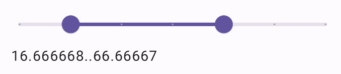
פס ההזזה של הטווח
אפשר גם להשתמש ברכיב הניתן להרכבה RangeSlider. כך המשתמש יכול לבחור שני ערכים. האפשרות הזו שימושית במקרים שבהם המשתמש רוצה לבחור מחיר מינימלי ומחיר מקסימלי.
הדוגמה הבאה היא דוגמה פשוטה יחסית של פס הזזה רציף.
@Preview @Composable fun RangeSliderExample() { var sliderPosition by remember { mutableStateOf(0f..100f) } Column { RangeSlider( value = sliderPosition, steps = 5, onValueChange = { range -> sliderPosition = range }, valueRange = 0f..100f, onValueChangeFinished = { // launch some business logic update with the state you hold // viewModel.updateSelectedSliderValue(sliderPosition) }, ) Text(text = sliderPosition.toString()) } }