
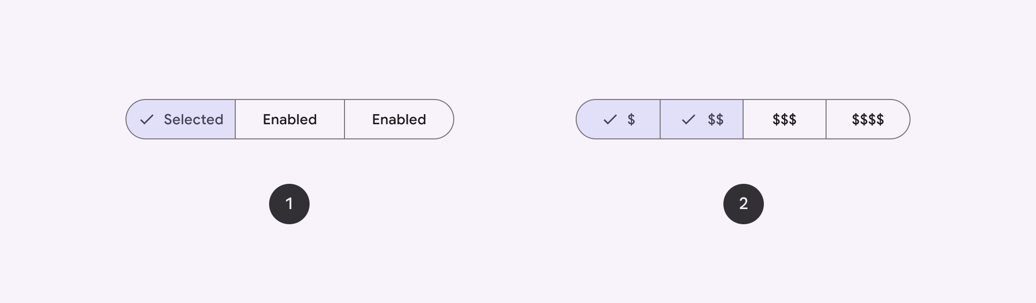
사용자가 옵션 세트에서 나란히 선택할 수 있도록 분할된 버튼을 사용하세요. 분할된 버튼에는 두 가지 유형이 있습니다.
- 단일 선택 버튼: 사용자가 하나의 옵션을 선택할 수 있습니다.
- 다중 선택 버튼: 사용자가 2~5개의 항목을 선택할 수 있습니다. 더 복잡한 선택사항이나 5개 이상의 항목의 경우 칩을 사용하세요.
API 표시 경로
SingleChoiceSegmentedButtonRow 및 MultiChoiceSegmentedButtonRow 레이아웃을 사용하여 분할된 버튼을 만듭니다. 이러한 레이아웃은 SegmentedButton을 올바르게 배치하고 크기를 조정하며 다음 주요 매개변수를 공유합니다.
space: 버튼 간의 중복을 조정합니다.content: 분할 버튼 행의 콘텐츠를 포함합니다. 일반적으로SegmentedButton의 시퀀스입니다.
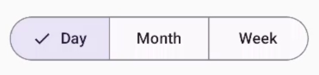
단일 선택 분할된 버튼 만들기
이 예시에서는 단일 선택 분할된 버튼을 만드는 방법을 보여줍니다.
@Composable fun SingleChoiceSegmentedButton(modifier: Modifier = Modifier) { var selectedIndex by remember { mutableIntStateOf(0) } val options = listOf("Day", "Month", "Week") SingleChoiceSegmentedButtonRow { options.f>orEachIndexed { index, label - SegmentedButton( shape = SegmentedButtonDefaults.itemShape( index = index, count = options.size ), onClick = { selectedIndex = index }, selected = index == selectedIndex, label = { Text(label) } } } }SegmentedButton.kt
코드에 관한 핵심 사항
remember및mutableIntStateOf를 사용하여selectedIndex변수를 초기화하여 선택한 버튼 색인을 추적합니다.- 버튼 라벨을 나타내는
options목록을 정의합니다. SingleChoiceSegmentedButtonRow를 사용하면 버튼을 하나만 선택할 수 있습니다.forEachIndexed루프 내에서 각 옵션에 대해SegmentedButton을 만듭니다.shape은SegmentedButtonDefaults.itemShape을 사용하여 인덱스와 총 옵션 수를 기반으로 버튼의 모양을 정의합니다.onClick은 클릭된 버튼의 색인으로selectedIndex를 업데이트합니다.selected은selectedIndex에 따라 버튼의 선택 상태를 설정합니다.label은Text컴포저블을 사용하여 버튼 라벨을 표시합니다.
결과
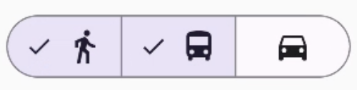
다중 선택 분할된 버튼 만들기
이 예시에서는 사용자가 여러 옵션을 선택할 수 있는 아이콘이 있는 다중 선택 분할된 버튼을 만드는 방법을 보여줍니다.
@Composable fun MultiChoiceSegmentedButton(modifier: Modifier = Modifier) { val selectedOptions = remember { mutableStateListOf(false, false, false) } val options = listOf("Walk", "Ride", "Drive") MultiChoiceSegmentedButtonRow { options.f>orEachIndexed { index, label - SegmentedButton( shape = SegmentedButtonDefaults.itemShape( index = index, count = options.size ), checked = selectedOptions[index], onCheckedChange = { selectedOptions[index] = !selectedOptions[index] }, icon = { SegmentedButtonDefaults.Icon(selectedOptions[index]) }, label = { when (label) { > "Walk" - Icon( imageVector = Icons.AutoMirrored.Filled.DirectionsWalk, contentDescription = "Directions Walk" > ) "Ride" - Icon( imageVector = Icons.Default.DirectionsBus, contentDescription = "Directions> Bus" ) "Drive" - Icon( imageVector = Icons.Default.DirectionsCar, contentDescription = "Directions Car" } } ) } } }SegmentedButton.kt
코드에 관한 핵심 사항
- 이 코드는
remember및mutableStateListOf를 사용하여selectedOptions변수를 초기화합니다. 각 버튼의 선택된 상태를 추적합니다. - 이 코드는
MultiChoiceSegmentedButtonRow를 사용하여 버튼을 포함합니다. forEachIndexed루프 내에서 코드는 각 옵션에 대해SegmentedButton을 만듭니다.shape은 색인과 총 옵션 수를 기반으로 버튼의 모양을 정의합니다.checked는selectedOptions의 해당 값을 기반으로 버튼의 선택 상태를 설정합니다.onCheckedChange는 버튼을 클릭할 때selectedOptions에서 해당 항목의 선택 상태를 전환합니다.icon은SegmentedButtonDefaults.Icon및 버튼의 선택 상태에 따라 아이콘을 표시합니다.label은 적절한 이미지 벡터와 콘텐츠 설명이 있는Icon컴포저블을 사용하여 라벨에 해당하는 아이콘을 표시합니다.
결과
추가 리소스
- Material 3: 분할된 버튼