
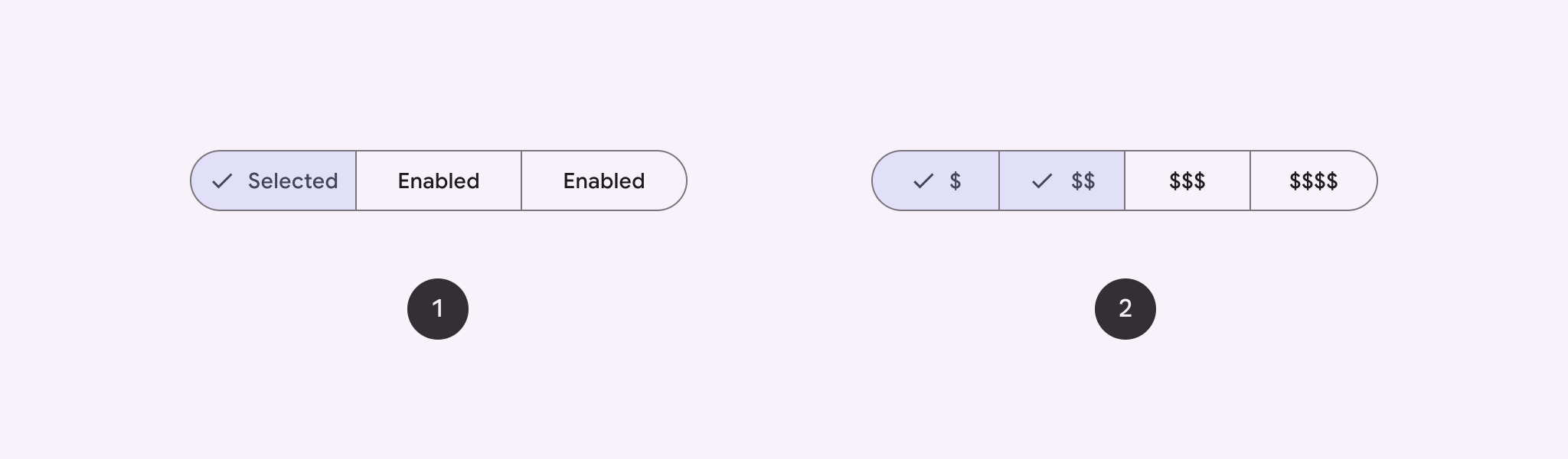
استخدِم زرًا مقسَّمًا للسماح للمستخدمين بالاختيار من مجموعة من الخيارات جنبًا إلى جنب. هناك نوعان من الأزرار المقسّمة:
- زر اختيار واحد: يتيح للمستخدمين اختيار خيار واحد.
- زر الاختيار المتعدد: يتيح للمستخدمين الاختيار بين عنصرين وخمسة عناصر. بالنسبة إلى الخيارات الأكثر تعقيدًا أو التي تتضمّن أكثر من خمسة عناصر، استخدِم الشرائح.
مساحة عرض واجهة برمجة التطبيقات
استخدِم التنسيقَين SingleChoiceSegmentedButtonRow وMultiChoiceSegmentedButtonRow لإنشاء أزرار مقسّمة. تحدّد هذه التصاميم موضع SegmentedButtons وحجمها بشكل صحيح، وتتشارك المَعلمات الرئيسية التالية:
space: لضبط التداخل بين الأزرارcontent: يحتوي على محتوى صف الأزرار المقسّمة، والذي يكون عادةً تسلسلاً منSegmentedButton.
إنشاء زر مقسَّم بخيار واحد
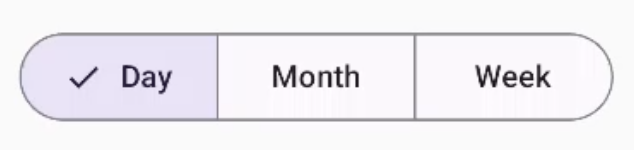
يوضّح هذا المثال كيفية إنشاء زر مقسَّم بخيار واحد:
@Composable fun SingleChoiceSegmentedButton(modifier: Modifier = Modifier) { var selectedIndex by remember { mutableIntStateOf(0) } val options = listOf("Day", "Month", "Week") SingleChoiceSegmentedButtonRow { options.f>orEachIndexed { index, label - SegmentedButton( shape = SegmentedButtonDefaults.itemShape( index = index, count = options.size ), onClick = { selectedIndex = index }, selected = index == selectedIndex, label = { Text(label) } } } }SegmentedButton.kt
النقاط الرئيسية حول الرمز
- تتم تهيئة المتغيّر
selectedIndexباستخدامrememberوmutableIntStateOfلتتبُّع فهرس الزر المحدّد. - تحدّد هذه السمة قائمة
optionsتمثّل تصنيفات الأزرار. SingleChoiceSegmentedButtonRowتتيح لك اختيار زر واحد فقط.- تنشئ
SegmentedButtonلكل خيار، داخل حلقةforEachIndexed:- تحدّد
shapeشكل الزر استنادًا إلى الفهرس وإجمالي عدد الخيارات باستخدامSegmentedButtonDefaults.itemShape. - يتم تعديل
onClickإلىselectedIndexباستخدام فهرس الزرّ الذي تم النقر عليه. - يضبط
selectedحالة اختيار الزر استنادًا إلىselectedIndex. - تعرض الدالة
labelتصنيف الزر باستخدام الدالة البرمجية القابلة للإنشاءText.
- تحدّد
النتيجة
إنشاء زر مقسَّم يتيح تحديد خيارات متعدّدة
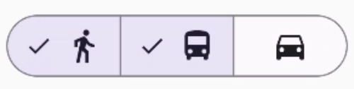
يوضّح هذا المثال كيفية إنشاء زر مقسَّم متعدد الخيارات يتضمّن رموزًا تتيح للمستخدمين تحديد خيارات متعددة:
@Composable fun MultiChoiceSegmentedButton(modifier: Modifier = Modifier) { val selectedOptions = remember { mutableStateListOf(false, false, false) } val options = listOf("Walk", "Ride", "Drive") MultiChoiceSegmentedButtonRow { options.f>orEachIndexed { index, label - SegmentedButton( shape = SegmentedButtonDefaults.itemShape( index = index, count = options.size ), checked = selectedOptions[index], onCheckedChange = { selectedOptions[index] = !selectedOptions[index] }, icon = { SegmentedButtonDefaults.Icon(selectedOptions[index]) }, label = { when (label) { > "Walk" - Icon( imageVector = Icons.AutoMirrored.Filled.DirectionsWalk, contentDescription = "Directions Walk" > ) "Ride" - Icon( imageVector = Icons.Default.DirectionsBus, contentDescription = "Directions> Bus" ) "Drive" - Icon( imageVector = Icons.Default.DirectionsCar, contentDescription = "Directions Car" } } ) } } }SegmentedButton.kt
النقاط الرئيسية حول الرمز
- تهيّئ التعليمات البرمجية المتغيّر
selectedOptionsباستخدامrememberوmutableStateListOf. يتتبّع هذا الإجراء حالة الزر المحدّدة. - يستخدم الرمز
MultiChoiceSegmentedButtonRowلاحتواء الأزرار. - داخل حلقة
forEachIndexed، ينشئ الرمزSegmentedButtonلكل خيار:- يحدّد
shapeشكل الزر استنادًا إلى الفهرس وإجمالي عدد الخيارات. - تضبط
checkedحالة تحديد الزر استنادًا إلى القيمة المقابلة فيselectedOptions. - يؤدي النقر على
onCheckedChangeإلى تبديل حالة التحديد للعنصر المقابل فيselectedOptions. - تعرِض
iconرمزًا استنادًا إلىSegmentedButtonDefaults.Iconوحالة تحديد المربّع في الزر. - تعرض
labelرمزًا مطابقًا للتصنيف باستخدام عناصرIconقابلة للإنشاء مع متجهات صور وأوصاف محتوى مناسبة.
- يحدّد
النتيجة
مراجع إضافية
- Material 3: أزرار مقسّمة