Tetap teratur dengan koleksi
Simpan dan kategorikan konten berdasarkan preferensi Anda.
Scaffold
Dalam Desain Material, kerangka adalah struktur mendasar yang menyediakan platform standar untuk antarmuka pengguna yang kompleks. Komponen ini menyatukan berbagai
bagian UI, seperti panel aplikasi dan tombol tindakan mengambang, sehingga memberikan tampilan dan nuansa yang koheren pada aplikasi.
Contoh
Composable Scaffold menyediakan API sederhana yang dapat Anda gunakan untuk
merakit struktur aplikasi Anda dengan cepat sesuai dengan panduan Desain Material.
Scaffold menerima beberapa composable sebagai parameter. Di antaranya adalah
berikut ini:
topBar: Panel aplikasi di bagian atas layar.
bottomBar: Panel aplikasi di bagian bawah layar.
floatingActionButton: Tombol yang melayang di pojok kanan bawah layar yang dapat Anda gunakan untuk menampilkan tindakan utama.
Anda juga dapat meneruskan konten Scaffold seperti yang Anda lakukan pada container lain. Fungsi ini meneruskan
PaddingValues ke lambda content yang harus Anda terapkan ke
composable root konten untuk membatasi ukurannya.
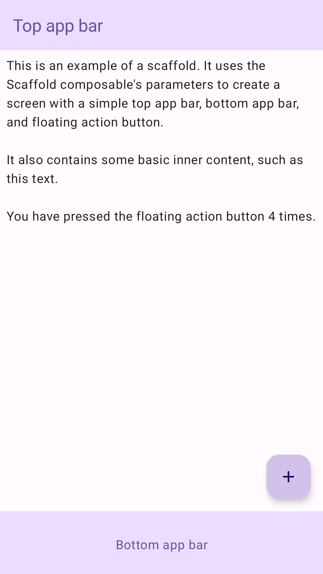
Contoh berikut menunjukkan penerapan Scaffold yang lengkap. Tata letak ini berisi panel aplikasi atas, panel aplikasi bawah, dan tombol tindakan mengambang.
@ComposablefunScaffoldExample(){varpressesbyremember{mutableIntStateOf(0)}Scaffold(topBar={TopAppBar(colors=topAppBarColors(containerColor=MaterialTheme.colorScheme.primaryContainer,titleContentColor=MaterialTheme.colorScheme.primary,),title={Text("Top app bar")})},bottomBar={BottomAppBar(containerColor=MaterialTheme.colorScheme.primaryContainer,contentColor=MaterialTheme.colorScheme.primary,){Text(modifier=Modifier.fillMaxWidth(),textAlign=TextAlign.Center,text="Bottom app bar",)}},floatingActionButton={FloatingActionButton(onClick={presses++}){Icon(Icons.Default.Add,contentDescription="Add")}}){innerPadding->
Column(modifier=Modifier.padding(innerPadding),verticalArrangement=Arrangement.spacedBy(16.dp),){Text(modifier=Modifier.padding(8.dp),text=""" This is an example of a scaffold. It uses the Scaffold composable's parameters to create a screen with a simple top app bar, bottom app bar, and floating action button. It also contains some basic inner content, such as this text. You have pressed the floating action button $presses times. """.trimIndent(),)}}}
Konten dan contoh kode di halaman ini tunduk kepada lisensi yang dijelaskan dalam Lisensi Konten. Java dan OpenJDK adalah merek dagang atau merek dagang terdaftar dari Oracle dan/atau afiliasinya.
Terakhir diperbarui pada 2025-08-27 UTC.
[[["Mudah dipahami","easyToUnderstand","thumb-up"],["Memecahkan masalah saya","solvedMyProblem","thumb-up"],["Lainnya","otherUp","thumb-up"]],[["Informasi yang saya butuhkan tidak ada","missingTheInformationINeed","thumb-down"],["Terlalu rumit/langkahnya terlalu banyak","tooComplicatedTooManySteps","thumb-down"],["Sudah usang","outOfDate","thumb-down"],["Masalah terjemahan","translationIssue","thumb-down"],["Masalah kode / contoh","samplesCodeIssue","thumb-down"],["Lainnya","otherDown","thumb-down"]],["Terakhir diperbarui pada 2025-08-27 UTC."],[],[],null,["Scaffold\n\nIn Material Design, a scaffold is a fundamental structure that provides a\nstandardized platform for complex user interfaces. It holds together different\nparts of the UI, such as app bars and floating action buttons, giving apps a\ncoherent look and feel.\n\nExample\n\nThe [`Scaffold`](/reference/kotlin/androidx/compose/material3/package-summary#Scaffold(androidx.compose.ui.Modifier,kotlin.Function0,kotlin.Function0,kotlin.Function0,kotlin.Function0,androidx.compose.material3.FabPosition,androidx.compose.ui.graphics.Color,androidx.compose.ui.graphics.Color,androidx.compose.foundation.layout.WindowInsets,kotlin.Function1)) composable provides a straightforward API you can use to\nquickly assemble your app's structure according to Material Design guidelines.\n`Scaffold` accepts several composables as parameters. Among these are the\nfollowing:\n\n- `topBar`: The app bar across the top of the screen.\n- `bottomBar`: The app bar across the bottom of the screen.\n- `floatingActionButton`: A button that hovers over the bottom-right corner of the screen that you can use to expose key actions.\n\n| **Note:** For more detailed examples on how you can implement both top and bottom app bars, see the app bars page.\n\nYou can also pass `Scaffold` content as you would to other containers. It passes\n`PaddingValues` to the `content` lambda that you should apply to your\ncontent's root composable to constrain its size.\n\nThe following example shows a complete `Scaffold` implementation. It contains a\ntop app bar, a bottom app bar, and a floating action button.\n\n\n```kotlin\n@Composable\nfun ScaffoldExample() {\n var presses by remember { mutableIntStateOf(0) }\n\n Scaffold(\n topBar = {\n TopAppBar(\n colors = topAppBarColors(\n containerColor = MaterialTheme.colorScheme.primaryContainer,\n titleContentColor = MaterialTheme.colorScheme.primary,\n ),\n title = {\n Text(\"Top app bar\")\n }\n )\n },\n bottomBar = {\n BottomAppBar(\n containerColor = MaterialTheme.colorScheme.primaryContainer,\n contentColor = MaterialTheme.colorScheme.primary,\n ) {\n Text(\n modifier = Modifier\n .fillMaxWidth(),\n textAlign = TextAlign.Center,\n text = \"Bottom app bar\",\n )\n }\n },\n floatingActionButton = {\n FloatingActionButton(onClick = { presses++ }) {\n Icon(Icons.Default.Add, contentDescription = \"Add\")\n }\n }\n ) { innerPadding -\u003e\n Column(\n modifier = Modifier\n .padding(innerPadding),\n verticalArrangement = Arrangement.spacedBy(16.dp),\n ) {\n Text(\n modifier = Modifier.padding(8.dp),\n text =\n \"\"\"\n This is an example of a scaffold. It uses the Scaffold composable's parameters to create a screen with a simple top app bar, bottom app bar, and floating action button.\n\n It also contains some basic inner content, such as this text.\n\n You have pressed the floating action button $presses times.\n \"\"\".trimIndent(),\n )\n }\n }\n}https://github.com/android/snippets/blob/dd30aee903e8c247786c064faab1a9ca8d10b46e/compose/snippets/src/main/java/com/example/compose/snippets/components/Scaffold.kt#L47-L100\n```\n\n\u003cbr /\u003e\n\nThis implementation appears as follows:\n**Figure 1.** An implementation of scaffold.\n\nAdditional resources\n\n- [App bars](/develop/ui/compose/components/app-bars)"]]