Koleksiyonlar ile düzeninizi koruyun
İçeriği tercihlerinize göre kaydedin ve kategorilere ayırın.
Scaffold
Materyal Tasarım'da iskele, karmaşık kullanıcı arayüzleri için standartlaştırılmış bir platform sağlayan temel bir yapıdır. Uygulama çubukları ve kayan işlem düğmeleri gibi kullanıcı arayüzünün farklı bölümlerini bir arada tutarak uygulamalara tutarlı bir görünüm ve tarz kazandırır.
Örnek
Scaffold composable'ı, uygulamanızın yapısını Materyal Tasarım yönergelerine göre hızlı bir şekilde oluşturmak için kullanabileceğiniz basit bir API sağlar.
Scaffold, parametre olarak çeşitli composable'ları kabul eder. Bunlardan bazıları şunlardır:
topBar: Ekranın üst kısmındaki uygulama çubuğu.
bottomBar: Ekranın alt kısmındaki uygulama çubuğu.
floatingActionButton: Ekranın sağ alt köşesinde yer alan ve temel işlemleri göstermek için kullanabileceğiniz bir düğme.
Ayrıca, diğer kapsayıcılara yaptığınız gibi Scaffold içerik de iletebilirsiniz. Boyutunu sınırlamak için içeriğinizin kök composable'ına uygulamanız gereken content lambda'sına PaddingValues değerini iletir.
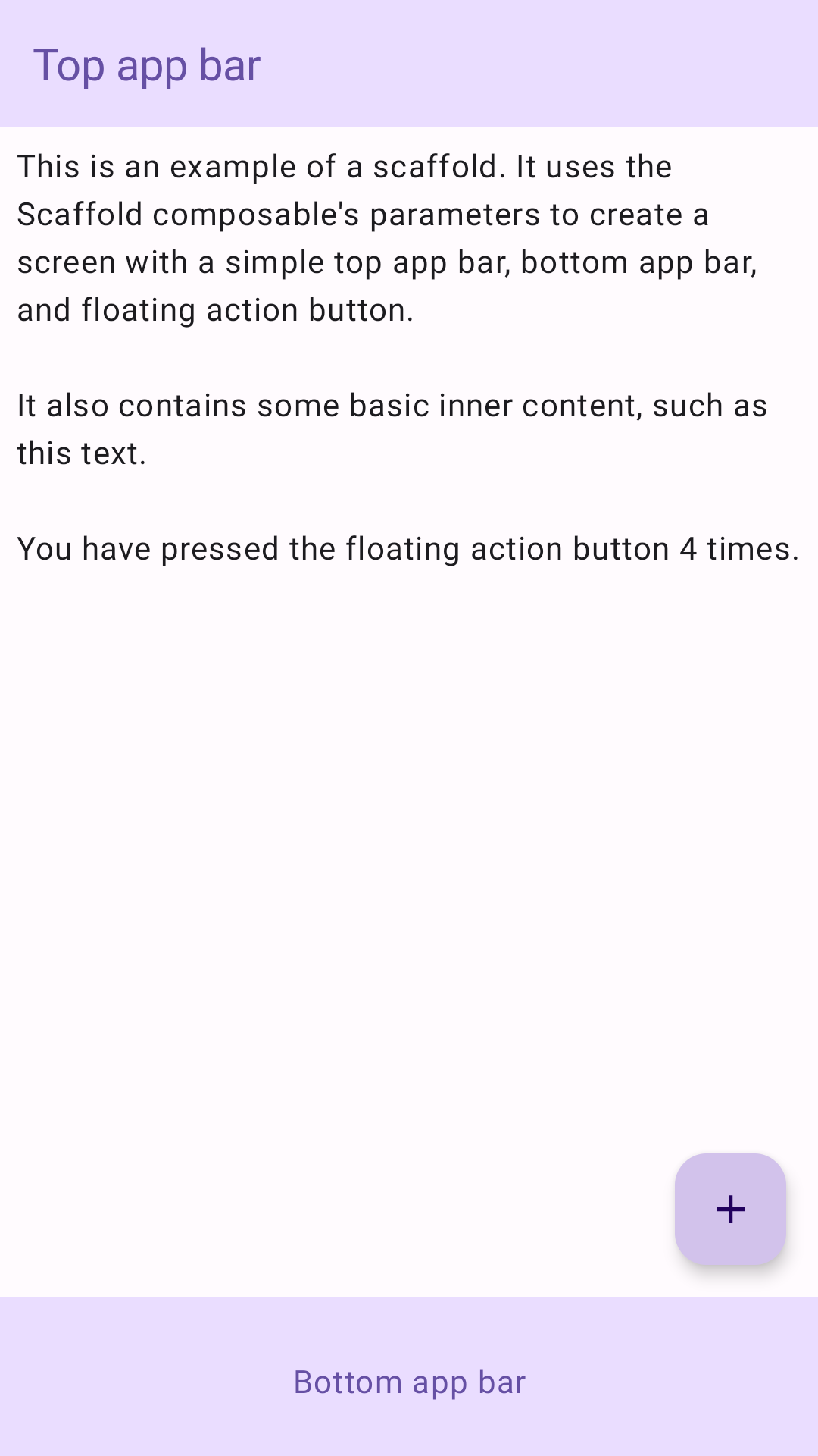
Aşağıdaki örnekte eksiksiz bir Scaffold uygulaması gösterilmektedir. Üst uygulama çubuğu, alt uygulama çubuğu ve kayan işlem düğmesi içerir.
@ComposablefunScaffoldExample(){varpressesbyremember{mutableIntStateOf(0)}Scaffold(topBar={TopAppBar(colors=topAppBarColors(containerColor=MaterialTheme.colorScheme.primaryContainer,titleContentColor=MaterialTheme.colorScheme.primary,),title={Text("Top app bar")})},bottomBar={BottomAppBar(containerColor=MaterialTheme.colorScheme.primaryContainer,contentColor=MaterialTheme.colorScheme.primary,){Text(modifier=Modifier.fillMaxWidth(),textAlign=TextAlign.Center,text="Bottom app bar",)}},floatingActionButton={FloatingActionButton(onClick={presses++}){Icon(Icons.Default.Add,contentDescription="Add")}}){innerPadding->
Column(modifier=Modifier.padding(innerPadding),verticalArrangement=Arrangement.spacedBy(16.dp),){Text(modifier=Modifier.padding(8.dp),text=""" This is an example of a scaffold. It uses the Scaffold composable's parameters to create a screen with a simple top app bar, bottom app bar, and floating action button. It also contains some basic inner content, such as this text. You have pressed the floating action button $presses times. """.trimIndent(),)}}}
Bu sayfadaki içerik ve kod örnekleri, İçerik Lisansı sayfasında açıklanan lisanslara tabidir. Java ve OpenJDK, Oracle ve/veya satış ortaklarının tescilli ticari markasıdır.
Son güncelleme tarihi: 2025-08-28 UTC.
[[["Anlaması kolay","easyToUnderstand","thumb-up"],["Sorunumu çözdü","solvedMyProblem","thumb-up"],["Diğer","otherUp","thumb-up"]],[["İhtiyacım olan bilgiler yok","missingTheInformationINeed","thumb-down"],["Çok karmaşık / çok fazla adım var","tooComplicatedTooManySteps","thumb-down"],["Güncel değil","outOfDate","thumb-down"],["Çeviri sorunu","translationIssue","thumb-down"],["Örnek veya kod sorunu","samplesCodeIssue","thumb-down"],["Diğer","otherDown","thumb-down"]],["Son güncelleme tarihi: 2025-08-28 UTC."],[],[],null,["Scaffold\n\nIn Material Design, a scaffold is a fundamental structure that provides a\nstandardized platform for complex user interfaces. It holds together different\nparts of the UI, such as app bars and floating action buttons, giving apps a\ncoherent look and feel.\n\nExample\n\nThe [`Scaffold`](/reference/kotlin/androidx/compose/material3/package-summary#Scaffold(androidx.compose.ui.Modifier,kotlin.Function0,kotlin.Function0,kotlin.Function0,kotlin.Function0,androidx.compose.material3.FabPosition,androidx.compose.ui.graphics.Color,androidx.compose.ui.graphics.Color,androidx.compose.foundation.layout.WindowInsets,kotlin.Function1)) composable provides a straightforward API you can use to\nquickly assemble your app's structure according to Material Design guidelines.\n`Scaffold` accepts several composables as parameters. Among these are the\nfollowing:\n\n- `topBar`: The app bar across the top of the screen.\n- `bottomBar`: The app bar across the bottom of the screen.\n- `floatingActionButton`: A button that hovers over the bottom-right corner of the screen that you can use to expose key actions.\n\n| **Note:** For more detailed examples on how you can implement both top and bottom app bars, see the app bars page.\n\nYou can also pass `Scaffold` content as you would to other containers. It passes\n`PaddingValues` to the `content` lambda that you should apply to your\ncontent's root composable to constrain its size.\n\nThe following example shows a complete `Scaffold` implementation. It contains a\ntop app bar, a bottom app bar, and a floating action button.\n\n\n```kotlin\n@Composable\nfun ScaffoldExample() {\n var presses by remember { mutableIntStateOf(0) }\n\n Scaffold(\n topBar = {\n TopAppBar(\n colors = topAppBarColors(\n containerColor = MaterialTheme.colorScheme.primaryContainer,\n titleContentColor = MaterialTheme.colorScheme.primary,\n ),\n title = {\n Text(\"Top app bar\")\n }\n )\n },\n bottomBar = {\n BottomAppBar(\n containerColor = MaterialTheme.colorScheme.primaryContainer,\n contentColor = MaterialTheme.colorScheme.primary,\n ) {\n Text(\n modifier = Modifier\n .fillMaxWidth(),\n textAlign = TextAlign.Center,\n text = \"Bottom app bar\",\n )\n }\n },\n floatingActionButton = {\n FloatingActionButton(onClick = { presses++ }) {\n Icon(Icons.Default.Add, contentDescription = \"Add\")\n }\n }\n ) { innerPadding -\u003e\n Column(\n modifier = Modifier\n .padding(innerPadding),\n verticalArrangement = Arrangement.spacedBy(16.dp),\n ) {\n Text(\n modifier = Modifier.padding(8.dp),\n text =\n \"\"\"\n This is an example of a scaffold. It uses the Scaffold composable's parameters to create a screen with a simple top app bar, bottom app bar, and floating action button.\n\n It also contains some basic inner content, such as this text.\n\n You have pressed the floating action button $presses times.\n \"\"\".trimIndent(),\n )\n }\n }\n}https://github.com/android/snippets/blob/dd30aee903e8c247786c064faab1a9ca8d10b46e/compose/snippets/src/main/java/com/example/compose/snippets/components/Scaffold.kt#L47-L100\n```\n\n\u003cbr /\u003e\n\nThis implementation appears as follows:\n**Figure 1.** An implementation of scaffold.\n\nAdditional resources\n\n- [App bars](/develop/ui/compose/components/app-bars)"]]