সেভ করা পৃষ্ঠা গুছিয়ে রাখতে 'সংগ্রহ' ব্যবহার করুন
আপনার পছন্দ অনুযায়ী কন্টেন্ট সেভ করুন ও সঠিক বিভাগে রাখুন।
একটি রেডিও বোতাম ব্যবহারকারীকে বিকল্পগুলির একটি সেট থেকে একটি বিকল্প নির্বাচন করতে দেয়। আপনি একটি রেডিও বোতাম ব্যবহার করেন যখন একটি তালিকা থেকে শুধুমাত্র একটি আইটেম নির্বাচন করা যায়। ব্যবহারকারীদের একাধিক আইটেম নির্বাচন করতে হলে পরিবর্তে একটি সুইচ ব্যবহার করুন।
চিত্র 1. একটি বিকল্পের সাথে একজোড়া রেডিও বোতাম নির্বাচন করা হয়েছে৷
API পৃষ্ঠ
উপলব্ধ বিকল্পগুলি তালিকাভুক্ত করতে RadioButton বোতাম ব্যবহার করুন। প্রতিটি RadioButton বিকল্প এবং একটি Row উপাদানের মধ্যে এর লেবেলকে একত্রে গোষ্ঠীবদ্ধ করতে মোড়ানো।
selected : রেডিও বোতামটি নির্বাচন করা হয়েছে কিনা তা নির্দেশ করে।
onClick : একটি ল্যাম্বডা ফাংশন যা ব্যবহারকারী রেডিও বোতামে ক্লিক করলে আপনার অ্যাপটি কার্যকর করে। যদি এটি null হয়, ব্যবহারকারী রেডিও বোতামের সাথে সরাসরি যোগাযোগ করতে পারবেন না।
enabled : রেডিও বোতাম সক্ষম বা নিষ্ক্রিয় কিনা তা নিয়ন্ত্রণ করে। ব্যবহারকারীরা অক্ষম রেডিও বোতামগুলির সাথে যোগাযোগ করতে পারে না।
interactionSource : আপনাকে বোতামের মিথস্ক্রিয়া অবস্থা পর্যবেক্ষণ করতে দেয়, উদাহরণস্বরূপ, এটি চাপা, হোভার করা বা ফোকাস করা কিনা।
একটি মৌলিক রেডিও বোতাম তৈরি করুন
নিম্নলিখিত কোড স্নিপেট একটি Column মধ্যে রেডিও বোতামগুলির একটি তালিকা রেন্ডার করে:
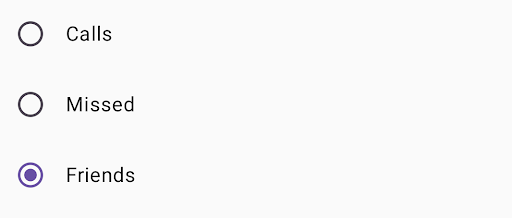
@ComposablefunRadioButtonSingleSelection(modifier:Modifier=Modifier){valradioOptions=listOf("Calls","Missed","Friends")val(selectedOption,onOptionSelected)=remember{mutableStateOf(radioOptions[0])}// Note that Modifier.selectableGroup() is essential to ensure correct accessibility behaviorColumn(modifier.selectableGroup()){radioOptions.forEach{text->
Row(Modifier.fillMaxWidth().height(56.dp).selectable(selected=(text==selectedOption),onClick={onOptionSelected(text)},role=Role.RadioButton).padding(horizontal=16.dp),verticalAlignment=Alignment.CenterVertically){RadioButton(selected=(text==selectedOption),onClick=null// null recommended for accessibility with screen readers)Text(text=text,style=MaterialTheme.typography.bodyLarge,modifier=Modifier.padding(start=16.dp))}}}}
radioOptions রেডিও বোতামের জন্য লেবেল প্রতিনিধিত্ব করে।
remember কম্পোজেবল ফাংশন একটি স্টেট ভেরিয়েবল selectedOption তৈরি করে এবং সেই স্টেট আপডেট করার জন্য একটি ফাংশন তৈরি করে যা onOptionSelected বলে। এই রাজ্যটি নির্বাচিত রেডিও বোতাম বিকল্পটি ধারণ করে।
mutableStateOf(radioOptions[0]) রাজ্যটিকে তালিকার প্রথম আইটেমে শুরু করে। "কল" হল প্রথম আইটেম, তাই এটি ডিফল্টরূপে নির্বাচিত রেডিও বোতাম।
Modifier.selectableGroup() স্ক্রিন রিডারদের জন্য সঠিক অ্যাক্সেসিবিলিটি আচরণ নিশ্চিত করে। এটি সিস্টেমকে জানায় যে এই Column উপাদানগুলি একটি নির্বাচনযোগ্য গোষ্ঠীর অংশ, যা সঠিক স্ক্রিন রিডার সমর্থন সক্ষম করে।
selectedselectedOption অবস্থার উপর ভিত্তি করে বর্তমান Row নির্বাচন করা হয়েছে কিনা তা নির্দেশ করে।
onClick lambda ফাংশন selectedOption অবস্থাকে ক্লিক করা বিকল্পে আপডেট করে যখন Row ক্লিক করা হয়।
role = Role.RadioButton অ্যাক্সেসিবিলিটি পরিষেবাগুলিকে জানায় যে Row একটি রেডিও বোতাম হিসাবে কাজ করে।
RadioButton(...)RadioButton কম্পোজযোগ্য তৈরি করে।
onClick = null on the RadioButton প্রবেশযোগ্যতা উন্নত করে। এটি সরাসরি ক্লিক ইভেন্ট পরিচালনা করতে রেডিও বোতামকে বাধা দেয় এবং Rowselectable সংশোধককে নির্বাচনের অবস্থা এবং অ্যাক্সেসযোগ্যতার আচরণ পরিচালনা করতে দেয়।
ফলাফল
চিত্র 2. "বন্ধু" বিকল্পের সাথে তিনটি রেডিও বোতাম নির্বাচন করা হয়েছে৷
এই পৃষ্ঠার কন্টেন্ট ও কোডের নমুনাগুলি Content License-এ বর্ণিত লাইসেন্সের অধীনস্থ। Java এবং OpenJDK হল Oracle এবং/অথবা তার অ্যাফিলিয়েট সংস্থার রেজিস্টার্ড ট্রেডমার্ক।
2025-08-28 UTC-তে শেষবার আপডেট করা হয়েছে।
[[["সহজে বোঝা যায়","easyToUnderstand","thumb-up"],["আমার সমস্যার সমাধান হয়েছে","solvedMyProblem","thumb-up"],["অন্যান্য","otherUp","thumb-up"]],[["এতে আমার প্রয়োজনীয় তথ্য নেই","missingTheInformationINeed","thumb-down"],["খুব জটিল / অনেক ধাপ","tooComplicatedTooManySteps","thumb-down"],["পুরনো","outOfDate","thumb-down"],["অনুবাদ সংক্রান্ত সমস্যা","translationIssue","thumb-down"],["নমুনা / কোড সংক্রান্ত সমস্যা","samplesCodeIssue","thumb-down"],["অন্যান্য","otherDown","thumb-down"]],["2025-08-28 UTC-তে শেষবার আপডেট করা হয়েছে।"],[],[],null,["A [radio button](https://m3.material.io/components/radio-button/overview) lets a user select an option from a set of\noptions. You use a radio button when only one item can be selected from a\nlist. If users need to select more than one item, use a [switch](https://m3.material.io/components/switch/overview)\ninstead.\n**Figure 1.** A pair of radio buttons with one option selected.\n\nAPI surface\n\nUse the [`RadioButton`](/reference/kotlin/androidx/compose/material3/package-summary#RadioButton(kotlin.Boolean,kotlin.Function0,androidx.compose.ui.Modifier,kotlin.Boolean,androidx.compose.material3.RadioButtonColors,androidx.compose.foundation.interaction.MutableInteractionSource)) composable to list the available options. Wrap each\n`RadioButton` option and its label inside a `Row` component to group them\ntogether.\n\n`RadioButton` includes the following key parameters:\n\n- `selected`: Indicates whether the radio button is selected.\n- `onClick`: A lambda function that your app executes when the user clicks the radio button. If this is `null`, the user can't interact directly with the radio button.\n- `enabled`: Controls whether the radio button is enabled or disabled. Users can't interact with disabled radio buttons.\n- `interactionSource`: Lets you observe the interaction state of the button, for example, whether it's pressed, hovered, or focused.\n\nCreate a basic radio button\n\nThe following code snippet renders a list of radio buttons within a `Column`:\n\n\n```kotlin\n@Composable\nfun RadioButtonSingleSelection(modifier: Modifier = Modifier) {\n val radioOptions = listOf(\"Calls\", \"Missed\", \"Friends\")\n val (selectedOption, onOptionSelected) = remember { mutableStateOf(radioOptions[0]) }\n // Note that Modifier.selectableGroup() is essential to ensure correct accessibility behavior\n Column(modifier.selectableGroup()) {\n radioOptions.forEach { text -\u003e\n Row(\n Modifier\n .fillMaxWidth()\n .height(56.dp)\n .selectable(\n selected = (text == selectedOption),\n onClick = { onOptionSelected(text) },\n role = Role.RadioButton\n )\n .padding(horizontal = 16.dp),\n verticalAlignment = Alignment.CenterVertically\n ) {\n RadioButton(\n selected = (text == selectedOption),\n onClick = null // null recommended for accessibility with screen readers\n )\n Text(\n text = text,\n style = MaterialTheme.typography.bodyLarge,\n modifier = Modifier.padding(start = 16.dp)\n )\n }\n }\n }\n}https://github.com/android/snippets/blob/7a0ebbee11495f628cf9d574f6b6069c2867232a/compose/snippets/src/main/java/com/example/compose/snippets/components/RadioButton.kt#L39-L70\n```\n\n\u003cbr /\u003e\n\nKey points about the code\n\n- `radioOptions` represents the labels for the radio buttons.\n- The `remember` composable function creates a state variable `selectedOption` and a function to update that state called `onOptionSelected`. This state holds the selected radio button option.\n - `mutableStateOf(radioOptions[0])` initializes the state to the first item in the list. \"Calls\" is the first item, so it's the radio button selected by default.\n- [`Modifier.selectableGroup()`](/reference/kotlin/androidx/compose/ui/Modifier#(androidx.compose.ui.Modifier).selectableGroup()) ensures proper accessibility behavior for screen readers. It informs the system that the elements within this `Column` are part of a selectable group, which enables proper screen reader support.\n- [`Modifier.selectable()`](/reference/kotlin/androidx/compose/ui/Modifier#(androidx.compose.ui.Modifier).selectable(kotlin.Boolean,kotlin.Boolean,androidx.compose.ui.semantics.Role,kotlin.Function0)) makes the entire `Row` act as a single selectable item.\n - `selected` indicates whether the current `Row` is selected based on the `selectedOption` state.\n - The `onClick` lambda function updates the `selectedOption` state to the clicked option when the `Row` is clicked.\n - `role = Role.RadioButton` informs accessibility services that the `Row` functions as a radio button.\n- `RadioButton(...)` creates the `RadioButton` composable.\n - `onClick = null` on the `RadioButton` improves accessibility. This prevents the radio button from handling the click event directly, and allows the `Row`'s `selectable` modifier to manage the selection state and accessibility behavior.\n\nResult **Figure 2.** Three radio buttons with the \"Friends\" option selected.\n\nAdditional resources\n\n- Material Design: [Buttons](https://m3.material.io/components/buttons/overview)"]]