
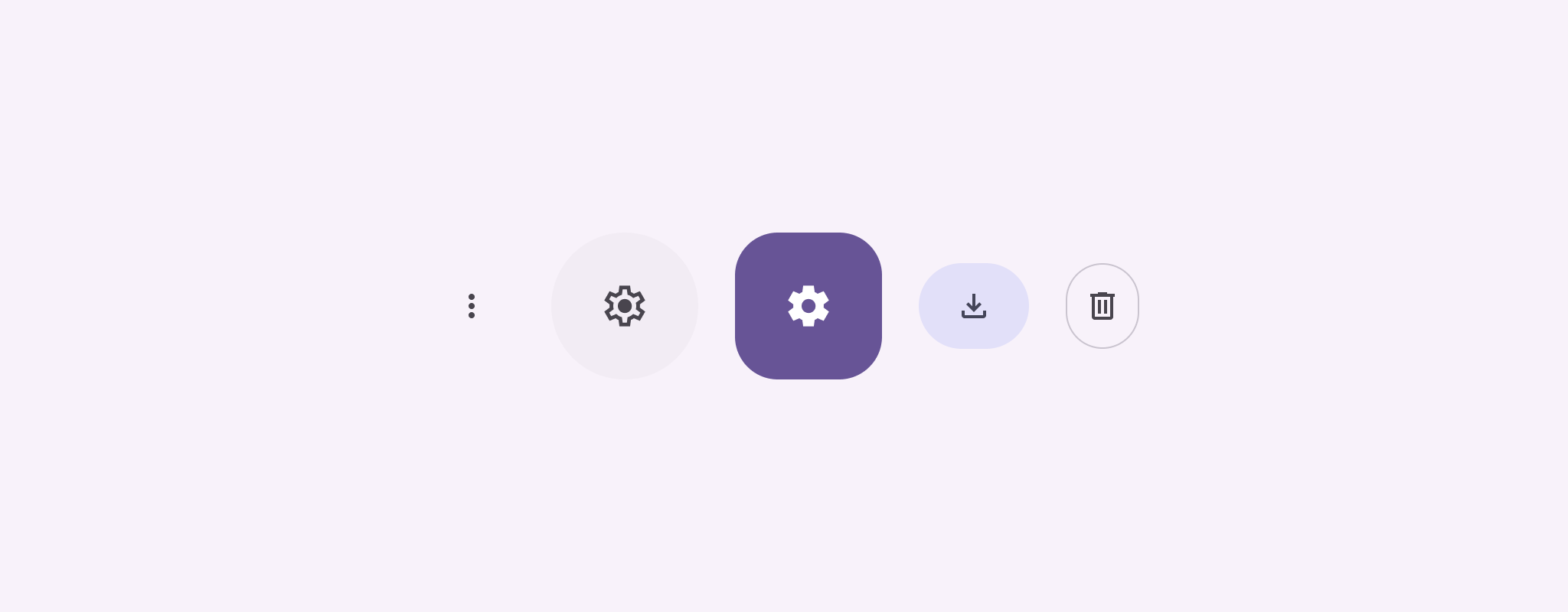
ปุ่มไอคอนแสดงการดำเนินการที่ผู้ใช้ทำได้ ปุ่มไอคอนต้องใช้ไอคอนที่มีความหมายชัดเจน และโดยทั่วไปจะแสดงการดำเนินการทั่วไปหรือที่ใช้งานบ่อย
ปุ่มไอคอนมี 2 ประเภท ได้แก่
- เริ่มต้น: ปุ่มเหล่านี้สามารถเปิดองค์ประกอบอื่นๆ เช่น เมนูหรือการค้นหา
- เปิด/ปิด: ปุ่มเหล่านี้อาจแสดงการดำเนินการแบบ 2 ค่าที่เปิดหรือปิดได้ เช่น "รายการโปรด" หรือ "บุ๊กมาร์ก"
แพลตฟอร์ม API
ใช้คอมโพสิชัน IconButton เพื่อติดตั้งใช้งานปุ่มไอคอนมาตรฐาน หากต้องการสร้างสไตล์ภาพที่แตกต่างกัน เช่น รูปภาพที่เติมเต็ม รูปภาพที่เติมโทนสี หรือรูปภาพที่วาดเส้นขอบ ให้ใช้ FilledIconButton, FilledTonalIconButton และ OutlinedIconButton ตามลำดับ
พารามิเตอร์หลักสําหรับ IconButton มีดังนี้
onClick: ฟังก์ชัน LAMBDA ที่ทำงานเมื่อผู้ใช้แตะปุ่มไอคอนenabled: บูลีนที่ควบคุมสถานะเปิดใช้ของปุ่ม เมื่อfalseปุ่มจะไม่ตอบสนองต่ออินพุตของผู้ใช้content: เนื้อหาแบบคอมโพสิเบิลภายในปุ่ม ซึ่งปกติจะเป็นIcon
ตัวอย่างพื้นฐาน: ปุ่มไอคอนเปิด/ปิด
ตัวอย่างนี้แสดงวิธีใช้ปุ่มไอคอนเปิด/ปิด ไอคอนปุ่มเปิด/ปิดจะเปลี่ยนลักษณะที่ปรากฏโดยขึ้นอยู่กับว่ามีการเลือกหรือไม่เลือก
@Preview @Composable fun ToggleIconButtonExample() { // isToggled initial value should be read from a view model or persistent storage. var isToggled by rememberSaveable { mutableStateOf(false) } IconButton( onClick = { isToggled = !isToggled } ) { Icon( painter = if (isToggled) painterResource(R.drawable.favorite_filled) else painterResource(R.drawable.favorite), contentDescription = if (isToggled) "Selected icon button" else "Unselected icon button." ) } }
ประเด็นสำคัญเกี่ยวกับรหัส
- Composable
ToggleIconButtonExampleจะกำหนดIconButtonแบบเปิด/ปิดได้mutableStateOf(false)สร้างออบเจ็กต์MutableStateที่มีค่าบูลีน โดยค่าเริ่มต้นคือfalseซึ่งทําให้isToggledเป็นผู้ถือสถานะ ซึ่งหมายความว่า Compose จะเขียน UI ใหม่ทุกครั้งที่ค่ามีการเปลี่ยนแปลงrememberSaveableช่วยให้สถานะisToggledคงอยู่แม้มีการเปลี่ยนแปลงการกำหนดค่า เช่น การหมุนหน้าจอ
onClicklambda ของIconButtonจะกำหนดลักษณะการทำงานของปุ่มเมื่อคลิก โดยสลับสถานะระหว่างtrueกับfalse- พารามิเตอร์
painterของคอมโพสิเบิลIconจะโหลดpainterResourceอื่นแบบมีเงื่อนไขตามสถานะisToggledซึ่งจะเปลี่ยนลักษณะที่ปรากฏของไอคอน- หาก
isToggledเป็นtrueระบบจะโหลดรูปหัวใจที่เต็มไปด้วยหัวใจ - หาก
isToggledเป็นfalseระบบจะโหลดรูปหัวใจที่วาดได้ซึ่งมีการร่างเส้นขอบ
- หาก
contentDescriptionของIconจะอัปเดตตามisToggledสถานะด้วยเพื่อให้ข้อมูลการช่วยเหลือพิเศษที่เหมาะสม
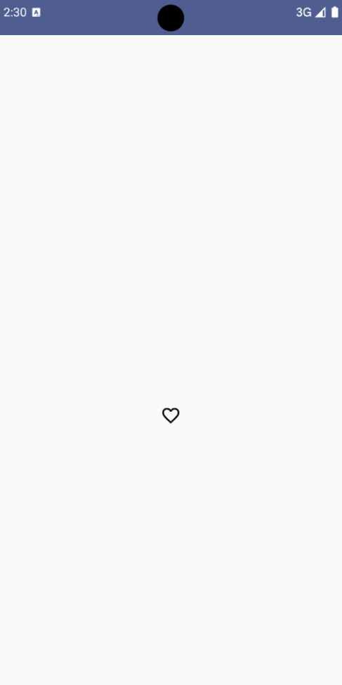
ผลลัพธ์
รูปภาพต่อไปนี้แสดงปุ่มไอคอนเปิด/ปิดจากข้อมูลโค้ดก่อนหน้าในสถานะที่ไม่ได้เลือก
ตัวอย่างขั้นสูง: การดำเนินการซ้ำในการกด
ส่วนนี้จะสาธิตวิธีสร้างปุ่มไอคอนที่เรียกการดำเนินการอย่างต่อเนื่องขณะที่ผู้ใช้กดปุ่มค้างไว้ แทนที่จะเรียกการดำเนินการเพียงครั้งเดียวต่อการคลิก
@Composable fun MomentaryIconButton( unselectedImage: Int, selectedImage: Int, contentDescription: String, modifier: Modifier = Modifier, stepDelay: Long = 100L, // Minimum value is 1L milliseconds. onClick: () -> Unit ) { val interactionSource = remember { MutableInteractionSource() } val isPressed by interactionSource.collectIsPressedAsState() val pressedListener by rememberUpdatedState(onClick) LaunchedEffect(isPressed) { while (isPressed) { delay(stepDelay.coerceIn(1L, Long.MAX_VALUE)) pressedListener() } } IconButton( modifier = modifier, onClick = onClick, interactionSource = interactionSource ) { Icon( painter = if (isPressed) painterResource(id = selectedImage) else painterResource(id = unselectedImage), contentDescription = contentDescription, ) } }
ประเด็นสำคัญเกี่ยวกับรหัส
MomentaryIconButtonใช้unselectedImage: Intซึ่งเป็นรหัสแหล่งข้อมูลที่วาดได้สำหรับไอคอนเมื่อไม่ได้กดปุ่ม และselectedImage: Intซึ่งเป็นรหัสแหล่งข้อมูลที่วาดได้สำหรับไอคอนเมื่อกดปุ่ม- โดยใช้
interactionSourceเพื่อติดตามการโต้ตอบ "กด" จากผู้ใช้โดยเฉพาะ isPressedเป็นจริงเมื่อมีการกดปุ่มอยู่ และจะเป็นเท็จในกรณีอื่น เมื่อisPressedเป็นtrueLaunchedEffectจะเข้าสู่ลูป- ภายในลูปนี้จะใช้
delay(ที่มีstepDelay) เพื่อสร้างการหยุดชั่วคราวระหว่างการดำเนินการที่ทริกเกอร์coerceInตรวจสอบว่าความล่าช้าอย่างน้อย 1 มิลลิวินาทีเพื่อป้องกันการวนซ้ำที่ไม่มีสิ้นสุด - ระบบจะเรียกใช้
pressedListenerหลังจากการเลื่อนเวลาแต่ละครั้งภายในลูป ซึ่งจะทำให้การดำเนินการซ้ำ
- ภายในลูปนี้จะใช้
pressedListenerใช้rememberUpdatedStateเพื่อให้แน่ใจว่าonClicklambda (การดำเนินการที่จะทำ) เป็นข้อมูลล่าสุดจากคอมโพสิชันล่าสุดเสมอIconจะเปลี่ยนรูปภาพที่แสดงโดยขึ้นอยู่กับว่าขณะนี้มีการกดปุ่มหรือไม่- หาก
isPressedเป็นจริงselectedImageจะแสดง - มิฉะนั้น ระบบจะแสดง
unselectedImage
- หาก
ต่อไป ให้ใช้ MomentaryIconButton นี้ในตัวอย่าง ข้อมูลโค้ดต่อไปนี้สาธิตปุ่มไอคอน 2 ปุ่มที่ควบคุมตัวนับ
@Preview() @Composable fun MomentaryIconButtonExample() { var pressedCount by remember { mutableIntStateOf(0) } Row( modifier = Modifier.fillMaxWidth(), verticalAlignment = Alignment.CenterVertically ) { MomentaryIconButton( unselectedImage = R.drawable.fast_rewind, selectedImage = R.drawable.fast_rewind_filled, stepDelay = 100L, onClick = { pressedCount -= 1 }, contentDescription = "Decrease count button" ) Spacer(modifier = Modifier) Text("advanced by $pressedCount frames") Spacer(modifier = Modifier) MomentaryIconButton( unselectedImage = R.drawable.fast_forward, selectedImage = R.drawable.fast_forward_filled, contentDescription = "Increase count button", stepDelay = 100L, onClick = { pressedCount += 1 } ) } }
ประเด็นสำคัญเกี่ยวกับรหัส
- คอมโพสิเบิล
MomentaryIconButtonExampleจะแสดงRowที่มี 2 อินสแตนซ์MomentaryIconButtonและคอมโพสิเบิลTextเพื่อสร้าง UI สําหรับการเพิ่มขึ้นและลดลงของตัวนับ - โดยจะเก็บ
pressedCountตัวแปรสถานะที่เปลี่ยนแปลงได้โดยใช้rememberและmutableIntStateOfซึ่งเริ่มต้นที่ 0 เมื่อpressedCountเปลี่ยนแปลง Composable ทั้งหมดที่สังเกตpressedCount(เช่น ComposableText) จะคอมโพสิทใหม่เพื่อให้สอดคล้องกับค่าใหม่ MomentaryIconButtonแรกจะลดลงpressedCountเมื่อคลิกหรือกดค้างไว้MomentaryIconButtonตัวที่ 2 จะเพิ่มขึ้นpressedCountเมื่อมีการคลิกหรือกดค้างไว้- ปุ่มทั้ง 2 ปุ่มใช้
stepDelay100 มิลลิวินาที ซึ่งหมายความว่าการกระทําonClickจะทําซ้ำทุกๆ 100 มิลลิวินาทีขณะที่กดปุ่มค้างไว้
ผลลัพธ์
วิดีโอต่อไปนี้แสดง UI ที่มีปุ่มไอคอนและตัวนับ