
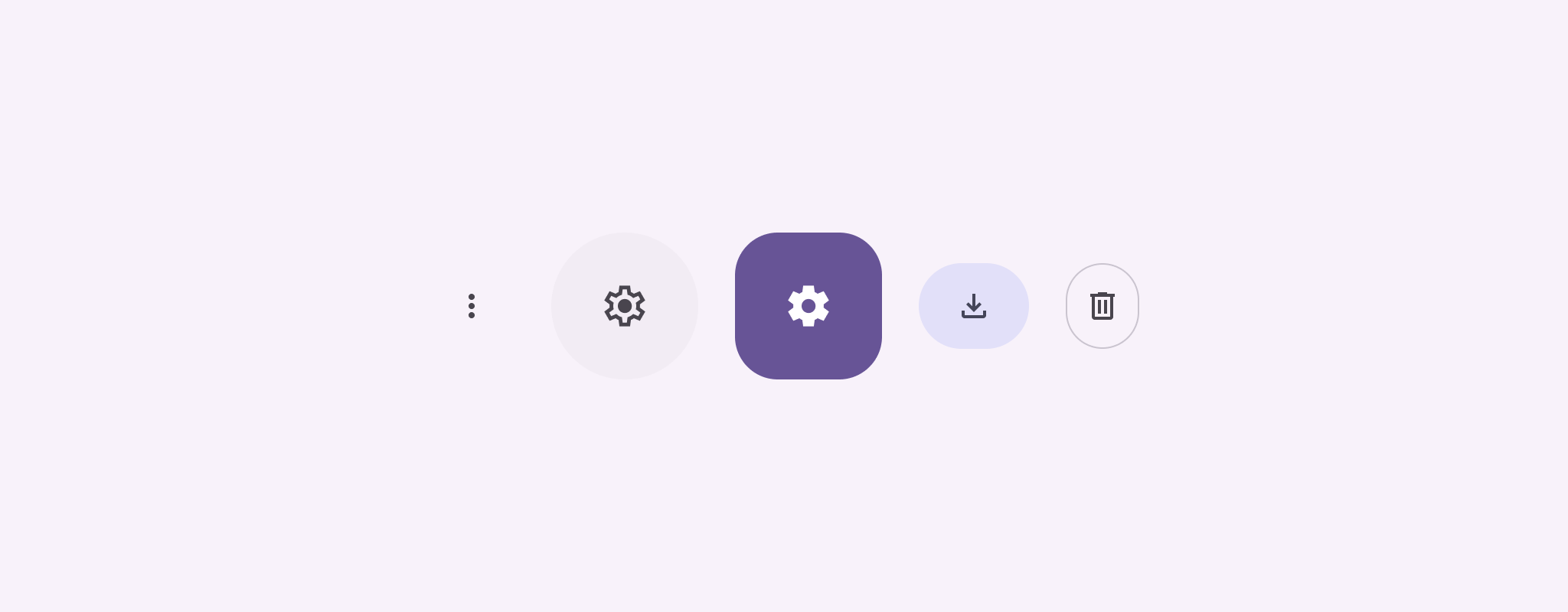
아이콘 버튼은 사용자가 취할 수 있는 작업을 표시합니다. 아이콘 버튼은 명확한 의미가 있는 아이콘을 사용해야 하며 일반적으로 일반적이거나 자주 사용되는 작업을 나타냅니다.
아이콘 버튼에는 두 가지 유형이 있습니다.
- 기본값: 이 버튼을 사용하면 메뉴나 검색과 같은 다른 요소를 열 수 있습니다.
- 전환: 이 버튼은 '즐겨찾기' 또는 '북마크'와 같이 켜거나 끌 수 있는 바이너리 작업을 나타낼 수 있습니다.
API 노출 영역
IconButton 컴포저블을 사용하여 표준 아이콘 버튼을 구현합니다. 채워진, 채워진 색조, 윤곽선이 있는 등 다양한 시각적 스타일을 만들려면 각각 FilledIconButton, FilledTonalIconButton, OutlinedIconButton를 사용하세요.
IconButton의 주요 매개변수는 다음과 같습니다.
onClick: 사용자가 아이콘 버튼을 탭할 때 실행되는 람다 함수입니다.enabled: 버튼의 사용 설정 상태를 제어하는 불리언입니다.false인 경우 버튼이 사용자 입력에 반응하지 않습니다.content: 버튼 내부의 컴포저블 콘텐츠입니다(일반적으로Icon).
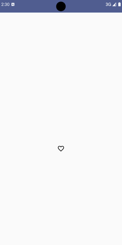
기본 예: 전환 아이콘 버튼
이 예에서는 전환 아이콘 버튼을 구현하는 방법을 보여줍니다. 전환 아이콘 버튼은 선택 여부에 따라 모양이 변경됩니다.
@Preview @Composable fun ToggleIconButtonExample() { // isToggled initial value should be read from a view model or persistent storage. var isToggled by rememberSaveable { mutableStateOf(false) } IconButton( onClick = { isToggled = !isToggled } ) { Icon( painter = if (isToggled) painterResource(R.drawable.favorite_filled) else painterResource(R.drawable.favorite), contentDescription = if (isToggled) "Selected icon button" else "Unselected icon button." ) } }
코드 관련 핵심 사항
ToggleIconButtonExample컴포저블은 전환 가능한IconButton를 정의합니다.mutableStateOf(false)는 불리언 값(초기 값:false)을 보유하는MutableState객체를 만듭니다. 이렇게 하면isToggled가 상태 홀더가 되므로 값이 변경될 때마다 Compose에서 UI를 재구성합니다.rememberSaveable는 화면 회전과 같은 구성 변경사항 간에isToggled상태가 유지되도록 합니다.
IconButton의onClick람다는 클릭 시 버튼의 동작을 정의하여 상태를true와false간에 전환합니다.Icon컴포저블의painter매개변수는isToggled상태에 따라 다른painterResource를 조건부로 로드합니다. 이렇게 하면 아이콘의 시각적 모양이 변경됩니다.isToggled가true이면 채워진 하트 드로어블을 로드합니다.isToggled가false이면 윤곽선이 그려진 하트 드로어블이 로드됩니다.
Icon의contentDescription도isToggled상태에 따라 업데이트되어 적절한 접근성 정보를 제공합니다.
결과
다음 이미지는 선택 해제된 상태의 이전 스니펫의 전환 아이콘 버튼을 보여줍니다.
고급 예: 누르기에 대한 반복 작업
이 섹션에서는 사용자가 클릭할 때마다 한 번만 트리거하는 것이 아니라 길게 누르는 동안 계속해서 작업을 트리거하는 아이콘 버튼을 만드는 방법을 보여줍니다.
@Composable fun MomentaryIconButton( unselectedImage: Int, selectedImage: Int, contentDescription: String, modifier: Modifier = Modifier, stepDelay: Long = 100L, // Minimum value is 1L milliseconds. onClick: () -> Unit ) { val interactionSource = remember { MutableInteractionSource() } val isPressed by interactionSource.collectIsPressedAsState() val pressedListener by rememberUpdatedState(onClick) LaunchedEffect(isPressed) { while (isPressed) { delay(stepDelay.coerceIn(1L, Long.MAX_VALUE)) pressedListener() } } IconButton( modifier = modifier, onClick = onClick, interactionSource = interactionSource ) { Icon( painter = if (isPressed) painterResource(id = selectedImage) else painterResource(id = unselectedImage), contentDescription = contentDescription, ) } }
코드 관련 핵심 사항
MomentaryIconButton는 버튼이 눌리지 않았을 때의 아이콘의 드로어블 리소스 ID인unselectedImage: Int와 버튼이 눌렸을 때의 아이콘의 드로어블 리소스 ID인selectedImage: Int를 사용합니다.interactionSource를 사용하여 사용자의 '누르기' 상호작용을 구체적으로 추적합니다.isPressed은 버튼을 누르고 있는 경우 true이고 그렇지 않은 경우 false입니다.isPressed이true이면LaunchedEffect가 루프를 시작합니다.- 이 루프 내에서
delay(stepDelay포함)를 사용하여 트리거 작업 간에 일시중지를 만듭니다.coerceIn는 무한 루프를 방지하기 위해 지연 시간이 1밀리초 이상인지 확인합니다. pressedListener는 루프 내에서 지연될 때마다 호출됩니다. 이렇게 하면 작업이 반복됩니다.
- 이 루프 내에서
pressedListener는rememberUpdatedState를 사용하여onClick람다 (실행할 작업)가 항상 최신 구성에서 최신 상태인지 확인합니다.Icon는 버튼이 현재 눌려 있는지 여부에 따라 표시되는 이미지를 변경합니다.isPressed이 true이면selectedImage가 표시됩니다.- 그렇지 않으면
unselectedImage가 표시됩니다.
다음으로 이 MomentaryIconButton를 예시에서 사용해 보겠습니다. 다음 스니펫은 카운터를 제어하는 두 개의 아이콘 버튼을 보여줍니다.
@Preview() @Composable fun MomentaryIconButtonExample() { var pressedCount by remember { mutableIntStateOf(0) } Row( modifier = Modifier.fillMaxWidth(), verticalAlignment = Alignment.CenterVertically ) { MomentaryIconButton( unselectedImage = R.drawable.fast_rewind, selectedImage = R.drawable.fast_rewind_filled, stepDelay = 100L, onClick = { pressedCount -= 1 }, contentDescription = "Decrease count button" ) Spacer(modifier = Modifier) Text("advanced by $pressedCount frames") Spacer(modifier = Modifier) MomentaryIconButton( unselectedImage = R.drawable.fast_forward, selectedImage = R.drawable.fast_forward_filled, contentDescription = "Increase count button", stepDelay = 100L, onClick = { pressedCount += 1 } ) } }
코드 관련 핵심 사항
MomentaryIconButtonExample컴포저블은 두 개의MomentaryIconButton인스턴스와 카운터를 증감하기 위한 UI를 빌드하는Text컴포저블이 포함된Row를 표시합니다.remember및mutableIntStateOf를 사용하여 0으로 초기화된 변경 가능한 상태 변수pressedCount를 유지합니다.pressedCount가 변경되면 이를 관찰하는 모든 컴포저블 (예:Text컴포저블)이 새 값을 반영하도록 재구성됩니다.- 첫 번째
MomentaryIconButton는 클릭하거나 길게 누르면pressedCount를 감소시킵니다. - 두 번째
MomentaryIconButton는 클릭하거나 길게 누르면pressedCount를 증가시킵니다. - 두 버튼 모두 100밀리초의
stepDelay를 사용합니다. 즉, 버튼을 누르고 있는 동안onClick작업이 100밀리초마다 반복됩니다.
결과
다음 동영상은 아이콘 버튼과 카운터가 있는 UI를 보여줍니다.