Mantieni tutto organizzato con le raccolte
Salva e classifica i contenuti in base alle tue preferenze.
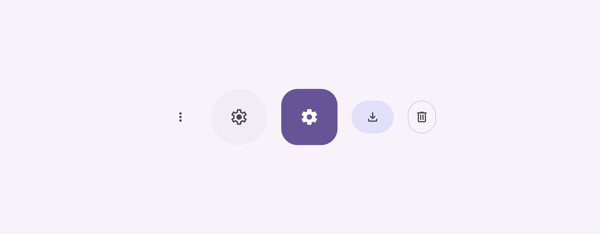
I pulsanti con icone mostrano le azioni che gli utenti possono intraprendere. I pulsanti con icone devono utilizzare un'icona con un significato chiaro e in genere rappresentano azioni comuni o usate di frequente.
Esistono due tipi di pulsanti con icone:
Predefinito: questi pulsanti possono aprire altri elementi, ad esempio un menu o una ricerca.
Di attivazione/disattivazione: questi pulsanti possono rappresentare azioni binarie che possono essere attivate o disattivate, ad esempio "Preferito" o "Segnalibro".
Figura 1. Pulsanti con icone, alcuni dei quali sono riempiti (a indicare la selezione) e delineati.
onClick: una funzione lambda che viene eseguita quando l'utente tocca il pulsante dell'icona.
enabled: un valore booleano che controlla lo stato di attivazione del pulsante. Quando
false, il pulsante non risponde all'input dell'utente.
content: i contenuti componibili all'interno del pulsante, in genere un Icon.
Esempio di base: pulsante di attivazione/disattivazione con icona
Questo esempio mostra come implementare un pulsante con icona di attivazione/disattivazione. L'aspetto di un pulsante con icona di attivazione/disattivazione cambia a seconda che sia selezionato o meno.
@Preview@ComposablefunToggleIconButtonExample(){// isToggled initial value should be read from a view model or persistent storage.varisToggledbyrememberSaveable{mutableStateOf(false)}IconButton(onClick={isToggled=!isToggled}){Icon(painter=if(isToggled)painterResource(R.drawable.favorite_filled)elsepainterResource(R.drawable.favorite),contentDescription=if(isToggled)"Selected icon button"else"Unselected icon button.")}}
Il componibile ToggleIconButtonExample definisce un IconButton attivabile/disattivabile.
mutableStateOf(false) crea un oggetto MutableState che contiene un valore booleano, inizialmente false. In questo modo, isToggled diventa un detentore dello stato,
il che significa che Compose ricomporrà l'interfaccia utente ogni volta che il relativo valore cambia.
rememberSaveable garantisce che lo stato isToggled persista anche in seguito alle modifiche di configurazione, come la rotazione dello schermo.
Il lambda onClick di IconButton definisce il comportamento del pulsante quando viene fatto clic, attivando/disattivando lo stato tra true e false.
Il parametro painter del composable Icon carica condizionatamente un painterResource diverso in base allo stato isToggled. In questo modo, l'aspetto dell'icona cambia.
Se isToggled è true, viene caricato il disegno del cuore pieno.
Se isToggled è false, viene caricato il disegno del cuore con il contorno.
Anche il contentDescription del Icon si aggiorna in base allo stato del isToggled per fornire informazioni sull'accessibilità appropriate.
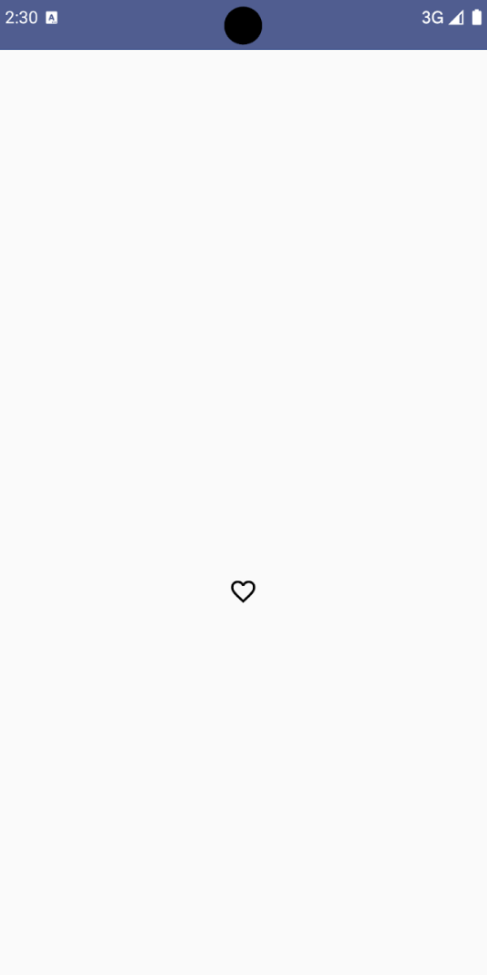
Risultato
L'immagine seguente mostra il pulsante dell'icona di attivazione/disattivazione dello snippet precedente nel suo stato non selezionato:
Figura 2. Un pulsante di attivazione/disattivazione dell'icona "Preferito" non selezionato.
Esempio avanzato: azioni ripetute con pressione
Questa sezione mostra come creare pulsanti con icone che attivano continuamente un'azione mentre l'utente li preme e li tiene premuti, anziché attivarsi solo una volta per clic.
@ComposablefunMomentaryIconButton(unselectedImage:Int,selectedImage:Int,contentDescription:String,modifier:Modifier=Modifier,stepDelay:Long=100L,// Minimum value is 1L milliseconds.onClick:()->Unit){valinteractionSource=remember{MutableInteractionSource()}valisPressedbyinteractionSource.collectIsPressedAsState()valpressedListenerbyrememberUpdatedState(onClick)LaunchedEffect(isPressed){while(isPressed){delay(stepDelay.coerceIn(1L,Long.MAX_VALUE))pressedListener()}}IconButton(modifier=modifier,onClick=onClick,interactionSource=interactionSource){Icon(painter=if(isPressed)painterResource(id=selectedImage)elsepainterResource(id=unselectedImage),contentDescription=contentDescription,)}}
MomentaryIconButton accetta un unselectedImage: Int, l'ID della risorsa drawable per l'icona quando il pulsante non è premuto, e selectedImage: Int, l'ID della risorsa drawable per l'icona quando il pulsante è premuto.
Utilizza un interactionSource per monitorare specificamente le interazioni di "pressione" dell'utente.
isPressed è true quando il pulsante è premuto attivamente e false
altrimenti. Quando isPressed è true, LaunchedEffect entra in un ciclo.
All'interno di questo ciclo, utilizza un delay (con stepDelay) per creare interruzioni tra le azioni di attivazione. coerceIn garantisce che il ritardo sia di almeno 1 ms per
evitare cicli infiniti.
pressedListener viene invocato dopo ogni ritardo all'interno del loop. In questo modo, l'azione viene ripetuta.
pressedListener utilizza rememberUpdatedState per assicurarsi che la funzione lambda onClick (l'azione da eseguire) sia sempre la più aggiornata dell'ultima composizione.
L'Icon cambia l'immagine visualizzata in base al fatto che il pulsante sia attualmente premuto o meno.
Se isPressed è true, viene mostrato selectedImage.
In caso contrario, viene visualizzato unselectedImage.
A questo punto, utilizza MomentaryIconButton in un esempio. Lo snippet seguente
mostra due pulsanti con icone che controllano un contatore:
@Preview()@ComposablefunMomentaryIconButtonExample(){varpressedCountbyremember{mutableIntStateOf(0)}Row(modifier=Modifier.fillMaxWidth(),verticalAlignment=Alignment.CenterVertically){MomentaryIconButton(unselectedImage=R.drawable.fast_rewind,selectedImage=R.drawable.fast_rewind_filled,stepDelay=100L,onClick={pressedCount-=1},contentDescription="Decrease count button")Spacer(modifier=Modifier)Text("advanced by $pressedCount frames")Spacer(modifier=Modifier)MomentaryIconButton(unselectedImage=R.drawable.fast_forward,selectedImage=R.drawable.fast_forward_filled,contentDescription="Increase count button",stepDelay=100L,onClick={pressedCount+=1})}}
Il composable MomentaryIconButtonExample mostra un Row contenente due MomentaryIconButton e un composable Text per creare un'interfaccia utente per incrementare e decrementare un contatore.
Mantiene una variabile di stato mutabile pressedCount utilizzando remember e
mutableIntStateOf, inizializzata a 0. Quando pressedCount cambia, tutti i composabili che lo osservano (come il composable Text) si ricompono per riflettere il nuovo valore.
Il primo MomentaryIconButton diminuisce pressedCount quando viene fatto clic o premuto.
Il secondo MomentaryIconButton aumenta pressedCount quando viene premuto o tenuto premuto.
Entrambi i pulsanti utilizzano un stepDelay di 100 millisecondi, il che significa che l'azione onClick
si ripete ogni 100 ms mentre un pulsante è premuto.
Risultato
Il video seguente mostra l'interfaccia utente con i pulsanti delle icone e il contatore:
Figura 3. Un'interfaccia utente del contatore con due pulsanti con icone (più e meno) che aumentano e diminuiscono il contatore.
I campioni di contenuti e codice in questa pagina sono soggetti alle licenze descritte nella Licenza per i contenuti. Java e OpenJDK sono marchi o marchi registrati di Oracle e/o delle sue società consociate.
Ultimo aggiornamento 2025-08-28 UTC.
[[["Facile da capire","easyToUnderstand","thumb-up"],["Il problema è stato risolto","solvedMyProblem","thumb-up"],["Altra","otherUp","thumb-up"]],[["Mancano le informazioni di cui ho bisogno","missingTheInformationINeed","thumb-down"],["Troppo complicato/troppi passaggi","tooComplicatedTooManySteps","thumb-down"],["Obsoleti","outOfDate","thumb-down"],["Problema di traduzione","translationIssue","thumb-down"],["Problema relativo a esempi/codice","samplesCodeIssue","thumb-down"],["Altra","otherDown","thumb-down"]],["Ultimo aggiornamento 2025-08-28 UTC."],[],[],null,["Icon buttons display actions that users can take. Icon buttons must use an icon\nwith a clear meaning, and typically represent common or frequently used actions.\n\nThere are two types of icon buttons:\n\n- **Default**: These buttons can open other elements, such as a menu or search.\n- **Toggle**: These buttons can represent binary actions that can be toggled on or off, such as \"favorite\" or \"bookmark\".\n\n**Figure 1.** Icon buttons, some of which are filled (indicating selection) and outlined.\n\nAPI surface\n\nUse the [`IconButton`](/reference/kotlin/androidx/compose/material3/package-summary#IconButton(kotlin.Function0,androidx.compose.ui.Modifier,kotlin.Boolean,androidx.compose.material3.IconButtonColors,androidx.compose.foundation.interaction.MutableInteractionSource,kotlin.Function1)) composable to implement standard icon buttons. To\ncreate different visual styles like filled, filled tonal, or outlined, use\n[`FilledIconButton`](/reference/kotlin/androidx/compose/material3/package-summary#FilledIconButton(kotlin.Function0,androidx.compose.material3.IconButtonShapes,androidx.compose.ui.Modifier,kotlin.Boolean,androidx.compose.material3.IconButtonColors,androidx.compose.foundation.interaction.MutableInteractionSource,kotlin.Function0)), [`FilledTonalIconButton`](/reference/kotlin/androidx/compose/material3/package-summary#FilledTonalIconButton(kotlin.Function0,androidx.compose.ui.Modifier,kotlin.Boolean,androidx.compose.ui.graphics.Shape,androidx.compose.material3.IconButtonColors,androidx.compose.foundation.interaction.MutableInteractionSource,kotlin.Function0)), and\n[`OutlinedIconButton`](/reference/kotlin/androidx/compose/material3/package-summary#OutlinedIconButton(kotlin.Function0,androidx.compose.material3.IconButtonShapes,androidx.compose.ui.Modifier,kotlin.Boolean,androidx.compose.material3.IconButtonColors,androidx.compose.foundation.BorderStroke,androidx.compose.foundation.interaction.MutableInteractionSource,kotlin.Function0)), respectively.\n\nThe key parameters for `IconButton` include:\n\n- `onClick`: A lambda function that executes when the user taps the icon button.\n- `enabled`: A boolean that controls the enabled state of the button. When `false`, the button does not respond to user input.\n- `content`: The composable content inside the button, typically an `Icon`.\n\nBasic example: Toggle icon button\n\nThis example shows you how to implement a toggle icon button. A toggle icon\nbutton changes its appearance based on whether it's selected or unselected.\n\n\n```kotlin\n@Preview\n@Composable\nfun ToggleIconButtonExample() {\n // isToggled initial value should be read from a view model or persistent storage.\n var isToggled by rememberSaveable { mutableStateOf(false) }\n\n IconButton(\n onClick = { isToggled = !isToggled }\n ) {\n Icon(\n painter = if (isToggled) painterResource(R.drawable.favorite_filled) else painterResource(R.drawable.favorite),\n contentDescription = if (isToggled) \"Selected icon button\" else \"Unselected icon button.\"\n )\n }\n}https://github.com/android/snippets/blob/5673ffc60b614daf028ee936227128eb8c4f9781/compose/snippets/src/main/java/com/example/compose/snippets/components/IconButton.kt#L44-L58\n```\n\n\u003cbr /\u003e\n\nKey points about the code\n\n- The `ToggleIconButtonExample` composable defines a toggleable `IconButton`.\n - `mutableStateOf(false)` creates a `MutableState` object that holds a boolean value, initially `false`. This makes `isToggled` a state holder, meaning Compose recomposes the UI whenever its value changes.\n - `rememberSaveable` ensures the `isToggled` state persists across configuration changes, like screen rotation.\n- The `onClick` lambda of the `IconButton` defines the button's behavior when clicked, toggling the state between `true` and `false`.\n- The [`Icon`](/reference/kotlin/androidx/compose/material3/package-summary#Icon(androidx.compose.ui.graphics.painter.Painter,kotlin.String,androidx.compose.ui.Modifier,androidx.compose.ui.graphics.Color)) composable's `painter` parameter conditionally loads a different `painterResource` based on the `isToggled` state. This changes the visual appearance of the icon.\n - If `isToggled` is `true`, it loads the filled heart drawable.\n - If `isToggled` is `false`, it loads the outlined heart drawable.\n- The `contentDescription` of the `Icon` also updates based on the `isToggled` state to provide appropriate accessibility information.\n\nResult\n\nThe following image shows the toggle icon button from the preceding snippet in\nits unselected state:\n**Figure 2.** A \"favorite\" toggle icon button in its unselected state.\n\nAdvanced example: Repeated actions on press\n\nThis section demonstrates how to create icon buttons that continuously trigger\nan action while the user presses and holds them, rather than just triggering\nonce per click.\n\n\n```kotlin\n@Composable\nfun MomentaryIconButton(\n unselectedImage: Int,\n selectedImage: Int,\n contentDescription: String,\n modifier: Modifier = Modifier,\n stepDelay: Long = 100L, // Minimum value is 1L milliseconds.\n onClick: () -\u003e Unit\n) {\n val interactionSource = remember { MutableInteractionSource() }\n val isPressed by interactionSource.collectIsPressedAsState()\n val pressedListener by rememberUpdatedState(onClick)\n\n LaunchedEffect(isPressed) {\n while (isPressed) {\n delay(stepDelay.coerceIn(1L, Long.MAX_VALUE))\n pressedListener()\n }\n }\n\n IconButton(\n modifier = modifier,\n onClick = onClick,\n interactionSource = interactionSource\n ) {\n Icon(\n painter = if (isPressed) painterResource(id = selectedImage) else painterResource(id = unselectedImage),\n contentDescription = contentDescription,\n )\n }\n}https://github.com/android/snippets/blob/5673ffc60b614daf028ee936227128eb8c4f9781/compose/snippets/src/main/java/com/example/compose/snippets/components/IconButton.kt#L62-L92\n```\n\n\u003cbr /\u003e\n\nKey points about the code\n\n- `MomentaryIconButton` takes an `unselectedImage: Int`, the drawable resource ID for the icon when the button is not pressed, and `selectedImage: Int`, the drawable resource ID for the icon when the button is pressed.\n- It uses an `interactionSource` to specifically track \"press\" interactions from the user.\n- `isPressed` is true when the button is actively being pressed and false otherwise. When `isPressed` is `true`, the `LaunchedEffect` enters a loop.\n - Inside this loop, it uses a `delay` (with `stepDelay`) to create pauses between triggering actions. `coerceIn` ensures the delay is at least 1ms to prevent infinite loops.\n - The `pressedListener` is invoked after each delay within the loop. This makes the action repeat.\n- The `pressedListener` uses `rememberUpdatedState` to ensure that the `onClick` lambda (the action to perform) is always the most up-to-date from the latest composition.\n- The `Icon` changes its displayed image based on whether the button is currently pressed or not.\n - If `isPressed` is true, the `selectedImage` is shown.\n - Otherwise, the `unselectedImage` is shown.\n\nNext, use this `MomentaryIconButton` in an example. The following snippet\ndemonstrates two icon buttons controlling a counter:\n\n\n```kotlin\n@Preview()\n@Composable\nfun MomentaryIconButtonExample() {\n var pressedCount by remember { mutableIntStateOf(0) }\n\n Row(\n modifier = Modifier.fillMaxWidth(),\n verticalAlignment = Alignment.CenterVertically\n ) {\n MomentaryIconButton(\n unselectedImage = R.drawable.fast_rewind,\n selectedImage = R.drawable.fast_rewind_filled,\n stepDelay = 100L,\n onClick = { pressedCount -= 1 },\n contentDescription = \"Decrease count button\"\n )\n Spacer(modifier = Modifier)\n Text(\"advanced by $pressedCount frames\")\n Spacer(modifier = Modifier)\n MomentaryIconButton(\n unselectedImage = R.drawable.fast_forward,\n selectedImage = R.drawable.fast_forward_filled,\n contentDescription = \"Increase count button\",\n stepDelay = 100L,\n onClick = { pressedCount += 1 }\n )\n }\n}https://github.com/android/snippets/blob/5673ffc60b614daf028ee936227128eb8c4f9781/compose/snippets/src/main/java/com/example/compose/snippets/components/IconButton.kt#L96-L123\n```\n\n\u003cbr /\u003e\n\nKey points about the code\n\n- The `MomentaryIconButtonExample` composable displays a `Row` containing two `MomentaryIconButton` instances and a `Text` composable to build a UI for incrementing and decrementing a counter.\n- It maintains a `pressedCount` mutable state variable using `remember` and `mutableIntStateOf`, initialized to 0. When `pressedCount` changes, any composables observing it (like the `Text` composable) recompose to reflect the new value.\n- The first `MomentaryIconButton` decreases `pressedCount` when clicked or held.\n- The second `MomentaryIconButton` increases `pressedCount` when clicked or held.\n- Both buttons use a `stepDelay` of 100 milliseconds, meaning the `onClick` action repeats every 100ms while a button is held.\n\nResult\n\nThe following video shows the UI with the icon buttons and the counter:\n**Figure 3**. A counter UI with two icon buttons (plus and minus) that increment and decrement the counter.\n\nAdditional resources\n\n- [Material 3 - Icon buttons](https://m3.material.io/components/icon-buttons/overview)"]]