
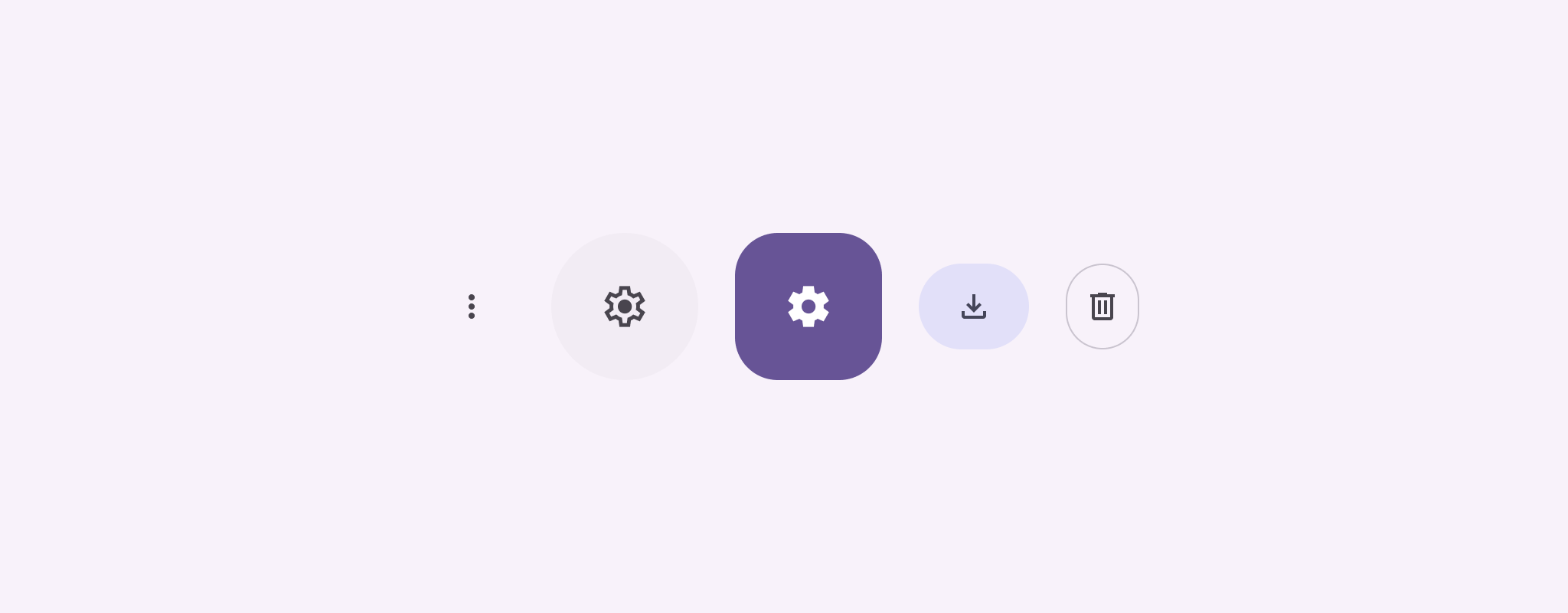
আইকন বোতাম ব্যবহারকারীরা নিতে পারে এমন অ্যাকশন প্রদর্শন করে। আইকন বোতামগুলিকে অবশ্যই একটি স্পষ্ট অর্থ সহ একটি আইকন ব্যবহার করতে হবে এবং সাধারণত সাধারণ বা ঘন ঘন ব্যবহৃত ক্রিয়াগুলিকে উপস্থাপন করতে হবে।
আইকন বোতাম দুই ধরনের আছে:
- ডিফল্ট : এই বোতামগুলি মেনু বা অনুসন্ধানের মতো অন্যান্য উপাদানগুলি খুলতে পারে।
- টগল করুন : এই বোতামগুলি বাইনারি ক্রিয়াগুলিকে উপস্থাপন করতে পারে যা চালু বা বন্ধ করা যেতে পারে, যেমন "প্রিয়" বা "বুকমার্ক"।
API পৃষ্ঠ
স্ট্যান্ডার্ড আইকন বোতাম প্রয়োগ করতে IconButton কম্পোজযোগ্য ব্যবহার করুন। ভরা, ভরা টোনাল বা রূপরেখার মতো বিভিন্ন ভিজ্যুয়াল শৈলী তৈরি করতে, যথাক্রমে FilledIconButton , FilledTonalIconButton এবং OutlinedIconButton ব্যবহার করুন।
IconButton এর মূল পরামিতিগুলির মধ্যে রয়েছে:
-
onClick: একটি ল্যাম্বডা ফাংশন যা ব্যবহারকারী যখন আইকন বোতামে ট্যাপ করে তখন কার্যকর করে। -
enabled: একটি বুলিয়ান যা বোতামের সক্রিয় অবস্থা নিয়ন্ত্রণ করে।falseহলে, বোতামটি ব্যবহারকারীর ইনপুটে সাড়া দেয় না। -
content: বোতামের ভিতরে কম্পোজযোগ্য বিষয়বস্তু, সাধারণত একটিIcon।
মৌলিক উদাহরণ: টগল আইকন বোতাম
এই উদাহরণটি আপনাকে দেখায় কিভাবে একটি টগল আইকন বোতাম বাস্তবায়ন করতে হয়। একটি টগল আইকন বোতাম নির্বাচিত বা অনির্বাচিত কিনা তার উপর ভিত্তি করে তার চেহারা পরিবর্তন করে।
@Preview @Composable fun ToggleIconButtonExample() { // isToggled initial value should be read from a view model or persistent storage. var isToggled by rememberSaveable { mutableStateOf(false) } IconButton( onClick = { isToggled = !isToggled } ) { Icon( painter = if (isToggled) painterResource(R.drawable.favorite_filled) else painterResource(R.drawable.favorite), contentDescription = if (isToggled) "Selected icon button" else "Unselected icon button." ) } }
কোড সম্পর্কে মূল পয়েন্ট
-
ToggleIconButtonExamplecomposable একটি টগলযোগ্যIconButtonসংজ্ঞায়িত করে।-
mutableStateOf(false)একটিMutableStateঅবজেক্ট তৈরি করে যা একটি বুলিয়ান মান ধারণ করে, প্রাথমিকভাবেfalse। এটিisToggledএকটি স্টেট হোল্ডার করে, যার অর্থ কম্পোজ UI কে পুনরায় কম্পোজ করে যখনই এর মান পরিবর্তন হয়। -
rememberSaveableনিশ্চিত করে যে স্ক্রীন রোটেশনের মতো কনফিগারেশন পরিবর্তন জুড়েisToggledঅবস্থা বজায় থাকে।
-
-
IconButtonএরonClicklambda ক্লিক করার সময় বোতামের আচরণকে সংজ্ঞায়িত করে,trueএবংfalseমধ্যে অবস্থা টগল করে। -
Iconকম্পোজেবলেরpainterপ্যারামিটার শর্তসাপেক্ষেisToggledঅবস্থার উপর ভিত্তি করে একটি ভিন্নpainterResourceলোড করে। এটি আইকনের চাক্ষুষ চেহারা পরিবর্তন করে।- যদি
isToggledtrueহয়, এটি ভরাট হৃদয় লোড করে আঁকা যায়। - যদি
isToggledfalseহয়, তাহলে এটি আউটলাইন করা হৃদয়কে লোড করে।
- যদি
- উপযুক্ত অ্যাক্সেসিবিলিটি তথ্য প্রদানের জন্য
IconcontentDescriptionisToggledঅবস্থার উপর ভিত্তি করে আপডেট হয়।
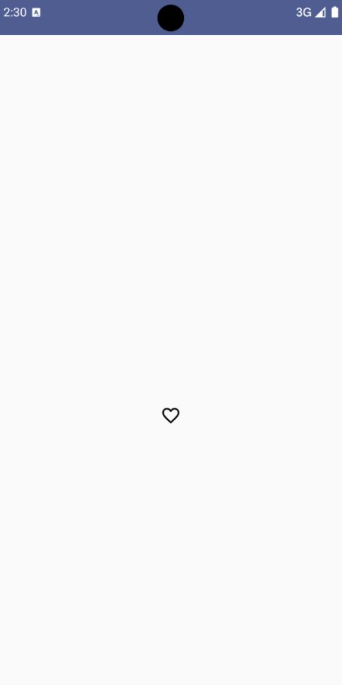
ফলাফল
নিম্নলিখিত চিত্রটি তার অনির্বাচিত অবস্থায় পূর্ববর্তী স্নিপেট থেকে টগল আইকন বোতামটি দেখায়:
উন্নত উদাহরণ: প্রেসে বারবার অ্যাকশন
এই বিভাগটি প্রদর্শন করে যে কীভাবে আইকন বোতামগুলি তৈরি করতে হয় যা ক্রমাগত একটি অ্যাকশন ট্রিগার করে যখন ব্যবহারকারী তাদের টিপে এবং ধরে রাখে, প্রতি ক্লিকে একবার ট্রিগার করার পরিবর্তে।
@Composable fun MomentaryIconButton( unselectedImage: Int, selectedImage: Int, contentDescription: String, modifier: Modifier = Modifier, stepDelay: Long = 100L, // Minimum value is 1L milliseconds. onClick: () -> Unit ) { val interactionSource = remember { MutableInteractionSource() } val isPressed by interactionSource.collectIsPressedAsState() val pressedListener by rememberUpdatedState(onClick) LaunchedEffect(isPressed) { while (isPressed) { delay(stepDelay.coerceIn(1L, Long.MAX_VALUE)) pressedListener() } } IconButton( modifier = modifier, onClick = onClick, interactionSource = interactionSource ) { Icon( painter = if (isPressed) painterResource(id = selectedImage) else painterResource(id = unselectedImage), contentDescription = contentDescription, ) } }
কোড সম্পর্কে মূল পয়েন্ট
-
MomentaryIconButtonএকটিunselectedImage: Int, বোতাম টিপলে আইকনের জন্য অঙ্কনযোগ্য রিসোর্স আইডি এবং বাটনটি চাপলে আইকনের জন্য অঙ্কনযোগ্য রিসোর্স আইডিselectedImage: Int। - এটি ব্যবহারকারীর কাছ থেকে বিশেষভাবে "প্রেস" ইন্টারঅ্যাকশন ট্র্যাক করতে একটি
interactionSourceব্যবহার করে। -
isPressedসত্য যখন বোতাম সক্রিয়ভাবে চাপা হয় এবং অন্যথায় মিথ্যা হয়। যখনisPressedtrueহয়, তখনLaunchedEffectএকটি লুপে প্রবেশ করে।- এই লুপের ভিতরে, এটি ট্রিগারিং অ্যাকশনগুলির মধ্যে বিরতি তৈরি করতে একটি
delay(stepDelayসহ) ব্যবহার করে।coerceInঅসীম লুপ প্রতিরোধ করতে বিলম্ব কমপক্ষে 1ms নিশ্চিত করে। - লুপের মধ্যে প্রতিটি বিলম্বের পরে
pressedListenerআহ্বান করা হয়। এটি কর্ম পুনরাবৃত্তি করে তোলে.
- এই লুপের ভিতরে, এটি ট্রিগারিং অ্যাকশনগুলির মধ্যে বিরতি তৈরি করতে একটি
-
onClicklambda (সঞ্চালনের ক্রিয়া) সর্বদা সর্বশেষ রচনা থেকে সবচেয়ে আপ-টু-ডেট তা নিশ্চিত করতেpressedListenerrememberUpdatedStateব্যবহার করে। -
Iconবর্তমানে বোতাম টিপছে কি না তার উপর ভিত্তি করে প্রদর্শিত চিত্র পরিবর্তন করে।- যদি
isPressedসত্য হয়,selectedImageদেখানো হয়। - অন্যথায়,
unselectedImageদেখানো হয়।
- যদি
পরবর্তী, একটি উদাহরণে এই MomentaryIconButton ব্যবহার করুন। নিম্নলিখিত স্নিপেট একটি কাউন্টার নিয়ন্ত্রণ করে দুটি আইকন বোতাম প্রদর্শন করে:
@Preview() @Composable fun MomentaryIconButtonExample() { var pressedCount by remember { mutableIntStateOf(0) } Row( modifier = Modifier.fillMaxWidth(), verticalAlignment = Alignment.CenterVertically ) { MomentaryIconButton( unselectedImage = R.drawable.fast_rewind, selectedImage = R.drawable.fast_rewind_filled, stepDelay = 100L, onClick = { pressedCount -= 1 }, contentDescription = "Decrease count button" ) Spacer(modifier = Modifier) Text("advanced by $pressedCount frames") Spacer(modifier = Modifier) MomentaryIconButton( unselectedImage = R.drawable.fast_forward, selectedImage = R.drawable.fast_forward_filled, contentDescription = "Increase count button", stepDelay = 100L, onClick = { pressedCount += 1 } ) } }
কোড সম্পর্কে মূল পয়েন্ট
-
MomentaryIconButtonExampleকম্পোজেবল দুটিMomentaryIconButtonদৃষ্টান্ত সহ একটিRowপ্রদর্শন করে এবং একটি কাউন্টার বৃদ্ধি এবং হ্রাস করার জন্য একটি UI তৈরি করার জন্য একটিTextকম্পোজযোগ্য। - এটি
rememberএবংmutableIntStateOfব্যবহার করে একটিpressedCountমিউটেবল স্টেট ভেরিয়েবল বজায় রাখে, 0 এ আরম্ভ করা হয়। যখনpressedCountপরিবর্তিত হয়, তখন যেকোন কম্পোজেবল এটিকে পর্যবেক্ষণ করে (যেমনTextকম্পোজেবল) নতুন মান প্রতিফলিত করতে পুনরায় কম্পোজ করে। - প্রথম
MomentaryIconButtonক্লিক করা বা রাখা হলেpressedCountকমে যায়। - দ্বিতীয়
MomentaryIconButtonক্লিক করা বা রাখা হলেpressedCountবৃদ্ধি করে। - উভয় বোতাম 100 মিলিসেকেন্ডের একটি
stepDelayব্যবহার করে, যার অর্থ একটি বোতাম রাখা অবস্থায়onClickঅ্যাকশনটি প্রতি 100 মিলিমিটারে পুনরাবৃত্তি হয়।
ফলাফল
নিম্নলিখিত ভিডিওটি আইকন বোতাম এবং কাউন্টার সহ UI দেখায়: