زر الإجراء العائم (FAB) هو زر عالي الأهمية يتيح للمستخدم تنفيذ إجراء أساسي في أحد التطبيقات. ويشجّع على اتّخاذ إجراء واحد ومحدّد، وهو المسار الأكثر شيوعًا الذي قد يتّخذه المستخدم، وعادةً ما يكون مثبّتًا في أسفل يسار الشاشة.
إليك ثلاث حالات استخدام يمكنك فيها استخدام زر الإجراء الرئيسي (FAB):
- إنشاء عنصر جديد: في تطبيق لتدوين الملاحظات، يمكن استخدام زر الإجراء الرئيسي (FAB) لـ إنشاء ملاحظة جديدة بسرعة.
- إضافة جهة اتصال جديدة: في تطبيق محادثة، يمكن أن يفتح زر الإجراء العائم واجهة تتيح لـ المستخدم إضافة شخص إلى محادثة.
- توسيط الموقع الجغرافي: في واجهة خريطة، يمكن أن يوسّط زر الإجراء الرئيسي (FAB) الخريطة على الـ موقع الجغرافي الحالي للمستخدم.
في التصميم المتعدد الأبعاد، هناك أربعة أنواع من زر الإجراء الرئيسي (FAB):
- زر الإجراء الرئيسي (FAB): زر إجراء رئيسي ذو حجم عادي.
- زر الإجراء الرئيسي الصغير: هو زر إجراء رئيسي أصغر حجمًا.
- زر الإجراء الرئيسي الكبير: هو زر إجراء رئيسي أكبر حجمًا.
- زر الإجراء الرئيسي الموسّع: هو زر إجراء رئيسي يحتوي على أكثر من مجرد رمز.

واجهة برمجة التطبيقات
على الرغم من وجود العديد من الدوال البرمجية المركّبة التي يمكنك استخدامها لإنشاء أزرار الإجراءات الرئيسية المتوافقة مع التصميم المتعدد الأبعاد، فإنّ مَعلماتها لا تختلف كثيرًا. في ما يلي بعض المَعلمات الرئيسية التي يجب أخذها في الاعتبار:
onClick: هي الدالة التي يتم استدعاؤها عندما ينقر المستخدم على الزر.containerColor: هو لون الزر.contentColor: هو لون الرمز.
زر الإجراء الرئيسي
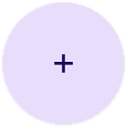
لإنشاء زر الإجراء الرئيسي عام، استخدِم الدالة البرمجية المركّبة الأساسية
FloatingActionButton. يوضّح المثال التالي عملية تنفيذ أساسية لزر الإجراء الرئيسي (FAB):
@Composable fun Example(onClick: () -> Unit) { FloatingActionButton( onClick = { onClick() }, ) { Icon(Icons.Filled.Add, "Floating action button.") } }
يظهر هذا التنفيذ على النحو التالي:

زر صغير
لإنشاء زر الإجراء الرئيسي صغير، استخدِم الدالة المركّبة
SmallFloatingActionButton. يوضّح المثال التالي كيفية إجراء ذلك، مع إضافة ألوان مخصّصة.
@Composable fun SmallExample(onClick: () -> Unit) { SmallFloatingActionButton( onClick = { onClick() }, containerColor = MaterialTheme.colorScheme.secondaryContainer, contentColor = MaterialTheme.colorScheme.secondary ) { Icon(Icons.Filled.Add, "Small floating action button.") } }
يظهر هذا التنفيذ على النحو التالي:

زر كبير
لإنشاء زر إجراء عائم كبير، استخدِم الـ
LargeFloatingActionButton المركّبة. لا تختلف هذه الدالة البرمجية المركّبة اختلافًا كبيرًا عن الأمثلة الأخرى باستثناء أنّها تؤدي إلى ظهور زر أكبر.
في ما يلي عملية تنفيذ بسيطة لزر الإجراء الرئيسي (FAB) كبير.
@Composable fun LargeExample(onClick: () -> Unit) { LargeFloatingActionButton( onClick = { onClick() }, shape = CircleShape, ) { Icon(Icons.Filled.Add, "Large floating action button") } }
يظهر هذا التنفيذ على النحو التالي:
زر موسّع
يمكنك إنشاء أزرار الإجراءات الرئيسية الأكثر تعقيدًا باستخدام الدالة المركّبة ExtendedFloatingActionButton. الفرق الرئيسي بينها
وبين FloatingActionButton هو أنّها تحتوي على مَعلمتَي icon و text
مخصّصتَين. تتيح لك هاتان المَعلمتان إنشاء زر يحتوي على محتوى أكثر تعقيدًا يتم تغيير حجمه ليناسب محتواه بشكل مناسب.
يوضّح المقتطف التالي كيفية تنفيذ ExtendedFloatingActionButton، مع تمرير قيم مثالية لـ icon وtext.
@Composable fun ExtendedExample(onClick: () -> Unit) { ExtendedFloatingActionButton( onClick = { onClick() }, icon = { Icon(Icons.Filled.Edit, "Extended floating action button.") }, text = { Text(text = "Extended FAB") }, ) }
يظهر هذا التنفيذ على النحو التالي: