الأزرار هي عناصر أساسية تتيح للمستخدم تنفيذ إجراء محدّد. هناك خمسة أنواع من الأزرار. يوضّح هذا الجدول مظهر كل نوع من أنواع الأزرار الخمسة، بالإضافة إلى المواضع التي يجب استخدامها فيها:
| النوع | المظهر | الغرض |
|---|---|---|
| معبأ | خلفية ثابتة مع نص متباين | أزرار ذات أهمية عالية وهي مخصّصة للإجراءات الأساسية في أحد التطبيقات، مثل "إرسال" و "حفظ". يبرز تأثير الظل أهمية الزر. |
| تعبئة نغمية | يختلف لون الخلفية ليتناسب مع السطح. | ويُستخدم أيضًا للإجراءات الأساسية أو المهمة. توفّر الأزرار اللونية المعبّأة وزنًا بصريًا أكبر وتناسب وظائف مثل "الإضافة إلى سلة التسوّق" و "تسجيل الدخول". |
| مرتفع | يتميّز بوجود ظل. | يؤدي غرضًا مشابهًا للأزرار اللونية. زيادة المسقط الرأسي لجعل الزر يظهر بشكل أكثر بروزًا |
| مخطّط | يحتوي على إطار بدون تعبئة. | أزرار ذات أهمية متوسطة، تحتوي على إجراءات مهمة ولكنها ليست أساسية وتتلاءم هذه الأزرار مع الأزرار الأخرى للإشارة إلى إجراءات ثانوية بديلة، مثل "إلغاء" أو "رجوع". |
| نص | تعرض هذه السمة النص بدون خلفية أو إطار. | أزرار ذات أهمية منخفضة، وهي مثالية للإجراءات الأقل أهمية، مثل روابط التنقّل أو الوظائف الثانوية، مثل "مزيد من المعلومات" أو "عرض التفاصيل". |
توضّح هذه الصورة أنواع الأزرار الخمسة في التصميم المتعدد الأبعاد:

مساحة عرض واجهة برمجة التطبيقات
onClick- الدالة التي يستدعيها النظام عندما يضغط المستخدم على الزر.
enabled- عندما تكون القيمة
false، تجعل هذه المَعلمة الزر غير متاح وغير نشط. colors- مثيل من
ButtonColorsيحدّد الألوان المستخدَمة في الزر. contentPadding- المساحة المتروكة داخل الزر
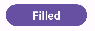
زر معبأ
يستخدم مكوّن زر التعبئة العنصر الأساسي المركّب Button. ويتم ملؤه بلون واحد تلقائيًا. يوضّح المقتطف كيفية تنفيذ المكوّن:
@Composable fun FilledButtonExample(onClick: () -> Unit) { Button(onClick = { onClick() }) { Text("Filled") } }
يظهر هذا التنفيذ على النحو التالي:
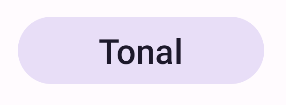
زر التعبئة النغمي
يستخدم مكوّن زر التعبئة النغمي الدالة البرمجية المركبة FilledTonalButton.
ويتم ملؤه بلون متدرّج تلقائيًا.
يوضّح المقتطف كيفية تنفيذ المكوّن:
@Composable fun FilledTonalButtonExample(onClick: () -> Unit) { FilledTonalButton(onClick = { onClick() }) { Text("Tonal") } }
يظهر هذا التنفيذ على النحو التالي:
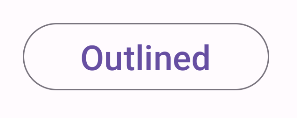
زر محدَّد الجوانب
يستخدم مكوّن الزر ذي الحدّ الخارجي الدالة البرمجية المركبة OutlinedButton. يظهر مع مخطط تفصيلي تلقائيًا.
يوضّح المقتطف كيفية تنفيذ المكوّن:
@Composable fun OutlinedButtonExample(onClick: () -> Unit) { OutlinedButton(onClick = { onClick() }) { Text("Outlined") } }
يظهر هذا التنفيذ على النحو التالي:
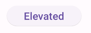
زر بارز
يستخدم مكوّن الزر البارز الدالة البرمجية المركبة ElevatedButton. ويحتوي على ظل يمثّل تأثير الارتفاع تلقائيًا. وهو زر معبأ
يتضمّن ظلًا.
يوضّح المقتطف كيفية تنفيذ المكوّن:
@Composable fun ElevatedButtonExample(onClick: () -> Unit) { ElevatedButton(onClick = { onClick() }) { Text("Elevated") } }
يظهر هذا التنفيذ على النحو التالي:
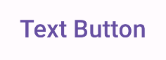
زر النص
يستخدم مكوِّن زر النص العنصر المركبTextButton. يظهر كنص فقط إلى أن يتم الضغط عليه. لا يتضمّن تعبئة أو مخططًا تفصيليًا بشكل تلقائي.
يوضّح المقتطف كيفية تنفيذ المكوّن:
@Composable fun TextButtonExample(onClick: () -> Unit) { TextButton( onClick = { onClick() } ) { Text("Text Button") } }
يظهر هذا التنفيذ على النحو التالي: