Dialog 구성요소는 기본 앱 콘텐츠 위의
레이어에 대화상자 메시지를 표시하거나 사용자 입력을 요청합니다. 사용자의 주의를 끌기 위해 방해성 UI 환경을 만듭니다.
대화상자의 사용 사례는 다음과 같습니다.
- 파일 삭제와 같은 사용자 작업 확인
- 할 일 목록 앱과 같은 사용자 입력 요청
- 프로필 설정에서 국가를 선택하는 것과 같이 사용자가 선택할 수 있는 옵션 목록 표시

알림 대화상자
AlertDialog 컴포저블은
Material Design 테마 대화상자를 만드는 편리한 API를 제공합니다. AlertDialog 에는 대화상자의 특정 요소를 처리하기 위한 특정 매개변수가 있습니다. 그중에는 다음이 포함됩니다.
title: 대화상자 상단에 표시되는 텍스트입니다.text: 대화상자 중앙에 표시되는 텍스트입니다.icon: 대화상자 상단에 표시되는 그래픽입니다.onDismissRequest: 사용자가 대화상자 외부를 탭하는 등의 방법으로 대화상자를 닫을 때 호출되는 함수입니다.dismissButton: 닫기 버튼 역할을 하는 컴포저블입니다.confirmButton: 확인 버튼 역할을 하는 컴포저블입니다.
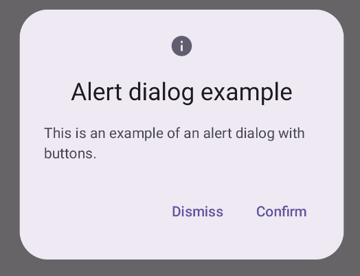
다음 예에서는 알림 대화상자에 두 개의 버튼을 구현합니다. 하나는 대화상자를 닫고 다른 하나는 요청을 확인합니다.
@Composable fun AlertDialogExample( onDismissRequest: () -> Unit, onConfirmation: () -> Unit, dialogTitle: String, dialogText: String, icon: ImageVector, ) { AlertDialog( icon = { Icon(icon, contentDescription = "Example Icon") }, title = { Text(text = dialogTitle) }, text = { Text(text = dialogText) }, onDismissRequest = { onDismissRequest() }, confirmButton = { TextButton( onClick = { onConfirmation() } ) { Text("Confirm") } }, dismissButton = { TextButton( onClick = { onDismissRequest() } ) { Text("Dismiss") } } ) }
이 구현은 다음과 같은 방식으로 하위 컴포저블에 인수를 전달하는 상위 컴포저블을 의미합니다.
@Composable fun DialogExamples() { // ... val openAlertDialog = remember { mutableStateOf(false) } // ... when { // ... openAlertDialog.value -> { AlertDialogExample( onDismissRequest = { openAlertDialog.value = false }, onConfirmation = { openAlertDialog.value = false println("Confirmation registered") // Add logic here to handle confirmation. }, dialogTitle = "Alert dialog example", dialogText = "This is an example of an alert dialog with buttons.", icon = Icons.Default.Info ) } } } }
이 구현은 다음과 같이 표시됩니다.
대화상자 컴포저블
Dialog 는 콘텐츠에 스타일 지정 또는 미리 정의된 슬롯을 제공하지 않는 기본 컴포저블입니다. 상대적으로 간단한 컨테이너이며 Card와 같은 컨테이너로 채워야 합니다. 다음은 대화상자의 주요 매개변수 중 일부입니다.
onDismissRequest: 사용자가 대화상자를 닫을 때 호출되는 람다입니다.properties: 맞춤설정을 위한 추가 범위를 제공하는DialogProperties의 인스턴스입니다.
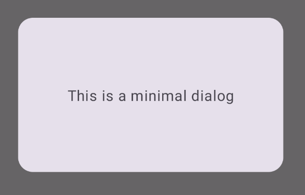
기본 예시
다음 예는 Dialog 컴포저블의 기본 구현입니다. 보조 컨테이너로 Card를 사용합니다. Card가 없으면 Text 구성요소가 기본 앱 콘텐츠 위에 단독으로 표시됩니다.
@Composable fun MinimalDialog(onDismissRequest: () -> Unit) { Dialog(onDismissRequest = { onDismissRequest() }) { Card( modifier = Modifier .fillMaxWidth() .height(200.dp) .padding(16.dp), shape = RoundedCornerShape(16.dp), ) { Text( text = "This is a minimal dialog", modifier = Modifier .fillMaxSize() .wrapContentSize(Alignment.Center), textAlign = TextAlign.Center, ) } } }
이 구현은 다음과 같이 표시됩니다. 대화상자가 열려 있으면 그 아래의 기본 앱 콘텐츠가 어둡게 표시되고 회색으로 표시됩니다.
고급 예시
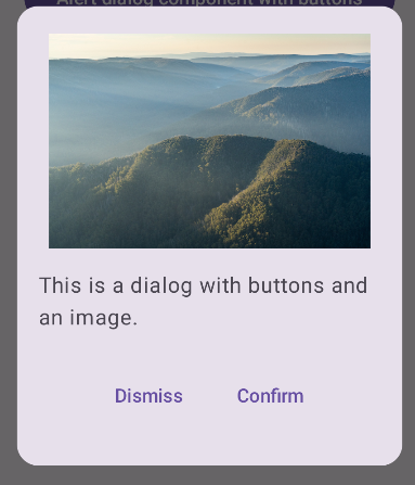
다음은 Dialog 컴포저블의 고급 구현입니다. 이 경우 구성요소는 이전 AlertDialog 예와 유사한 인터페이스를 수동으로 구현합니다.
@Composable fun DialogWithImage( onDismissRequest: () -> Unit, onConfirmation: () -> Unit, painter: Painter, imageDescription: String, ) { Dialog(onDismissRequest = { onDismissRequest() }) { // Draw a rectangle shape with rounded corners inside the dialog Card( modifier = Modifier .fillMaxWidth() .height(375.dp) .padding(16.dp), shape = RoundedCornerShape(16.dp), ) { Column( modifier = Modifier .fillMaxSize(), verticalArrangement = Arrangement.Center, horizontalAlignment = Alignment.CenterHorizontally, ) { Image( painter = painter, contentDescription = imageDescription, contentScale = ContentScale.Fit, modifier = Modifier .height(160.dp) ) Text( text = "This is a dialog with buttons and an image.", modifier = Modifier.padding(16.dp), ) Row( modifier = Modifier .fillMaxWidth(), horizontalArrangement = Arrangement.Center, ) { TextButton( onClick = { onDismissRequest() }, modifier = Modifier.padding(8.dp), ) { Text("Dismiss") } TextButton( onClick = { onConfirmation() }, modifier = Modifier.padding(8.dp), ) { Text("Confirm") } } } } } }
이 구현은 다음과 같이 표시됩니다.