
کامپوننت Chip یک عنصر رابط کاربری فشرده و تعاملی است. این کامپوننت، موجودیتهای پیچیدهای مانند یک مخاطب یا تگ را نشان میدهد که اغلب دارای یک آیکون و برچسب است. این کامپوننت میتواند قابل بررسی، قابل رد کردن یا قابل کلیک باشد.
چهار نوع تراشه و محل استفاده از آنها به شرح زیر است:
- دستیار : کاربر را در طول انجام یک کار راهنمایی میکند. اغلب به عنوان یک عنصر موقت رابط کاربری در پاسخ به ورودی کاربر ظاهر میشود.
- فیلتر : به کاربران امکان میدهد محتوا را از مجموعهای از گزینهها پالایش کنند. این گزینهها میتوانند انتخاب یا لغو انتخاب شوند و ممکن است هنگام انتخاب، یک آیکون تیک داشته باشند.
- ورودی : اطلاعات ارائه شده توسط کاربر، مانند انتخابها در یک منو را نشان میدهد. آنها میتوانند شامل یک آیکون و متن باشند و برای حذف، علامت X را ارائه میدهند.
- پیشنهاد : بر اساس فعالیت یا ورودی اخیر کاربر، توصیههایی به او ارائه میدهد. معمولاً در زیر فیلد ورودی ظاهر میشود تا کاربر را به انجام اقداماتی ترغیب کند.

سطح API
چهار ترکیبپذیر وجود دارد که با چهار نوع تراشه مطابقت دارند. بخشهای زیر این ترکیبپذیرها و تفاوتهای آنها را با جزئیات شرح میدهند. با این حال، آنها پارامترهای زیر را به اشتراک میگذارند:
-
label: رشتهای که روی تراشه ظاهر میشود. -
icon: آیکونی که در ابتدای چیپ نمایش داده میشود. برخی از composableهای خاص دارای پارامترهایleadingIconوtrailingIconجداگانهای هستند. -
onClick: لامبدی که تراشه هنگام فشردن آن توسط کاربر فراخوانی میکند.
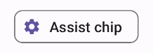
تراشه کمکی
کامپوننت AssistChip روشی ساده برای ایجاد یک چیپ کمکی ارائه میدهد که کاربر را در جهت خاصی هدایت میکند. یکی از ویژگیهای متمایز آن، پارامتر leadingIcon است که به شما امکان میدهد یک آیکون را در سمت چپ چیپ نمایش دهید. مثال زیر نحوه پیادهسازی آن را نشان میدهد:
@Composable fun AssistChipExample() { AssistChip( onClick = { Log.d("Assist chip", "hello world") }, label = { Text("Assist chip") }, leadingIcon = { Icon( Icons.Filled.Settings, contentDescription = "Localized description", Modifier.size(AssistChipDefaults.IconSize) ) } ) }
این پیادهسازی به شکل زیر ظاهر میشود.
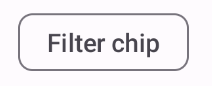
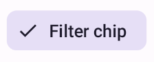
تراشه فیلتر
کامپوننت FilterChip از شما میخواهد که پیگیری کنید آیا چیپ انتخاب شده است یا خیر. مثال زیر نشان میدهد که چگونه میتوانید یک آیکون تیکدار را فقط زمانی که کاربر چیپ را انتخاب کرده است، نمایش دهید:
@Composable fun FilterChipExample() { var selected by remember { mutableStateOf(false) } FilterChip( onClick = { selected = !selected }, label = { Text("Filter chip") }, selected = selected, leadingIcon = if (selected) { { Icon( imageVector = Icons.Filled.Done, contentDescription = "Done icon", modifier = Modifier.size(FilterChipDefaults.IconSize) ) } } else { null }, ) }
این پیادهسازی در صورت عدم انتخاب به صورت زیر ظاهر میشود:
و هنگام انتخاب به صورت زیر نمایش داده میشود:
تراشه ورودی
شما میتوانید از InputChip composable برای ایجاد چیپهایی که از تعامل کاربر حاصل میشوند استفاده کنید. برای مثال، در یک کلاینت ایمیل، وقتی کاربر در حال نوشتن ایمیل است، یک چیپ ورودی ممکن است نشاندهندهی مخاطبی باشد که کاربر به فیلد "To:" اضافه کرده است.
پیادهسازی زیر یک تراشه ورودی را نشان میدهد که از قبل در حالت انتخاب شده قرار دارد. کاربر با فشردن آن، تراشه را از کار میاندازد.
@Composable fun InputChipExample( text: String, onDismiss: () -> Unit, ) { var enabled by remember { mutableStateOf(true) } if (!enabled) return InputChip( onClick = { onDismiss() enabled = !enabled }, label = { Text(text) }, selected = enabled, avatar = { Icon( Icons.Filled.Person, contentDescription = "Localized description", Modifier.size(InputChipDefaults.AvatarSize) ) }, trailingIcon = { Icon( Icons.Default.Close, contentDescription = "Localized description", Modifier.size(InputChipDefaults.AvatarSize) ) }, ) }
این پیادهسازی به شکل زیر ظاهر میشود.

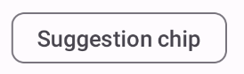
تراشه پیشنهاد
SuggestionChip ، چه از نظر تعریف API و چه از نظر موارد استفاده رایج، اساسیترین کامپوننت فهرستشده در این صفحه است. چیپهای پیشنهاد، نکات (یا راهنماییهای) پویا تولید شده را ارائه میدهند. برای مثال، در یک برنامه چت هوش مصنوعی، ممکن است از چیپهای پیشنهاد برای ارائه پاسخهای احتمالی به جدیدترین پیام استفاده کنید.
این پیادهسازی SuggestionChip را در نظر بگیرید:
@Composable fun SuggestionChipExample() { SuggestionChip( onClick = { Log.d("Suggestion chip", "hello world") }, label = { Text("Suggestion chip") } ) }
این پیادهسازی به صورت زیر ظاهر میشود:
تراشه مرتفع
تمام مثالهای این سند از ترکیبپذیرهای پایه استفاده میکنند که ظاهری مسطح دارند. اگر تراشهای با ظاهری برجسته میخواهید، از یکی از سه ترکیبپذیر زیر استفاده کنید: