
רכיב ה-Card הוא קומפוזיציה שמשמשת כקונטיינר של Material Design לממשק המשתמש.
בדרך כלל, כרטיסים מציגים פריט תוכן אחד קוהרנטי. בדוגמאות הבאות אפשר לראות איפה כדאי להשתמש בכרטיס:
- מוצר באפליקציית קניות.
- כתבת חדשות באפליקציית חדשות.
- הודעה באפליקציית תקשורת.
ההתמקדות בהצגת פריט תוכן יחיד היא שמבדילה בין Card לבין מאגרי תגים אחרים. לדוגמה, Scaffold מספק מבנה כללי למסך שלם. כרטיס הוא בדרך כלל רכיב קטן יותר בממשק המשתמש בתוך פריסה גדולה יותר, בעוד שרכיב פריסה כמו Column או Row מספק API פשוט וכללי יותר.

הטמעה בסיסית
התנהגות של Card דומה מאוד לזו של מאגרים אחרים ב-Compose. מצהירים על התוכן שלו על ידי קריאה לרכיבים אחרים שניתנים להרכבה בתוכו. לדוגמה, בדוגמה המינימלית הבאה, הפונקציה Card מכילה קריאה לפונקציה Text:
@Composable
fun CardMinimalExample() {
    Card() {
        Text(text = "Hello, world!")
    }
}
הטמעות מתקדמות
מידע נוסף על הגדרת ה-API של Card מופיע בהפניה. הוא מגדיר כמה פרמטרים שמאפשרים להתאים אישית את המראה וההתנהגות של הרכיב.
הנה כמה פרמטרים חשובים שכדאי לזכור:
-
elevation: מוסיף צל לרכיב כדי ליצור מראה של רכיב מוגבה מעל הרקע. -
colors: משתמש בסוגCardColorsכדי להגדיר את צבע ברירת המחדל של הקונטיינר ושל כל רכיבי הצאצא. -
enabled: אם מעבירים את הערךfalseלפרמטר הזה, הכרטיס מופיע כלא זמין ולא מגיב לקלט של המשתמש. -
onClick: בדרך כלל,Cardלא מקבל אירועי קליק. לכן, העומס העיקרי שחשוב לציין הוא זה שמגדיר פרמטרonClick. כדאי להשתמש בשיטת העמסה העודפת הזו אם רוצים שההטמעה שלCardתגיב ללחיצות של המשתמש.
בדוגמה הבאה אפשר לראות איך משתמשים בפרמטרים האלה, וגם בפרמטרים נפוצים אחרים כמו shape ו-modifier.
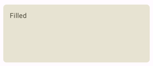
כרטיס מלא
בדוגמה הבאה אפשר לראות איך מטמיעים כרטיס מלא.
הדבר החשוב כאן הוא השימוש במאפיין colors כדי לשנות את צבע המילוי.
@Composable fun FilledCardExample() { Card( colors = CardDefaults.cardColors( containerColor = MaterialTheme.colorScheme.surfaceVariant, ), modifier = Modifier .size(width = 240.dp, height = 100.dp) ) { Text( text = "Filled", modifier = Modifier .padding(16.dp), textAlign = TextAlign.Center, ) } }
ההטמעה הזו נראית כך:
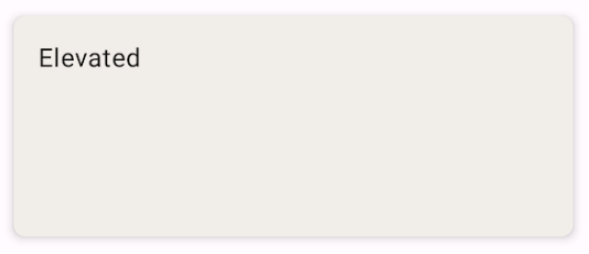
כרטיס מוגבה
בקטע הקוד הבא אפשר לראות איך מטמיעים כרטיס מוגבה. משתמשים ברכיב הקומפוזבילי הייעודי ElevatedCard.
אפשר להשתמש במאפיין elevation כדי לשלוט במראה של הגובה ובצל שנוצר.
@Composable fun ElevatedCardExample() { ElevatedCard( elevation = CardDefaults.cardElevation( defaultElevation = 6.dp ), modifier = Modifier .size(width = 240.dp, height = 100.dp) ) { Text( text = "Elevated", modifier = Modifier .padding(16.dp), textAlign = TextAlign.Center, ) } }
ההטמעה הזו נראית כך:
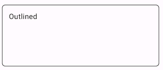
כרטיס עם קווי מתאר
זו דוגמה לכרטיס עם קו מתאר. משתמשים בקוד OutlinedCard קומפוזבילי הייעודי.
@Composable fun OutlinedCardExample() { OutlinedCard( colors = CardDefaults.cardColors( containerColor = MaterialTheme.colorScheme.surface, ), border = BorderStroke(1.dp, Color.Black), modifier = Modifier .size(width = 240.dp, height = 100.dp) ) { Text( text = "Outlined", modifier = Modifier .padding(16.dp), textAlign = TextAlign.Center, ) } }
ההטמעה הזו נראית כך:
מגבלות
לכרטיסים אין פעולות גלילה או סגירה מובנות, אבל אפשר לשלב אותם עם רכיבים שאפשר להרכיב מהם ממשק משתמש (composables) שמציעים את התכונות האלה. לדוגמה, כדי להטמיע החלקה לסגירה בכרטיס, משלבים אותו עם הקומפוזיציה SwipeToDismiss. כדי לשלב את ההגדרה עם גלילה, משתמשים במקשי קיצור לגלילה כמו verticalScroll. מידע נוסף זמין במסמכי התיעוד של Scroll.