버튼은 사용자가 정의된 작업을 트리거할 수 있는 기본 구성요소입니다. 버튼에는 다섯 가지 유형이 있습니다. 이 표에서는 다섯 가지 버튼 유형의 디자인과 사용해야 하는 위치를 설명합니다.
| 유형 | 디자인 | 목적 |
|---|---|---|
| 채움 | 대비되는 텍스트가 있는 단색 배경입니다. | 강조도가 높은 버튼 '제출', '저장'과 같은 애플리케이션의 기본 작업에 사용됩니다. 그림자 효과는 버튼의 중요성을 강조합니다. |
| 채워진 톤 | 표면에 맞게 배경 색상이 다릅니다. | 기본 또는 중요한 작업에도 사용됩니다. 채워진 톤 버튼은 시각적 무게감을 주며 '장바구니에 추가', '로그인'과 같은 기능에 적합합니다. |
| 높임 | 그림자가 있어 눈에 띕니다. | 톤 버튼과 유사한 용도로 사용됩니다. 버튼이 더욱 눈에 띄도록 높이를 늘입니다. |
| 윤곽선 있음 | 채우기가 없는 테두리가 있습니다. | 중간 강조 버튼으로, 중요하지만 기본은 아닌 작업이 포함되어 있습니다. 다른 버튼과 잘 어울려 대체, 보조 작업(예: '취소' 또는 '뒤로')을 나타냅니다. |
| 텍스트 | 배경이나 테두리 없이 텍스트를 표시합니다. | 강조도가 낮은 버튼으로, 탐색 링크나 '자세히 알아보기', '세부정보 보기'와 같은 보조 기능 등 중요도가 낮은 작업에 적합합니다. |
이 이미지는 Material Design의 다섯 가지 버튼 유형을 보여줍니다.

API 표시 경로
onClick- 사용자가 버튼을 누를 때 시스템에서 호출하는 함수입니다.
enabled-
false인 경우 이 매개변수로 인해 버튼이 사용할 수 없고 비활성 상태로 표시됩니다. colors- 버튼에 사용되는 색상을 결정하는
ButtonColors의 인스턴스입니다. contentPadding- 버튼 내의 패딩입니다.
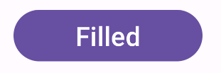
채워진 버튼
채워진 버튼 구성요소는 기본 Button 컴포저블을 사용합니다. 기본적으로 단색으로 채워집니다. 스니펫은 구성요소를 구현하는 방법을 보여줍니다.
@Composable fun FilledButtonExample(onClick: () -> Unit) { Button(onClick = { onClick() }) { Text("Filled") } }
이 구현은 다음과 같이 표시됩니다.
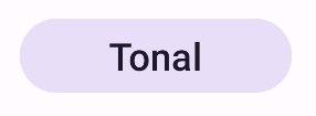
채워진 톤 버튼
채워진 톤 버튼 구성요소는 FilledTonalButton 컴포저블을 사용합니다.
기본적으로 톤 색상으로 채워집니다.
스니펫은 구성요소를 구현하는 방법을 보여줍니다.
@Composable fun FilledTonalButtonExample(onClick: () -> Unit) { FilledTonalButton(onClick = { onClick() }) { Text("Tonal") } }
이 구현은 다음과 같이 표시됩니다.
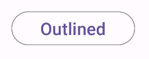
윤곽선 있는 버튼
윤곽선 있는 구성요소는 OutlinedButton 컴포저블을 사용합니다. 기본적으로 윤곽선이 표시됩니다.
스니펫은 구성요소를 구현하는 방법을 보여줍니다.
@Composable fun OutlinedButtonExample(onClick: () -> Unit) { OutlinedButton(onClick = { onClick() }) { Text("Outlined") } }
이 구현은 다음과 같이 표시됩니다.
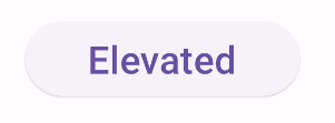
높임 버튼
높임 버튼은 ElevatedButton 컴포저블을 사용합니다. 기본적으로 높임 효과를 나타내는 그림자가 있습니다. 그림자가 포함된 채워진 버튼입니다.
스니펫은 구성요소를 구현하는 방법을 보여줍니다.
@Composable fun ElevatedButtonExample(onClick: () -> Unit) { ElevatedButton(onClick = { onClick() }) { Text("Elevated") } }
이 구현은 다음과 같이 표시됩니다.
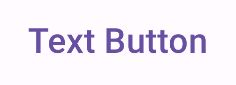
텍스트 버튼
텍스트 버튼 구성요소는 TextButton 컴포저블을 사용합니다. 누를 때까지 텍스트로만 표시됩니다. 기본적으로 단색 채우기나 윤곽선이 없습니다.
스니펫은 구성요소를 구현하는 방법을 보여줍니다.
@Composable fun TextButtonExample(onClick: () -> Unit) { TextButton( onClick = { onClick() } ) { Text("Text Button") } }
이 구현은 다음과 같이 표시됩니다.