Кнопки — это основные компоненты, позволяющие пользователю запускать определенное действие. Существует пять типов кнопок. В этой таблице описан внешний вид каждого из пяти типов кнопок, а также места их использования:
| Тип | Появление | Цель |
|---|---|---|
| Заполненный | Однотонный фон с контрастным текстом. | Кнопки с высокой степенью детализации. Они предназначены для выполнения основных действий в приложении, таких как «отправить» и «сохранить». Эффект тени подчеркивает важность кнопки. |
| Заполненный тональный | Цвет фона меняется в зависимости от поверхности. | Также подходит для основных или важных действий. Заполненные тональными кнопками кнопки обеспечивают больший визуальный вес и подходят для таких функций, как «добавить в корзину» и «Войти». |
| Возвышенный | Выделяется наличием тени. | Выполняет ту же функцию, что и тональные кнопки. Увеличьте высоту, чтобы кнопка стала еще более заметной. |
| Изложено | Имеет рамку без заливки. | Кнопки со средней степенью акцента, содержащие действия, которые важны, но не являются первостепенными. Они хорошо сочетаются с другими кнопками, указывая на альтернативные, второстепенные действия, такие как «Отмена» или «Назад». |
| Текст | Отображает текст без фона и рамки. | Кнопки с низким уровнем акцента, идеально подходящие для менее важных действий, таких как навигационные ссылки, или второстепенных функций, например, «Узнать больше» или «Просмотреть подробности». |
На этом изображении показаны пять типов кнопок в Material Design:

Поверхность API
-
onClick - Функция, которую система вызывает при нажатии пользователем кнопки.
-
enabled - Если значение параметра
false, кнопка будет отображаться как недоступная и неактивная. -
colors - Экземпляр класса
ButtonColors, определяющий цвета, используемые для кнопки. -
contentPadding - Отступ внутри кнопки.
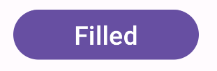
Заполненная кнопка
Компонент «Заполненная кнопка» использует базовый компонент Button . По умолчанию он заполнен сплошным цветом. В приведенном фрагменте кода показано, как реализовать этот компонент:
@Composable fun FilledButtonExample(onClick: () -> Unit) { Button(onClick = { onClick() }) { Text("Filled") } }
Данная реализация выглядит следующим образом:
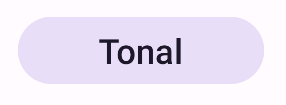
Заполненная тональная кнопка
Компонент кнопки с тональным заполнением использует составной объект FilledTonalButton . По умолчанию он заполнен тональным цветом.
Приведённый фрагмент кода демонстрирует, как реализовать компонент:
@Composable fun FilledTonalButtonExample(onClick: () -> Unit) { FilledTonalButton(onClick = { onClick() }) { Text("Tonal") } }
Данная реализация выглядит следующим образом:
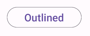
Кнопка с контуром
Компонент кнопки с контуром использует составной объект OutlinedButton . По умолчанию он отображается с контуром.
Приведённый фрагмент кода демонстрирует, как реализовать компонент:
@Composable fun OutlinedButtonExample(onClick: () -> Unit) { OutlinedButton(onClick = { onClick() }) { Text("Outlined") } }
Данная реализация выглядит следующим образом:
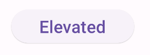
Кнопка на возвышении
Компонент «Приподнятая кнопка» использует составной объект ElevatedButton . По умолчанию он имеет тень, которая имитирует эффект возвышения. Это заполненная кнопка с тенью.
Приведённый фрагмент кода демонстрирует, как реализовать компонент:
@Composable fun ElevatedButtonExample(onClick: () -> Unit) { ElevatedButton(onClick = { onClick() }) { Text("Elevated") } }
Данная реализация выглядит следующим образом:
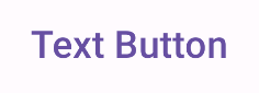
Текстовая кнопка
Компонент текстовой кнопки использует составной объект TextButton . До нажатия он отображается только в виде текста. По умолчанию у него нет сплошной заливки или контура.
Приведённый фрагмент кода демонстрирует, как реализовать компонент:
@Composable fun TextButtonExample(onClick: () -> Unit) { TextButton( onClick = { onClick() } ) { Text("Text Button") } }
Данная реализация выглядит следующим образом: