
Compose 內建許多動畫機制,您可能會不知道該選擇哪一個。以下列出常見的動畫用途。如要進一步瞭解可用的各種 API 選項,請參閱完整的 Compose 動畫說明文件。
為常見的可組合函式屬性加入動畫效果
Compose 提供便利的 API,可解決許多常見的動畫用途。本節說明如何為可組合項的常見屬性製作動畫。
以動畫呈現顯示 / 消失效果
使用 AnimatedVisibility 隱藏或顯示可組合函式。AnimatedVisibility 內的子項可以使用 Modifier.animateEnterExit(),自行設定進入或退出轉場效果。
var visible by remember { mutableStateOf(true) } // Animated visibility will eventually remove the item from the composition once the animation has finished. AnimatedVisibility(visible) { // your composable here // ... }
AnimatedVisibility 的進入和結束參數可讓您設定可組合函式在顯示和消失時的行為。詳情請參閱完整說明文件。
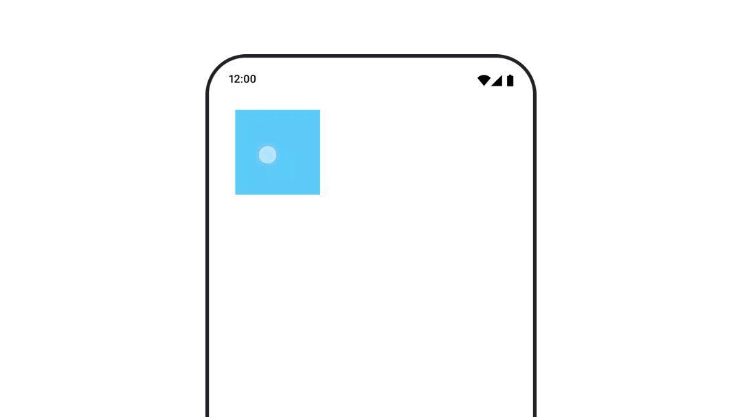
如要為可組合函式的顯示狀態加上動畫效果,也可以使用 animateFloatAsState 隨時間改變 Alpha 值:
var visible by remember { mutableStateOf(true) } val animatedAlpha by animateFloatAsState( targetValue = if (visible) 1.0f else 0f, label = "alpha" ) Box( modifier = Modifier .size(200.dp) .graphicsLayer { alpha = animatedAlpha } .clip(RoundedCornerShape(8.dp)) .background(colorGreen) .align(Alignment.TopCenter) ) { }
不過,變更 Alpha 值時,請注意可組合項仍會保留在組合中,並繼續佔用版面配置空間。這可能會導致螢幕閱讀器和其他無障礙機制仍將項目視為在畫面上。另一方面,AnimatedVisibility 最終會從組合中移除項目。
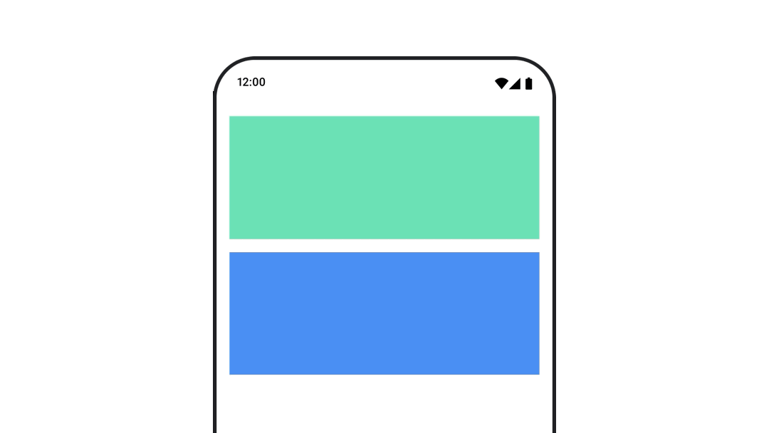
動畫背景顏色
val animatedColor by animateColorAsState( if (animateBackgroundColor) colorGreen else colorBlue, label = "color" ) Column( modifier = Modifier.drawBehind { drawRect(animatedColor) } ) { // your composable here }
這個選項的成效比使用 Modifier.background() 更出色。
Modifier.background() 適用於一次性色彩設定,但如果隨著時間推移為色彩設定動畫效果,可能會導致不必要的重組。
如要無限期為背景顏色加上動畫效果,請參閱重複動畫部分。
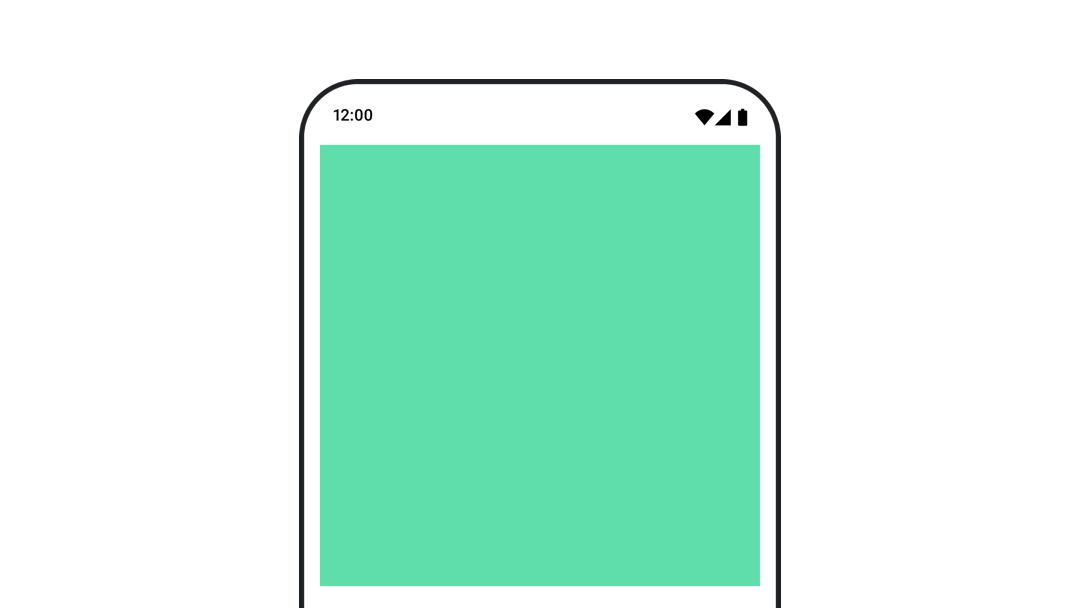
為可組合函式的大小設定動畫效果
Compose 提供幾種不同的方式,可讓您為可組合函式的大小製作動畫。在可組合項大小變更之間使用 animateContentSize() 製作動畫。
舉例來說,如果您有一個含有文字的方塊,文字可以從一行擴展到多行,您可以使用 Modifier.animateContentSize() 實現更流暢的轉場效果:
var expanded by remember { mutableStateOf(false) } Box( modifier = Modifier .background(colorBlue) .animateContentSize() .height(if (expanded) 400.dp else 200.dp) .fillMaxWidth() .clickable( interactionSource = remember { MutableInteractionSource() }, indication = null ) { expanded = !expanded } ) { }
您也可以使用 AnimatedContent,並搭配 SizeTransform 說明大小變更方式。
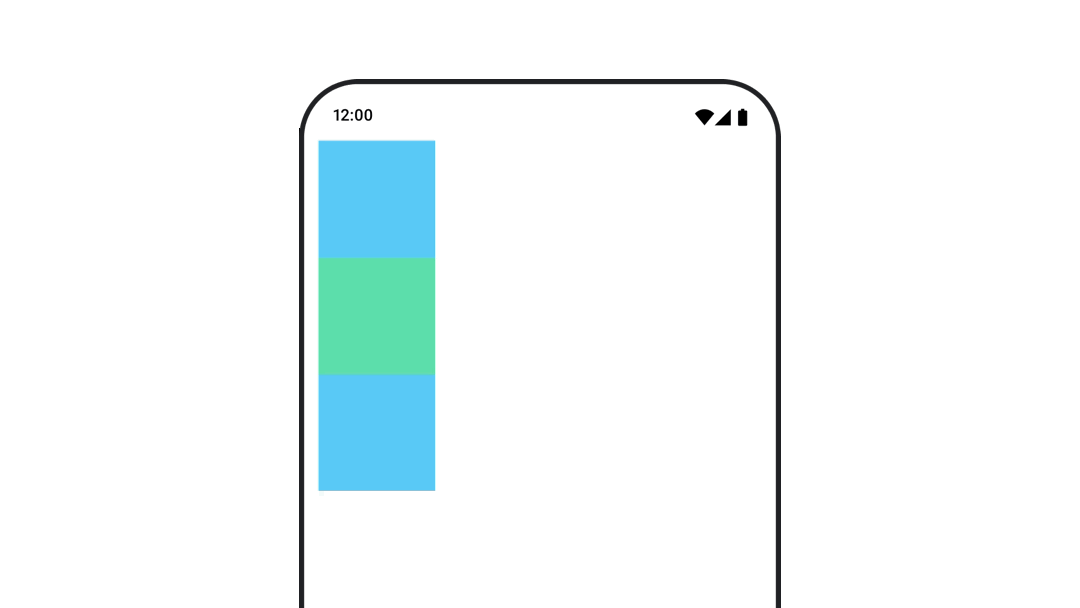
為可組合函式的位置加入動畫效果
如要為可組合函式的位置設定動畫效果,請搭配使用 Modifier.offset{ } 和 animateIntOffsetAsState()。
var moved by remember { mutableStateOf(false) } val pxToMove = with(LocalDensity.current) { 100.dp.toPx().roundToInt() } val offset by animateIntOffsetAsState( targetValue = if (moved) { IntOffset(pxToMove, pxToMove) } else { IntOffset.Zero }, label = "offset" ) Box( modifier = Modifier .offset { offset } .background(colorBlue) .size(100.dp) .clickable( interactionSource = remember { MutableInteractionSource() }, indication = null ) { moved = !moved } )
如要確保可組合函式在位置或大小動畫化時,不會繪製在其他可組合函式上方或下方,請使用 Modifier.layout{ }。這個修飾符會將大小和位置變更傳播至父項,進而影響其他子項。
舉例來說,如果您要在 Column 內移動 Box,且其他子項也需要隨著 Box 移動,請使用 Modifier.layout{ } 加入位移資訊,如下所示:
var toggled by remember { mutableStateOf(false) } val interactionSource = remember { MutableInteractionSource() } Column( modifier = Modifier .padding(16.dp) .fillMaxSize() .clickable(indication = null, interactionSource = interactionSource) { toggled = !toggled } ) { val offsetTarget = if (toggled) { IntOffset(150, 150) } else { IntOffset.Zero } val offset = animateIntOffsetAsState( targetValue = offsetTarget, label = "offset" ) Box( modifier = Modifier .size(100.dp) .background(colorBlue) ) Box( modifier = Modifier .layout { measurable, constraints -> val offsetValue = if (isLookingAhead) offsetTarget else offset.value val placeable = measurable.measure(constraints) layout(placeable.width + offsetValue.x, placeable.height + offsetValue.y) { placeable.placeRelative(offsetValue) } } .size(100.dp) .background(colorGreen) ) Box( modifier = Modifier .size(100.dp) .background(colorBlue) ) }
Modifier.layout{ }以動畫呈現可組合函式的邊框間距
如要為可組合函式的邊框間距設定動畫效果,請搭配使用 animateDpAsState 和 Modifier.padding():
var toggled by remember { mutableStateOf(false) } val animatedPadding by animateDpAsState( if (toggled) { 0.dp } else { 20.dp }, label = "padding" ) Box( modifier = Modifier .aspectRatio(1f) .fillMaxSize() .padding(animatedPadding) .background(Color(0xff53D9A1)) .clickable( interactionSource = remember { MutableInteractionSource() }, indication = null ) { toggled = !toggled } )
為可組合函式的高度設定動畫
如要為可組合函式的陰影製作動畫,請搭配使用 animateDpAsState 和 Modifier.graphicsLayer{ }。如要一次性變更高程,請使用 Modifier.shadow()。如果您要為陰影製作動畫,使用 Modifier.graphicsLayer{ } 修飾符是效能較高的做法。
val mutableInteractionSource = remember { MutableInteractionSource() } val pressed = mutableInteractionSource.collectIsPressedAsState() val elevation = animateDpAsState( targetValue = if (pressed.value) { 32.dp } else { 8.dp }, label = "elevation" ) Box( modifier = Modifier .size(100.dp) .align(Alignment.Center) .graphicsLayer { this.shadowElevation = elevation.value.toPx() } .clickable(interactionSource = mutableInteractionSource, indication = null) { } .background(colorGreen) ) { }
或者,您也可以使用 Card 可組合項,並為每個狀態設定不同的拔高屬性值。
為文字縮放、平移或旋轉加入動畫效果
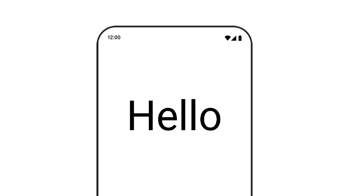
為文字的縮放、平移或旋轉效果製作動畫時,請將 TextStyle 的 textMotion 參數設為 TextMotion.Animated。這樣可確保文字動畫之間的轉換更流暢。使用 Modifier.graphicsLayer{ } 即可翻譯、旋轉或縮放文字。
val infiniteTransition = rememberInfiniteTransition(label = "infinite transition") val scale by infiniteTransition.animateFloat( initialValue = 1f, targetValue = 8f, animationSpec = infiniteRepeatable(tween(1000), RepeatMode.Reverse), label = "scale" ) Box(modifier = Modifier.fillMaxSize()) { Text( text = "Hello", modifier = Modifier .graphicsLayer { scaleX = scale scaleY = scale transformOrigin = TransformOrigin.Center } .align(Alignment.Center), // Text composable does not take TextMotion as a parameter. // Provide it via style argument but make sure that we are copying from current theme style = LocalTextStyle.current.copy(textMotion = TextMotion.Animated) ) }
文字顏色動畫
如要為文字顏色製作動畫,請在 BasicText 可組合函式中使用 color lambda:
val infiniteTransition = rememberInfiniteTransition(label = "infinite transition") val animatedColor by infiniteTransition.animateColor( initialValue = Color(0xFF60DDAD), targetValue = Color(0xFF4285F4), animationSpec = infiniteRepeatable(tween(1000), RepeatMode.Reverse), label = "color" ) BasicText( text = "Hello Compose", color = { animatedColor }, // ... )
切換不同類型的內容
如要在不同可組合項之間製作動畫,請使用 AnimatedContent;如要製作可組合項之間的標準淡入淡出效果,請使用 Crossfade。
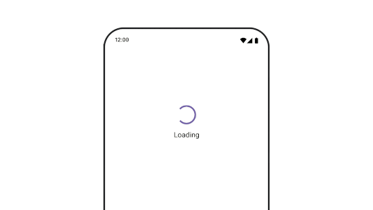
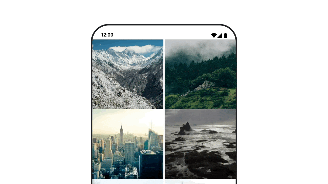
var state by remember { mutableStateOf(UiState.Loading) } AnimatedContent( state, transitionSpec = { fadeIn( animationSpec = tween(3000) ) togetherWith fadeOut(animationSpec = tween(3000)) }, modifier = Modifier.clickable( interactionSource = remember { MutableInteractionSource() }, indication = null ) { state = when (state) { UiState.Loading -> UiState.Loaded UiState.Loaded -> UiState.Error UiState.Error -> UiState.Loading } }, label = "Animated Content" ) { targetState -> when (targetState) { UiState.Loading -> { LoadingScreen() } UiState.Loaded -> { LoadedScreen() } UiState.Error -> { ErrorScreen() } } }
AnimatedContent 可自訂為顯示多種不同的轉入和轉出轉場效果。詳情請參閱AnimatedContent說明文件,或這篇網誌文章
AnimatedContent。
在導覽至不同目的地時顯示動畫
使用 navigation-compose 構件時,如要在可組合函式之間加入轉場動畫效果,請在可組合函式中指定 enterTransition 和 exitTransition。您也可以在頂層設定所有目的地的預設動畫 NavHost:
val navController = rememberNavController() NavHost( navController = navController, startDestination = "landing", enterTransition = { EnterTransition.None }, exitTransition = { ExitTransition.None } ) { composable("landing") { ScreenLanding( // ... ) } composable( "detail/{photoUrl}", arguments = listOf(navArgument("photoUrl") { type = NavType.StringType }), enterTransition = { fadeIn( animationSpec = tween( 300, easing = LinearEasing ) ) + slideIntoContainer( animationSpec = tween(300, easing = EaseIn), towards = AnimatedContentTransitionScope.SlideDirection.Start ) }, exitTransition = { fadeOut( animationSpec = tween( 300, easing = LinearEasing ) ) + slideOutOfContainer( animationSpec = tween(300, easing = EaseOut), towards = AnimatedContentTransitionScope.SlideDirection.End ) } ) { backStackEntry -> ScreenDetails( // ... ) } }
進入和退出轉場效果有很多種,可對傳入和傳出的內容套用不同效果,詳情請參閱說明文件。
重複播放動畫
搭配 infiniteRepeatable
animationSpec 使用 rememberInfiniteTransition,即可讓動畫不斷重複播放。變更 RepeatModes,指定應如何來回移動。
使用 repeatable 重複執行指定次數。
val infiniteTransition = rememberInfiniteTransition(label = "infinite") val color by infiniteTransition.animateColor( initialValue = Color.Green, targetValue = Color.Blue, animationSpec = infiniteRepeatable( animation = tween(1000, easing = LinearEasing), repeatMode = RepeatMode.Reverse ), label = "color" ) Column( modifier = Modifier.drawBehind { drawRect(color) } ) { // your composable here }
在可組合函式啟動時啟動動畫
可組合函式進入組合時,系統會執行 LaunchedEffect。這會在啟動可組合項時啟動動畫,您可以使用這項功能來驅動動畫狀態變化。使用 Animatable 和 animateTo 方法,在啟動時啟動動畫:
val alphaAnimation = remember { Animatable(0f) } LaunchedEffect(Unit) { alphaAnimation.animateTo(1f) } Box( modifier = Modifier.graphicsLayer { alpha = alphaAnimation.value } )
建立連續動畫
使用 Animatable 協同程式 API 執行循序或並行動畫。在 Animatable 上依序呼叫 animateTo 會導致每個動畫等待先前的動畫完成後再繼續。這是因為它是暫停函式。
val alphaAnimation = remember { Animatable(0f) } val yAnimation = remember { Animatable(0f) } LaunchedEffect("animationKey") { alphaAnimation.animateTo(1f) yAnimation.animateTo(100f) yAnimation.animateTo(500f, animationSpec = tween(100)) }
建立並行動畫
使用協同程式 API (Animatable#animateTo() 或 animate),或 Transition API 即可達成動畫並行效果。如果您在協同程式環境中使用多個啟動函式,動畫會同時啟動:
val alphaAnimation = remember { Animatable(0f) } val yAnimation = remember { Animatable(0f) } LaunchedEffect("animationKey") { launch { alphaAnimation.animateTo(1f) } launch { yAnimation.animateTo(100f) } }
您可以使用 updateTransition API,同時使用相同狀態來驅動多個不同的屬性動畫。以下範例會為狀態變更控制的兩個屬性 (rect 和 borderWidth) 加上動畫效果:
var currentState by remember { mutableStateOf(BoxState.Collapsed) } val transition = updateTransition(currentState, label = "transition") val rect by transition.animateRect(label = "rect") { state -> when (state) { BoxState.Collapsed -> Rect(0f, 0f, 100f, 100f) BoxState.Expanded -> Rect(100f, 100f, 300f, 300f) } } val borderWidth by transition.animateDp(label = "borderWidth") { state -> when (state) { BoxState.Collapsed -> 1.dp BoxState.Expanded -> 0.dp } }
提升動畫效能
Compose 中的動畫可能會導致效能問題。這是因為動畫的本質就是快速移動或變更螢幕上的像素,逐格建立移動的錯覺。
請考慮 Compose 的不同階段:組合、版面配置和繪製。如果動畫會變更版面配置階段,則需要重新配置及重繪所有受影響的可組合項。如果動畫是在繪製階段發生,預設會比在版面配置階段執行動畫的效能更高,因為整體工作量較少。
為確保應用程式在動畫製作期間盡可能減少工作量,請盡可能選擇 Modifier 的 lambda 版本。這會略過重新組合,並在組合階段以外執行動畫,否則請使用 Modifier.graphicsLayer{ },因為這個修飾符一律會在繪製階段執行。如要進一步瞭解相關資訊,請參閱效能說明文件中的「延遲讀取」一節。
變更動畫時間
根據預設,Compose 會對大多數動畫使用彈簧動畫。彈簧或物理動畫更自然。此外,這類動畫會考量物件的目前速度,而非固定時間,因此可以中斷。如要覆寫預設值,先前示範的所有動畫 API 都能設定 animationSpec,自訂動畫的執行方式,無論您希望動畫在特定時間長度內執行,還是更具彈性,都能達成。
以下是不同 animationSpec 選項的摘要:
spring:以物理為基礎的動畫,是所有動畫的預設值。您可以變更 stiffness 或 dampingRatio,達到不同的動畫外觀和風格。tween(between 的簡寫):以時間長度為基礎的動畫,會使用Easing函式在兩個值之間產生動畫。keyframes:規格,用於在動畫的特定關鍵點指定值。repeatable:以時間長度為準的規格,會執行特定次數,次數由RepeatMode指定。infiniteRepeatable:以時間長度為準的規格,會無限期執行。snap:立即跳至結尾值,不會有任何動畫效果。
如要進一步瞭解 animationSpecs,請參閱完整說明文件。
其他資源
如需更多 Compose 中有趣的動畫範例,請參閱下列內容: