
Compose มีกลไกภาพเคลื่อนไหวในตัวมากมาย และอาจทำให้คุณสับสนเมื่อต้องเลือกใช้ ด้านล่างนี้คือรายการ Use Case ของภาพเคลื่อนไหวที่พบบ่อย ดูข้อมูลเพิ่มเติมเกี่ยวกับตัวเลือก API ต่างๆ ทั้งหมดที่มีให้คุณได้ในเอกสารประกอบเกี่ยวกับ Compose Animation ฉบับเต็ม
ทําให้คุณสมบัติที่ใช้ร่วมกันของ Composable เคลื่อนไหว
Compose มี API ที่สะดวกซึ่งช่วยให้คุณแก้ปัญหาการใช้งานภาพเคลื่อนไหวทั่วไปได้หลายกรณี ส่วนนี้แสดงวิธีสร้างภาพเคลื่อนไหวให้กับพร็อพเพอร์ตี้ทั่วไปของ Composable
สร้างภาพเคลื่อนไหวให้ปรากฏ / หายไป
ใช้ AnimatedVisibility เพื่อซ่อนหรือแสดง Composable บุตรหลานที่อยู่ใน
AnimatedVisibility สามารถใช้ Modifier.animateEnterExit() สำหรับการเปลี่ยนฉากเข้า
หรือออกของตนเองได้
var visible by remember { mutableStateOf(true) } // Animated visibility will eventually remove the item from the composition once the animation has finished. AnimatedVisibility(visible) { // your composable here // ... }
พารามิเตอร์เข้าและออกของ AnimatedVisibility ช่วยให้คุณกำหนดค่าลักษณะการทำงานของ
Composable เมื่อปรากฏและหายไปได้ อ่านข้อมูลเพิ่มเติมได้ในเอกสารประกอบ
ฉบับเต็ม
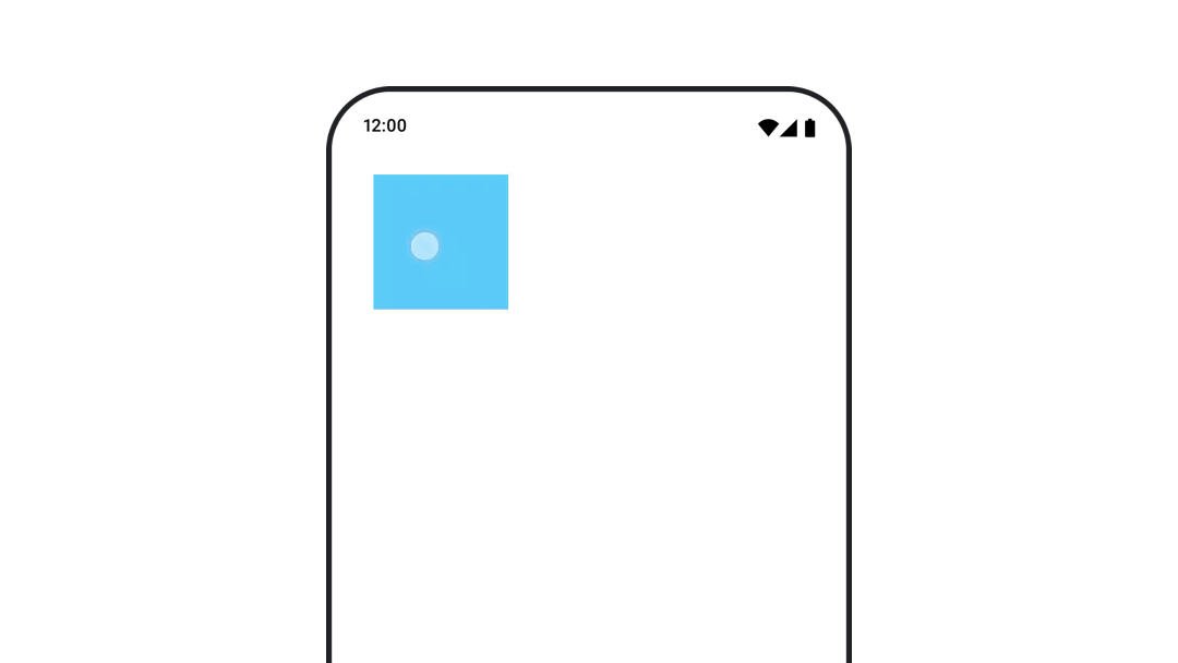
อีกตัวเลือกหนึ่งในการสร้างภาพเคลื่อนไหวให้การมองเห็นของ Composable คือการสร้างภาพเคลื่อนไหวให้
อัลฟ่าเมื่อเวลาผ่านไปโดยใช้ animateFloatAsState ดังนี้
var visible by remember { mutableStateOf(true) } val animatedAlpha by animateFloatAsState( targetValue = if (visible) 1.0f else 0f, label = "alpha" ) Box( modifier = Modifier .size(200.dp) .graphicsLayer { alpha = animatedAlpha } .clip(RoundedCornerShape(8.dp)) .background(colorGreen) .align(Alignment.TopCenter) ) { }
อย่างไรก็ตาม การเปลี่ยนค่าอัลฟ่ามีข้อควรระวังคือ Composable จะยังคงอยู่ใน Composition และยังคงใช้พื้นที่ที่กำหนดไว้ ซึ่งอาจทำให้โปรแกรมอ่านหน้าจอและกลไกการช่วยเหลือพิเศษอื่นๆ ยังคงพิจารณารายการบนหน้าจอ ในทางกลับกัน AnimatedVisibility จะนำ
รายการออกจากองค์ประกอบในที่สุด
เปลี่ยนสีพื้นหลังแบบเคลื่อนไหว
val animatedColor by animateColorAsState( if (animateBackgroundColor) colorGreen else colorBlue, label = "color" ) Column( modifier = Modifier.drawBehind { drawRect(animatedColor) } ) { // your composable here }
ตัวเลือกนี้มีประสิทธิภาพมากกว่าการใช้ Modifier.background()
Modifier.background() ใช้ได้กับการตั้งค่าสีแบบครั้งเดียว แต่เมื่อ
เคลื่อนไหวสีเมื่อเวลาผ่านไป การตั้งค่านี้อาจทำให้เกิดการจัดองค์ประกอบใหม่มากกว่า
ที่จำเป็น
ดูส่วนการทำซ้ำภาพเคลื่อนไหวเพื่อทำให้สีพื้นหลังเคลื่อนไหวอย่างต่อเนื่อง
เคลื่อนไหวขนาดของ Composable
Compose ช่วยให้คุณเคลื่อนไหวขนาดของ Composable ได้หลายวิธี ใช้
animateContentSize() สำหรับภาพเคลื่อนไหวระหว่างการเปลี่ยนแปลงขนาดที่ประกอบได้
ตัวอย่างเช่น หากคุณมีกล่องที่มีข้อความซึ่งขยายจาก 1 บรรทัดเป็นหลายบรรทัดได้ คุณสามารถใช้ Modifier.animateContentSize() เพื่อให้การเปลี่ยนผ่านราบรื่นยิ่งขึ้นได้โดยทำดังนี้
var expanded by remember { mutableStateOf(false) } Box( modifier = Modifier .background(colorBlue) .animateContentSize() .height(if (expanded) 400.dp else 200.dp) .fillMaxWidth() .clickable( interactionSource = remember { MutableInteractionSource() }, indication = null ) { expanded = !expanded } ) { }
คุณยังใช้ AnimatedContent กับ SizeTransform เพื่ออธิบาย
วิธีเปลี่ยนขนาดได้ด้วย
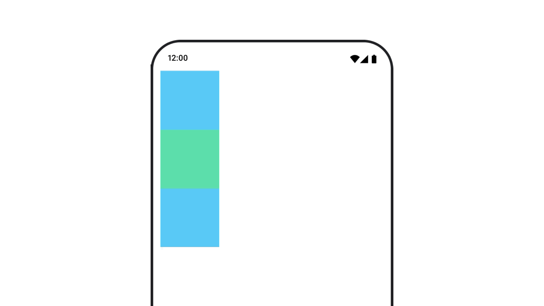
ทําให้ตําแหน่งของฟังก์ชันที่ประกอบกันได้เคลื่อนไหว
หากต้องการเคลื่อนไหวตำแหน่งของ Composable ให้ใช้ Modifier.offset{ } ร่วมกับ
animateIntOffsetAsState()
var moved by remember { mutableStateOf(false) } val pxToMove = with(LocalDensity.current) { 100.dp.toPx().roundToInt() } val offset by animateIntOffsetAsState( targetValue = if (moved) { IntOffset(pxToMove, pxToMove) } else { IntOffset.Zero }, label = "offset" ) Box( modifier = Modifier .offset { offset } .background(colorBlue) .size(100.dp) .clickable( interactionSource = remember { MutableInteractionSource() }, indication = null ) { moved = !moved } )
หากต้องการให้มั่นใจว่าระบบจะไม่วาด Composable ทับหรือใต้ Composable อื่นเมื่อเคลื่อนไหวตำแหน่งหรือขนาด ให้ใช้ Modifier.layout{ } ตัวแก้ไขนี้
จะส่งต่อการเปลี่ยนแปลงขนาดและตำแหน่งไปยังองค์ประกอบหลัก ซึ่งจะส่งผลต่อ
องค์ประกอบย่อยอื่นๆ
ตัวอย่างเช่น หากคุณกำลังย้าย Box ภายใน Column และเด็กคนอื่นๆ
ต้องย้ายตามเมื่อ Box เคลื่อนที่ ให้ระบุข้อมูลออฟเซ็ตพร้อมกับ
Modifier.layout{ } ดังนี้
var toggled by remember { mutableStateOf(false) } val interactionSource = remember { MutableInteractionSource() } Column( modifier = Modifier .padding(16.dp) .fillMaxSize() .clickable(indication = null, interactionSource = interactionSource) { toggled = !toggled } ) { val offsetTarget = if (toggled) { IntOffset(150, 150) } else { IntOffset.Zero } val offset = animateIntOffsetAsState( targetValue = offsetTarget, label = "offset" ) Box( modifier = Modifier .size(100.dp) .background(colorBlue) ) Box( modifier = Modifier .layout { measurable, constraints -> val offsetValue = if (isLookingAhead) offsetTarget else offset.value val placeable = measurable.measure(constraints) layout(placeable.width + offsetValue.x, placeable.height + offsetValue.y) { placeable.placeRelative(offsetValue) } } .size(100.dp) .background(colorGreen) ) Box( modifier = Modifier .size(100.dp) .background(colorBlue) ) }
Modifier.layout{ }สร้างภาพเคลื่อนไหวของระยะขอบของ Composable
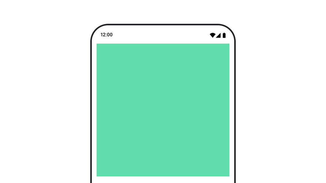
หากต้องการสร้างภาพเคลื่อนไหวให้กับระยะขอบของ Composable ให้ใช้ animateDpAsState ร่วมกับ
Modifier.padding() ดังนี้
var toggled by remember { mutableStateOf(false) } val animatedPadding by animateDpAsState( if (toggled) { 0.dp } else { 20.dp }, label = "padding" ) Box( modifier = Modifier .aspectRatio(1f) .fillMaxSize() .padding(animatedPadding) .background(Color(0xff53D9A1)) .clickable( interactionSource = remember { MutableInteractionSource() }, indication = null ) { toggled = !toggled } )
ทําให้ระดับความสูงของ Composable เคลื่อนไหว
หากต้องการเคลื่อนไหวระดับความสูงของ Composable ให้ใช้ animateDpAsState ร่วมกับ
Modifier.graphicsLayer{ } สำหรับการเปลี่ยนแปลงระดับความสูงแบบครั้งเดียว ให้ใช้
Modifier.shadow() หากคุณกำลังสร้างภาพเคลื่อนไหวของเงา การใช้ตัวแก้ไข
Modifier.graphicsLayer{ }เป็นตัวเลือกที่มีประสิทธิภาพมากกว่า
val mutableInteractionSource = remember { MutableInteractionSource() } val pressed = mutableInteractionSource.collectIsPressedAsState() val elevation = animateDpAsState( targetValue = if (pressed.value) { 32.dp } else { 8.dp }, label = "elevation" ) Box( modifier = Modifier .size(100.dp) .align(Alignment.Center) .graphicsLayer { this.shadowElevation = elevation.value.toPx() } .clickable(interactionSource = mutableInteractionSource, indication = null) { } .background(colorGreen) ) { }
หรือจะใช้ Card ที่ประกอบได้ แล้วตั้งค่าพร็อพเพอร์ตี้ยกระดับเป็นค่าต่างๆ ตามสถานะก็ได้
ทำให้ขนาด การเปลี่ยนตำแหน่ง หรือการหมุนของข้อความเคลื่อนไหว
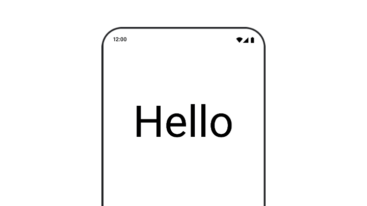
เมื่อเคลื่อนไหวการปรับขนาด การแปล หรือการหมุนของข้อความ ให้ตั้งค่าพารามิเตอร์ textMotion
ใน TextStyle เป็น TextMotion.Animated ซึ่งจะช่วยให้การเปลี่ยน
ระหว่างภาพเคลื่อนไหวของข้อความราบรื่นยิ่งขึ้น ใช้ Modifier.graphicsLayer{ } เพื่อ
แปล หมุน หรือปรับขนาดข้อความ
val infiniteTransition = rememberInfiniteTransition(label = "infinite transition") val scale by infiniteTransition.animateFloat( initialValue = 1f, targetValue = 8f, animationSpec = infiniteRepeatable(tween(1000), RepeatMode.Reverse), label = "scale" ) Box(modifier = Modifier.fillMaxSize()) { Text( text = "Hello", modifier = Modifier .graphicsLayer { scaleX = scale scaleY = scale transformOrigin = TransformOrigin.Center } .align(Alignment.Center), // Text composable does not take TextMotion as a parameter. // Provide it via style argument but make sure that we are copying from current theme style = LocalTextStyle.current.copy(textMotion = TextMotion.Animated) ) }
ทำให้สีข้อความเคลื่อนไหว
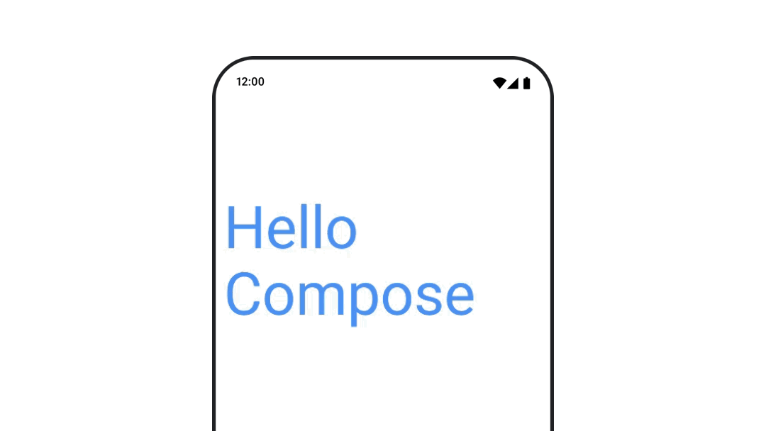
หากต้องการสร้างภาพเคลื่อนไหวสีข้อความ ให้ใช้แลมบ์ดา color ใน Composable BasicText
val infiniteTransition = rememberInfiniteTransition(label = "infinite transition") val animatedColor by infiniteTransition.animateColor( initialValue = Color(0xFF60DDAD), targetValue = Color(0xFF4285F4), animationSpec = infiniteRepeatable(tween(1000), RepeatMode.Reverse), label = "color" ) BasicText( text = "Hello Compose", color = { animatedColor }, // ... )
สลับระหว่างเนื้อหาประเภทต่างๆ
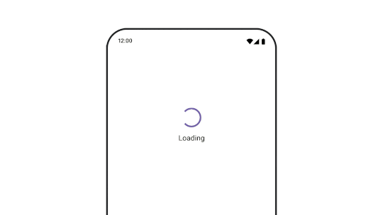
ใช้ AnimatedContent เพื่อเปลี่ยนภาพระหว่าง Composable ต่างๆ หากต้องการเพียงแค่ให้ Composable ค่อยๆ จางหายไป ให้ใช้ Crossfade
var state by remember { mutableStateOf(UiState.Loading) } AnimatedContent( state, transitionSpec = { fadeIn( animationSpec = tween(3000) ) togetherWith fadeOut(animationSpec = tween(3000)) }, modifier = Modifier.clickable( interactionSource = remember { MutableInteractionSource() }, indication = null ) { state = when (state) { UiState.Loading -> UiState.Loaded UiState.Loaded -> UiState.Error UiState.Error -> UiState.Loading } }, label = "Animated Content" ) { targetState -> when (targetState) { UiState.Loading -> { LoadingScreen() } UiState.Loaded -> { LoadedScreen() } UiState.Error -> { ErrorScreen() } } }
AnimatedContent สามารถปรับแต่งให้แสดงการเปลี่ยนฉากเข้าและออกได้หลายรูปแบบ อ่านข้อมูลเพิ่มเติมได้ในเอกสารประกอบเกี่ยวกับ
AnimatedContent หรืออ่านบล็อกโพสต์นี้เกี่ยวกับ
AnimatedContent
เคลื่อนไหวขณะนำทางไปยังจุดหมายต่างๆ
หากต้องการสร้างภาพเคลื่อนไหวของการเปลี่ยนผ่านระหว่าง Composable เมื่อใช้
อาร์ติแฟกต์ navigation-compose ให้ระบุ enterTransition และ
exitTransition ใน Composable นอกจากนี้ คุณยังตั้งค่าภาพเคลื่อนไหวเริ่มต้นที่จะใช้กับปลายทางทั้งหมดที่ระดับบนสุดได้ด้วย NavHost โดยทำดังนี้
val navController = rememberNavController() NavHost( navController = navController, startDestination = "landing", enterTransition = { EnterTransition.None }, exitTransition = { ExitTransition.None } ) { composable("landing") { ScreenLanding( // ... ) } composable( "detail/{photoUrl}", arguments = listOf(navArgument("photoUrl") { type = NavType.StringType }), enterTransition = { fadeIn( animationSpec = tween( 300, easing = LinearEasing ) ) + slideIntoContainer( animationSpec = tween(300, easing = EaseIn), towards = AnimatedContentTransitionScope.SlideDirection.Start ) }, exitTransition = { fadeOut( animationSpec = tween( 300, easing = LinearEasing ) ) + slideOutOfContainer( animationSpec = tween(300, easing = EaseOut), towards = AnimatedContentTransitionScope.SlideDirection.End ) } ) { backStackEntry -> ScreenDetails( // ... ) } }
การเปลี่ยนฉากเข้าและออกมีหลายประเภท ซึ่งจะใช้เอฟเฟกต์ที่แตกต่างกันกับเนื้อหาที่เข้ามาและออกไป โปรดดูข้อมูลเพิ่มเติมในเอกสารประกอบ
เล่นภาพเคลื่อนไหวซ้ำ
ใช้ rememberInfiniteTransition กับ infiniteRepeatable
animationSpec เพื่อให้ภาพเคลื่อนไหวเล่นซ้ำไปเรื่อยๆ เปลี่ยน RepeatModes เพื่อ
ระบุวิธีที่ควรไปกลับ
ใช้ repeatable เพื่อทำซ้ำจำนวนครั้งที่กำหนด
val infiniteTransition = rememberInfiniteTransition(label = "infinite") val color by infiniteTransition.animateColor( initialValue = Color.Green, targetValue = Color.Blue, animationSpec = infiniteRepeatable( animation = tween(1000, easing = LinearEasing), repeatMode = RepeatMode.Reverse ), label = "color" ) Column( modifier = Modifier.drawBehind { drawRect(color) } ) { // your composable here }
เริ่มภาพเคลื่อนไหวเมื่อเปิดตัว Composable
LaunchedEffect จะทำงานเมื่อ Composable เข้าสู่ Composition โดยจะเริ่ม
ภาพเคลื่อนไหวเมื่อเปิดตัว Composable คุณสามารถใช้ตัวเลือกนี้เพื่อขับเคลื่อนการเปลี่ยนแปลงสถานะ
ภาพเคลื่อนไหวได้ การใช้ Animatable กับเมธอด animateTo เพื่อเริ่มภาพเคลื่อนไหวเมื่อเปิดแอป
val alphaAnimation = remember { Animatable(0f) } LaunchedEffect(Unit) { alphaAnimation.animateTo(1f) } Box( modifier = Modifier.graphicsLayer { alpha = alphaAnimation.value } )
สร้างภาพเคลื่อนไหวแบบต่อเนื่อง
ใช้ AnimatableCoroutine API เพื่อดำเนินการภาพเคลื่อนไหวแบบต่อเนื่องหรือพร้อมกัน
การเรียกใช้ animateTo ใน Animatable ต่อกันจะทำให้
ภาพเคลื่อนไหวแต่ละรายการรอให้ภาพเคลื่อนไหวก่อนหน้าเสร็จสิ้นก่อนจึงจะดำเนินการต่อได้
เนื่องจากเป็นฟังก์ชันระงับ
val alphaAnimation = remember { Animatable(0f) } val yAnimation = remember { Animatable(0f) } LaunchedEffect("animationKey") { alphaAnimation.animateTo(1f) yAnimation.animateTo(100f) yAnimation.animateTo(500f, animationSpec = tween(100)) }
สร้างภาพเคลื่อนไหวพร้อมกัน
ใช้ API ของโครูทีน (Animatable#animateTo() หรือ animate) หรือ
API ของ Transition เพื่อให้ภาพเคลื่อนไหวทำงานพร้อมกัน หากคุณใช้ฟังก์ชัน
launch หลายรายการในบริบทของโครูทีน ฟังก์ชันจะเปิดภาพเคลื่อนไหวพร้อมกัน
val alphaAnimation = remember { Animatable(0f) } val yAnimation = remember { Animatable(0f) } LaunchedEffect("animationKey") { launch { alphaAnimation.animateTo(1f) } launch { yAnimation.animateTo(100f) } }
คุณสามารถใช้ updateTransition API เพื่อใช้สถานะเดียวกันในการขับเคลื่อน
ภาพเคลื่อนไหวของพร็อพเพอร์ตี้ต่างๆ มากมายพร้อมกัน ตัวอย่างด้านล่างจะเคลื่อนไหวพร็อพเพอร์ตี้ 2 รายการที่ควบคุมโดยการเปลี่ยนสถานะ ได้แก่ rect และ borderWidth
var currentState by remember { mutableStateOf(BoxState.Collapsed) } val transition = updateTransition(currentState, label = "transition") val rect by transition.animateRect(label = "rect") { state -> when (state) { BoxState.Collapsed -> Rect(0f, 0f, 100f, 100f) BoxState.Expanded -> Rect(100f, 100f, 300f, 300f) } } val borderWidth by transition.animateDp(label = "borderWidth") { state -> when (state) { BoxState.Collapsed -> 1.dp BoxState.Expanded -> 0.dp } }
เพิ่มประสิทธิภาพภาพเคลื่อนไหว
ภาพเคลื่อนไหวใน Compose อาจทำให้เกิดปัญหาด้านประสิทธิภาพ เนื่องจากลักษณะของภาพเคลื่อนไหวคือการเลื่อนหรือเปลี่ยนพิกเซลบนหน้าจออย่างรวดเร็ว ทีละเฟรมเพื่อสร้างภาพลวงตาของการเคลื่อนไหว
พิจารณาระยะต่างๆ ของ Compose ได้แก่ การเขียน การจัดวาง และการวาด หากภาพเคลื่อนไหวเปลี่ยนเฟสเลย์เอาต์ จะต้องมีการ จัดเลย์เอาต์ใหม่และวาดใหม่สำหรับ Composable ทั้งหมดที่ได้รับผลกระทบ หากภาพเคลื่อนไหวเกิดขึ้นในระยะการวาด ภาพเคลื่อนไหวจะทำงานได้ดีกว่าการเรียกใช้ภาพเคลื่อนไหวในระยะเลย์เอาต์โดยค่าเริ่มต้น เนื่องจากโดยรวมแล้วระบบจะมีงานที่ต้องทำน้อยกว่า
เลือกใช้ Lambda
เวอร์ชันของ Modifier หากเป็นไปได้ เพื่อให้แอปทำงานน้อยที่สุดขณะเคลื่อนไหว ซึ่งจะข้ามการจัดองค์ประกอบใหม่และ
แสดงภาพเคลื่อนไหวนอกระยะการจัดองค์ประกอบ หรือใช้
Modifier.graphicsLayer{ } เนื่องจากตัวแก้ไขนี้จะทำงานในระยะการวาดเสมอ ดูข้อมูลเพิ่มเติมเกี่ยวกับเรื่องนี้ได้ที่ส่วนเลื่อนการอ่านใน
เอกสารประกอบเกี่ยวกับประสิทธิภาพ
เปลี่ยนเวลาของภาพเคลื่อนไหว
โดยค่าเริ่มต้น Compose จะใช้ภาพเคลื่อนไหวสปริงกับภาพเคลื่อนไหวส่วนใหญ่ สปริงหรือ
ภาพเคลื่อนไหวตามหลักฟิสิกส์จะดูเป็นธรรมชาติมากขึ้น นอกจากนี้ยังสามารถขัดจังหวะได้เนื่องจาก
จะพิจารณาความเร็วปัจจุบันของออบเจ็กต์แทนที่จะเป็นเวลาที่กำหนด
หากต้องการลบล้างค่าเริ่มต้น API ภาพเคลื่อนไหวทั้งหมดที่แสดงด้านบน
สามารถตั้งค่า animationSpec เพื่อปรับแต่งวิธีที่ภาพเคลื่อนไหวทำงาน
ไม่ว่าคุณต้องการให้ภาพเคลื่อนไหวทำงานในช่วงระยะเวลาหนึ่งหรือให้มีความยืดหยุ่นมากขึ้น
สรุปตัวเลือก animationSpec ต่างๆ มีดังนี้
spring: ภาพเคลื่อนไหวตามหลักฟิสิกส์ ซึ่งเป็นค่าเริ่มต้นสำหรับภาพเคลื่อนไหวทั้งหมด คุณ สามารถเปลี่ยนความแข็งหรืออัตราการหน่วงเพื่อสร้างภาพเคลื่อนไหว ที่มีรูปลักษณ์และความรู้สึกแตกต่างกันtween(ย่อมาจาก between): ภาพเคลื่อนไหวตามระยะเวลา ซึ่งจะเคลื่อนไหว ระหว่างค่า 2 ค่าด้วยฟังก์ชันEasingkeyframes: ข้อกำหนดสำหรับการระบุค่าที่จุดสำคัญบางจุดในภาพเคลื่อนไหวrepeatable: ข้อกำหนดตามระยะเวลาที่ทำงานตามจำนวนครั้งที่แน่นอน ซึ่งระบุโดยRepeatModeinfiniteRepeatable: สเปคตามระยะเวลาที่ทำงานตลอดไปsnap: สแนปไปยังค่าสุดท้ายทันทีโดยไม่มีภาพเคลื่อนไหว
อ่านเอกสารประกอบฉบับสมบูรณ์เพื่อดูข้อมูลเพิ่มเติมเกี่ยวกับ animationSpecs
แหล่งข้อมูลเพิ่มเติม
ดูตัวอย่างภาพเคลื่อนไหวสนุกๆ เพิ่มเติมใน Compose ได้ที่
- ภาพเคลื่อนไหว 5 แบบอย่างรวดเร็วใน Compose
- การทำให้แมงกะพรุนเคลื่อนไหวใน Compose
- การปรับแต่ง
AnimatedContentใน Compose - ทำความคุ้นเคยกับฟังก์ชันการลดความเร็วใน Compose