
Compose には、一般的なアニメーションのユースケースを処理するためのコンポーザブルと修飾子が組み込まれています。
組み込みのアニメーション コンポーザブル
Compose には、コンテンツの表示、非表示、レイアウトの変更をアニメーション化するコンポーザブルがいくつか用意されています。
表示と非表示をアニメーション化する
AnimatedVisibility コンポーザブルは、コンテンツの表示と非表示をアニメーション化します。
var visible by remember { mutableStateOf(true) } // Animated visibility will eventually remove the item from the composition once the animation has finished. AnimatedVisibility(visible) { // your composable here // ... }
デフォルトでは、コンテンツの表示にはフェードインと拡大が使われ、非表示にはフェードアウトと縮小が使われます。このトランジションをカスタマイズするには、EnterTransition オブジェクトと ExitTransition オブジェクトを指定します。
var visible by remember { mutableStateOf(true) } val density = LocalDensity.current AnimatedVisibility( visible = visible, enter = slideInVertically { // Slide in from 40 dp from the top. with(density) { -40.dp.roundToPx() } } + expandVertically( // Expand from the top. expandFrom = Alignment.Top ) + fadeIn( // Fade in with the initial alpha of 0.3f. initialAlpha = 0.3f ), exit = slideOutVertically() + shrinkVertically() + fadeOut() ) { Text( "Hello", Modifier .fillMaxWidth() .height(200.dp) ) }
上記の例に示すように、複数の EnterTransition オブジェクトまたは ExitTransition オブジェクトを + 演算子で結合できます。各オブジェクトは、動作をカスタマイズするためのオプション パラメータを受け入れます。詳細については、リファレンス ページをご覧ください。
開始と終了のトランジションの例


AnimatedVisibility には、MutableTransitionState 引数を取る派生形も用意されています。これにより、AnimatedVisibility コンポーザブルがコンポジション ツリーに追加された直後にアニメーションをトリガーできます。アニメーションの状態を監視する場合にも便利です。
// Create a MutableTransitionState<Boolean> for the AnimatedVisibility. val state = remember { MutableTransitionState(false).apply { // Start the animation immediately. targetState = true } } Column { AnimatedVisibility(visibleState = state) { Text(text = "Hello, world!") } // Use the MutableTransitionState to know the current animation state // of the AnimatedVisibility. Text( text = when { state.isIdle && state.currentState -> "Visible" !state.isIdle && state.currentState -> "Disappearing" state.isIdle && !state.currentState -> "Invisible" else -> "Appearing" } ) }
子の開始と終了をアニメーション化する
AnimatedVisibility 内のコンテンツ(直接または間接の子)は、animateEnterExit 修飾子を使用して、それぞれに異なるアニメーションの動作を指定できます。子それぞれの視覚効果は、AnimatedVisibility コンポーザブルで指定されたアニメーションと、子自身の開始アニメーションと終了アニメーションの組み合わせです。
var visible by remember { mutableStateOf(true) } AnimatedVisibility( visible = visible, enter = fadeIn(), exit = fadeOut() ) { // Fade in/out the background and the foreground. Box( Modifier .fillMaxSize() .background(Color.DarkGray) ) { Box( Modifier .align(Alignment.Center) .animateEnterExit( // Slide in/out the inner box. enter = slideInVertically(), exit = slideOutVertically() ) .sizeIn(minWidth = 256.dp, minHeight = 64.dp) .background(Color.Red) ) { // Content of the notification… } } }
場合によっては、AnimatedVisibility にアニメーションをまったく適用しないようにして、子の animateEnterExit でそれぞれ独自のアニメーションを持つようにしたい場合があります。これを実現するには、AnimatedVisibility コンポーザブルで EnterTransition.None と ExitTransition.None を指定します。
カスタム アニメーションを追加する
組み込みの開始アニメーションと終了アニメーション以外のカスタム アニメーション効果を追加する場合は、AnimatedVisibility のコンテンツ ラムダ内の transition プロパティを使用して、元となる Transition インスタンスにアクセスします。Transition インスタンスに追加されたアニメーションの状態は、AnimatedVisibility の開始アニメーションと終了アニメーションと同時に実行されます。AnimatedVisibility は、Transition 内のすべてのアニメーションが終了するまで待ってから、コンテンツを削除します。(animate*AsState を使用するなどして)Transition とは独立して作成された終了アニメーションについては、AnimatedVisibility では考慮できないため、終了前にコンテンツ コンポーザブルを削除する場合があります。
var visible by remember { mutableStateOf(true) } AnimatedVisibility( visible = visible, enter = fadeIn(), exit = fadeOut() ) { // this: AnimatedVisibilityScope // Use AnimatedVisibilityScope#transition to add a custom animation // to the AnimatedVisibility. val background by transition.animateColor(label = "color") { state -> if (state == EnterExitState.Visible) Color.Blue else Color.Gray } Box( modifier = Modifier .size(128.dp) .background(background) ) }
Transition を使用してアニメーションを管理する方法については、transition で複数のプロパティを同時にアニメーション化するをご覧ください。
ターゲットの状態に基づいてアニメーション化する
AnimatedContent コンポーザブルは、ターゲット状態に基づいてコンテンツが変化するのに応じて、コンテンツをアニメーション化します。
Row { var count by remember { mutableIntStateOf(0) } Button(onClick = { count++ }) { Text("Add") } AnimatedContent( targetState = count, label = "animated content" ) { targetCount -> // Make sure to use `targetCount`, not `count`. Text(text = "Count: $targetCount") } }
デフォルトでは、初期コンテンツがフェードアウトしてから、ターゲット コンテンツがフェードインします(この動作はフェードスルーと呼ばれています)。このアニメーションの動作をカスタマイズするには、transitionSpec パラメータに ContentTransform オブジェクトを指定します。ContentTransform のインスタンスを作成するには、with 中置関数を使用して EnterTransition オブジェクトと ExitTransition オブジェクトを組み合わせます。SizeTransform を ContentTransform オブジェクトに適用するには、using 中置関数で接続します。
AnimatedContent( targetState = count, transitionSpec = { // Compare the incoming number with the previous number. if (targetState > initialState) { // If the target number is larger, it slides up and fades in // while the initial (smaller) number slides up and fades out. slideInVertically { height -> height } + fadeIn() togetherWith slideOutVertically { height -> -height } + fadeOut() } else { // If the target number is smaller, it slides down and fades in // while the initial number slides down and fades out. slideInVertically { height -> -height } + fadeIn() togetherWith slideOutVertically { height -> height } + fadeOut() }.using( // Disable clipping since the faded slide-in/out should // be displayed out of bounds. SizeTransform(clip = false) ) }, label = "animated content" ) { targetCount -> Text(text = "$targetCount") }
EnterTransition は、ターゲット コンテンツの表示方法を定義し、ExitTransition は、初期コンテンツの消失方法を定義します。AnimatedVisibility で使用可能なすべての EnterTransition 関数と ExitTransition 関数に加えて、AnimatedContent には slideIntoContainer と slideOutOfContainer が用意されています。これらは slideInHorizontally/Vertically と slideOutHorizontally/Vertically に代わる便利な方法であり、AnimatedContent コンテンツの初期コンテンツとターゲット コンテンツのサイズに基づいてスライド距離を計算します。
SizeTransform は、初期コンテンツとターゲット コンテンツの間のサイズのアニメーション方法を定義します。アニメーションの作成時に、初期サイズとターゲット サイズの両方にアクセスできます。SizeTransform は、アニメーション中にコンテンツをコンポーネントのサイズに切り取るかどうかも制御します。
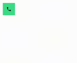
var expanded by remember { mutableStateOf(false) } Surface( color = MaterialTheme.colorScheme.primary, onClick = { expanded = !expanded } ) { AnimatedContent( targetState = expanded, transitionSpec = { fadeIn(animationSpec = tween(150, 150)) togetherWith fadeOut(animationSpec = tween(150)) using SizeTransform { initialSize, targetSize -> if (targetState) { keyframes { // Expand horizontally first. IntSize(targetSize.width, initialSize.height) at 150 durationMillis = 300 } } else { keyframes { // Shrink vertically first. IntSize(initialSize.width, targetSize.height) at 150 durationMillis = 300 } } } }, label = "size transform" ) { targetExpanded -> if (targetExpanded) { Expanded() } else { ContentIcon() } } }
子の開始と終了のトランジションをアニメーション化する
AnimatedVisibility と同様に、animateEnterExit 修飾子は AnimatedContent のコンテンツ ラムダ内で使用できます。これを使用して、EnterAnimation と ExitAnimation を直接または間接の子のそれぞれに個別に適用します。
カスタム アニメーションを追加する
AnimatedVisibility と同様に、transition フィールドは AnimatedContent のコンテンツ ラムダ内で使用できます。これを使用して、AnimatedContent 遷移と同時に実行されるカスタム アニメーション効果を作成します。詳細については、updateTransition をご覧ください。
2 つのレイアウト間のアニメーション
Crossfade は、クロスフェード アニメーションで 2 つのレイアウト間をアニメーション化します。current パラメータに渡される値を切り替えると、コンテンツがクロスフェード アニメーションで切り替わります。
var currentPage by remember { mutableStateOf("A") } Crossfade(targetState = currentPage, label = "cross fade") { screen -> when (screen) { "A" -> Text("Page A") "B" -> Text("Page B") } }
組み込みアニメーション修飾子
Compose には、コンポーザブルで特定の変更を直接アニメーション化するための修飾子が用意されています。
コンポーザブルのサイズ変更をアニメーション化する
animateContentSize 修飾子は、サイズ変更をアニメーション化します。
var expanded by remember { mutableStateOf(false) } Box( modifier = Modifier .background(colorBlue) .animateContentSize() .height(if (expanded) 400.dp else 200.dp) .fillMaxWidth() .clickable( interactionSource = remember { MutableInteractionSource() }, indication = null ) { expanded = !expanded } ) { }
リストアイテムのアニメーション
Lazy リストまたは Lazy グリッド内でアイテムの並べ替えをアニメーション化する場合は、Lazy レイアウト アイテムのアニメーションに関するドキュメントをご覧ください。
あなたへのおすすめ
- 注: JavaScript がオフになっている場合はリンクテキストが表示されます
- 値ベースのアニメーション
- Compose のアニメーション
- アニメーション ツールのサポート {:#tooling}