字体
使用集合让一切井井有条
根据您的偏好保存内容并对其进行分类。
将所有 Roboto 实例替换为 Roboto Flex。量身定制针对手表和 Material 3 富有表现力的设计语言进行了优化的基准字体比例。
使用可变轴、可变宽度和粗细来管理大显示屏和标题文本的样式,以提升样式,并为较小的尺寸带来更实用和易读的效果。
Roboto Flex
Roboto Flex 提供了一组可变轴,可满足应用的使用情形。
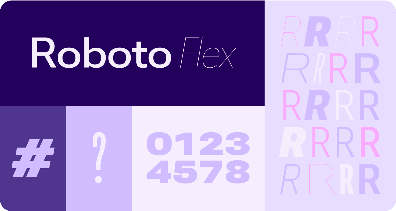
可调节的坐标轴
虽然可变字体可以具有许多可变字体属性来进行表达,但有两个可自定义的样式属性(或轴)最适合产品设计:粗细和宽度。
体重
Weight 是主要属性,用于定义任何给定字体中字体的笔画的总体粗细。最常见的粗细为常规和粗体,但粗细可以从极轻到极重。如果字体是可变的,则可提供完整且连续的笔画粗细范围,使粗细数实际上不受限制。
注意事项
warning
注意
请注意不要为正文使用过于轻薄的字体类型。
分辨率较低的显示屏可能无法显示精致的排版,尤其是较小的排版。使用较大的字号(例如显示字体)时,请使用较细的字体粗细。
warning
注意
相反,在较小的尺寸下,过重的粗细可能会影响可辨性。字体过粗可能会难以阅读。
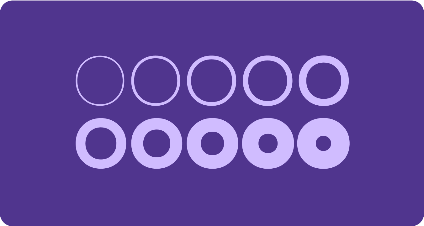
宽度
Width 是字体的字符占用了多少水平空间的结果。宽度较窄时,每行可容纳更多字符,而宽度较宽时,可能更具个性。
注意事项
check_circle
正确做法
宽度越窄,在小尺寸下就越能容纳更多字符,例如名称或长数字。
cancel
错误做法
由于宽度较大的样式会占用更多空间,因此请避免在空间有限的区域(例如应用页面标题)中使用此类样式。
本页面上的内容和代码示例受内容许可部分所述许可的限制。Java 和 OpenJDK 是 Oracle 和/或其关联公司的注册商标。
最后更新时间 (UTC):2025-07-27。
[[["易于理解","easyToUnderstand","thumb-up"],["解决了我的问题","solvedMyProblem","thumb-up"],["其他","otherUp","thumb-up"]],[["没有我需要的信息","missingTheInformationINeed","thumb-down"],["太复杂/步骤太多","tooComplicatedTooManySteps","thumb-down"],["内容需要更新","outOfDate","thumb-down"],["翻译问题","translationIssue","thumb-down"],["示例/代码问题","samplesCodeIssue","thumb-down"],["其他","otherDown","thumb-down"]],["最后更新时间 (UTC):2025-07-27。"],[],[],null,["# Fonts\n\nReplace all instances of Roboto with Roboto Flex. Tailor a baseline type scale\nthat is optimized for the watch and the Material 3 Expressive design language.\n\nUsing variable axis, variable width and weight to curate how we style big\ndisplay and title text to elevate style and bring more utility and legibility\nfor smaller sizes.\n\nRoboto Flex\n-----------\n\n\nRoboto Flex offers a set of variable axis that serves your app's use cases. \n\n\u003cbr /\u003e\n\nAdjustable axes\n---------------\n\nWhile variable fonts can have a multitude of variable font attributes for\nexpression, there are two customizable stylistic attributes (or axes) that are\nmost applicable for product design: weight and width.\n\n### Weight\n\n\n[Weight](https://fonts.google.com/knowledge/choosing_type/exploring_typefaces_with_multiple_weights_or_grades) is the primary attribute that defines the overall thickness of a\ntypeface's strokes in any given font. The most common weights are regular and\nbold, but weights can cover extremes from the very light to the very heavy. If\nthe typeface is variable, it provides a full, continuous range of stroke\nthicknesses, making the number of weights effectively unlimited. \n\n\u003cbr /\u003e\n\n#### Things to remember\n\nwarning\n\n### Caution\n\nBe careful of using too light a weight type for body text.\nLower resolution displays can struggle with delicate, especially small\ntypography. Use lighter weights at larger font sizes, such as display\ntype. \nwarning\n\n### Caution\n\nConversely, excessive weight at smaller sizes may affect\nlegibility. Too thick a type may be difficult to read.\n\n### Width\n\n\n[Width](https://fonts.google.com/knowledge/glossary/width) is the result of how much horizontal space is taken up by a\ntypeface's characters. A narrow width allows more characters to fit per line\nwhile a wider width may offer more personality. \n\n\u003cbr /\u003e\n\n#### Things to remember\n\ncheck_circle\n\n### Do\n\nA thinner width can allow for more characters to fit at\nsmall sizes, such as name or a long number. \ncancel\n\n### Don't\n\nSince wider styles take up more space, avoid using them for\nareas with limited space, such as in the app page header."]]