
适用于 Wear OS 的 Material 3 Expressive 通过为其颜色角色分配不同的色相、色度和色调值来建立视觉层次结构,从而有效区分醒目强调色与中性 Surface 颜色。系统包含主色、辅色和第三色强调色角色,这不仅增强了表达能力,还通过独特的颜色选择,让您可以更精细地控制视觉层次结构。这种有意使用颜色的方式可确保手表界面保持一致且协调,即使采用主题设置也是如此。
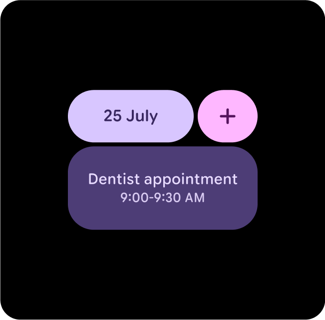
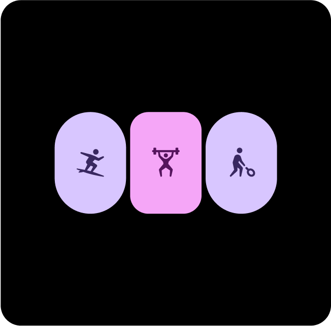
不同主题中不同布局、组件和界面的示例,但仍保持足够的颜色对比度。
配对和图层颜色
为了保持视觉无障碍性,请仅在预期的配对颜色令牌中应用颜色。不当组合颜色可能会破坏视觉无障碍所需的对比度,尤其是在通过动态配色调整颜色时。
正确搭配和叠加颜色
为确保视觉效果和无障碍功能正常,请确保将正确的令牌映射到正确的位置。不当的颜色映射可能会导致意外的视觉效果,并破坏无障碍功能。
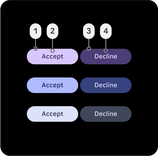
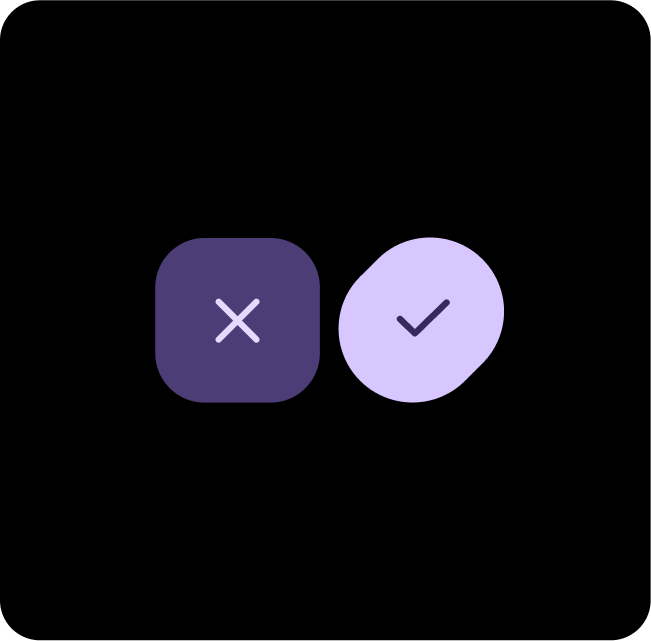
正确做法
正确搭配和叠加颜色角色,以确保适当的视觉效果和无障碍功能。
在此示例中,如果按钮的 (2) on-primary 设置为 (1) primary,或者 (4) on-primary-container 设置为 (3) primary-container,则在对比度级别发生变化时,按钮仍清晰可辨,并且对比度比率至少为 7:1,因此获得 AAA 评级。
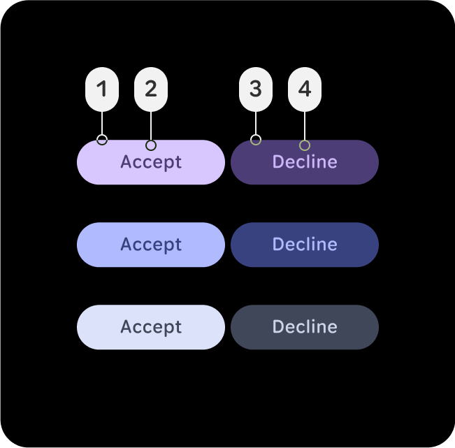
错误做法
不当的颜色映射可能会导致意外的视觉效果,并破坏无障碍功能。
在此示例中,如果按钮的 (2) primary-container 采用 (1) primary 或 (4) primary-dim,而 (3) primary-container 采用 (4) primary-dim,则由于对比度水平发生变化,且不遵循正常文本的最低 7:1 对比度比率,因此按钮会变得难以辨认。这些对比度级别适用于主色、辅色和第三色。
推荐的颜色搭配
主要维度 + 主要维度
请为主要操作使用“主色”,并为补充项使用“主色-灰度”。这样可以营造深度感,同时确保主要操作脱颖而出。
主色调 + 第三色调
使用主色调 - 暗色突出显示重要元素,使用第三色提供醒目的反馈,例如点按响应。

主要容器 + 辅助容器
请将 Secondary-Container 用于不太显眼的内容,将 Primary 应用于关键元素,以确保它们脱颖而出并吸引注意力。
主要 + 主要容器
请为主要操作使用 Primary,并为补充项或次要项使用 Primary-Container。这样可以营造深度感,同时确保主要操作脱颖而出。
主要维度 + 第三级维度
使用 Primary-Dim 突出显示重要元素,使用 Tertiary-Dim 提供醒目的反馈,例如已达成目标。
第三级容器 + 主要容器 + 次级容器
如果主操作不明确,请将第三层级和主层级组合使用为主操作,将辅助容器用于补充操作。
辅助容器 + 主要容器
如果您想显示两个同等重要的选项或容器,但仍希望二者之间有对比,请使用“主色调-暗色”和“辅色调”。
主要 + 第三级 + 主要容器
如果主操作不明确,请将第三层级和主层级组合使用为主操作,将主层级与容器层级组合使用为补充操作。
主要维度 + 第三级维度
请将“主色”用于主要操作,将“主色调暗”用于补充项。这有助于营造深度感,同时让主要操作脱颖而出。