
ToggleChip 是一种特殊条状标签,可让用户选择各种选项。
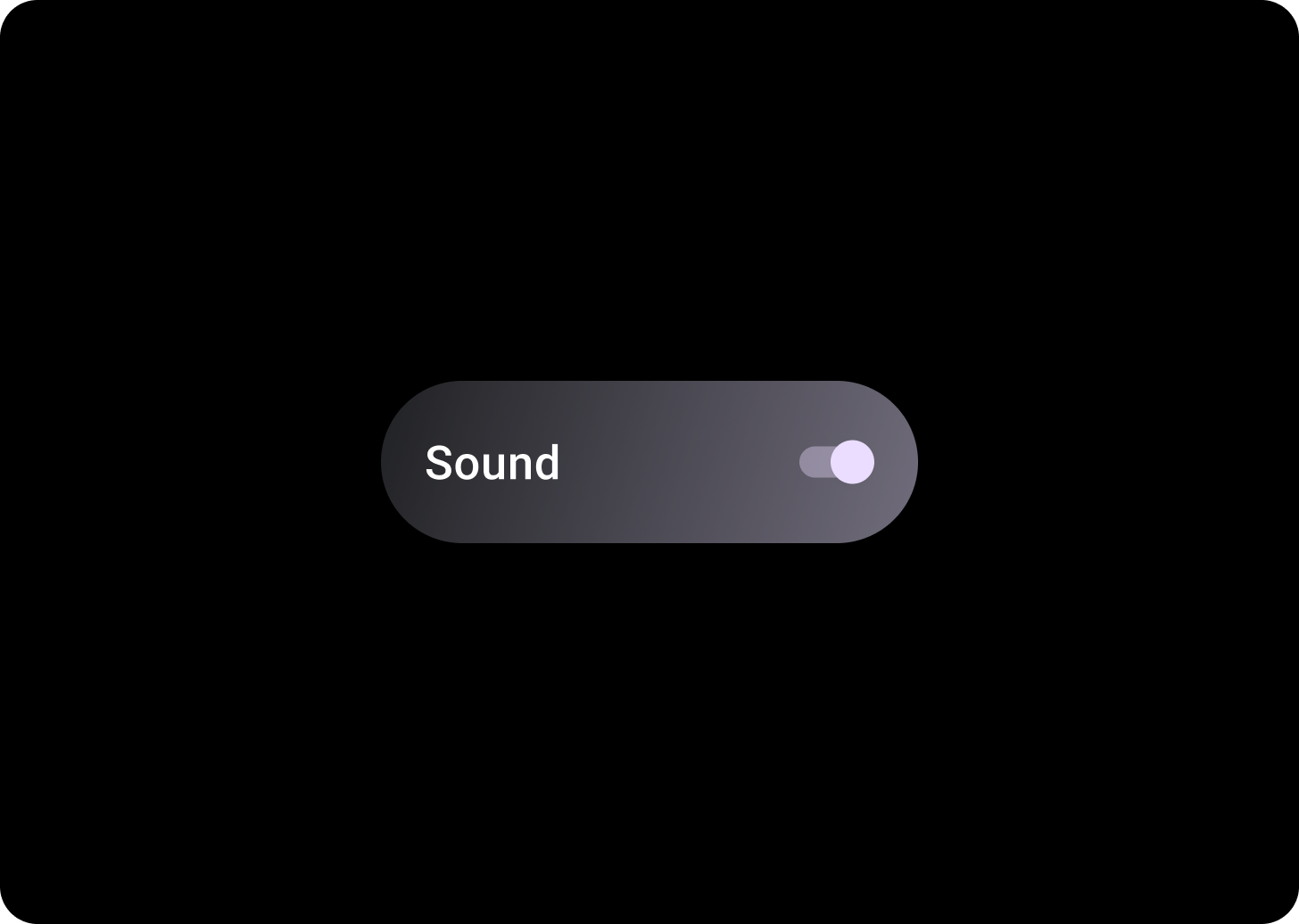
切换条状标签包含一个用于在两种状态之间进行切换的控件,例如,开关、单选按钮或复选框。如果需要快速轻松地设置许多选项(例如在“设置”中),请使用切换条状标签。
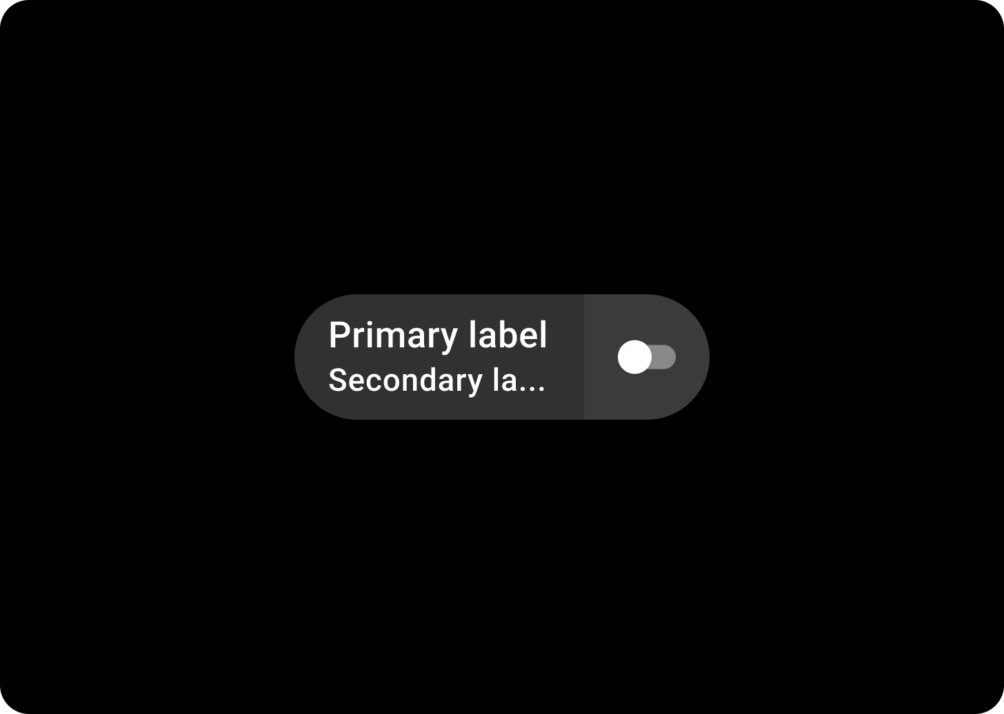
解剖学
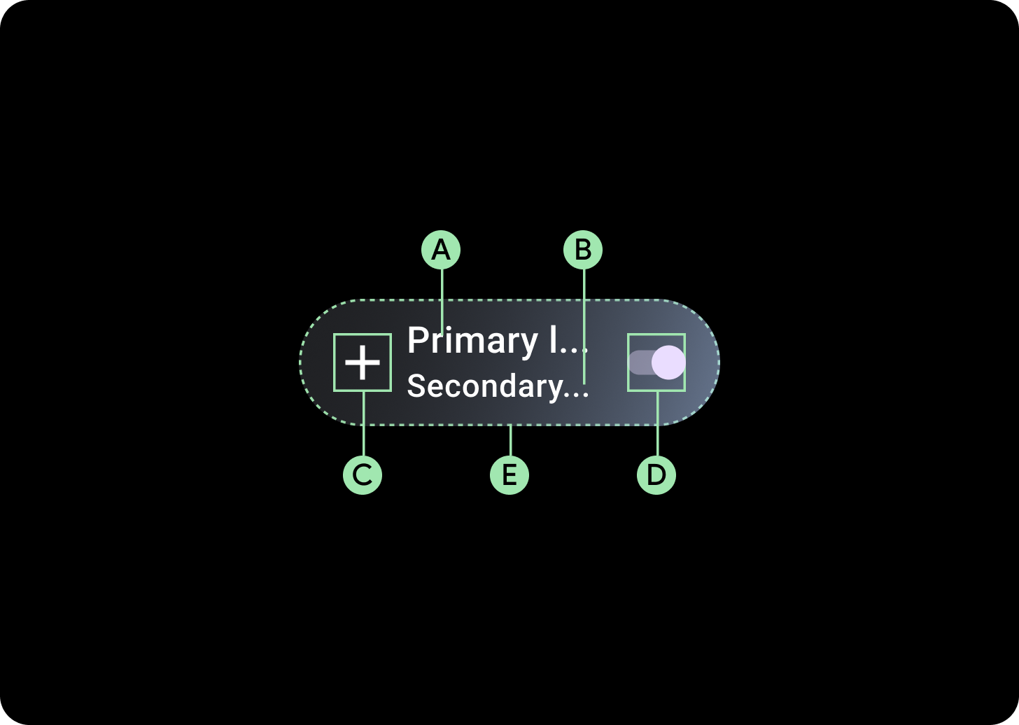
切换条状标签有四个槽位,可容纳两个文本标签、一个选择控件和一个应用图标。图标和次级标签是可选的。
A. 标签
B. 次级标签
C. 图标
D. 选择控制
E. 容器
切换条状标签渐变效果
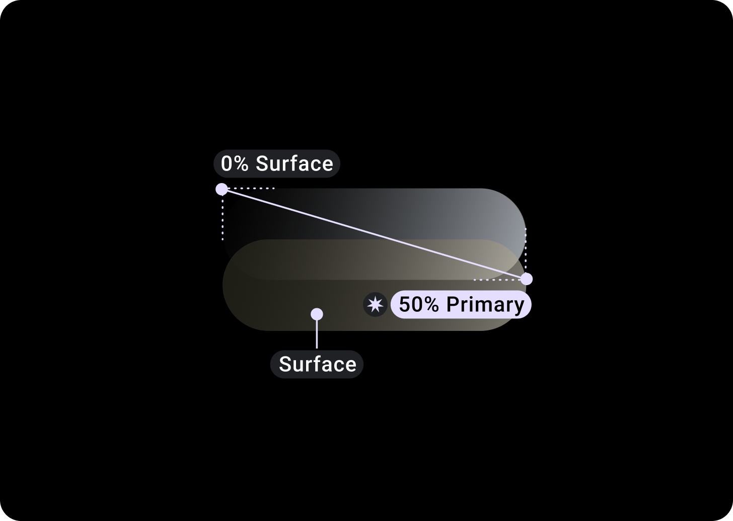
顶部/左侧 = 0% 表面
底部/右侧 = 50% 主要
(表面颜色背景上的渐变叠加层)
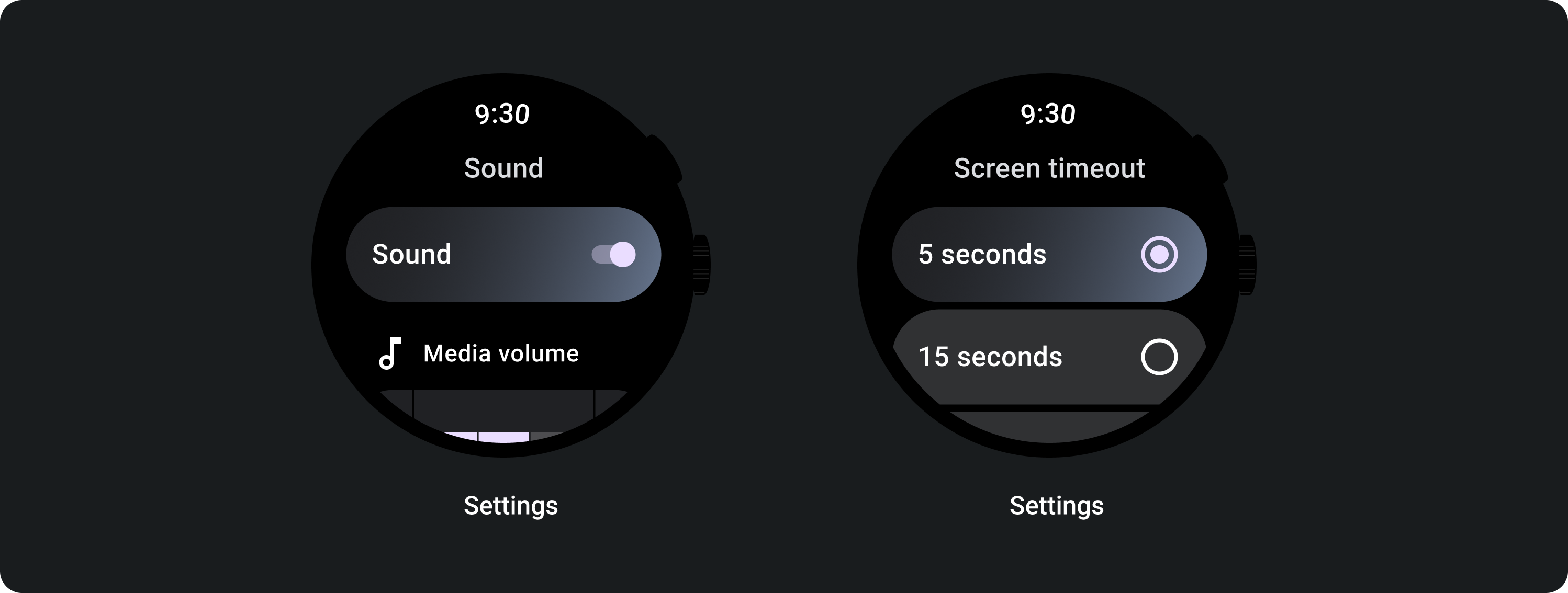
选择控件
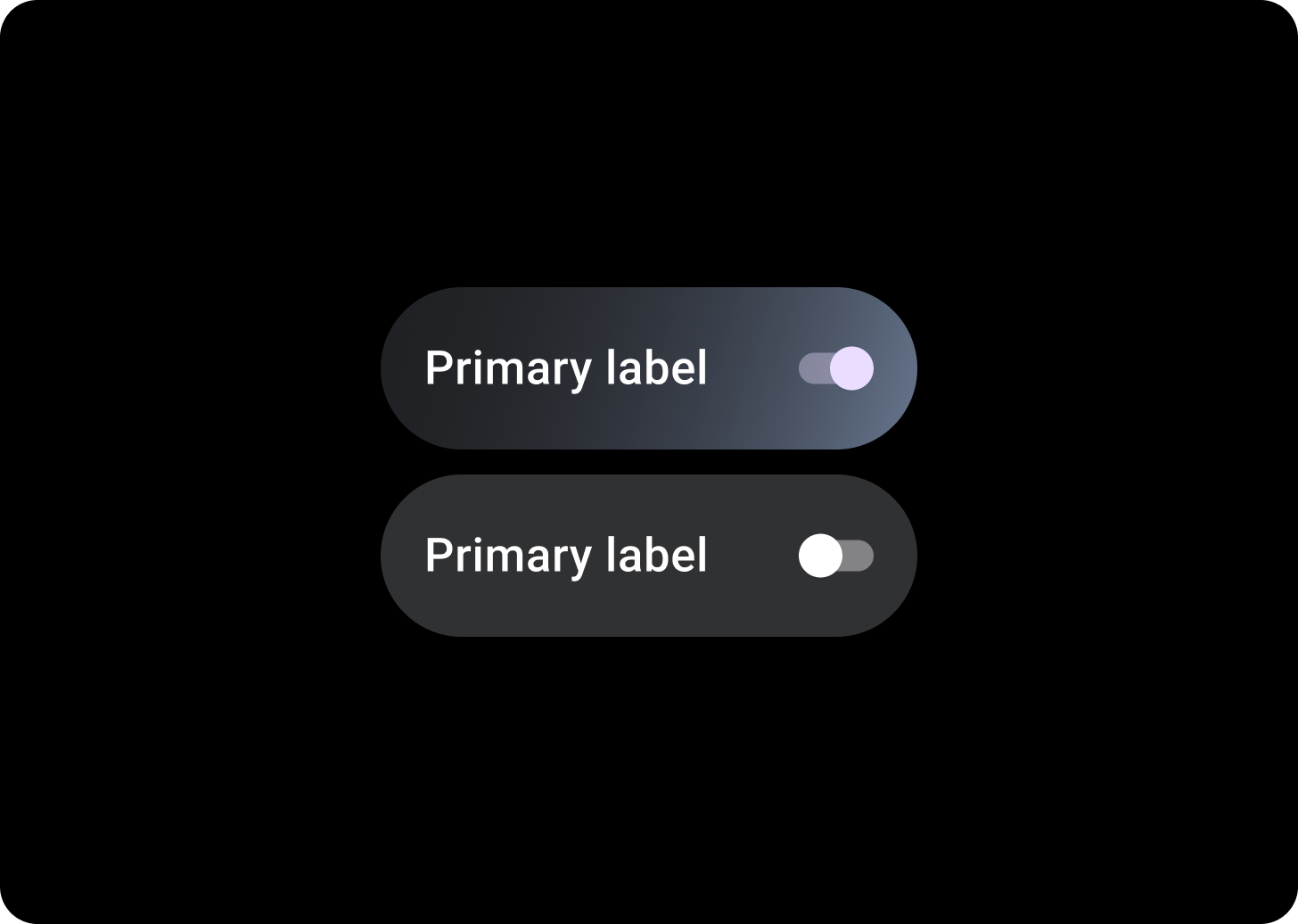
开关
开关用于开启或关闭选择。
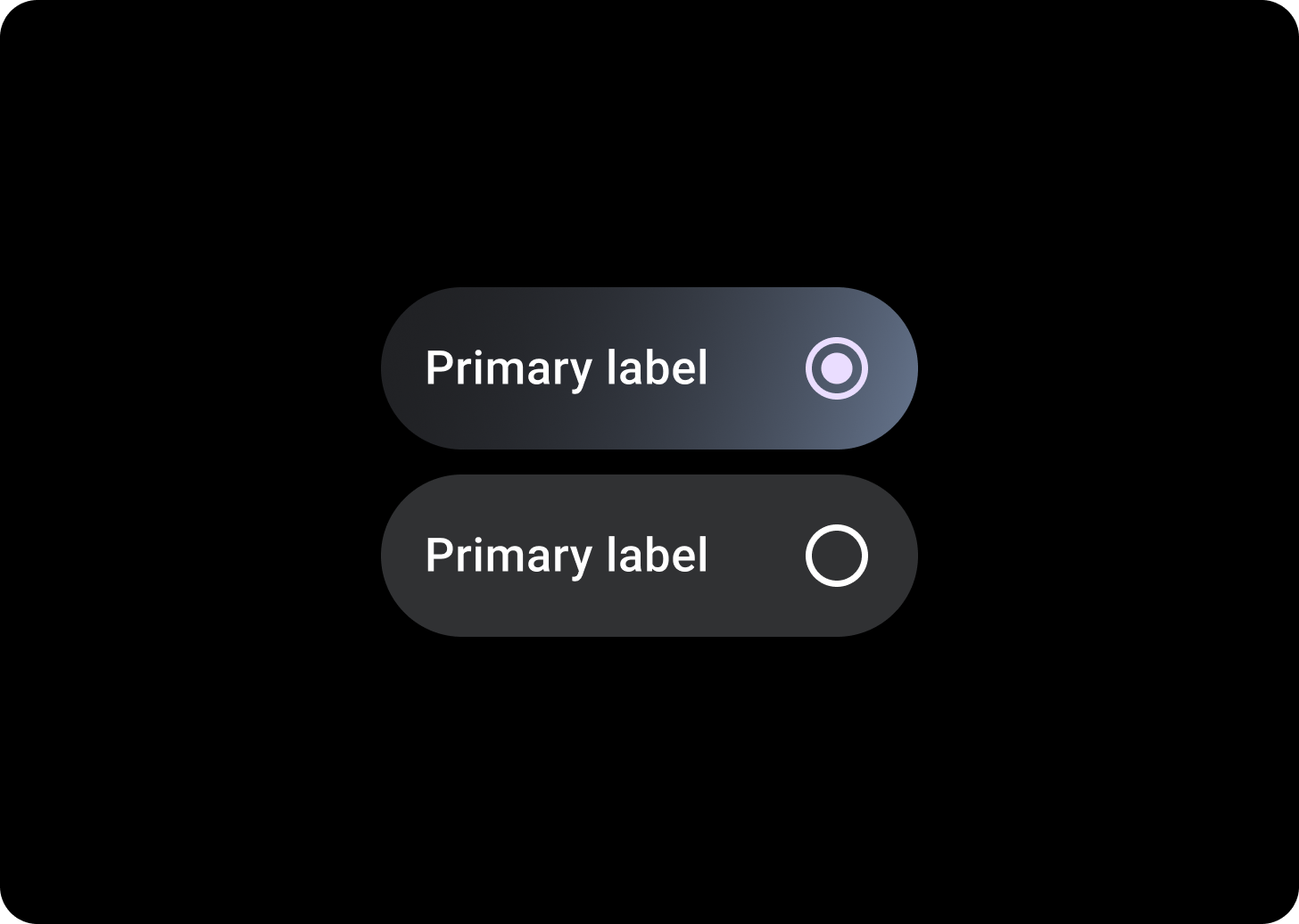
单选按钮
单选按钮适用于只能让用户选择一个选项的列表。

复选框
复选框适用于用户可以选择多个选项的列表。
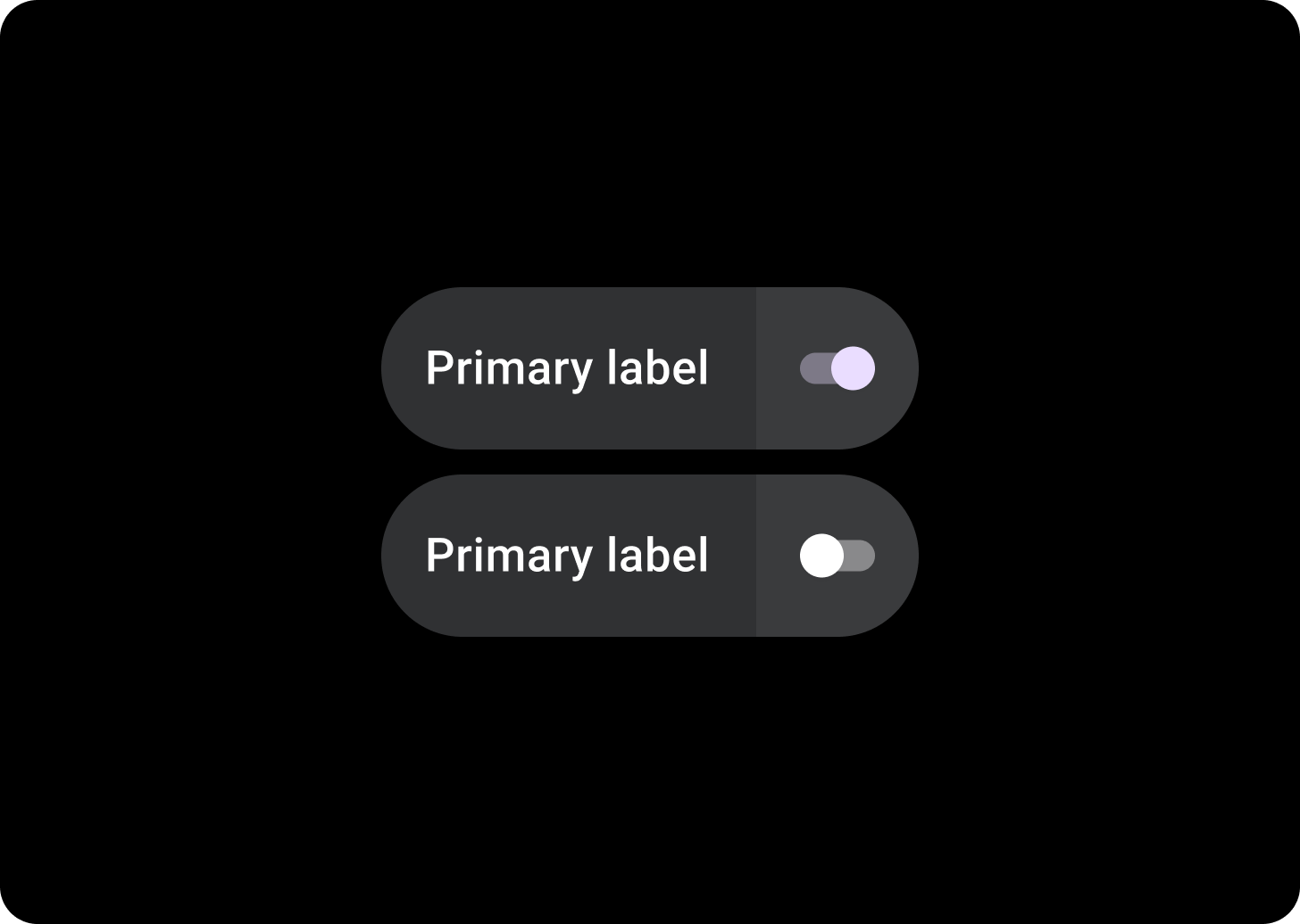
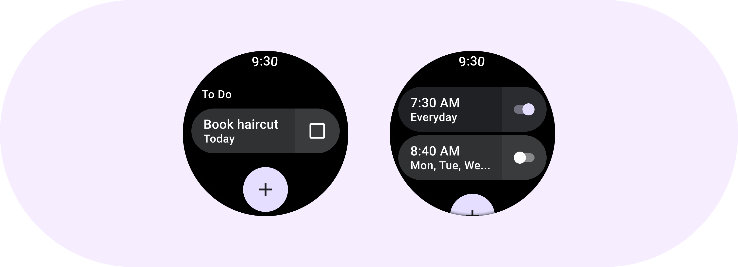
拆分式切换条状标签
如果您需要两个可点按区域,请使用拆分式切换条状标签。
相关组件
拆分 ToggleChips
SplitToggleChip 与 ToggleChip 的不同,因为它具有两个可点按区域,一个可点击,另一个包含切换开关。
在拆分式切换条状标签上,通过为各个部分采用不同的颜色来区分可点按的背景区域和切换控件。
使用方法
使用 ToggleChips,如以下示例所示。
自适应布局
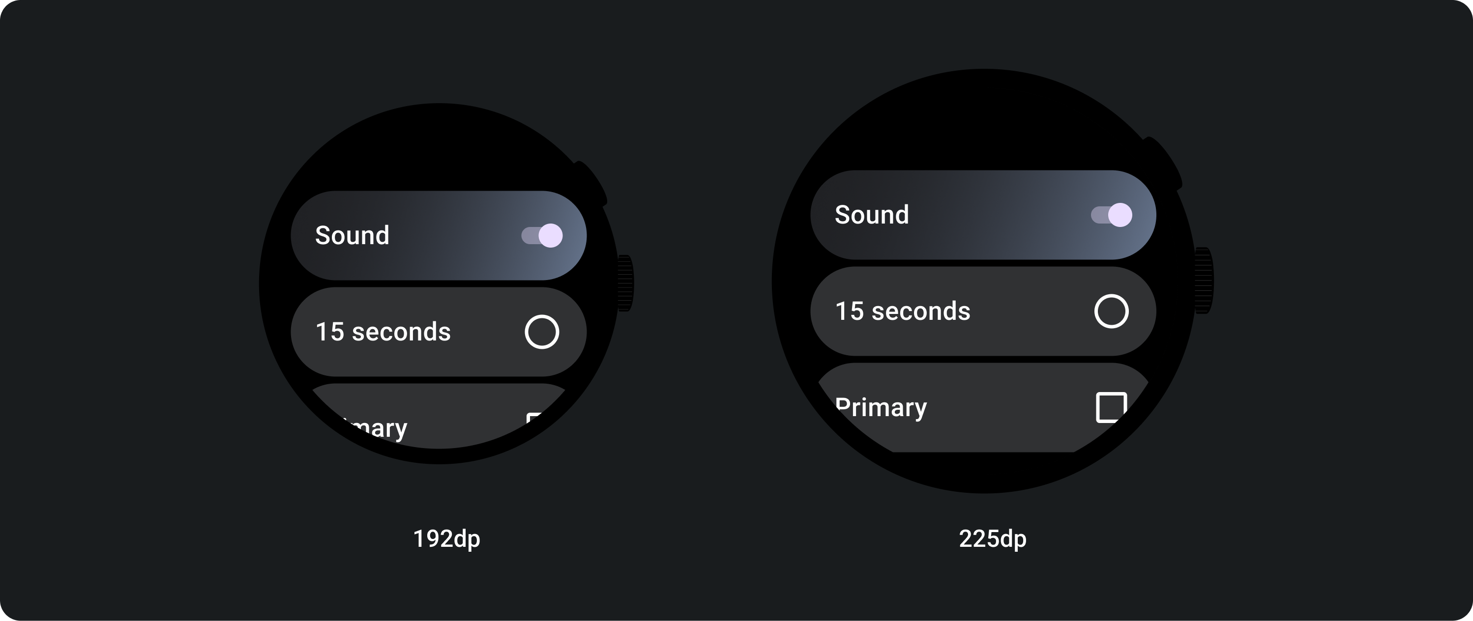
自适应行为
在较大的显示屏上,ToggleChips 会拉伸以填充可用宽度。
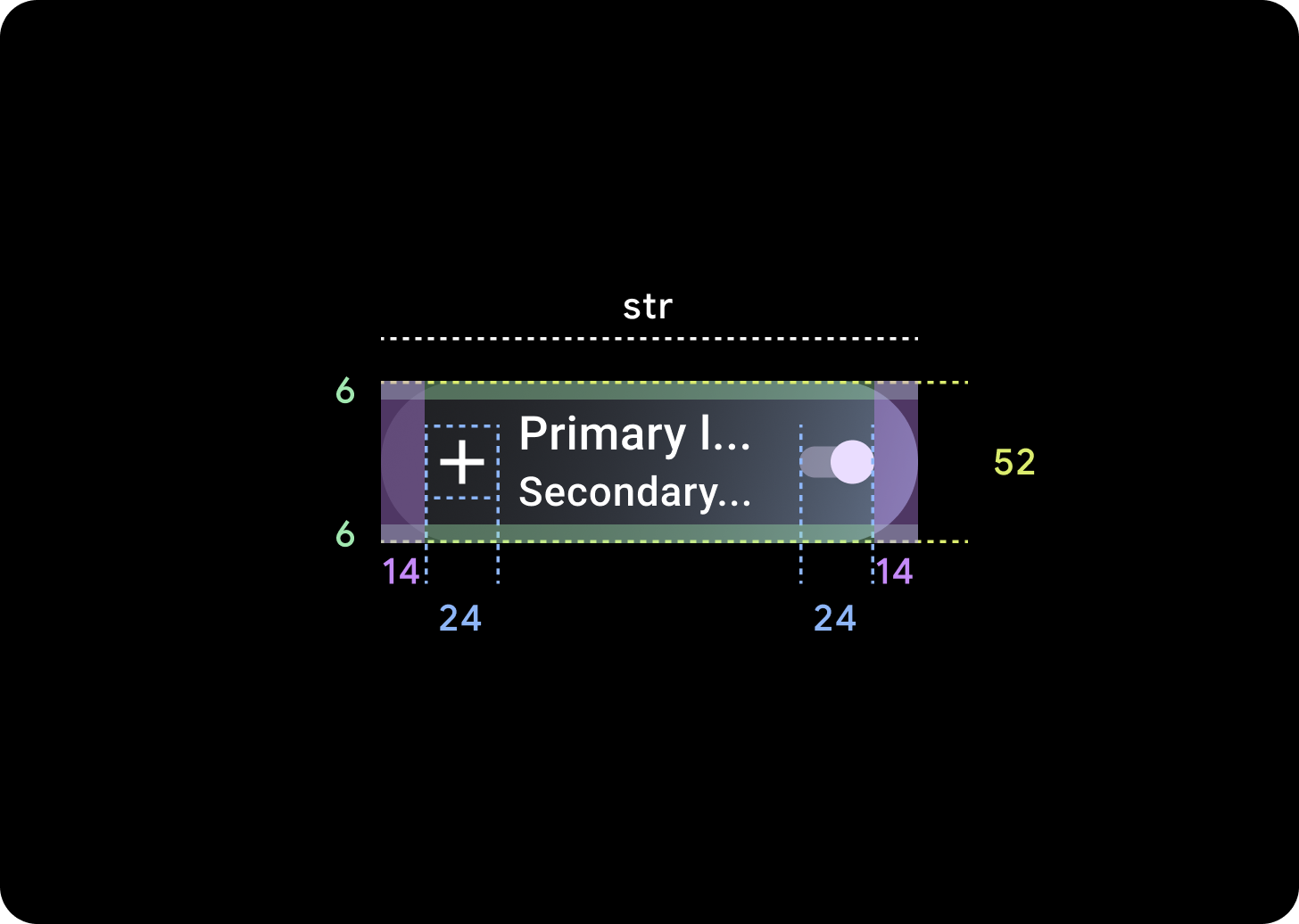
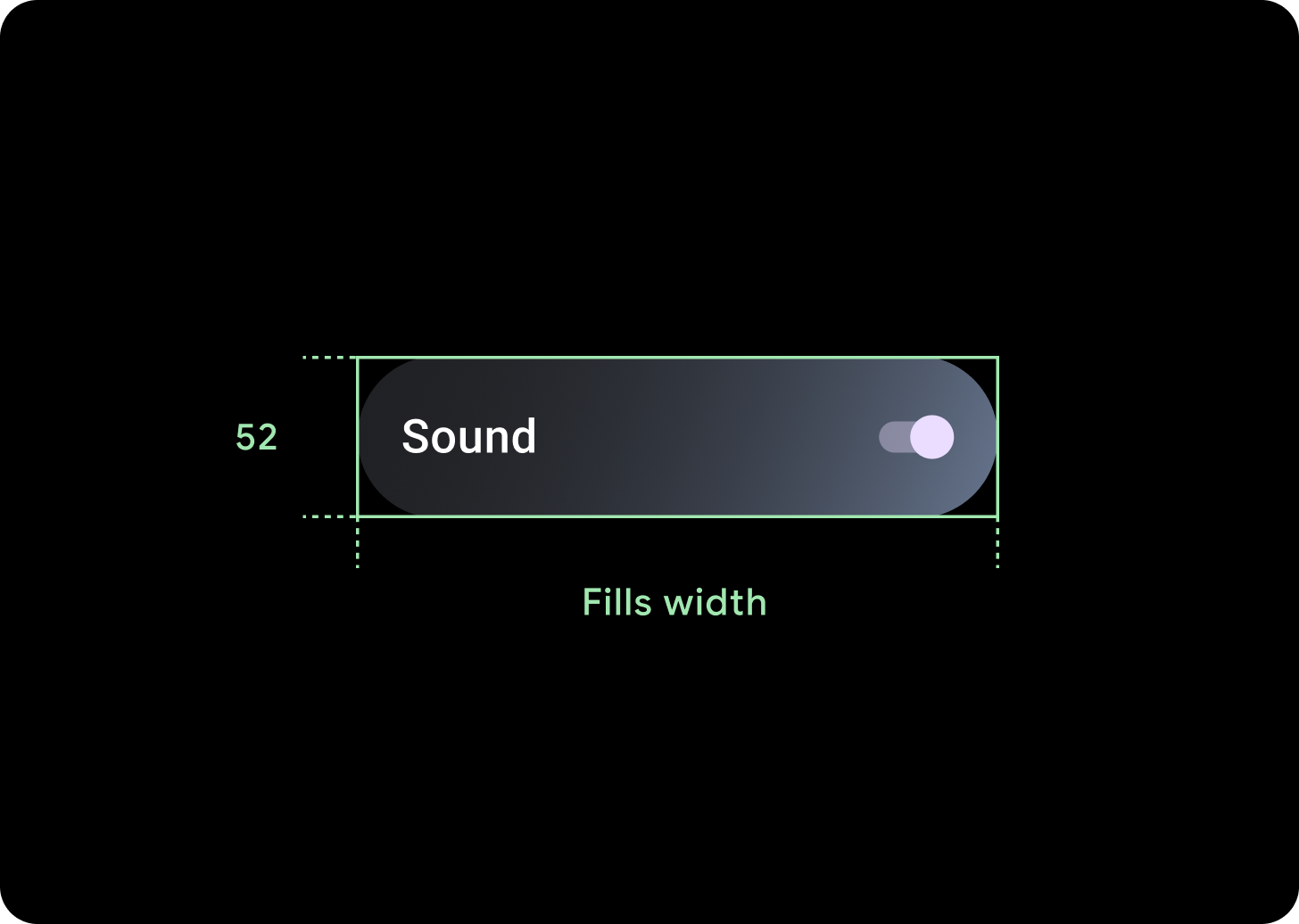
图标 (24 x 24 dp)
容器 (52 x XX dp)