第 2 层级:响应式且经过优化
使用集合让一切井井有条
根据您的偏好保存内容并对其进行分类。
采用自适应布局并能自动适应不同屏幕尺寸的应用可为用户带来更多价值,并提供更高效、更具吸引力的用户体验。
自适应布局可动态设置按钮、文本字段和对话框等元素的格式和位置,以提供最佳用户体验。通过采用自适应设计实践,在较大屏幕上自动为应用用户提供更多价值。无论是让用户一眼看到更多文字、在屏幕上执行更多操作,还是提供更大、更易于访问的点按目标,自适应做法都能为大屏设备用户带来更出色的体验。
通过自适应设计创造价值
check_circle
正确做法
- 使用具有内置响应式和自适应行为的 M3 Compose 组件库。
- 利用自适应布局,该布局可自动平稳地调整以填充各种屏幕尺寸的可用空间。
cancel
错误做法
- 拉伸界面元素(包括文本字段、按钮、对话框)以填充多余的空间。
- 增大字体大小,除非字体主要用于图形目的。
示例
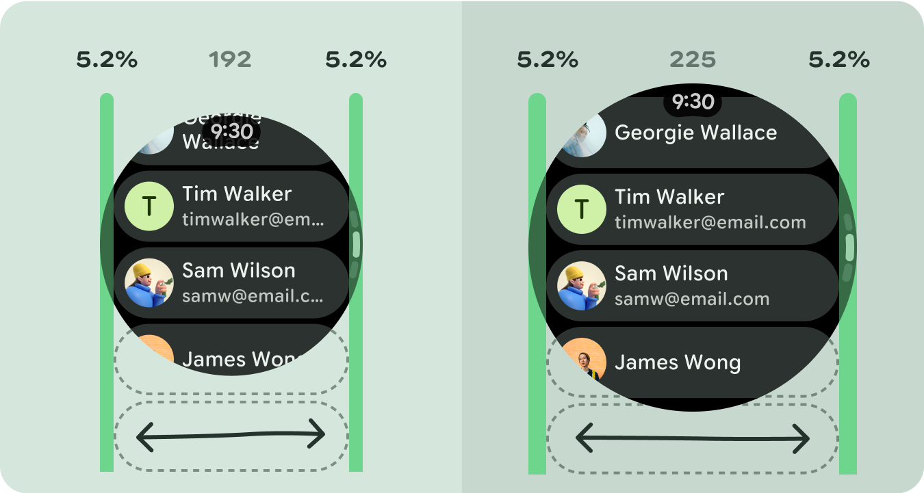
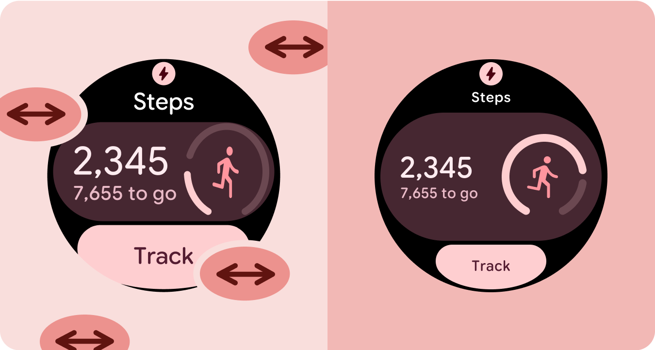
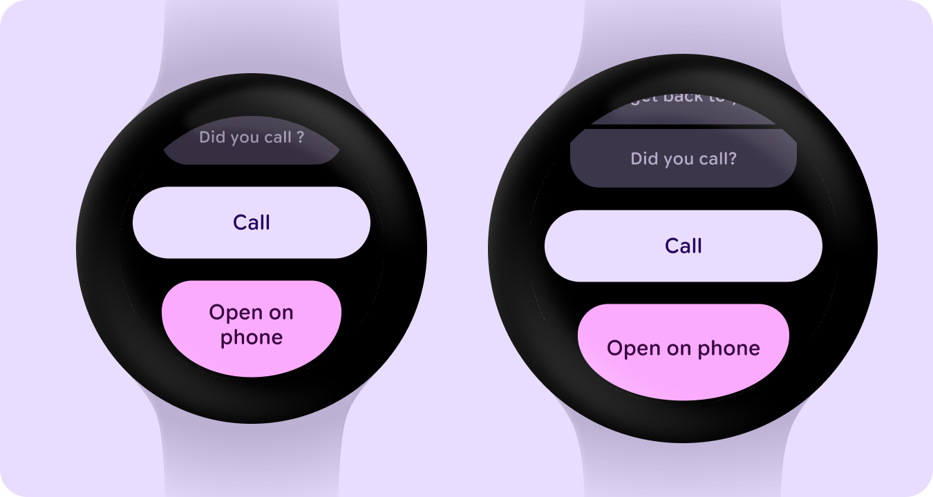
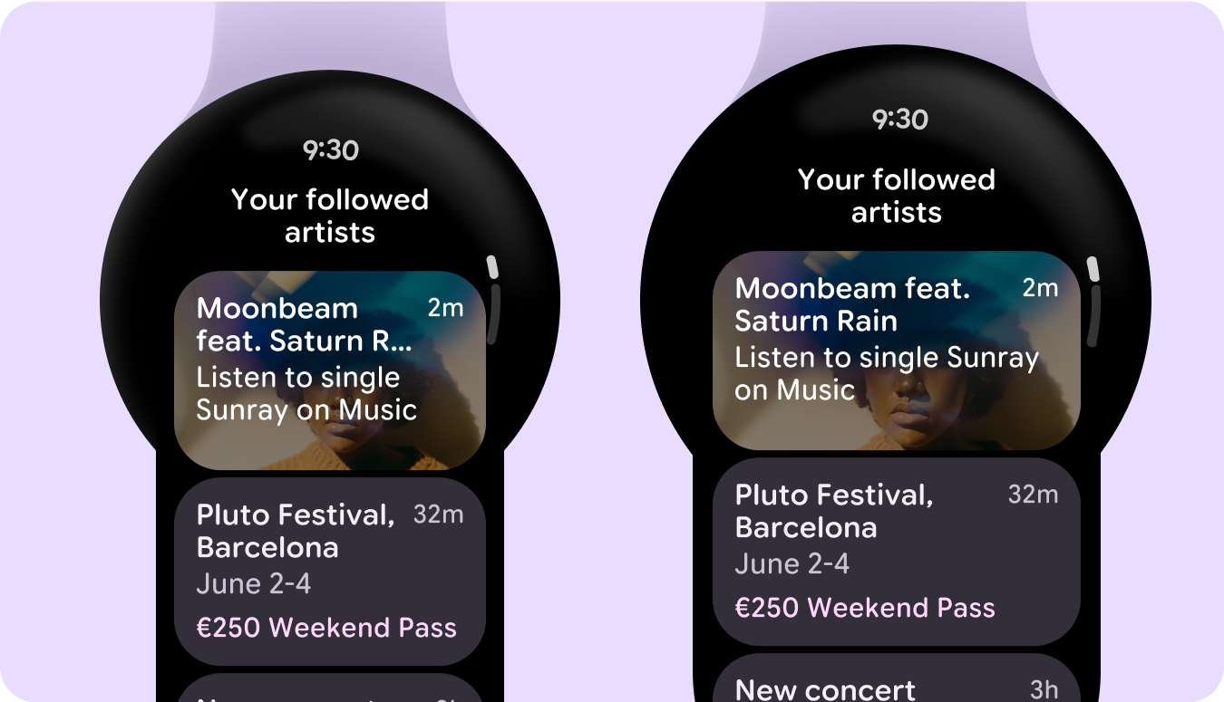
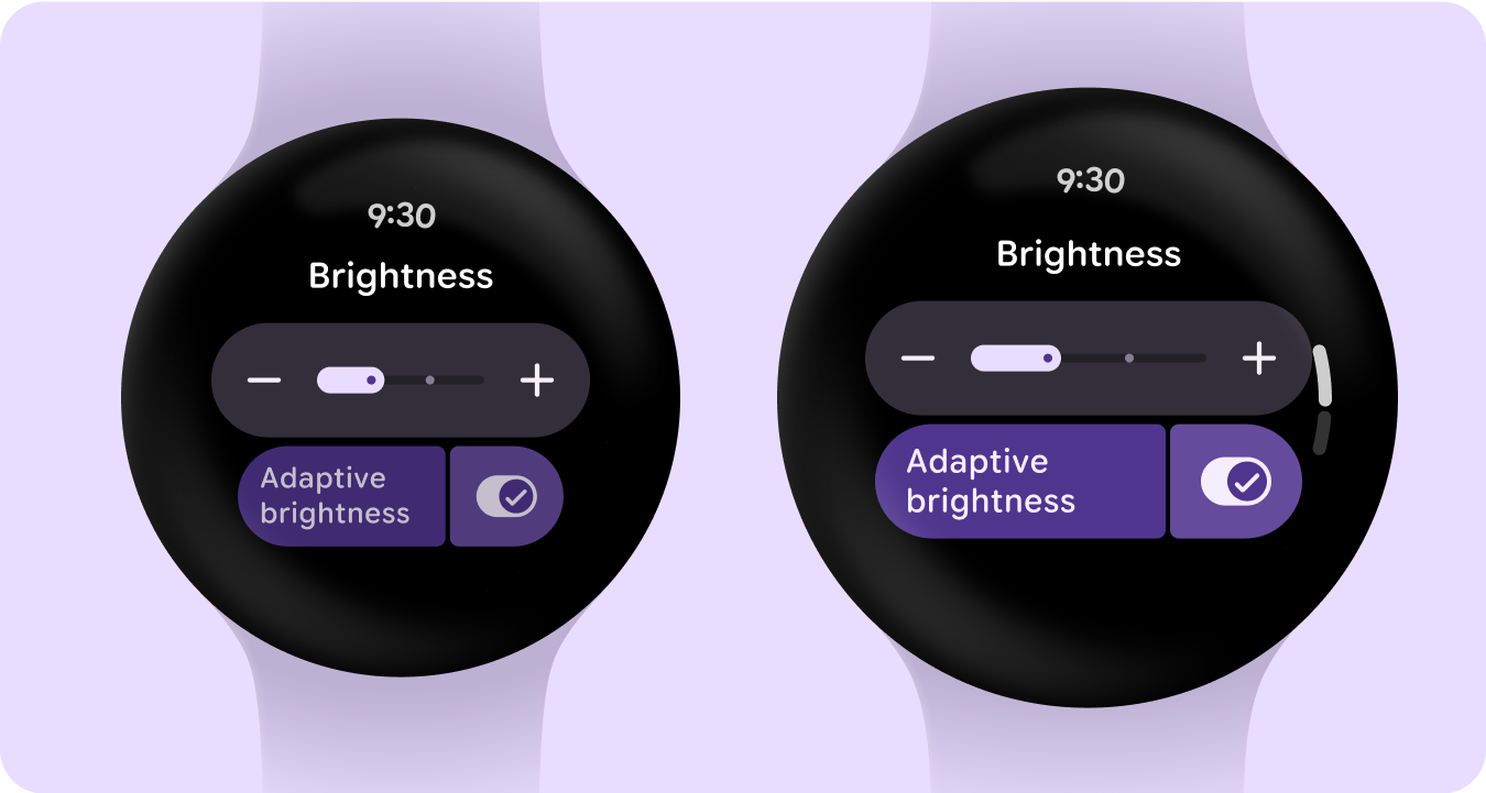
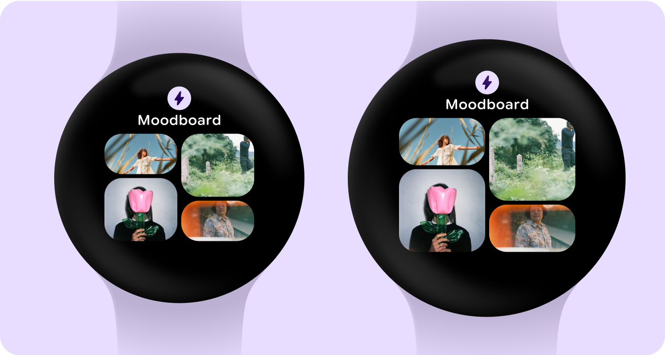
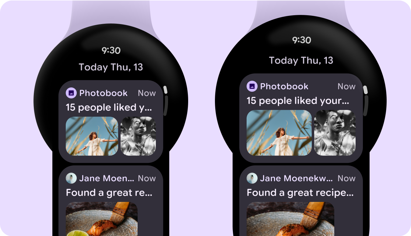
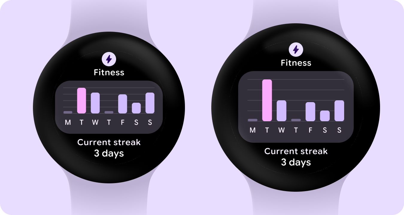
以下图片展示了自适应且经过优化的应用示例。
本页面上的内容和代码示例受内容许可部分所述许可的限制。Java 和 OpenJDK 是 Oracle 和/或其关联公司的注册商标。
最后更新时间 (UTC):2025-07-27。
[[["易于理解","easyToUnderstand","thumb-up"],["解决了我的问题","solvedMyProblem","thumb-up"],["其他","otherUp","thumb-up"]],[["没有我需要的信息","missingTheInformationINeed","thumb-down"],["太复杂/步骤太多","tooComplicatedTooManySteps","thumb-down"],["内容需要更新","outOfDate","thumb-down"],["翻译问题","translationIssue","thumb-down"],["示例/代码问题","samplesCodeIssue","thumb-down"],["其他","otherDown","thumb-down"]],["最后更新时间 (UTC):2025-07-27。"],[],[],null,["# Tier 2: Responsive and optimized\n\nApps that employ responsive layouts and automatically adapt to different screen\nsizes offer additional value to users and provide more productive, engaging user\nexperiences.\n\nResponsive layouts dynamically format and position elements such as buttons,\ntext fields, and dialogs for an optimal user experience. Automatically offer\nusers of your app additional value on larger screens by utilizing responsive\ndesign practices. Whether it's more text visible at a glance, more actions on\nscreen, or larger, more accessible tap targets, responsive practices provide an\nenhanced experience for users of larger screens.\n\nAdd value through responsive design\n-----------------------------------\n\ncheck_circle\n\n### Do\n\n- Use the M3 Compose component library which has built-in responsive and adaptive behavior.\n- Utilize responsive layouts, which automatically and smoothly adjust to fill the available space across screen sizes. \ncancel\n\n### Don't\n\n- Stretch UI elements---including text fields, buttons, dialogs---to fill extra space.\n- Increase the sizes of fonts, unless they're serving a primarily graphic purpose.\n\nExamples\n--------\n\nThe following images show examples of apps that are responsive and optimized.\n\n\n### Edge-hugging buttons\n\n\u003cbr /\u003e\n\n\n### List of cards\n\n\u003cbr /\u003e\n\n\n### List of switchers and buttons\n\n\u003cbr /\u003e\n\n\n### Tile with image cards\n\n\u003cbr /\u003e\n\n\n### List of cards with images\n\n\u003cbr /\u003e\n\n\n### Tile with graph\n\n\u003cbr /\u003e"]]