

A minimum quality bar for experiences across all screen sizes on Wear OS
The first step in creating a great app for Wear OS is making your app ready for all screen sizes. This means testing your app across a range of target screen sizes and identifying and fixing any obvious bugs.
At this stage, your app's layout might not be ideal, but the app doesn't have obvious visual or interaction issues, and users can complete all task flows.
Common issues to look out for
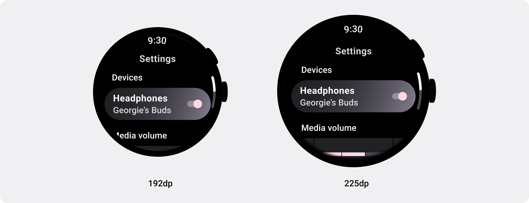
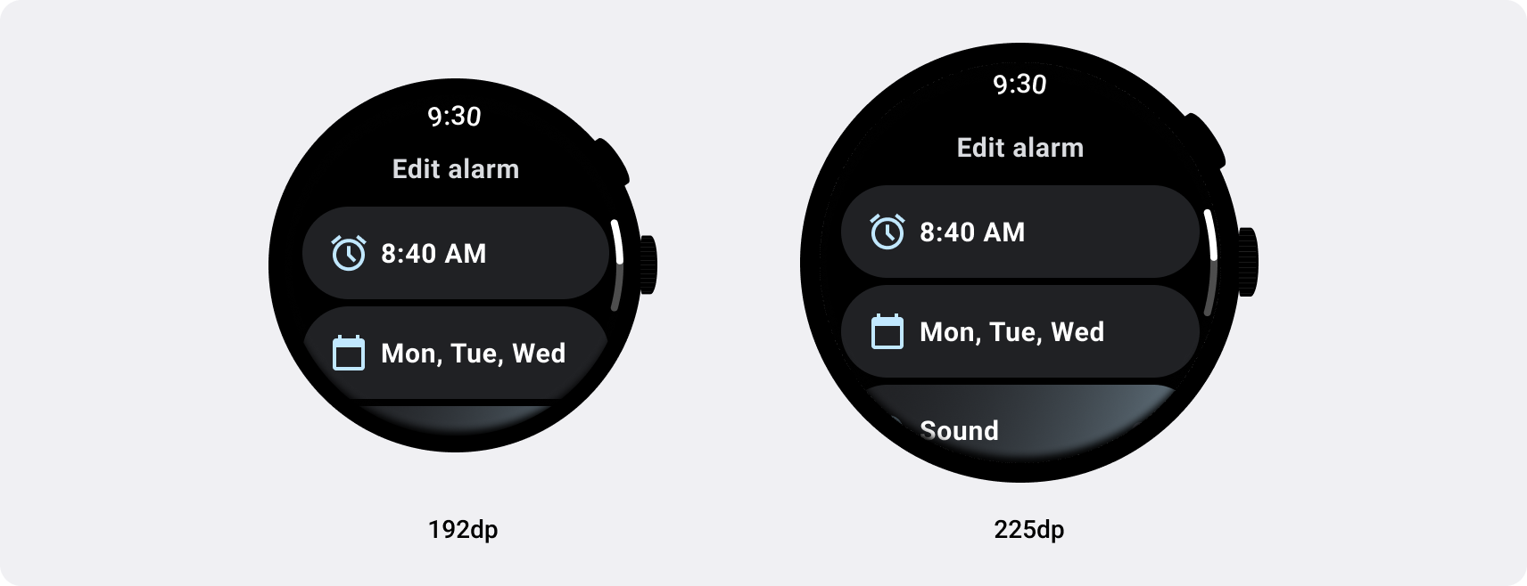
- Issues with top, bottom, and or side margins
- Clipping of text, buttons, or other components
- Improper component adaptation
- Inconsistent scaling of UI elements
Best practice
Check to make sure your app has no obvious bugs across screen
sizes.

Watch out for
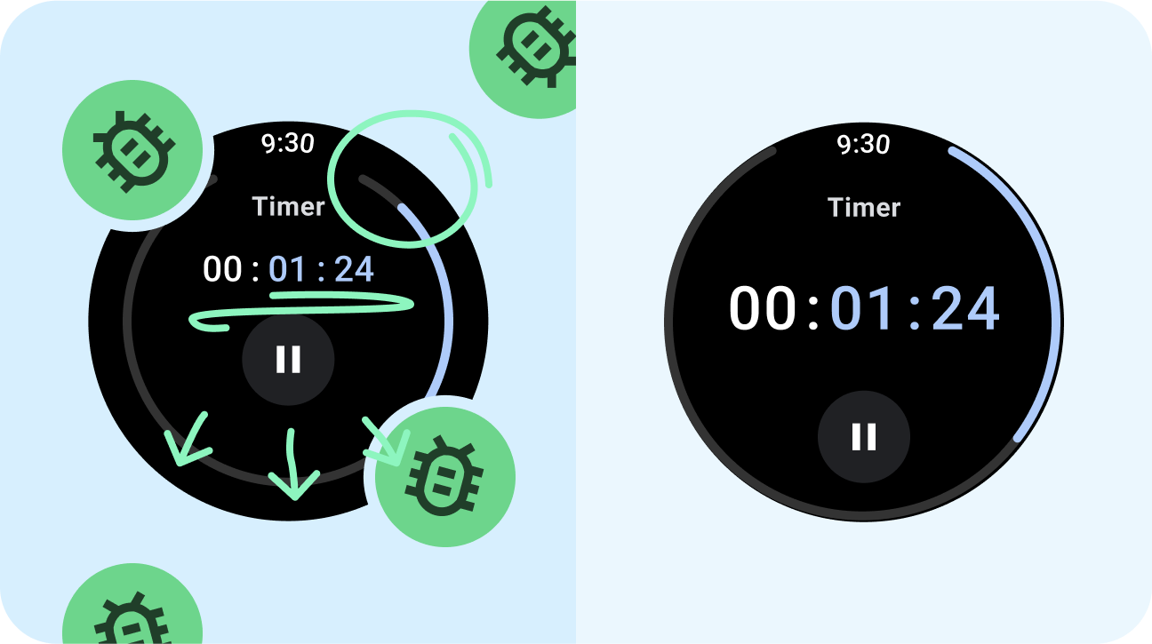
- Awkward alignments or spacing.
- Proportionally scaling up the UI contents.
Next step: responsive and optimized

Apps that are responsive and optimized utilize responsive layouts that automatically adapt to different screen sizes, offering some additional value to users and providing a productive, engaging user experience.