

Apps that are adaptive and differentiated create a user experience that isn't possible on devices with smaller screens.
These apps use new layouts, implemented at a key screen size breakpoint, to derive additional value for users of devices with larger screens, enabling a user experience that devices with smaller screens can't match.
Add value by applying new layouts and templates
Adaptive layout differentiated apps follow adaptive design practices but also utilize breakpoints to apply different layouts and create an even richer experience for users of devices with substantially larger screens, as shown in the following examples:
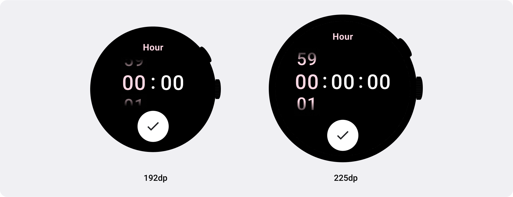
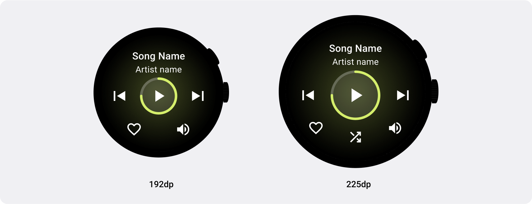
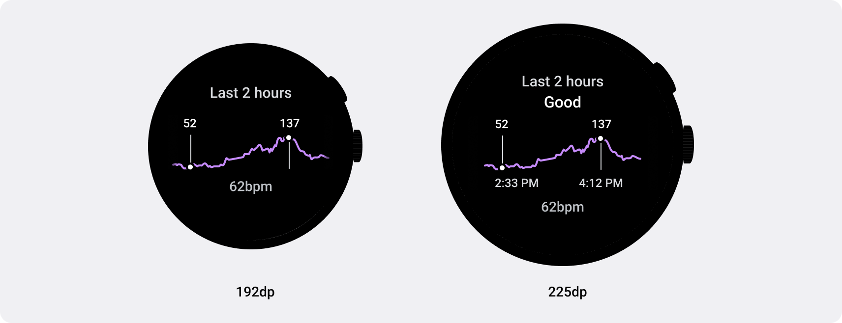
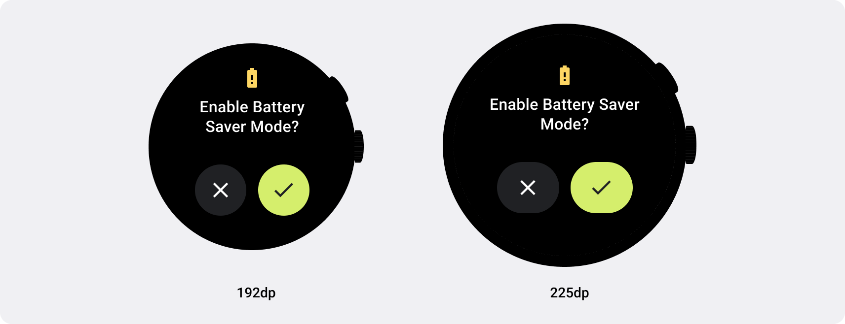
Use breakpoints on Wear OS
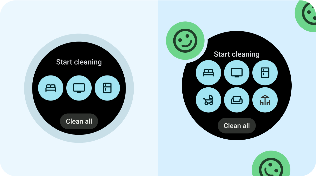
Utilizing a breakpoint at 225 dp can help optimize layouts across a range of sizes.
See the Compose and Tiles implementation guidance for differentiated layouts.
Do
- Think big.
- Design custom layouts and behaviors at 225 dp and larger.
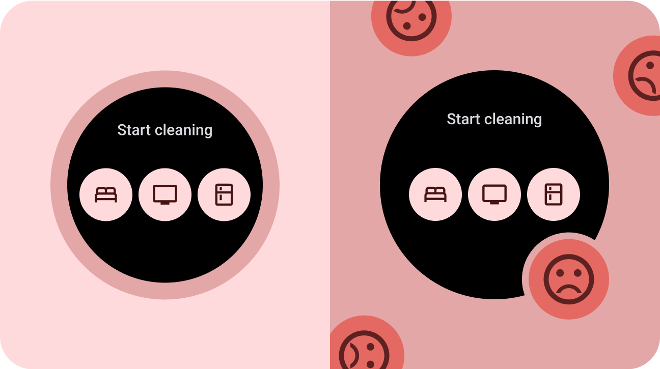
Don't
- Settle for less.
- Design for just one device size.
- Let your app be unremarkable.