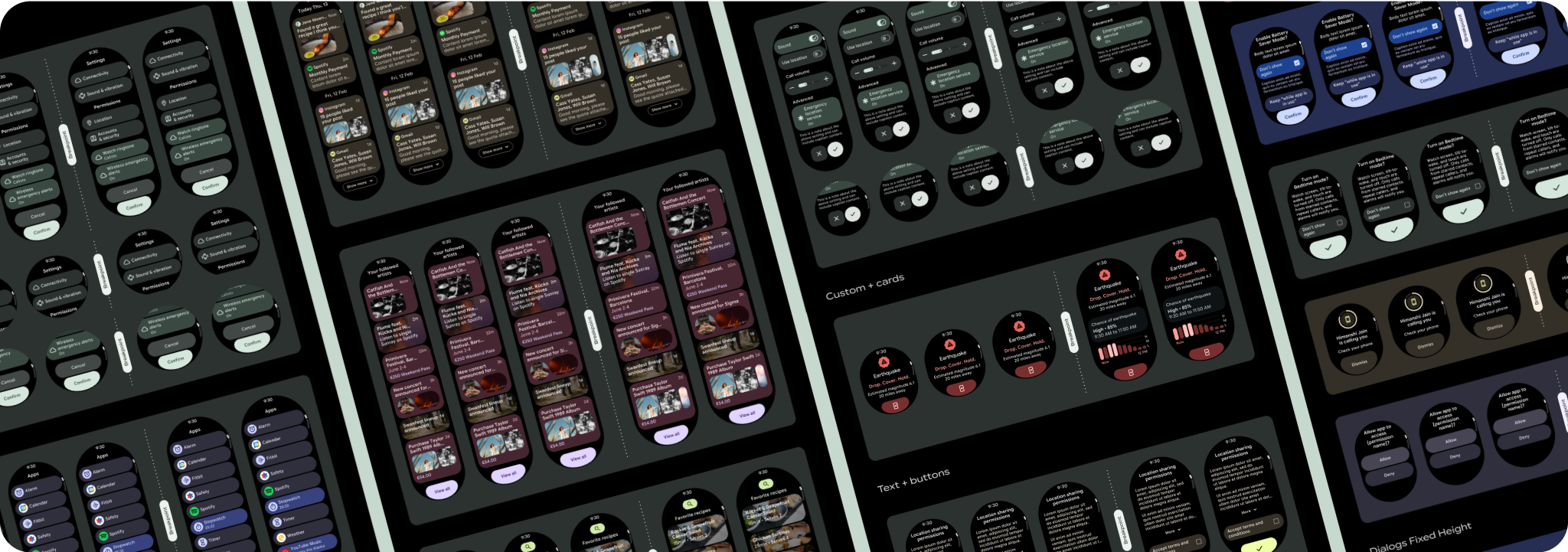
滚动式应用的常见布局
使用集合让一切井井有条
根据您的偏好保存内容并对其进行分类。
可滚动应用视图布局包括列表 (TransformingLazyColumn
) 和对话框。这些布局构成了大多数应用屏幕,它们代表了需要适应更大屏幕尺寸的一系列组件。检查组件是否响应灵敏,即它们是否会填充可用的宽度,并在屏幕的高度可用时采用 TransformingLazyColumn
调整。这些布局已经采用响应式设计,我们还提供了一些其他建议,以便您进一步利用扩大的展示空间。

制作自适应且经过优化的设计
为了帮助您的设计布局适应更大的屏幕尺寸,我们更新了布局和组件的行为,使其具有内置的自适应行为,包括基于百分比的内边距和内边距。为解决此问题,我们更新了 Android 界面库布局和组件,使其具有内置的自适应行为,包括基于百分比的内边距和内边距。如果您使用的是我们的 Compose 组件,则可以自动继承这种响应能力。
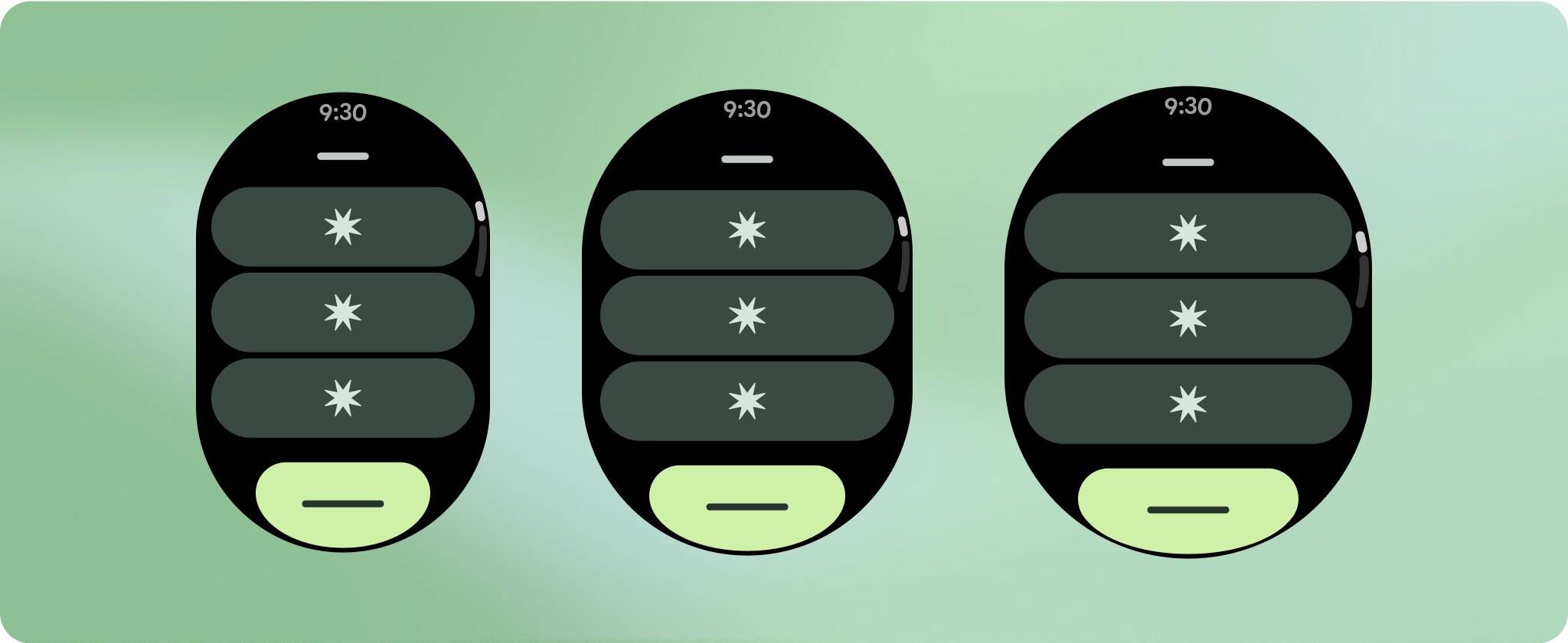
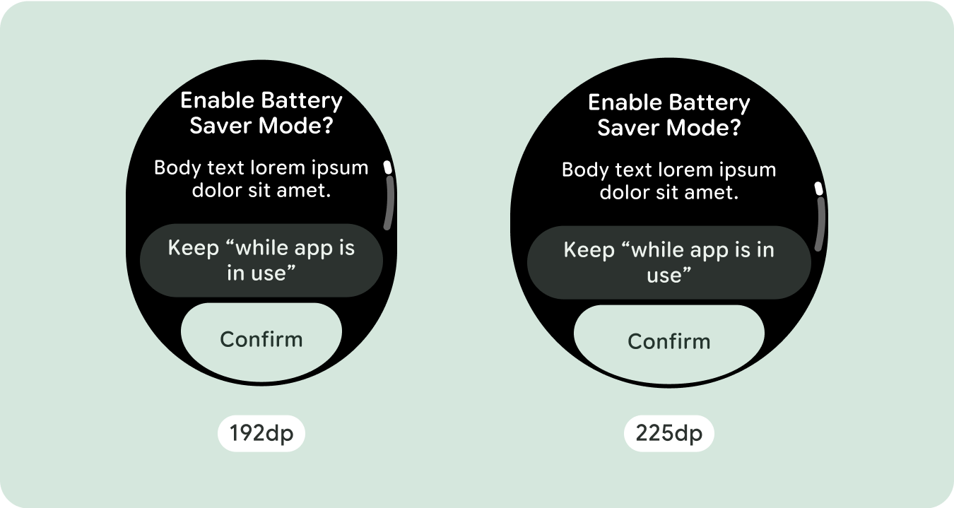
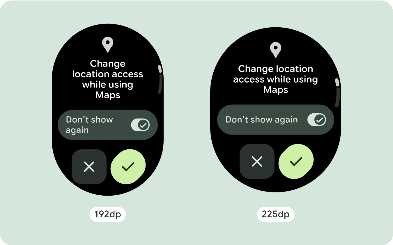
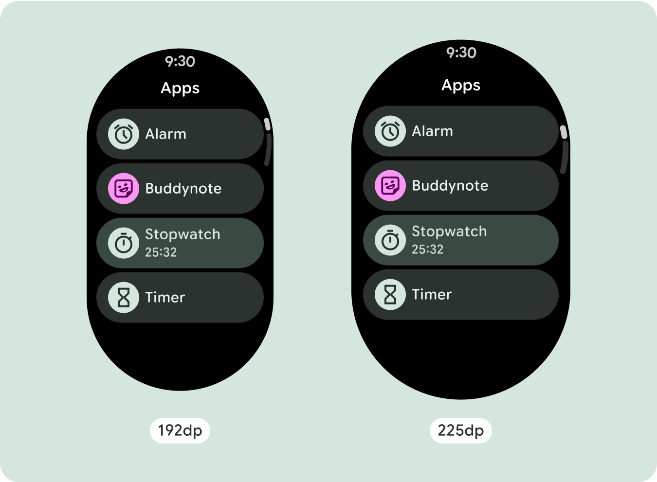
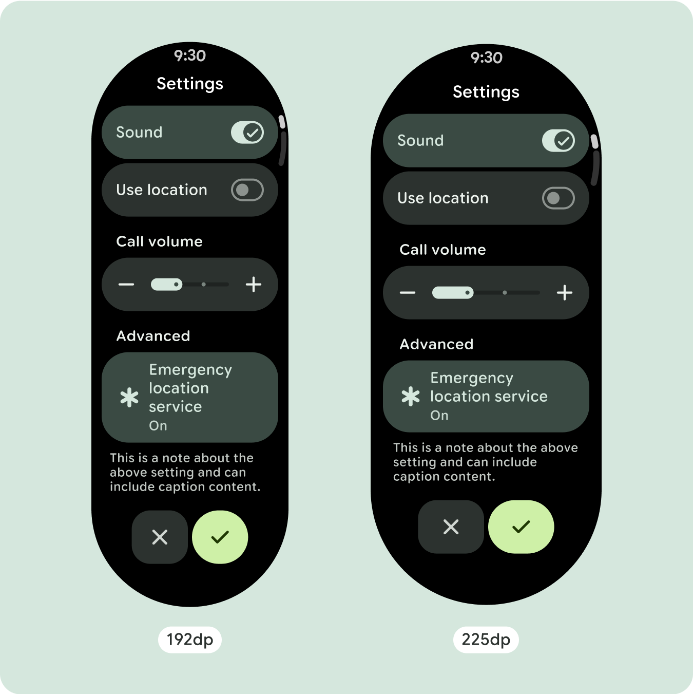
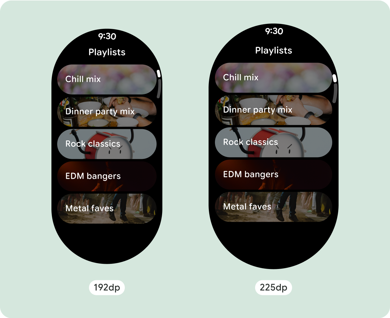
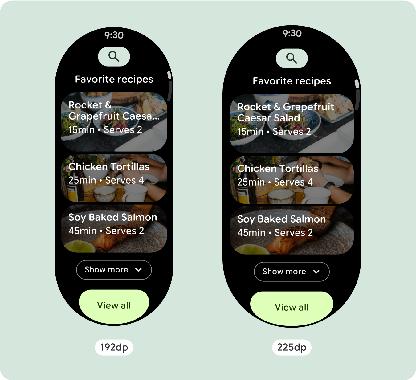
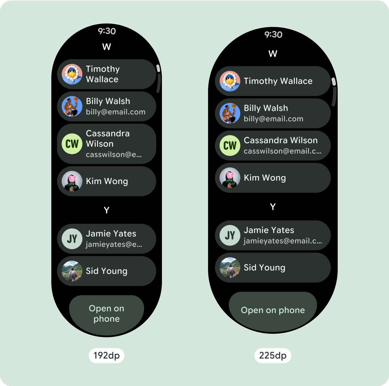
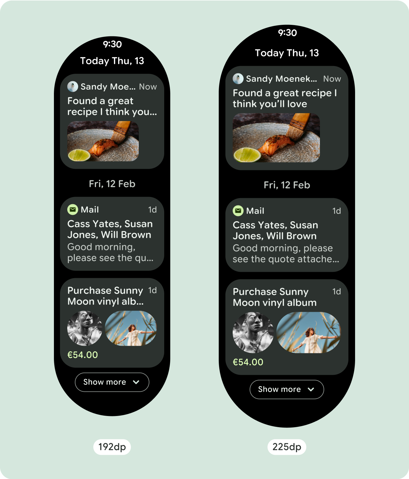
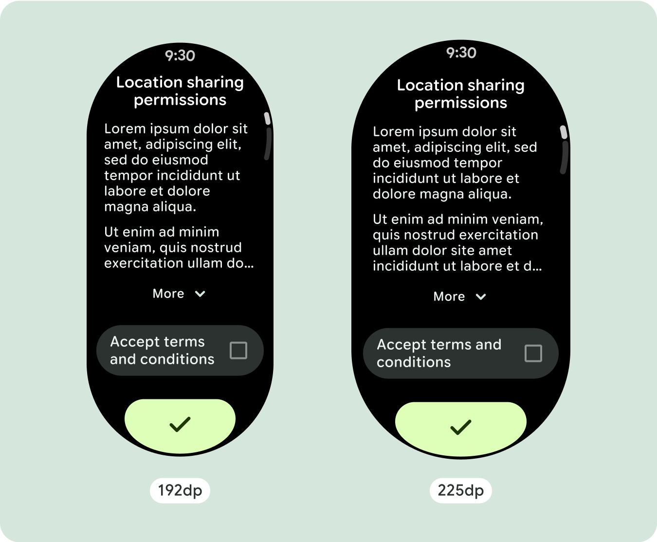
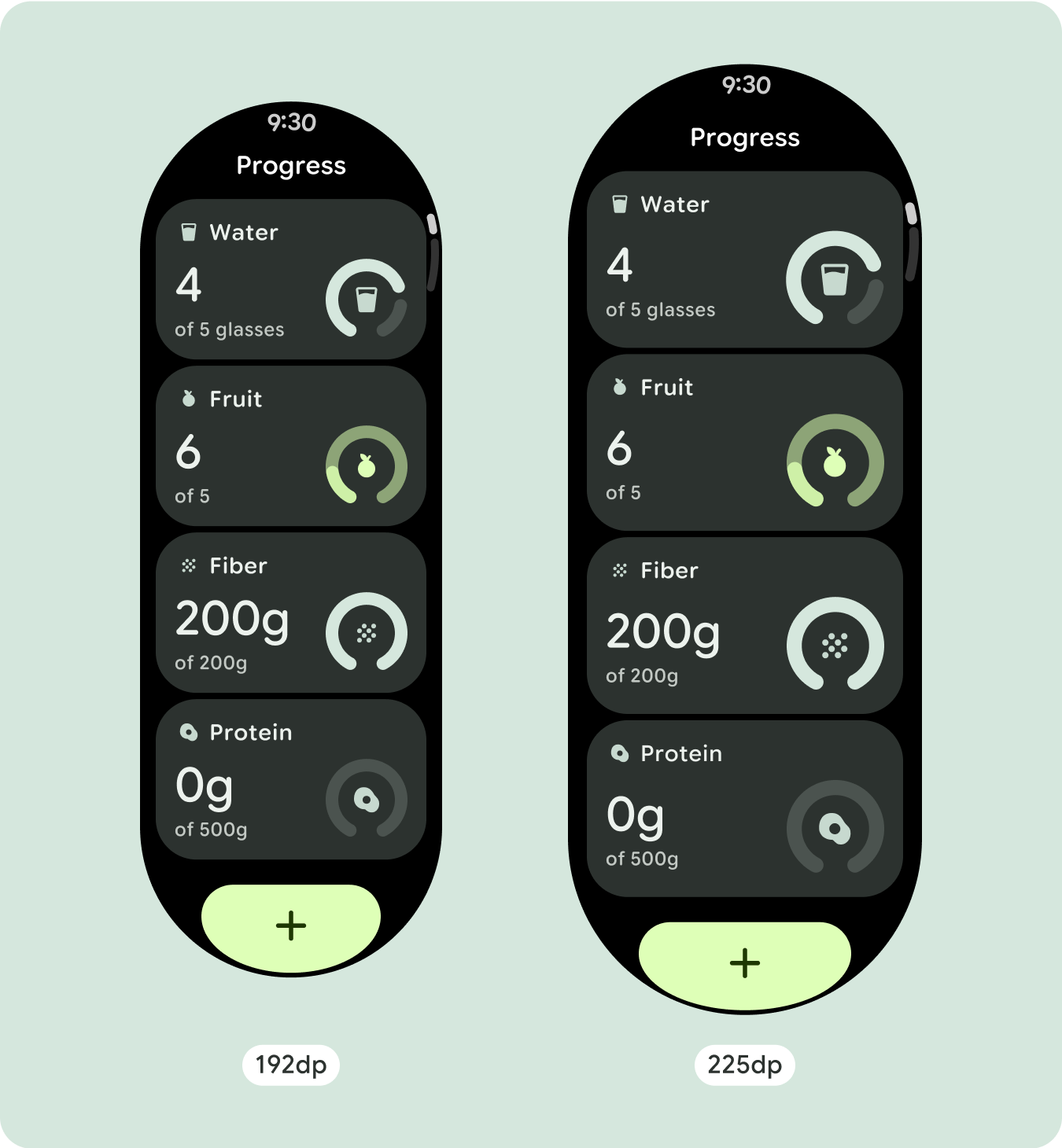
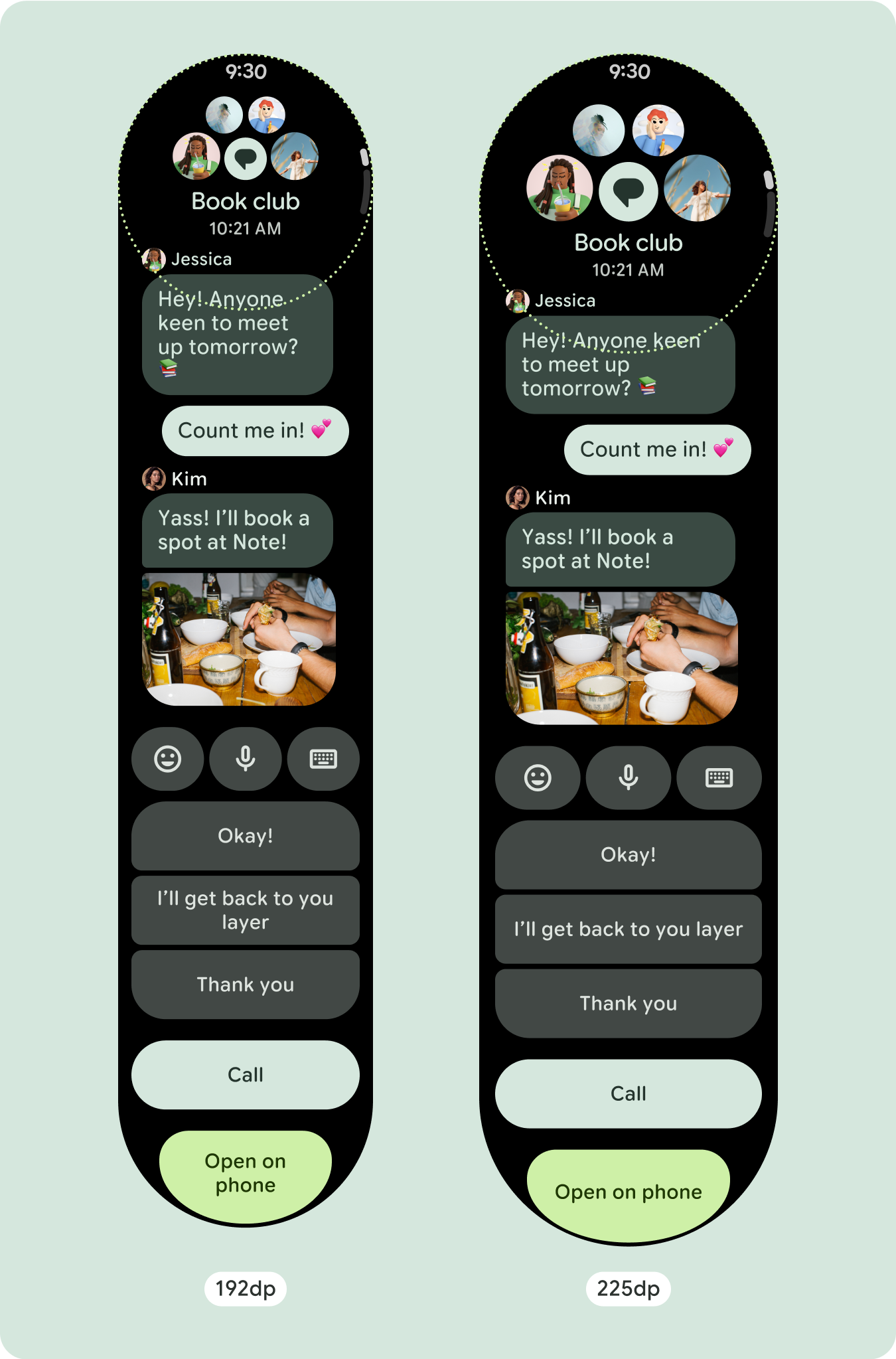
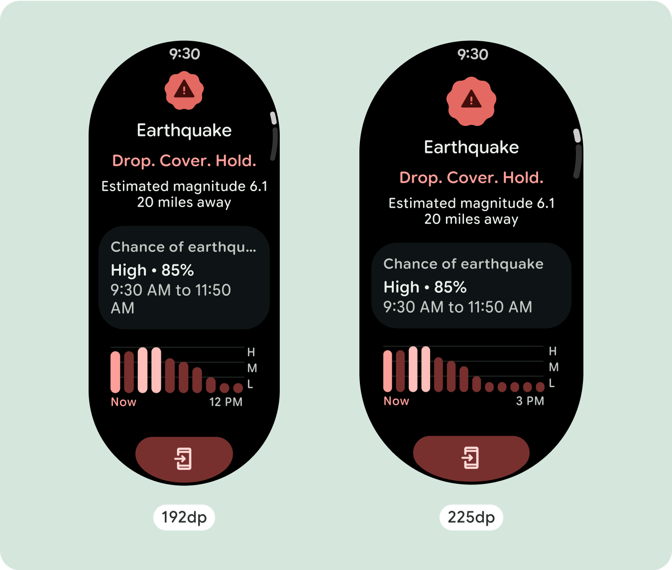
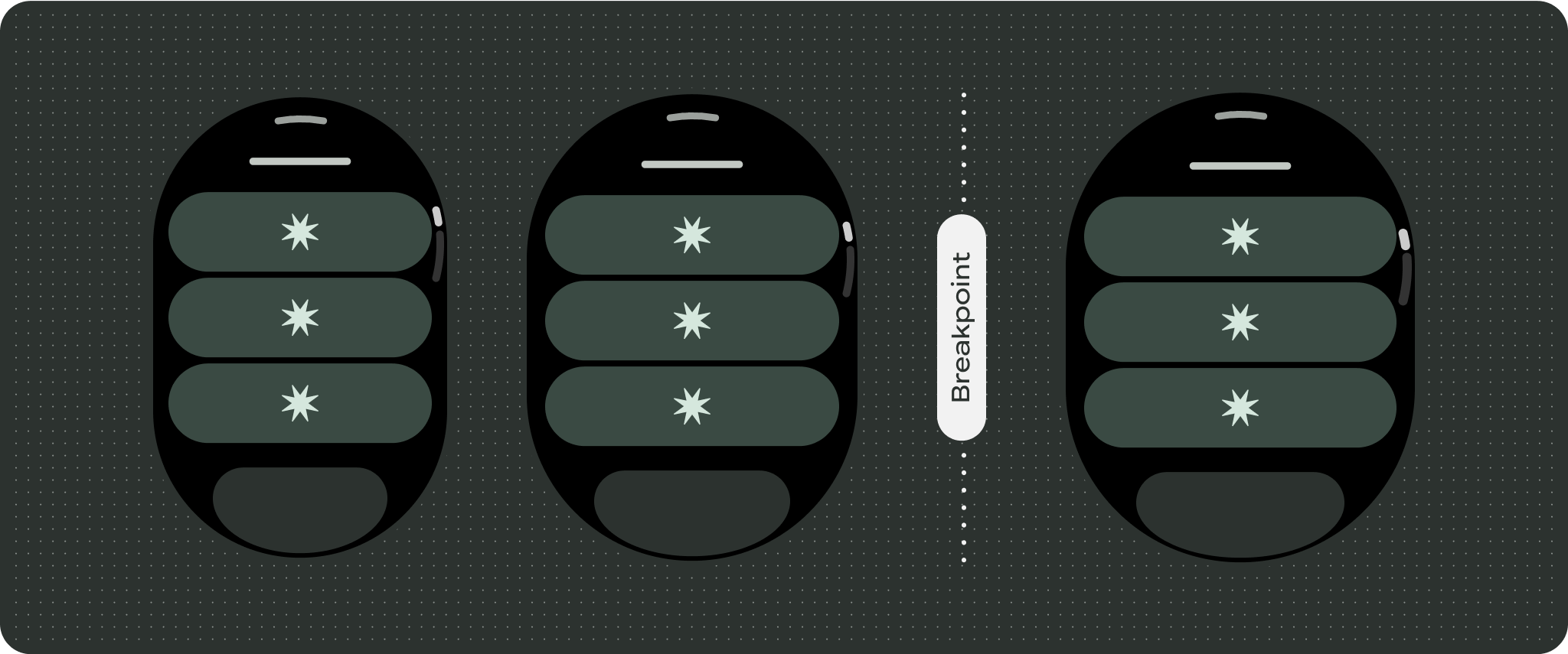
对于独特的屏幕设计,请在各种屏幕尺寸上进行全面测试,确保组件和元素能够顺畅自适应,并避免内容被剪裁。百分比边距有助于有效缩放分隔符,我们建议在 225dp 处使用断点,以便在较大的手表屏幕上显示更多信息和增强功能。
检查组件是否填满了可用宽度
所有组件均采用响应式设计,这意味着它们会填充可用的宽度和高度。请确保您设置了必要的外边距,以确保内容不会被圆角屏幕剪裁。
显示其他文本字符
大多数组件都有文本框,可填充可用宽度。也就是说,随着屏幕宽度的增加,它们会自动增加字符数。
构建自适应且差异化的设计
由于滚动布局会自动显示之前隐藏在屏幕折叠处下方的更多内容,因此您无需执行太多操作即可增强价值。每个组件都会填充可用宽度,在某些情况下,组件可能会增加文本行数(例如卡片),或者组件会伸展以填充可用宽度(例如图标按钮)。
为了充分利用大屏幕尺寸的额外空间,请在 225dp 处添加尺寸断点。借助此断点,您可以显示更多内容、添加更多按钮或数据,或更改布局以更好地适应更大的屏幕。这需要为每个断点采用不同的设计。较大的屏幕设计(225 英寸以上)可以包含以下额外元素:
增加现有组件的大小或更改其状态
经过优化且差异化的布局
在 225dp 断点之后,布局可能会略有变化,以便优化默认视图中折叠线上方的内容,但无论屏幕尺寸如何,折叠线下方所有相同的内容都应仍然可用。
响应式和自适应行为
Compose 库中的所有组件都会自动适应更大的屏幕尺寸,并获得宽度和高度。采用自适应设计做法的滚动视图通常可适应各种屏幕尺寸。不过,在某些特殊情况下,您可以使用断点替换尺寸并增强布局,从而扩展功能、提高一目了然性或让内容更好地适应屏幕。
所有上、下和侧边距都应以百分比定义,以避免剪裁并按比例缩放元素。假设 PositionIndicator
在用户滚动时显示,并且无论屏幕尺寸如何,它都会自动贴合屏幕边框。
核对清单
- 应用建议的顶部、底部和侧边外边距。
- 以百分比值定义外边距,以防止在可滚动容器的开头和结尾处发生剪裁。
- 在界面元素之间应用固定的 DP 值边距。
- 考虑在 225dp 处应用断点,以在更大的屏幕尺寸上显示更多内容或使现有内容更易于浏览。

打造差异化体验
滚动视图高度可自定义,能够按任何顺序添加任何组合组件。上边距和下边距可能会因顶部和底部显示的组件而异。这是为了防止内容被屏幕的增长曲线剪裁。

本页面上的内容和代码示例受内容许可部分所述许可的限制。Java 和 OpenJDK 是 Oracle 和/或其关联公司的注册商标。
最后更新时间 (UTC):2025-07-27。
[[["易于理解","easyToUnderstand","thumb-up"],["解决了我的问题","solvedMyProblem","thumb-up"],["其他","otherUp","thumb-up"]],[["没有我需要的信息","missingTheInformationINeed","thumb-down"],["太复杂/步骤太多","tooComplicatedTooManySteps","thumb-down"],["内容需要更新","outOfDate","thumb-down"],["翻译问题","translationIssue","thumb-down"],["示例/代码问题","samplesCodeIssue","thumb-down"],["其他","otherDown","thumb-down"]],["最后更新时间 (UTC):2025-07-27。"],[],[],null,["# Common layouts for scrolling apps\n\nScrolling app view layouts include lists (`TransformingLazyColumn`) and dialogs.\nThese layouts make up the majority of app screens, and they represent a\ncollection of components which need to adapt to larger screen sizes. Check that\nthe components are responsive---that is, that they fill the available width and\nadopt the `TransformingLazyColumn` adjustments when more of the screen's height\nis available. These layouts are built responsively already, and we have some\nadditional recommendations to take further advantage of the expanded real\nestate.\n\nBuild responsive and optimized designs\n--------------------------------------\n\nTo help your design layouts adapt to larger screen sizes, we have updated the\nbehavior of our layouts and components to have built-in responsive behavior,\nincluding percentage-based margins and padding. To address this, we have updated\nour Android UI library layouts and components with built-in responsive behavior,\nincluding percentage-based margins and padding. If you're utilizing our Compose\ncomponents, you can automatically inherit this responsiveness.\n\nFor unique screen designs, thoroughly test across a variety of screen sizes,\nensuring components and elements adapt smoothly and avoid content clipping. Our\npercentage margins help spacers scale effectively, and we recommend using a\nbreakpoint at 225dp to introduce additional information and enhanced\nfunctionality on larger watch screens.\n\n### Check that components fill the available width\n\n\nAll components are built responsively, meaning they fill the available width and\nheight. Make sure you have the necessary margins to ensure content doesn't get\nclipped by the rounding screen. \n\n\n\u003cbr /\u003e\n\n### Show additional text characters\n\n\nMost components have text boxes which fill the available width. This means that\nthey automatically gain character counts as the screen width increases. \n\n\n\u003cbr /\u003e\n\nBuild adaptive and differentiated designs\n-----------------------------------------\n\nAs scrolling layouts will automatically show more of what was previously hidden\nbelow the screen fold, there isn't much you need to do to add value. Each\ncomponent fills the available width, and in some cases, a component might gain\nadditional rows of text (such as cards), or components stretch to fill the\navailable width (such as icon buttons).\n\nTo best use the additional space on larger screen sizes, add a size breakpoint\nat 225dp. This breakpoint makes it possible to reveal additional content,\ninclude more buttons or data, or change the layout to better suit the larger\nscreen. This requires a different design for each breakpoint. The larger screen\ndesign (225+) could include the following additional elements:\n\n### Increase the size or change the state of the existing components\n\n\nThis could be done in order to show more detail or make the content more\nglanceable. \n\n\u003cbr /\u003e\n\n### Optimized and differentiated layouts\n\n\nThe layout can alter slightly after the 225dp breakpoint, so that the content\nabove the fold in the default view is optimized, however all of the same content\nbelow the fold should still be available regardless of screen size. \n\n\u003cbr /\u003e\n\nResponsive and adaptive behavior\n--------------------------------\n\nAll components in the Compose library will automatically adapt to the wider\nscreen size, and gain width and height. Scroll views that use responsive design\npractices usually adapt to a range of screen sizes. However, in some special\ncases, you can use a breakpoint to override dimensions and augment layouts which\nexpand functionality, improve glanceability, or make content fit better on\nscreen.\n\nAll top, bottom, and side margins should be defined in percentages to avoid\nclipping and provide proportional scaling of elements. Consider that the\n`PositionIndicator` appears when the user scrolls, and it automatically hugs the\nscreen's bezel no matter its size.\n\n### Checklist\n\n- Apply the recommended top, bottom, and side margins.\n- Define outer margins in percentage values to prevent clipping at the beginning and end of the scrollable container.\n- Apply margins in fixed DP values between UI elements.\n- Consider applying a breakpoint at 225dp to introduce additional content or make existing content more glanceable when on bigger screen sizes.\n\nCreate differentiated experiences\n---------------------------------\n\nScrolling views are highly customizable, with the ability to add any combination\nof components in any order. The top and bottom margins can change depending on\nwhich components sit at the top and bottom. This is to prevent content from\nbeing clipped by the growing curve of the screen."]]