与手持设备相比,智能手表的屏幕尺寸较小,因此以用户可访问且高效利用可用屏幕空间的方式排列和显示元素至关重要。为了让您的内容适合屏幕,请根据 Material 准则指定正确的内边距和外边距。
即使您的设计适合屏幕,当用户执行以下任一操作时,界面的元素也可能会被截断或裁剪:
- 更改显示语言。
- 更改文字大小。
- 启用粗体文字系统设置。
测试您的设计时一定要考虑到这些因素,以确保它们无缝适应不同的用户环境。
让互动元素完全可见
如果界面包含互动元素,请检查用户是否可以将这些元素完全滚动到用户视野范围内,尤其是当这些元素位于页面边缘时。如果您的应用使用 Horologist 库,请使用 responsive() 布局工厂。否则,请使用分隔符并为 ScalingLazyColumn 对象的顶部和底部添加外边距,以防止第一个和最后一个列表项始终被裁剪。
使用条状标签而非卡片实现密集布局
如果您需要更密集的布局,请使用 CompactChip 而不是卡片。卡片表面区域越大,防止文本被截断和内容被裁剪的难度就越大。
考虑屏幕尺寸对截断和裁剪的影响
根据 Wear OS 设备的屏幕尺寸,您可以留出较小或较大的空间来显示其他文本和按钮:
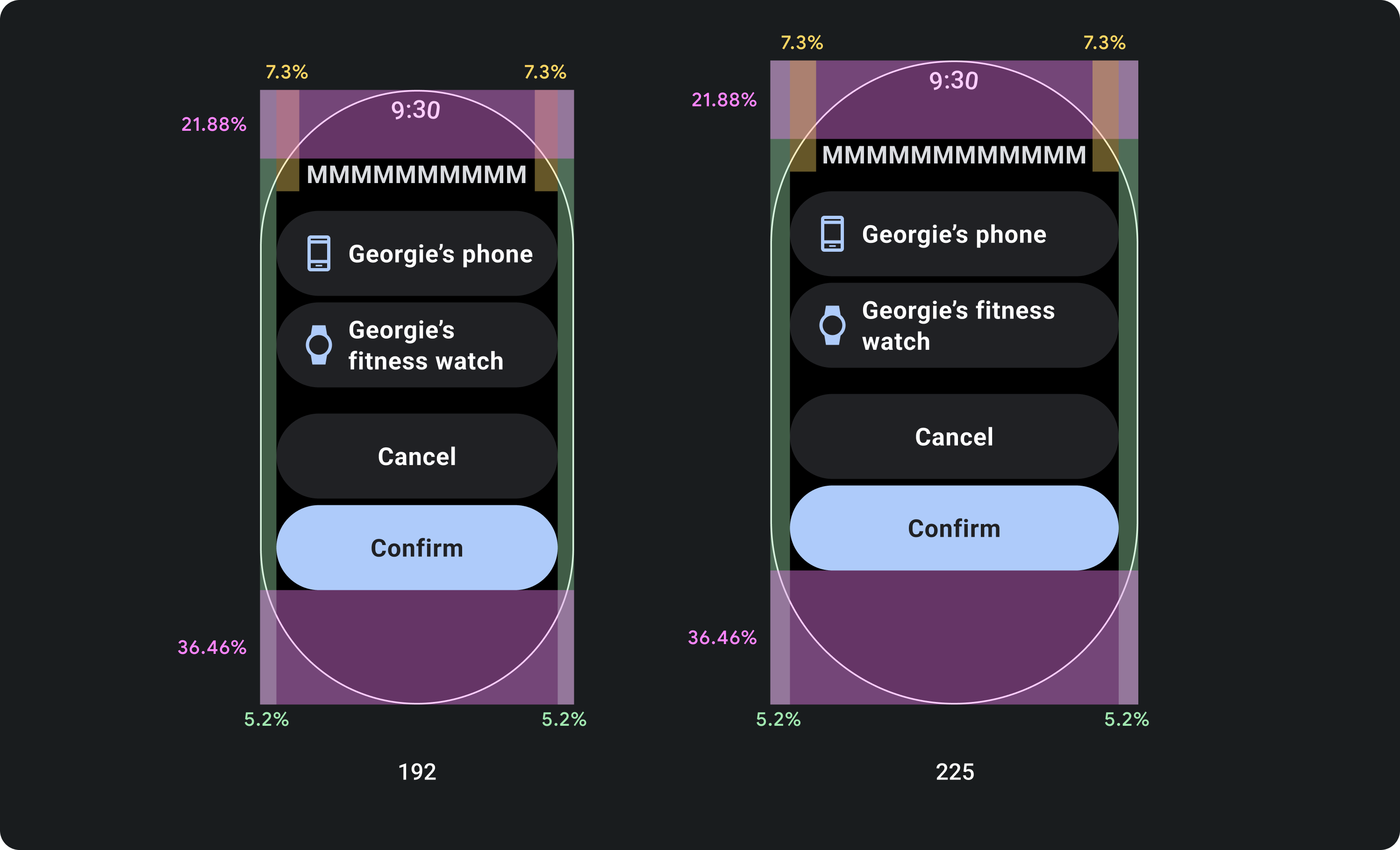
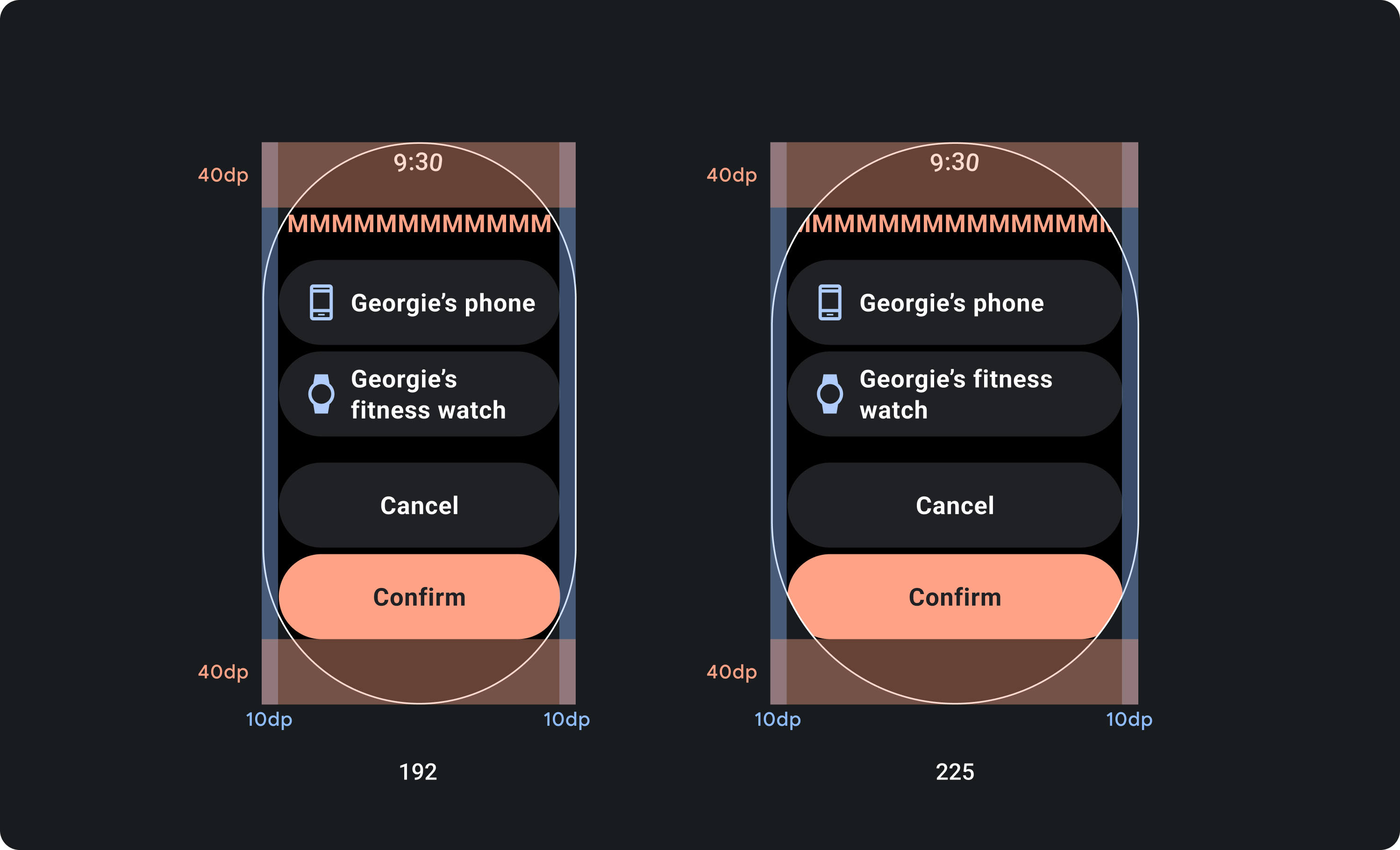
设计时应采用百分比利润率,而非固定利润率
若要创建可响应 Wear OS 设备的屏幕尺寸的内容,请应用百分比外边距,其中每个外边距的大小都相对于屏幕尺寸。如果项目位于屏幕的顶部或底部,请应用额外的内内边距,以最大限度地减少从屏幕的曲边裁剪的内容。相比之下,当一组内容足够小,足以放在一个屏幕上时,顶部和底部的空间会增加。
正确做法
错误做法
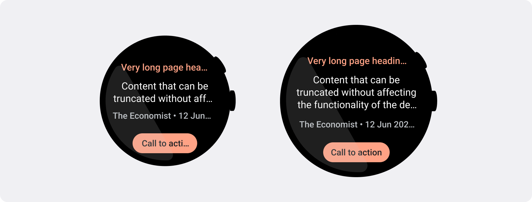
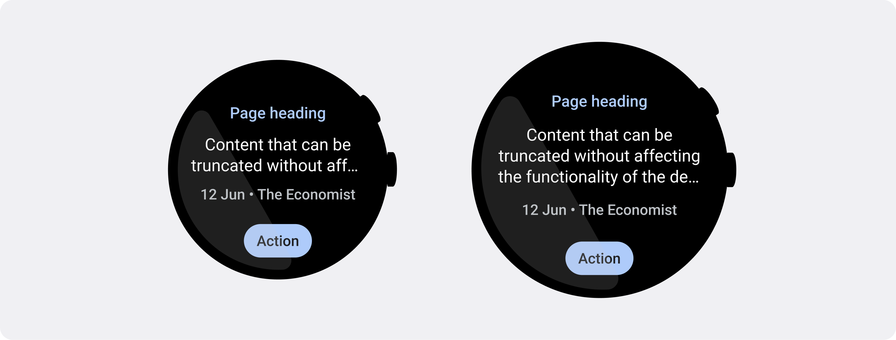
遵循较小的屏幕要求的字符数限制
在大多数情况下,较大的屏幕可以在截断之前显示更多文本和内容。不过,即使可能会提供更多水平空间,也应始终针对最小的屏幕尺寸进行设计,以便在各种设备上打造一致的体验。
例如,在截断之前,在较大的屏幕上,按钮可以容纳更多字符,但如果是对用户体验至关重要的号召性用语,则应使用足够短的文本,使其能够在小设备的屏幕上完整显示而不会被截断。
或者,如果功能块显示可变内容(例如从服务器提取的文本),请做好规划,避免此文本在较小的屏幕上被截断。
正确做法