ナビゲーション ドロワーは、ユーザーがさまざまなデスティネーションや機能にアクセスできるようにするため、どのテレビアプリでも不可欠なコンポーネントです。ナビゲーション ドロワーはアプリの情報アーキテクチャのバックボーンであり、アプリ内をわかりやすく直感的に移動できる方法を提供します。
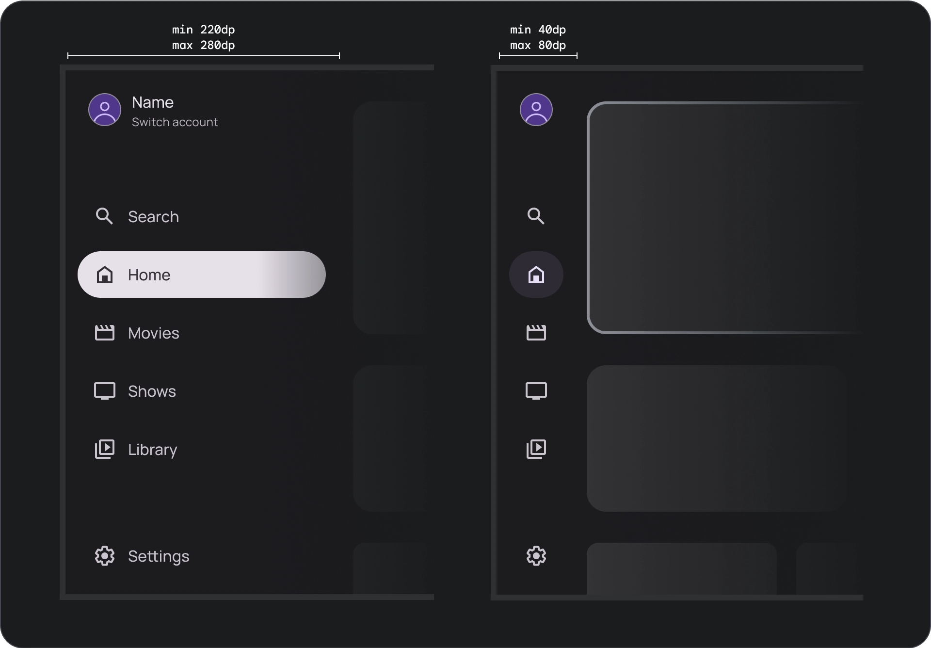
モバイルのナビゲーション ドロワーとは対照的に、テレビのナビゲーション ドロワーは、展開状態と閉じ状態の両方をユーザーに表示します。
リソース
| タイプ | リンク | ステータス |
|---|---|---|
| デザイン | デザインソース(Figma) | 利用可能 |
| 実装 |
Jetpack Compose(NavigationDrawer)
Jetpack Compose(ModalNavigationDrawer) |
利用可能 |
ハイライト
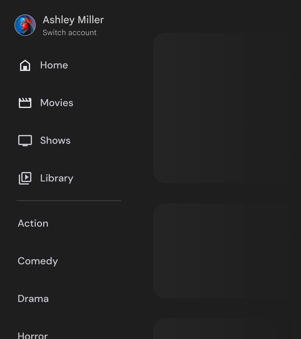
- デスティネーションは、ユーザーの重要度に応じて並べ替えられます。頻繁に訪れるデスティネーションが最初に表示され、関連するデスティネーションがグループ化されます。
- 標準のナビゲーション ドロワーとモーダル ナビゲーション ドロワーの両方で、閉じたときにナビゲーション レールが必要になります。
バリエーション
ナビゲーション ドロワー スタイルには次の 2 種類があります。
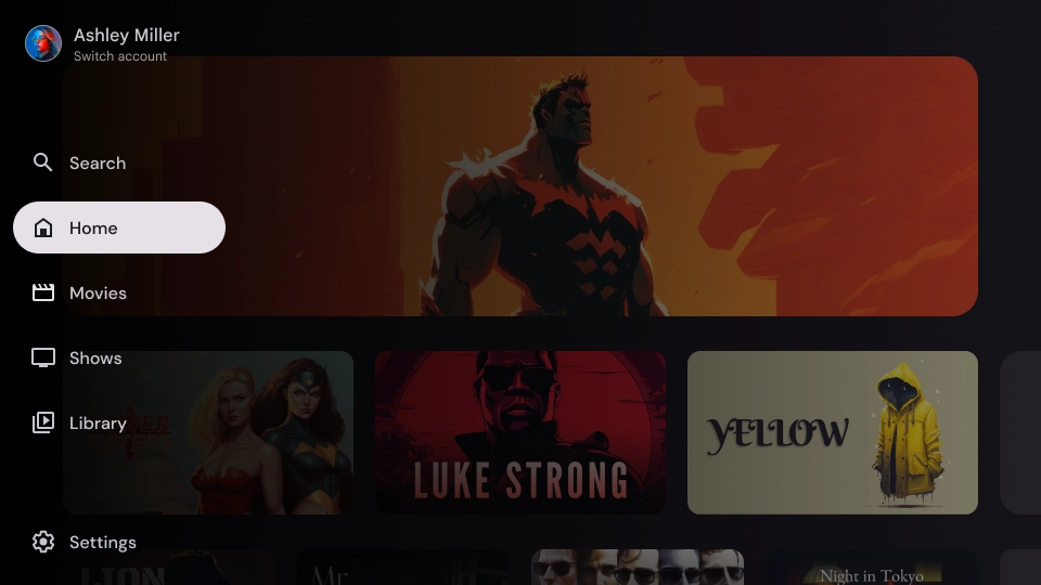
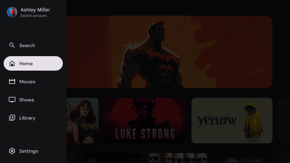
- 標準のナビゲーション ドロワー - 展開するとナビゲーション用のスペースが追加され、ページ コンテンツが押しやられます。
- モーダル ナビゲーション ドロワー - アプリのコンテンツの上にオーバーレイとして表示され、ドロワーが開いているときに読みやすさを高めるためにスクリムが表示されます。
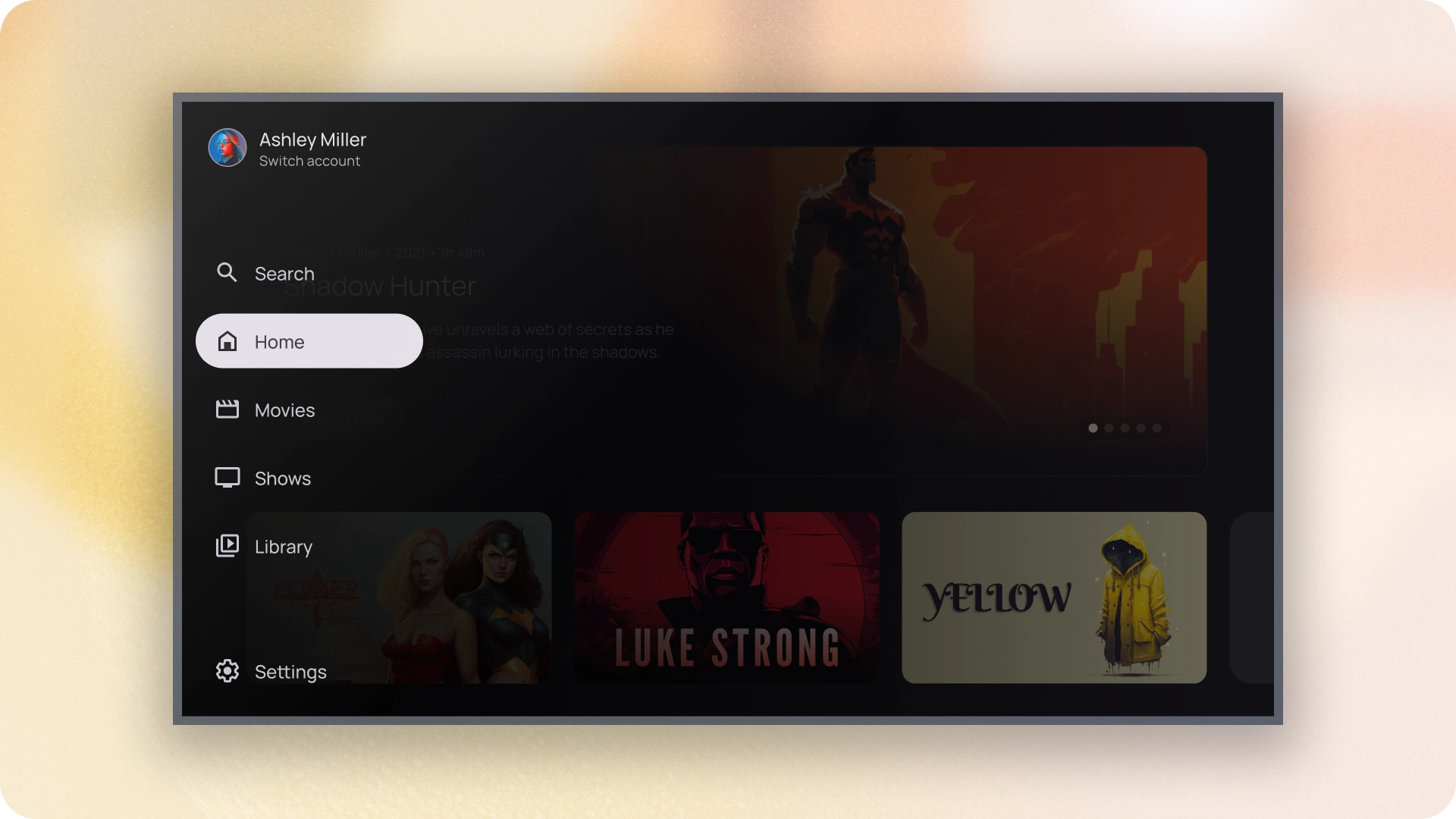
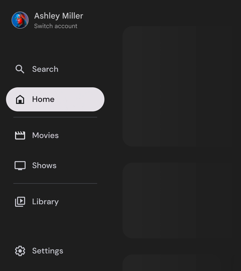
標準のナビゲーション ドロワー
解剖学
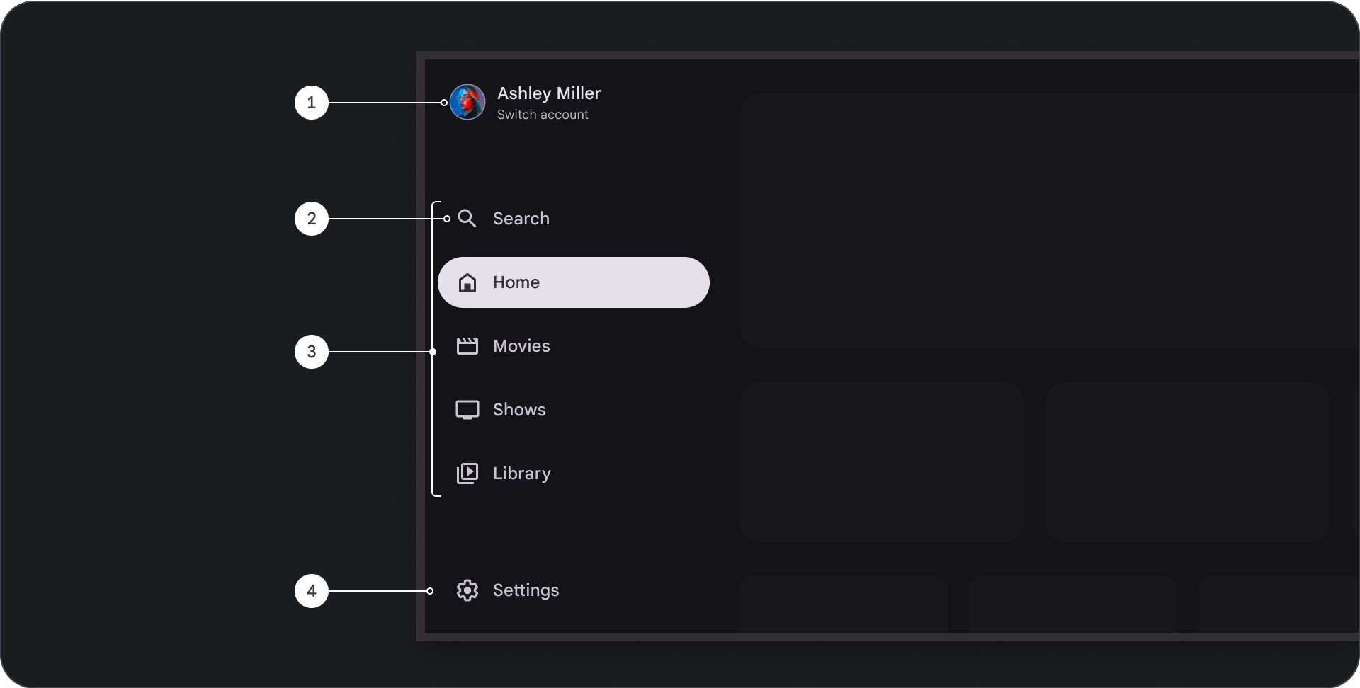
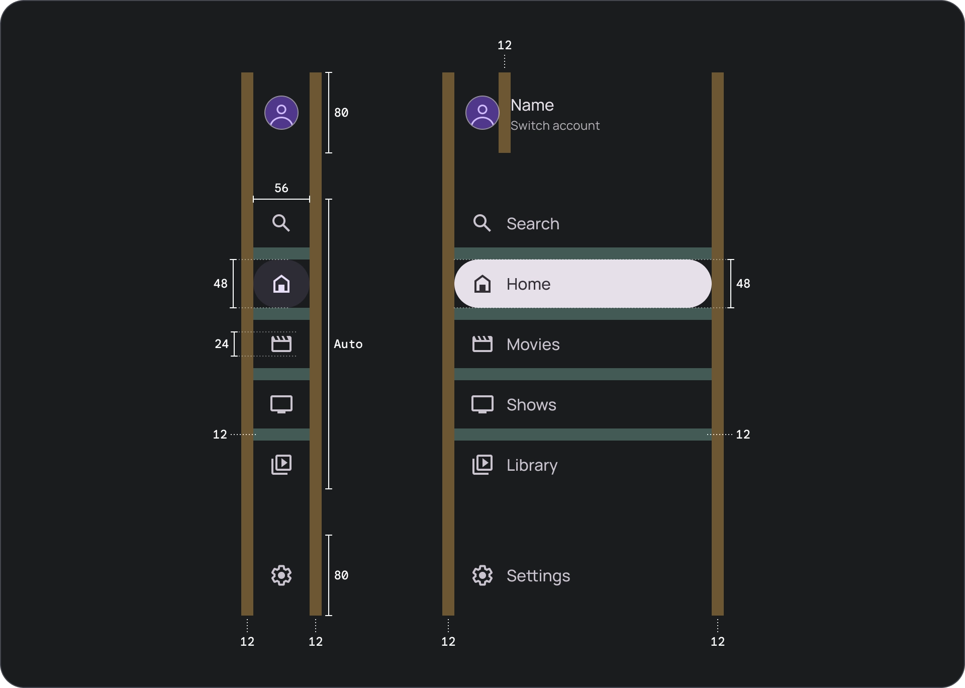
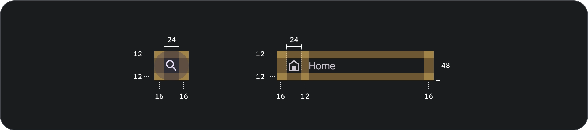
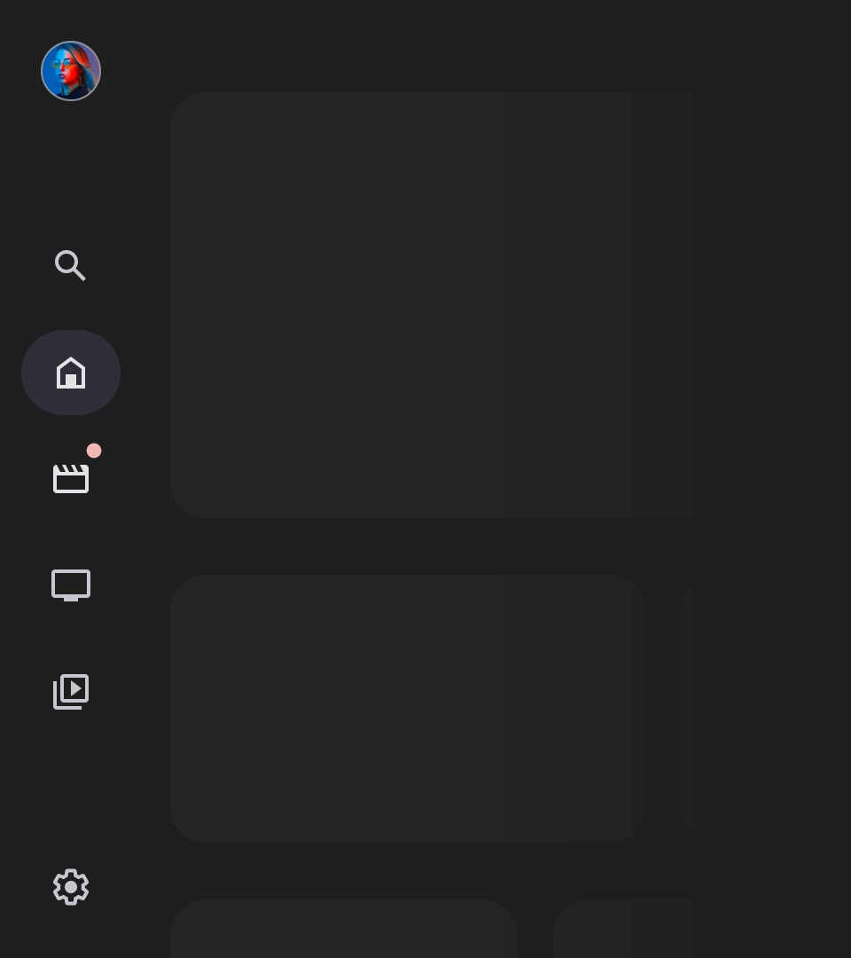
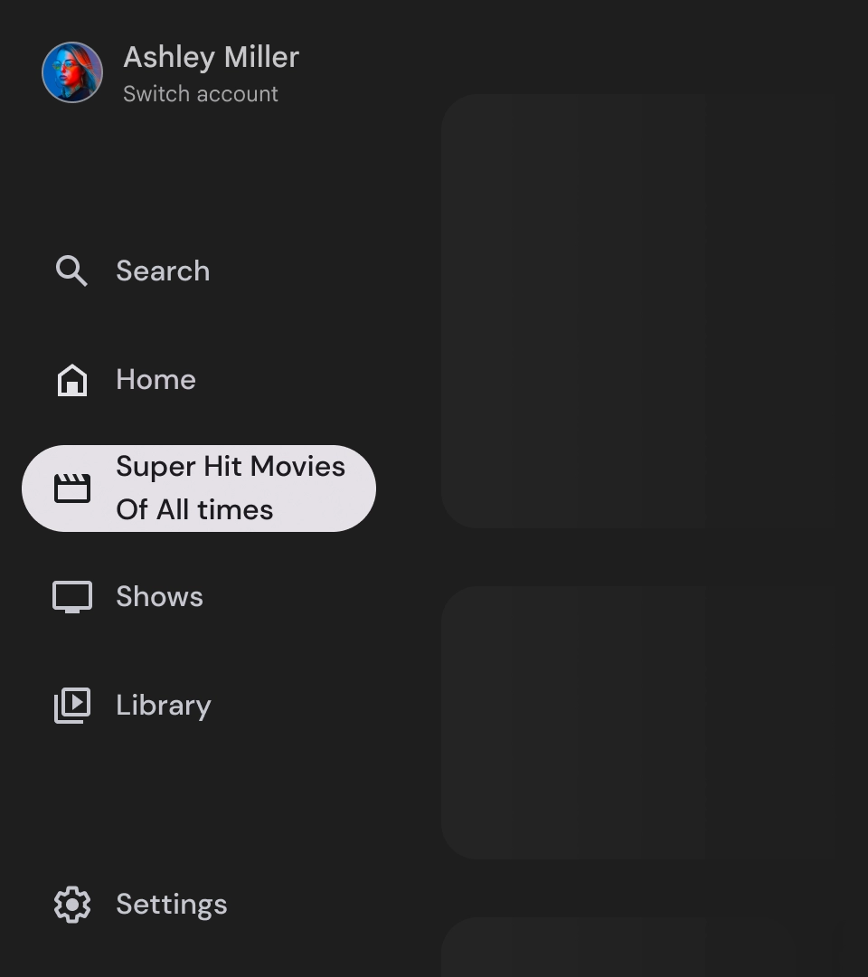
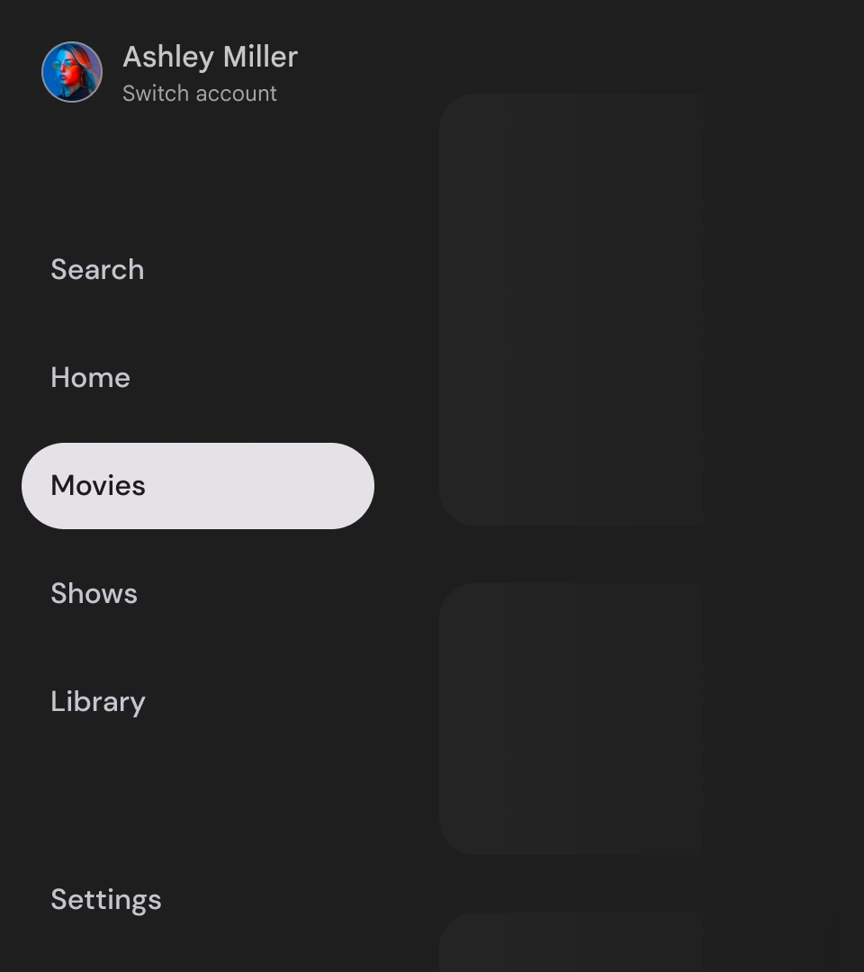
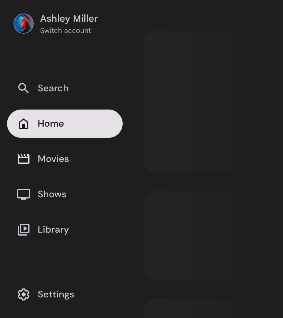
- 上部セクション: アプリのロゴが表示されます。プロファイルを切り替えるボタンや、検索アクションをトリガーするボタンとして機能します。閉じた状態の一番上のコンテナには、アイコンのみが表示されます。
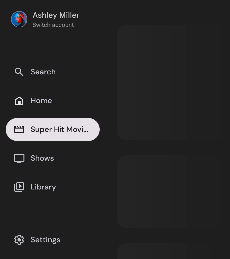
- ナビゲーション アイテム: ナビゲーション レールの各アイテムには、アイコンとテキストが組み合わされています。折りたたまれた状態のアイテムにはアイコンのみが表示されます。
- ナビゲーション レール: ナビゲーション レールは、3 ~ 7 個のアプリのデスティネーションを表示する列で、メインメニューとして機能します。各リンク先にはテキストラベルとオプションのアイコンがあり、コンテキストを重視してメニュー項目をグループ化することもできます。
- 下部セクション: 1 ~ 3 個のアクション ボタンを配置できます。設定、ヘルプ、プロフィールなどのページに適しています。
動作
- ナビゲーション ドロワーの展開: 標準のナビゲーション ドロワーを開くと、ページ コンテンツが押し下げられ、ナビゲーションの展開バージョンのスペースが確保されます。
- ナビゲーションの更新: ナビゲーション アイテム間を移動すると、ページが新しいデスティネーションに自動的に更新されます。
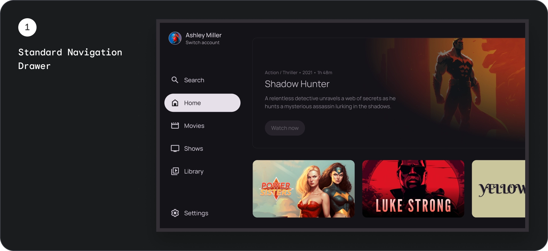
モーダル ナビゲーション ドロワー
解剖学
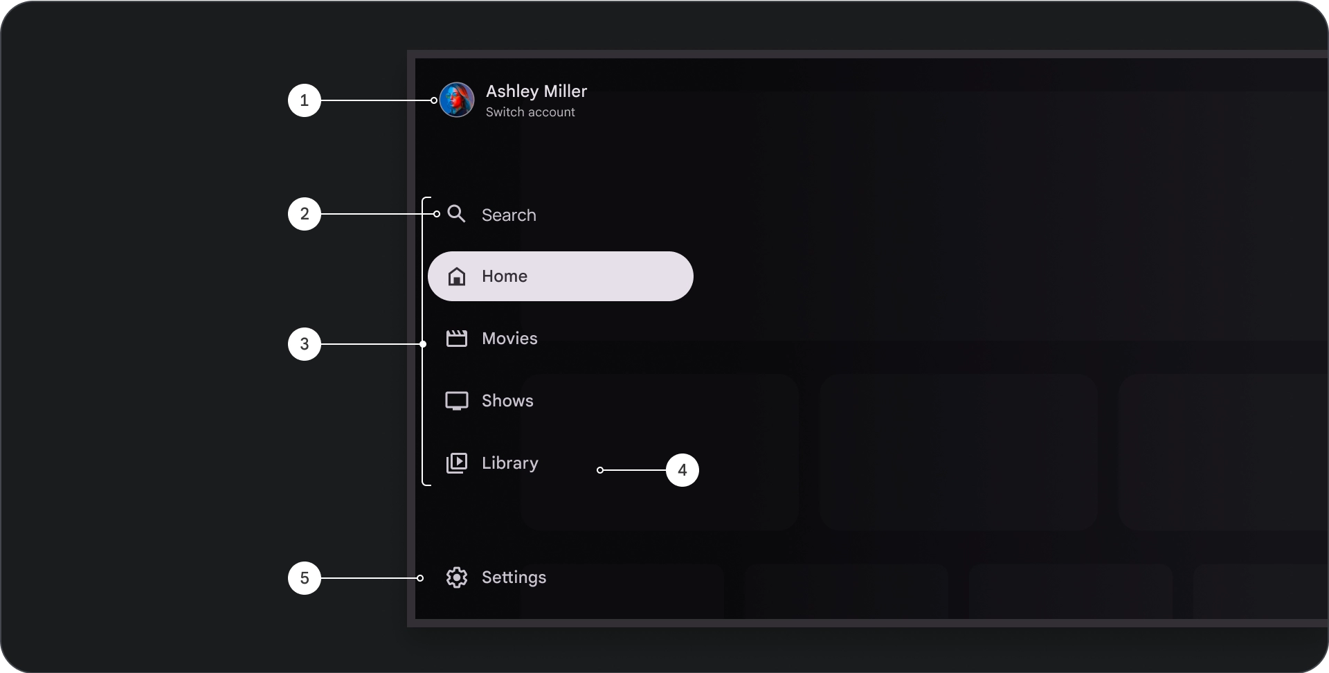
- 上部セクション: アプリのロゴが表示されます。プロファイルを切り替えたり、検索アクションをトリガーしたりするためのボタンとして機能します。閉じた状態の一番上のコンテナには、アイコンのみが表示されます。
- ナビゲーション アイテム: ナビゲーション レールの各アイテムには、アイコンとテキストが組み合わされています。折りたたまれた状態のアイテムにはアイコンのみが表示されます。
- ナビゲーション レール: 3 ~ 7 個のアプリ デスティネーションを表示する列。メインメニューとして機能します。各リンク先にはテキストラベルとオプションのアイコンがあり、コンテキストを重視してメニュー アイテムをグループ化することもできます。
- スクリム: ナビゲーション アイテムのテキストを読みやすくします。
- 下部セクション: 1 ~ 3 個のアクション ボタンを配置できます。設定、ヘルプ、プロフィールなどのページに適しています。
動作
- 引き出しの展開: アプリのコンテンツの上にオーバーレイとして表示され、引き出しが展開されたときに読みやすさを高めるスクリームが付いています。
- ナビゲーションの更新: ユーザーがナビゲーション アイテムを選択したときに発生します。
スクリム
モーダル ナビゲーション ドロワーの場合、ドロワーの背後にスクリームを配置すると、ドロワーのコンテンツを読みやすくできます。ナビゲーション ドロワーの背後にグラデーションまたは単色のサーフェスを使用して、UI のさまざまなバリエーションを作成できます。
グラデーション スクリム
無地のスクリム
仕様
使用方法
アクティブ インジケーター
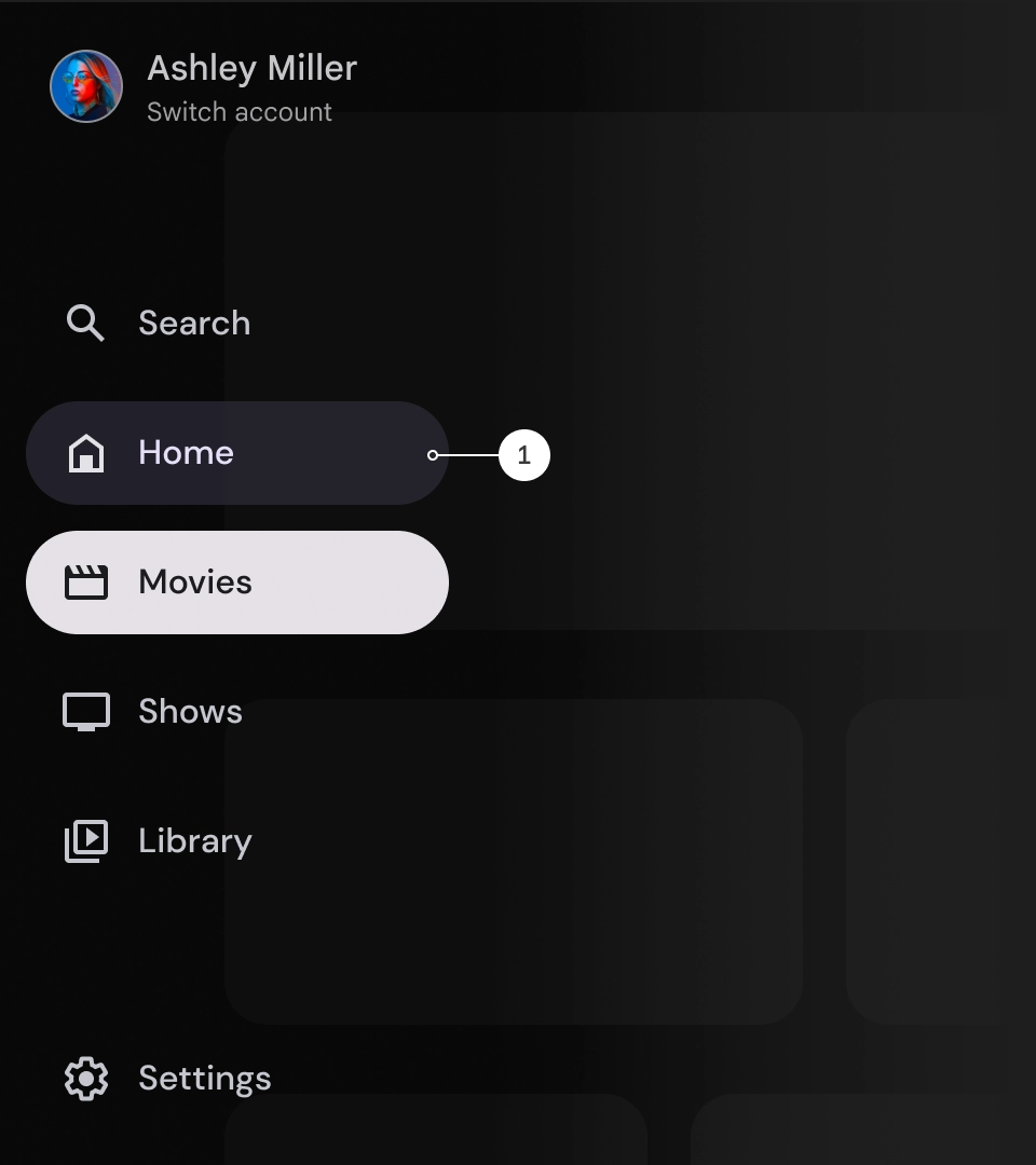
アクティブ インジケーターは、表示されているナビゲーション ドロワーのリンクをハイライト表示する視覚的な手がかりです。通常、インジケーターは、引き出し内の他のアイテムとは視覚的に異なる背景の形状で表されます。アクティブ インジケーターは、アプリ内の現在地と閲覧しているデスティネーションをユーザーに知らせます。アクティブ インジケーターがはっきりと表示され、ナビゲーション ドロワー内の他のアイテムと簡単に区別できるようにします。
分割線(省略可)
分割線を使用すると、ナビゲーション ドロワー内の目的地のグループを分割して整理できます。ただし、分割線が多すぎると視覚的なノイズが発生し、ユーザーに不要な認知的負荷をかける可能性があるため、分割線は控えめに使用してください。
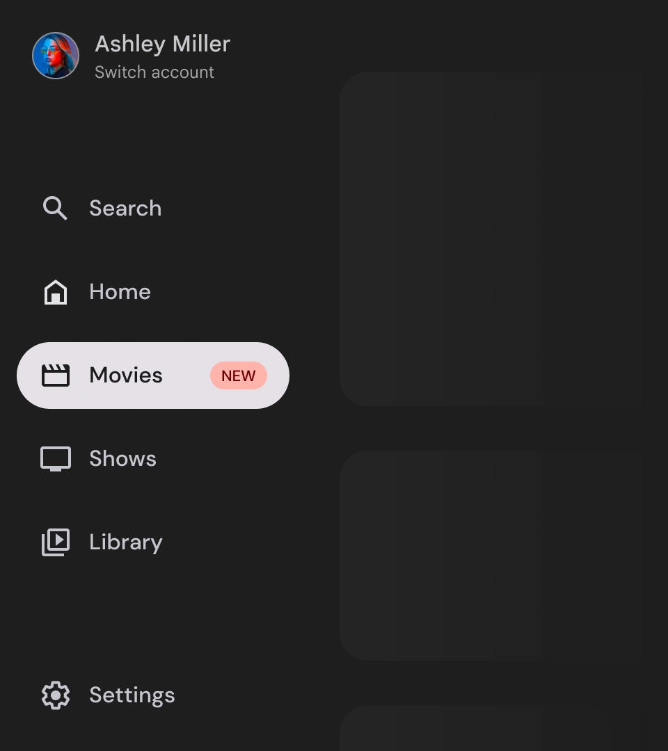
バッジ
バッジは、ナビゲーション アイテムに追加して追加情報を提供する視覚的な手がかりです。たとえば、バッジを使用して、ストリーミング アプリで利用可能な新作映画の数を示すことができます。バッジは、UI が雑然と見える可能性があるため、必要に応じて慎重に使用してください。バッジを使用する場合は、バッジが明確でわかりやすく、ユーザーがアプリを操作する際に邪魔にならないようにします。
バッジが展開された状態
バッジを閉じた
ラベル
ナビゲーション ドロワーのラベルは、読みやすくするために明確で簡潔にする必要があります。
注意
すべきでないこと
すべきでないこと
すべきでないこと
ナビゲーション ドロワーは、アプリの階層を表す基本要素であり、5 ~ 6 つのメイン ナビゲーション デスティネーションのみを表示するために使用する必要があります。
すべきこと