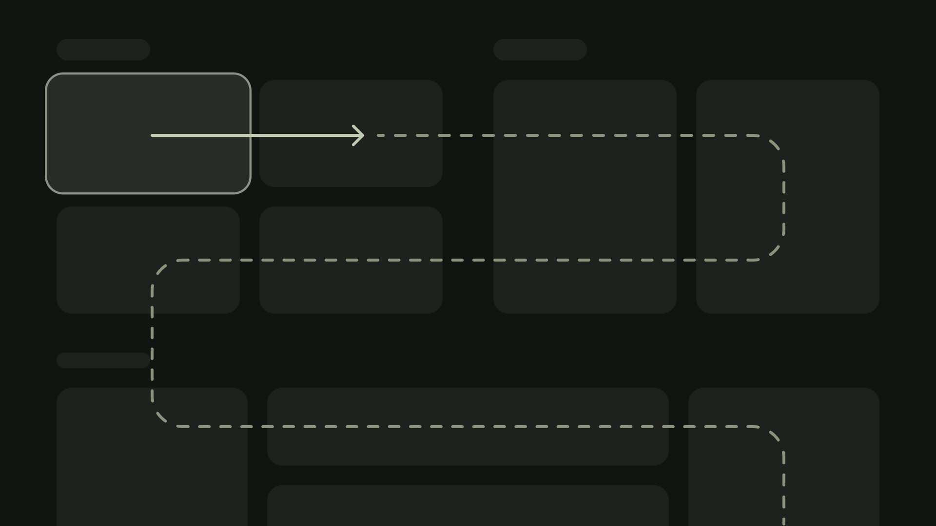
TV devices provide a limited set of navigation controls for apps. To create an effective navigation scheme for your TV UI, consider these limited controls and how the user navigates using remote control buttons instead of a touch screen.
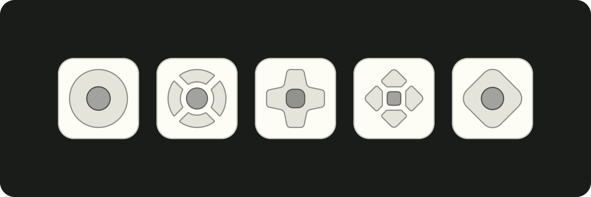
Highlights
- The controller offers limited navigation capabilities – up-down-left-right – so pay attention to how this can shape your app's UI design.
- Navigation should feel natural and familiar.
- Create a simple navigation experience with the remote's back button.
- If a user doesn't have a straight path to get to a control, consider relocating it.
Principles
The goal is for navigation to feel natural and familiar without dominating the user interface or diverting attention from content. The following principles help set a baseline for a consistent and intuitive user experience across TV apps.
Efficient
Make it fast and simple to get to content. Users want to access content quickly, using a minimal number of clicks. Organize your information in a way that requires the fewest screens.
Predictable
Follow best practices and recommendations to make navigation predictable to users. Don't reinvent navigation patterns unnecessarily, as this leads to confusion and unpredictability.
Intuitive
Make navigation simple enough to seamlessly support widely adopted user behaviors. Don't over-complicate by adding unnecessary layers of navigation.
Controller
Controllers come in a variety of styles, from a minimalist remote control to complex game controllers. All controllers include a directional pad (D-pad) plus select, home, and back buttons. Other buttons vary by model.
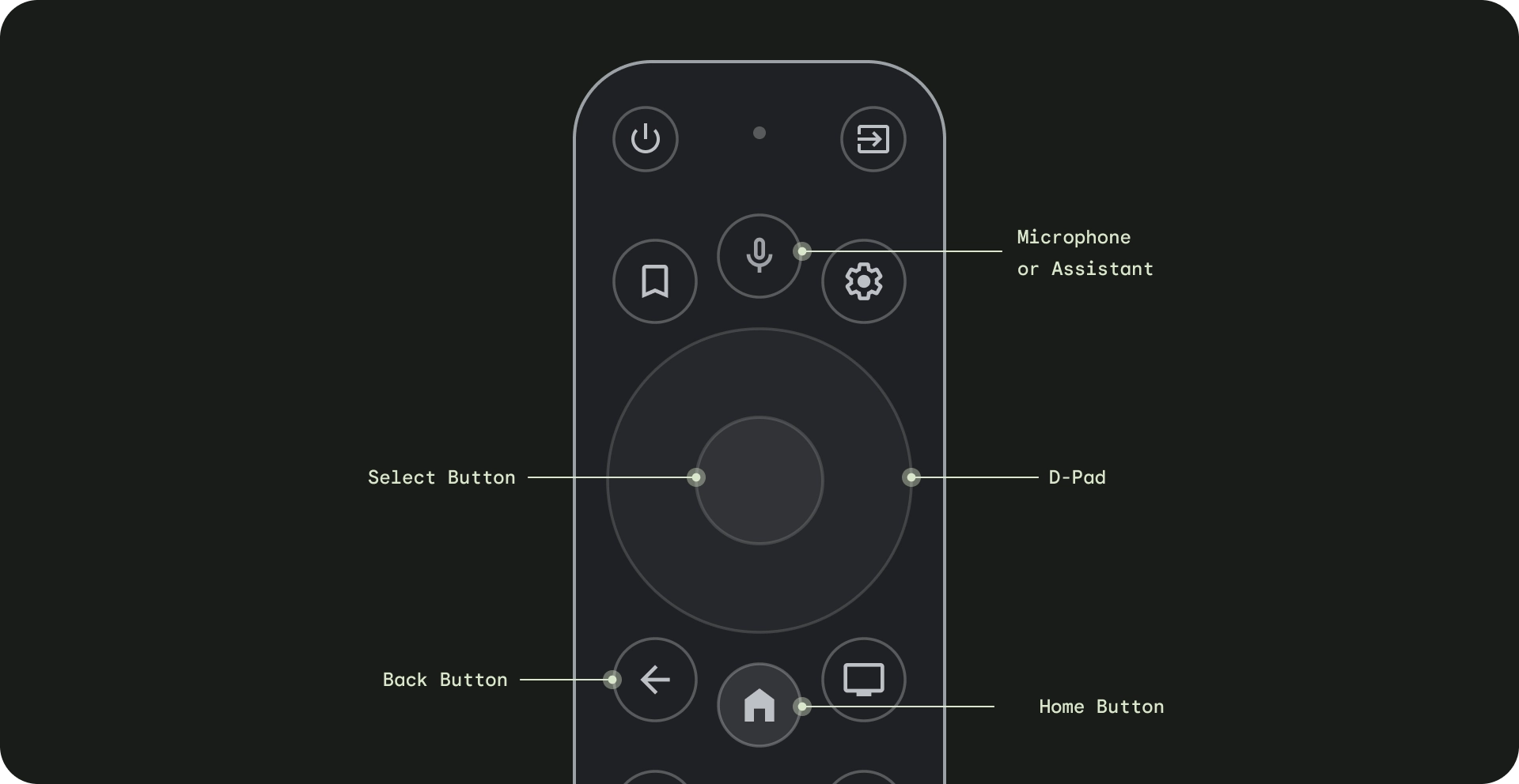
- Directional pad (D-pad) - The primary navigation method on TV is through the D-pad, which includes up, down, left, and right directional hardware buttons.
- Select button - Selects the on-screen item with focus. Press and hold can be used to show more options.
- Home button - Takes the user to the system Home screen.
- Back button - Gives users a way to return to the previous view.
- Microphone button - Invokes either Google Assistant or voice input.
D-pad navigation
On a TV device, users navigate using a 4-way D-pad: up, down, left, and right. To build an optimal TV app, design a navigation scheme where the user can quickly learn how to use your app with the four arrow keys. The D-pad moves focus from one element to the nearest element in the corresponding direction.
To test your app's navigation works well with a D-pad on a TV device, consider the following:
- Ensure a user can navigate to all focusable elements on the screen.
- Ensure that the navigation direction is straightforward and predictable.
- For scrolling lists, make sure the D-pad up and down buttons scroll the whole list and each list item can be selected.
Home button
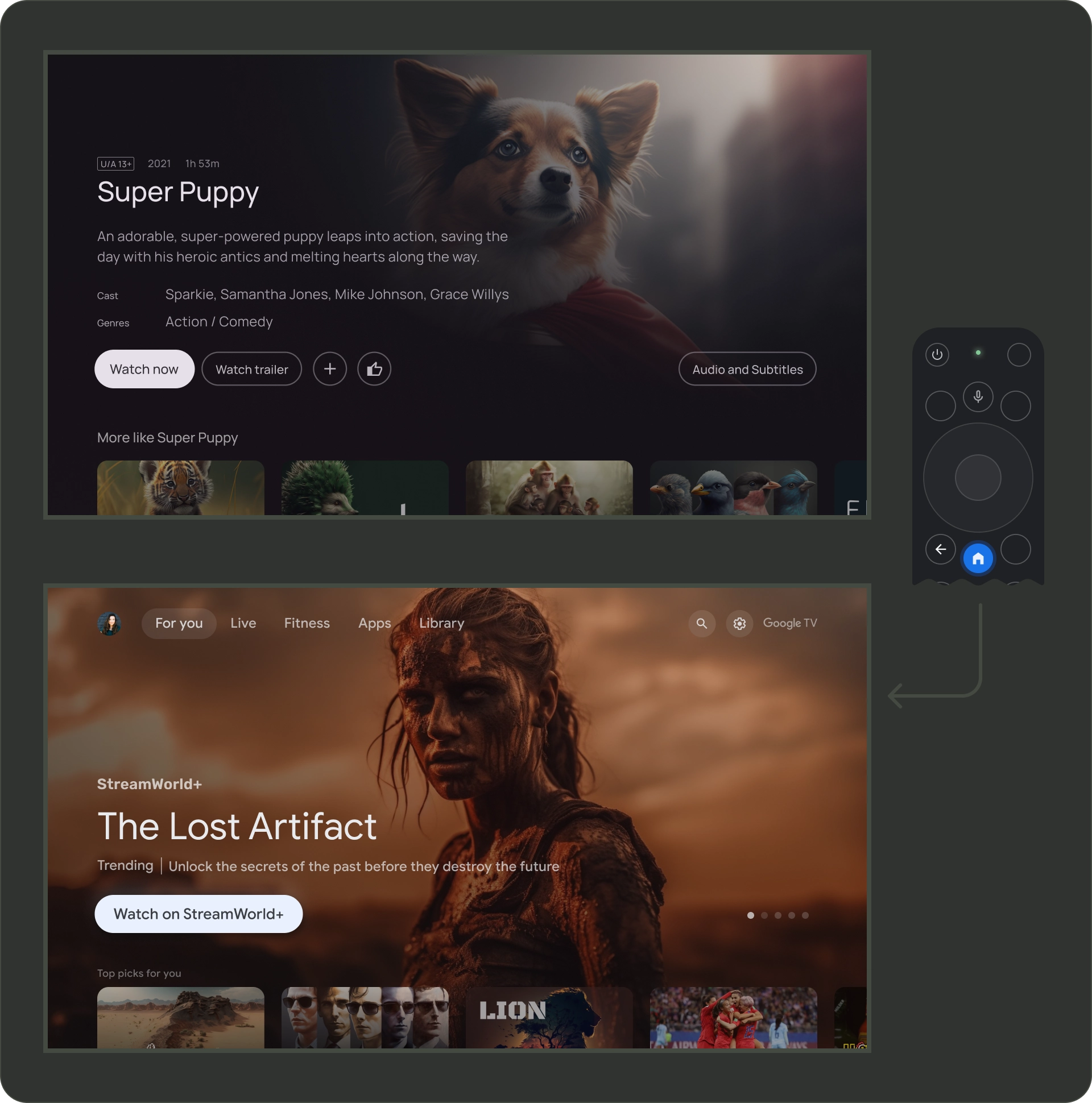
Pressing the home button always takes the user back to the Google TV Home or Launcher. The current app would suspend in the background by default.
Long pressing on the home button displays the system dashboard on Google TV and apps grid on Android TV. Default behavior may vary according to manufacturer.
Back button
For consistency across apps on the platform, ensure the behavior of the back button follows these guidelines.
Use predictable back button behavior
To create a predictable navigation experience, when the user presses the remote's back button, take them to the previous destination. Ultimately, the user should land on the Google TV Home or Launcher if they keep pressing the back button.
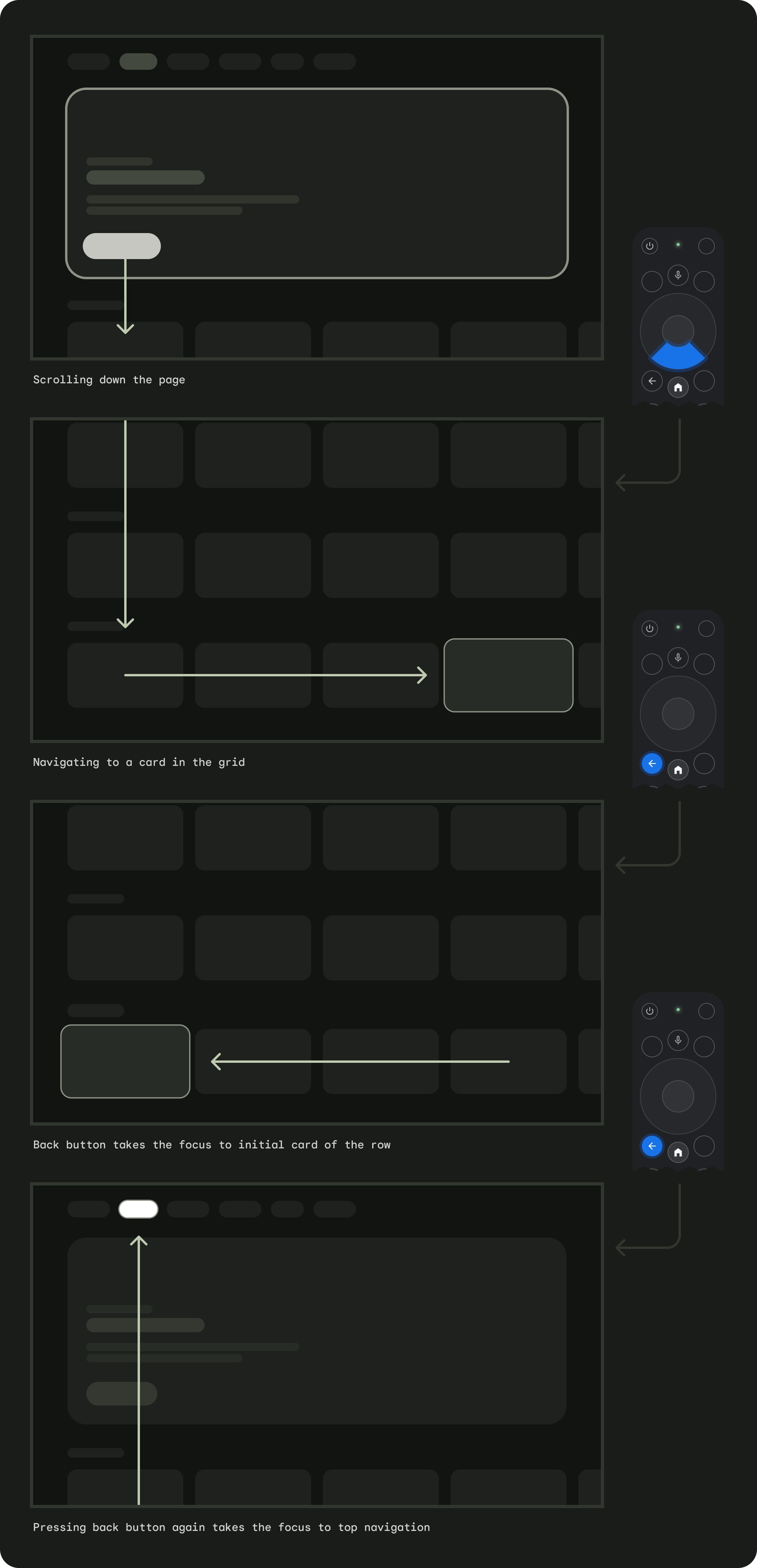
App with top navigation
User is taken back to the top of the page by scrolling quickly and activates the focus to the menu.
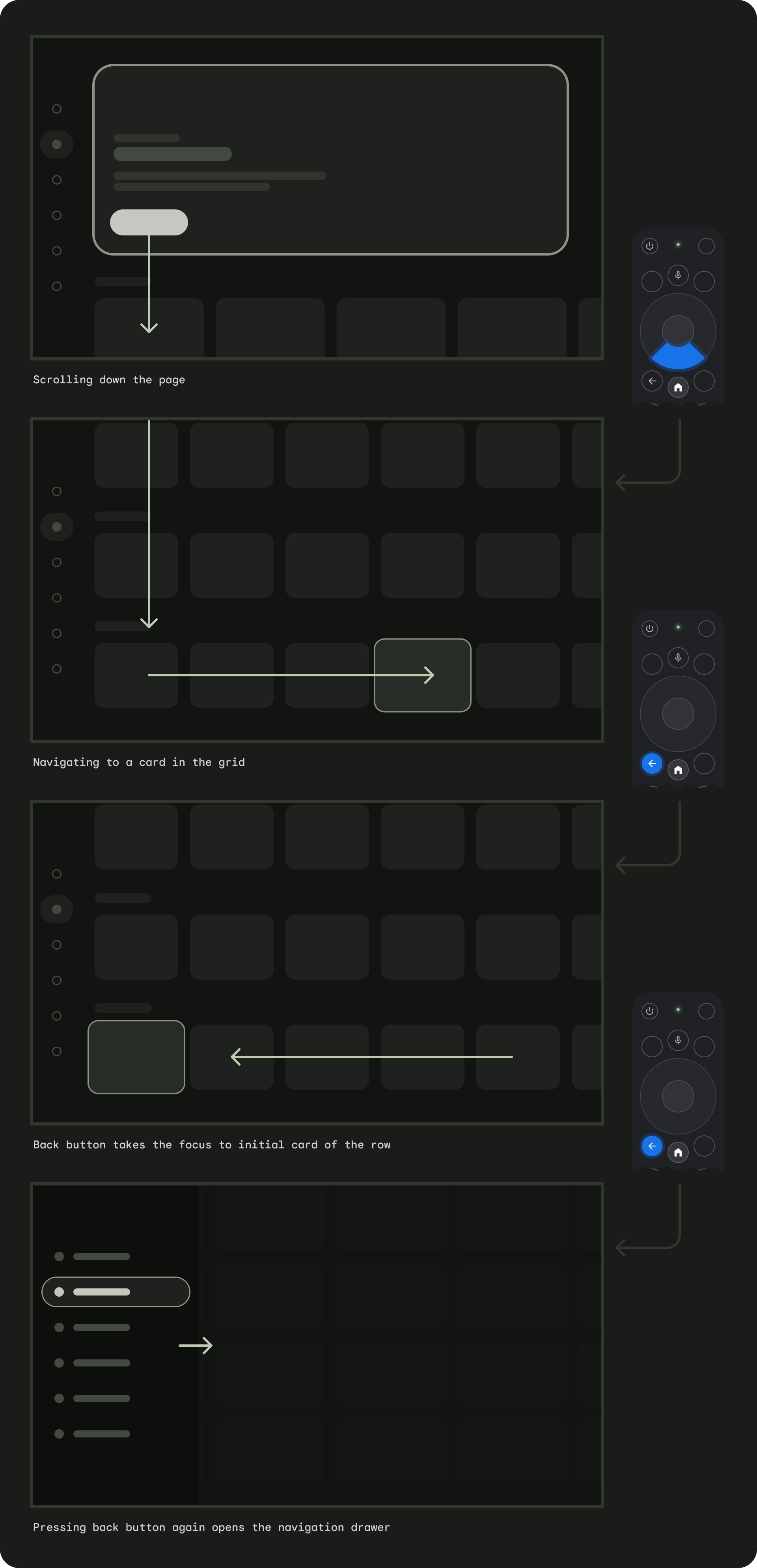
App with left navigation
The left side menu is activated and the user's focus is taken to the active menu item.
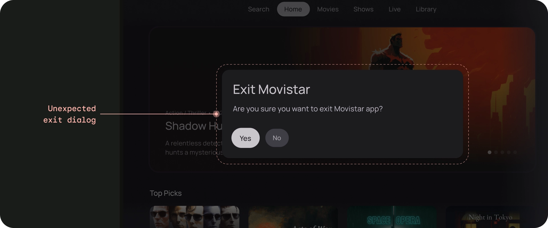
Ensure that the back button isn't gated by confirmation screens or part of an infinite loop.
Don't
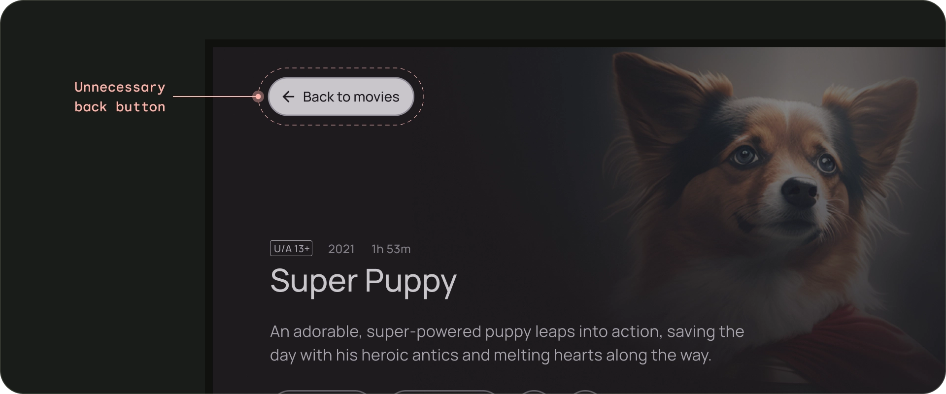
Don't display a back button
Unlike on handheld devices, the back button on the remote is used to navigate backward on a TV. It's not necessary to show a virtual back button on the screen.
Don't
Show cancel button, if necessary
If the only visible actions are confirming, destructive, or purchase actions, it's good practice to have a Cancel button that returns to the previous destination.
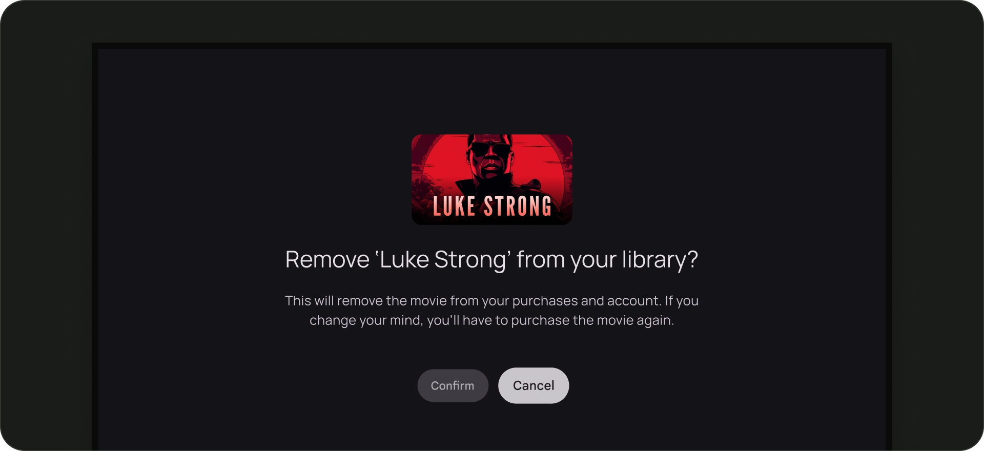
Do
Navigation architecture
Fixed start destination
The first screen the user sees when they launch the app from the launcher is also the last screen the user sees when they return to the launcher after pressing the back button.
Deep linking simulates manual navigation
Whether deep linking or manually navigating to a specific destination, users can use the back button to navigate from anywhere in the app to the start destination.
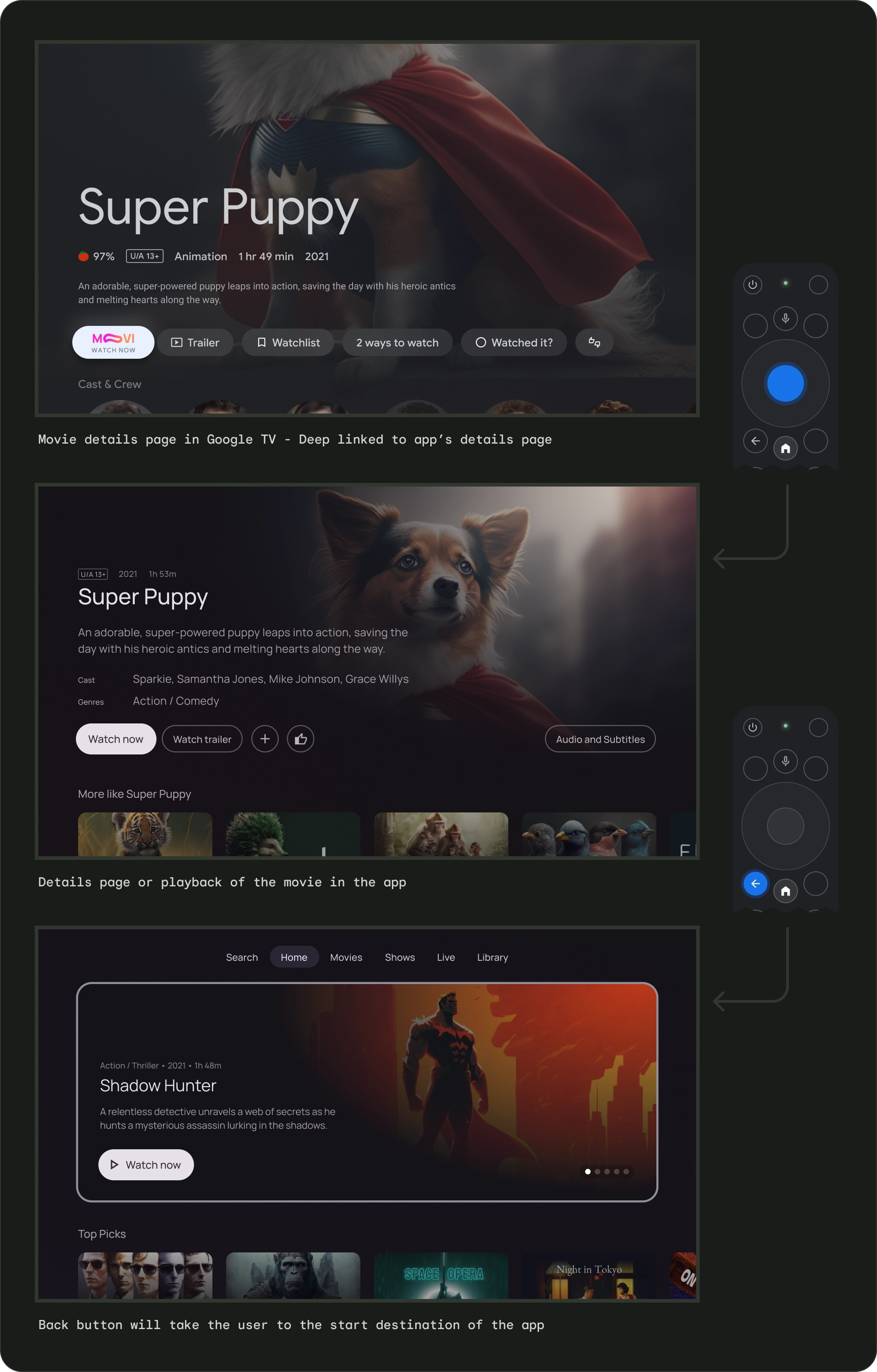
Deep linking into an app from another app simulates manual navigation. For example, if the user goes directly to a details page on the Moviestar app from Google TV and then presses the back button, they are taken to the home page of the Moviestar app.
Clear path to all focusable elements
Let users navigate your UI with a clear direction. If there isn't a straight path to get to a control, consider relocating it.
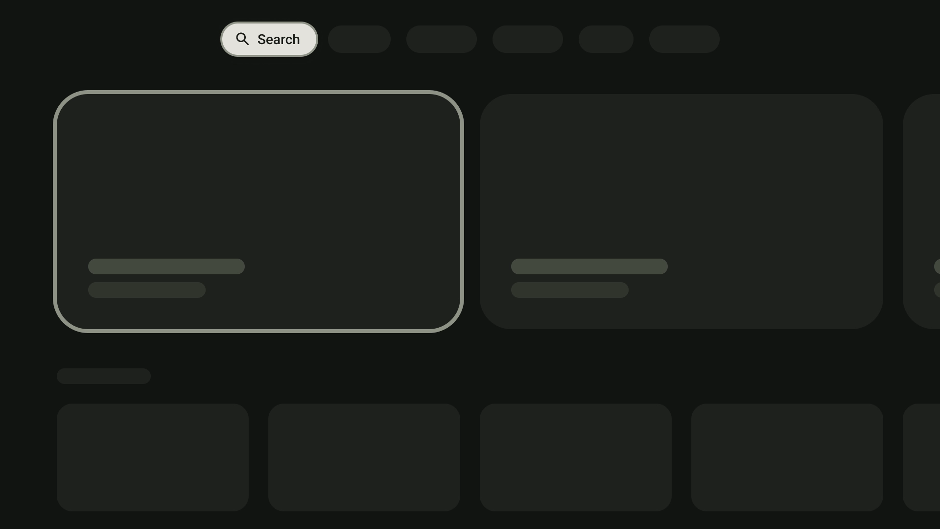
Do
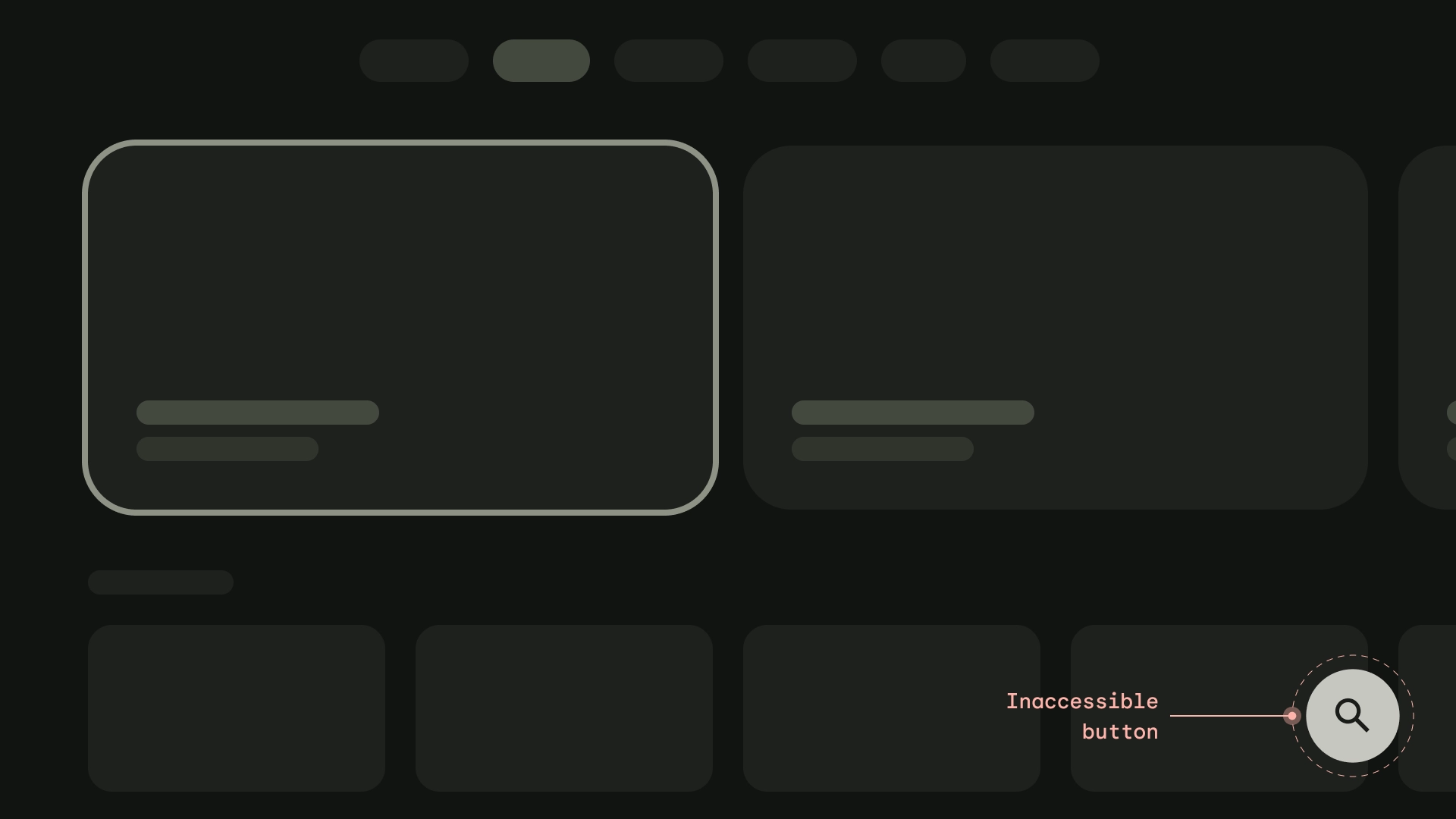
Don't
Axis
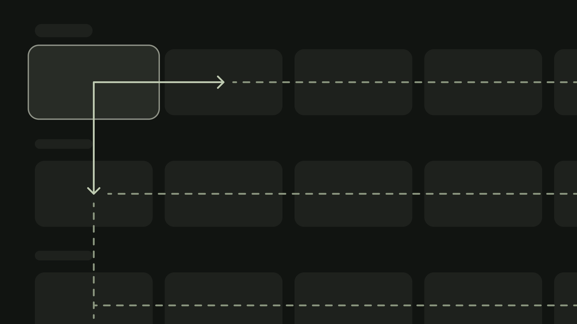
Design your layout to take advantage of horizontal and vertical axes. Give each direction a specific function to make it fast to navigate large hierarchies.
Do
