
Color on TV design can inspire, set the mood and even drive users to make decisions. It's a powerful and tangible element that users notice first. As a rich way to connect with a wide audience, it's no wonder color is an important step in crafting a high quality TV interface.
Highlights
- The "Standard" picture mode is the most common TV display setting.
- Most TVs support sRGB.
- When choosing colors, consider that users watch TV at varying distances, and in low-light.
- The display technology and the color space settings of TVs can vary greatly.
- Make sure to test with as many device and color space variations as are practical.
- Take into account different user needs and preferences when using color.
- Pay attention to common TV problems, like banding, when using gradients.
TV colors and TV displays
It's a common misconception that all displays show all colors in the same way. Maybe you've noticed it while using a work laptop or watching a film at a friend's. The same color may vary between TV models, computer monitors, and mobile devices.
Color space
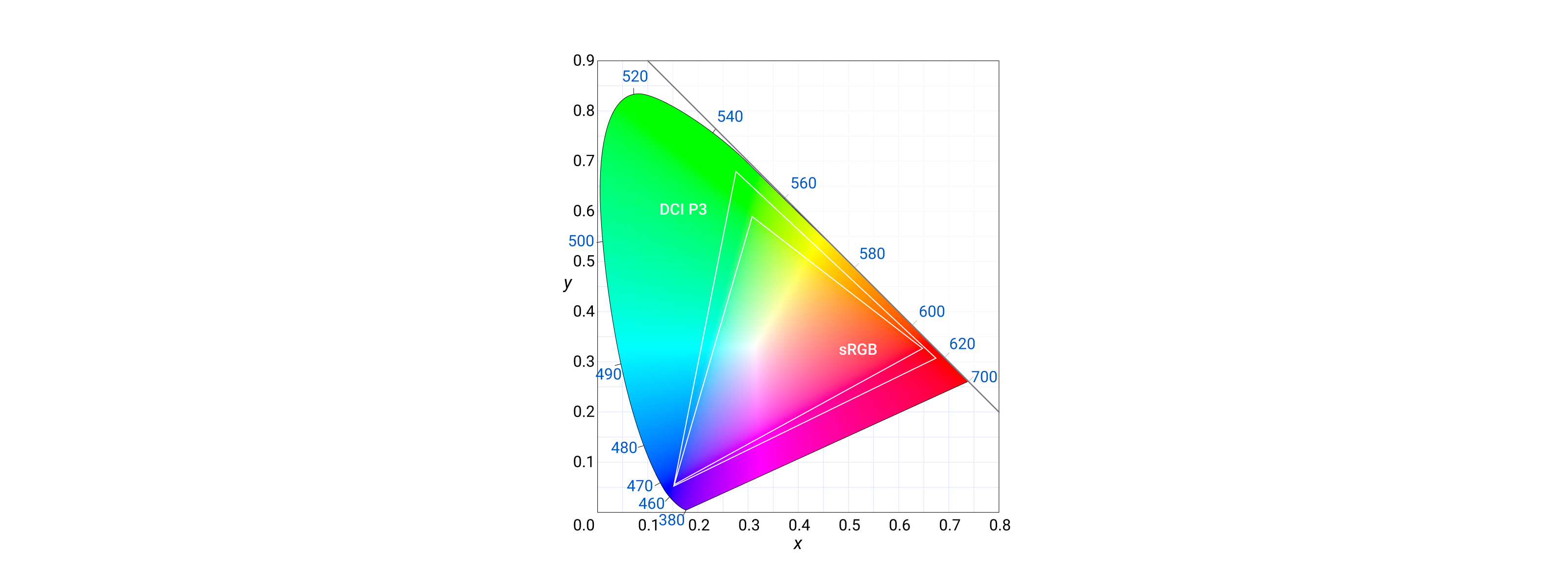
Color space refers to the spectrum of colors that a TV display can reproduce. These include the sRGB and the DCI-P3 color spaces. sRGB is the most widely used color space and is compatible with the largest range of TV models. It is used in operating systems, TV shows, and games.
Choosing the DCI-P3 color space can result in videos that appear more vivid and lifelike. Since content made in DCI-P3 has access to a larger percentage of colors, the content may only be compatible with advanced TV displays.
Picture mode
Picture modes can affect color quality on TV by changing the way that the TV processes the image. For example, Standard picture modes typically try to produce a more accurate color representation, while Vivid picture modes increase the saturation of the colors to make them more vibrant.
The default picture mode for most TV panels is Standard. This mode is designed to provide a balanced picture with accurate colors. But a user has many options to choose from. Many users change picture modes to improve perceived picture quality.
Let's look at seven common picture modes:
- Standard: Default picture mode. It provides a balanced picture with accurate colors.
- Vivid: Increases the saturation of the colors, making them more vibrant.
- Dynamic: Increases the contrast of the image, making it appear sharper.
- Game: Optimizes the picture for gaming, reducing input lag.
- Movie: Optimizes the picture for watching movies, reducing motion blur.
- Sports: Optimizes the picture for watching sports, increasing the brightness of the image.
- Custom: Lets the user to adjust the picture settings to their own preferences.
Contrast
Contrast is one of the most important aspects of picture quality, especially with modern HDR displays. It is the difference between the darkest black and the brightest white that a TV can produce. A higher contrast ratio typically means deeper blacks, which makes a big difference in overall picture quality.

Contrast: 562:1 (Low)
|

Contrast: Inf: 1 (Perfect)
|
Same color on different TVs may look washed out on TV with a low contrast ratio. To ensure a good user experience, designers should consider the following tips when creating UI for TV applications:
- Use high contrast between text and background colors.
- Choose clear, readable fonts with larger sizes and line spacing.
- Incorporate accessibility features.
- Avoid relying solely on color to convey information.
- Optimize for different color spaces (SDR and HDR).
- Test legibility in different lighting conditions.
Display technology
Display technologies can also impact the color displayed on the screen. Some common types include:
- LCD: Liquid crystal displays are the most common type of TV display. They work by using a backlight to illuminate a liquid crystal panel, which then blocks or allows light to pass through to create an image. LCD TVs are relatively inexpensive and come in a wide range of sizes, but they can suffer from poor contrast and color reproduction.
- LED: Light-emitting diode displays are a newer type of LCD TV that use LEDs as the backlight. LEDs are more energy-efficient than traditional LCDs and can produce a brighter, more vivid image. LED TVs tend to be more expensive than LCD TVs.
- QLED: Quantum dot light-emitting diode displays are a type of LED display that use quantum dots to produce light. Quantum dots are tiny particles that can produce a wider range of colors than traditional LEDs.
- OLED: Organic light-emitting diode displays are a type of LED display that use organic materials to produce light. OLED TVs are the most expensive type of TV, but they offer the best contrast and color reproduction of any type of TV.
Each type of TV display technology has its own advantages and disadvantages when rendering color.
To learn more, watch How a TV Works in Slow Motion from The Slow Mo Guys.
Principles
For more readings, see the Material Color principles.
- Accessibility first: TV interfaces have a diverse audience. From the young to the elderly to the visually impaired. Always take into account needs, and preferences when using color. Putting accessibility first in your UI can give users an efficient experience. An example of this is meeting color contrast standards. Note: Always consider color rendering variations across different TV models.
- Color with purpose: When used correctly, color can enhance communication and create meaningful and immersive experiences. It reflects your product's identity across the TV interface.
- Choose a contrasting foundation: A contrasting background helps users interpret and interact with your app's text and various elements. The higher contrast ensures the content is visible.
Screen banding

Screen banding on a TV refers to the appearance of visible horizontal or vertical lines, bands, or gradients on the display that are not part of the actual content being shown. This artifact can manifest as either distinct lines or as a gradual transition in colors or shades across the screen. Banding can be caused by factors such as low color depth, compression artifacts, signal interference, or panel or GPU issues.
When designing a user interface for TV, particularly when it comes to gradients and avoiding banding, consider the following tips:
- Use high-color-depth gradients: To minimize the risk of banding, use gradients with a high color depth (e.g., 10-bit or higher). This ensures smoother transitions between colors and reduce the likelihood of visible bands.
- Avoid extreme color transitions: When creating gradients, try to avoid sharp transitions between colors, as these can be more prone to banding. Instead, use more subtle, gradual color transitions that allow for a smoother appearance on the screen.
- Test on multiple devices: As TVs can vary in color depth and panel quality, it's important to test your UI design on multiple devices to ensure that gradients appear smooth and banding-free across different screens.
- Use dithering techniques: Dithering is a technique that can help reduce banding by blending colors together in a patterned, noise-like manner. This can help create the illusion of smoother color transitions, even on screens with lower color depth.
- Choose solid colors or subtle patterns: If gradients are not essential for your design, consider using solid colors or subtle patterns instead. These are less prone to banding and can still create an aesthetically pleasing UI.