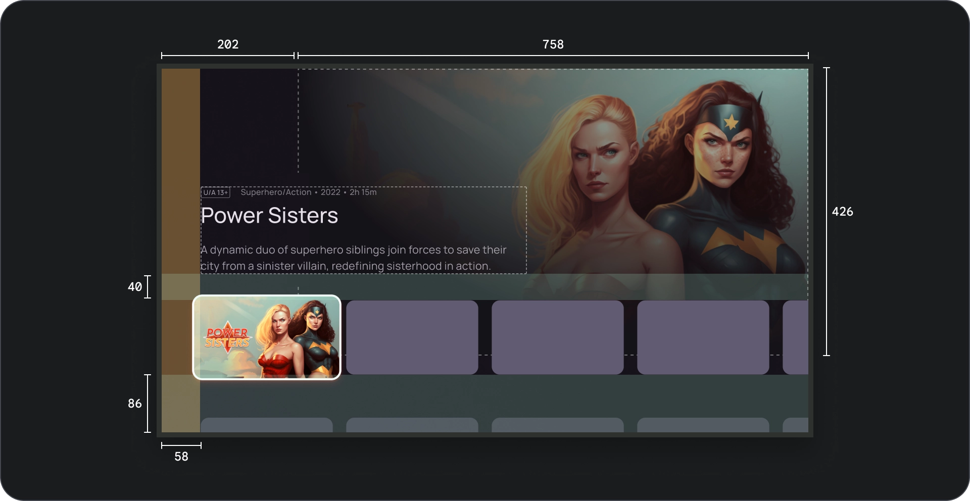
Immersive list is a combination of a row of content & preview of the selected item. It features content in a larger viewport.
Resources
| Type | Link | Status |
|---|---|---|
| Design | Design source (Figma) | Available |
| Implementation | Sample | N/A |
Highlights
- Dynamic content preview. When a user navigates through the row of content, the preview area automatically update to display the current focused item.
- The Immersive list component features a larger viewport for displaying content, making it easier for users to view and appreciate the visual details of the focused item.
- Immersive lists provide relevant and contextual information about the focused item, helping users make informed decisions without leaving the browsing experience.
- The Immersive list component uses progressive disclosure to reveal more details about the content as users navigate, reducing cognitive load and maintaining user engagement.
- The Immersive list component ensures consistent interactions across the app, providing users with a familiar and predictable experience.
Anatomy
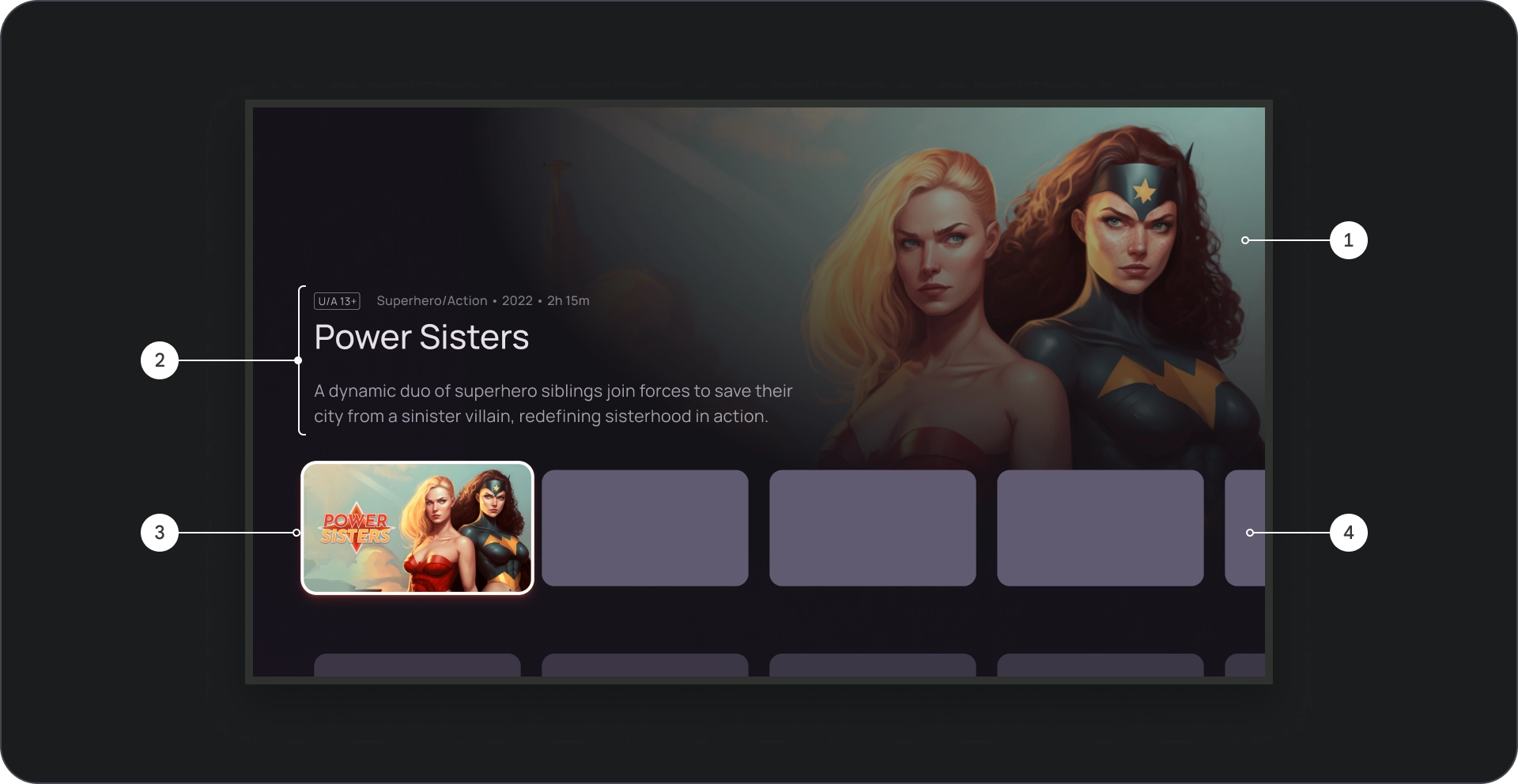
- Image background
- Content block
- Card on focus
- Content grid
- Cinematic scrim
- Poster
- Background color
Specs
Behavior
When navigating between cards in the Immersive list, the details of the selected card are progressively revealed in the background.
When the immersive list is in focus, its height increases to reveal additional information, such as the background title and description, as shown in the following video.
Usage
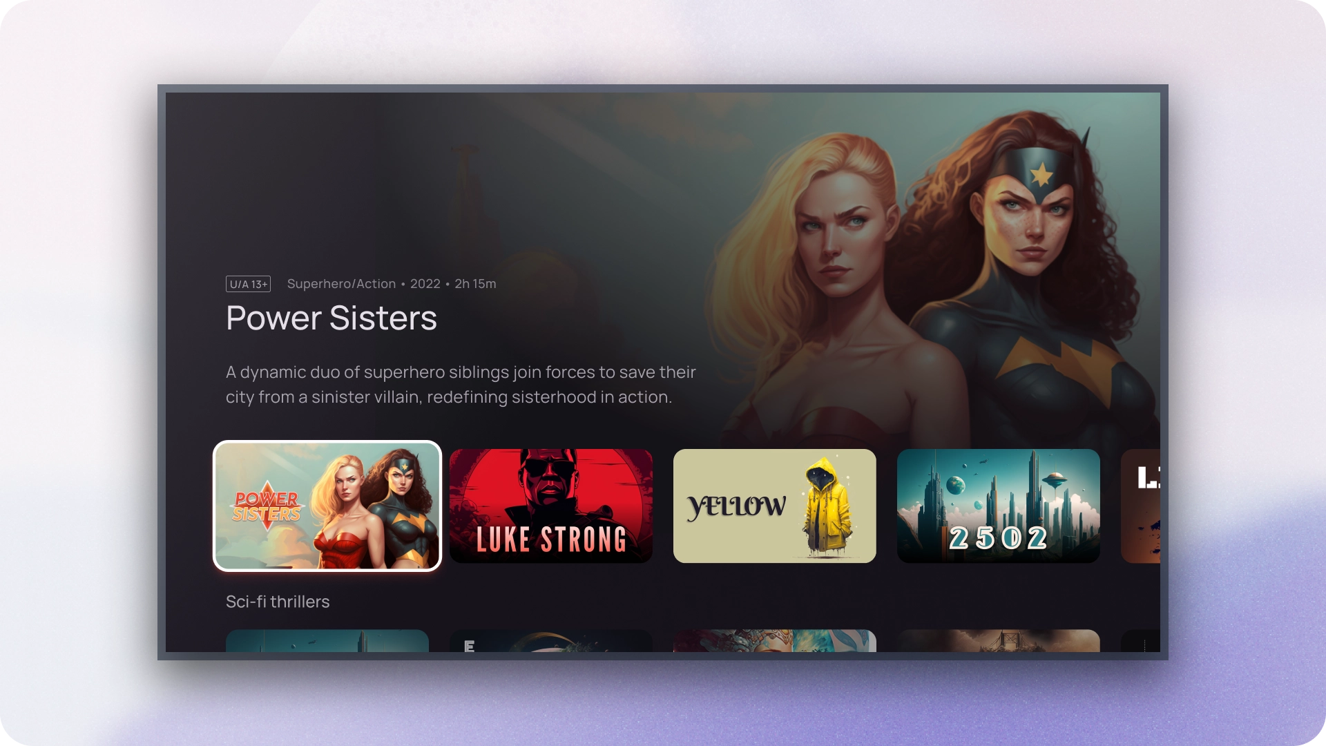
Use immersive carousels when you want to draw attention to featured or promoted content, such as new releases, popular shows, or exclusive titles. The larger viewport and dynamic preview provide a compelling way to showcase these high-priority items.
Image display
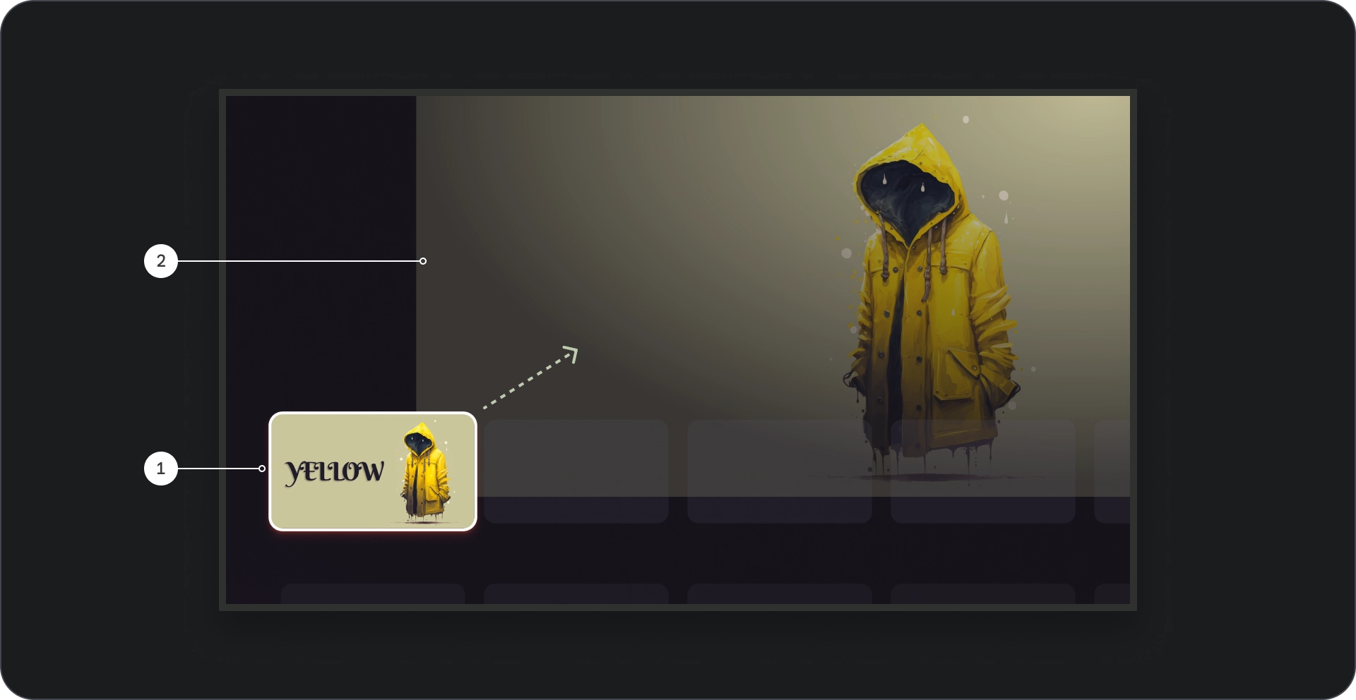
- Card focus: As the user navigates through the carousel, the focused card is visually emphasized, scaling the card by 1.1, using a border, and other visual cues as elevation to indicate its selection. Ensure content titles inside the thumbnail of the focused card are clearly visible and easier to read.
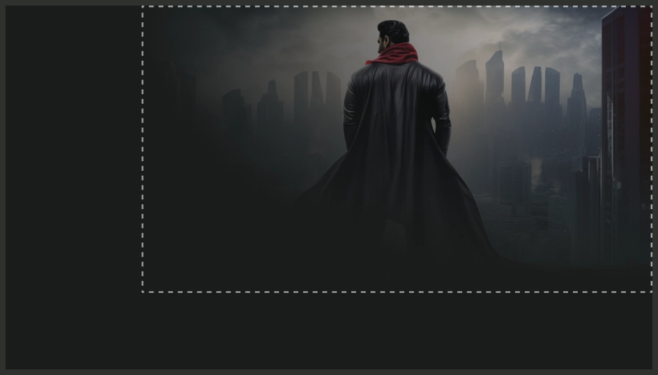
- Background image: When a card is in focus, a corresponding background image is displayed in the larger viewport. We recommend this background image is high-quality and visually appealing, as it provides an immersive and engaging backdrop for the content.
Composition
Do

Don't
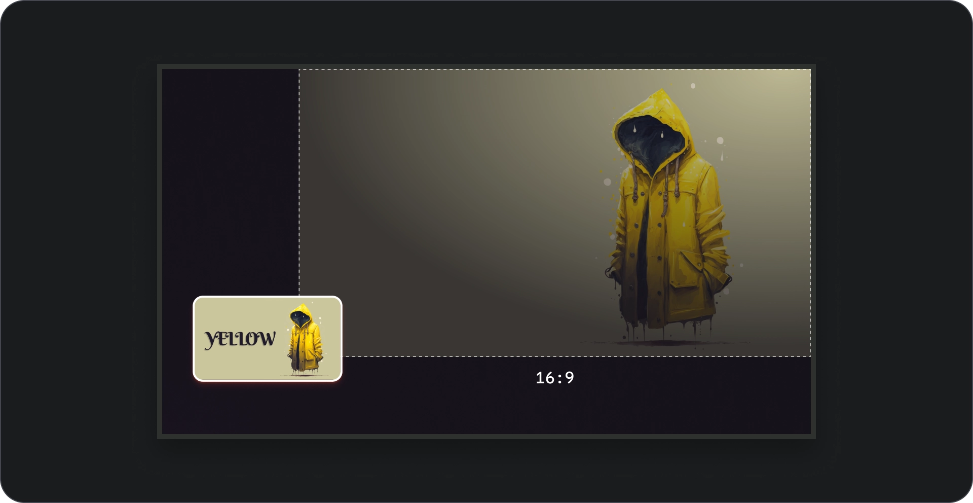
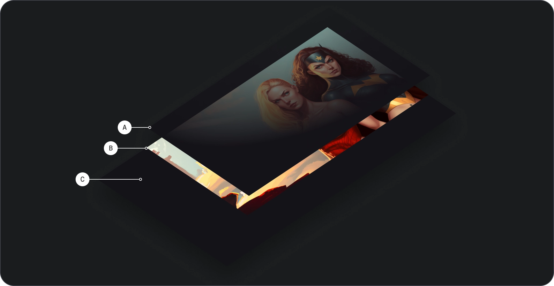
To ensure the images used as backgrounds in the Immersive list component look good, make sure to scale them appropriately so they are not blurry or distorted.
Aspect ratio
Use a 16:9 ratio for background images whenever possible to ensure a visually appealing and consistent layout.