Navigation drawers are essential components in any TV app as they allow users to access different destinations and features. A navigation drawer is the backbone of the app's information architecture, providing a clear and intuitive way to navigate through the app.
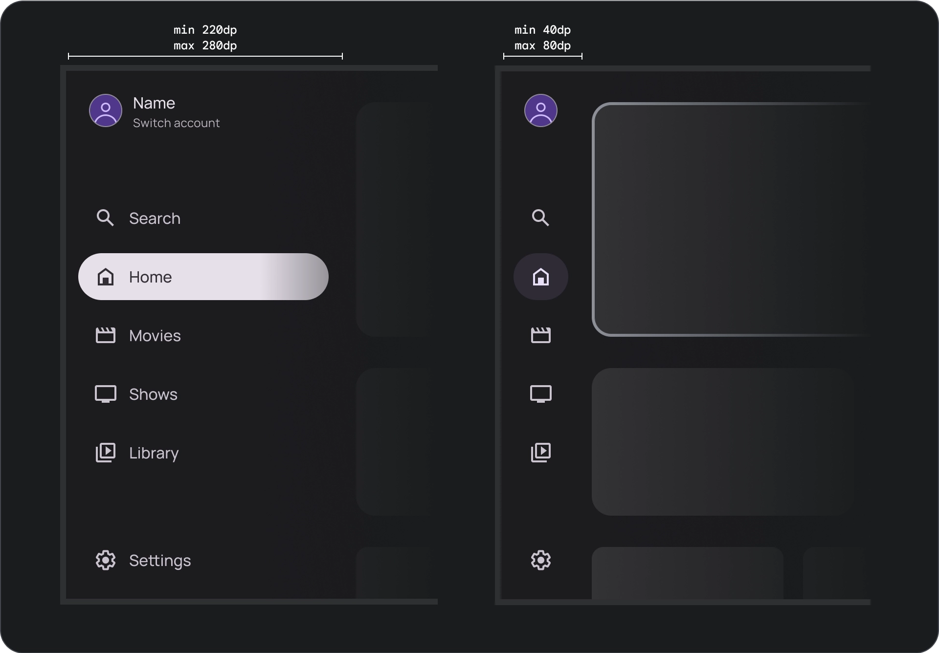
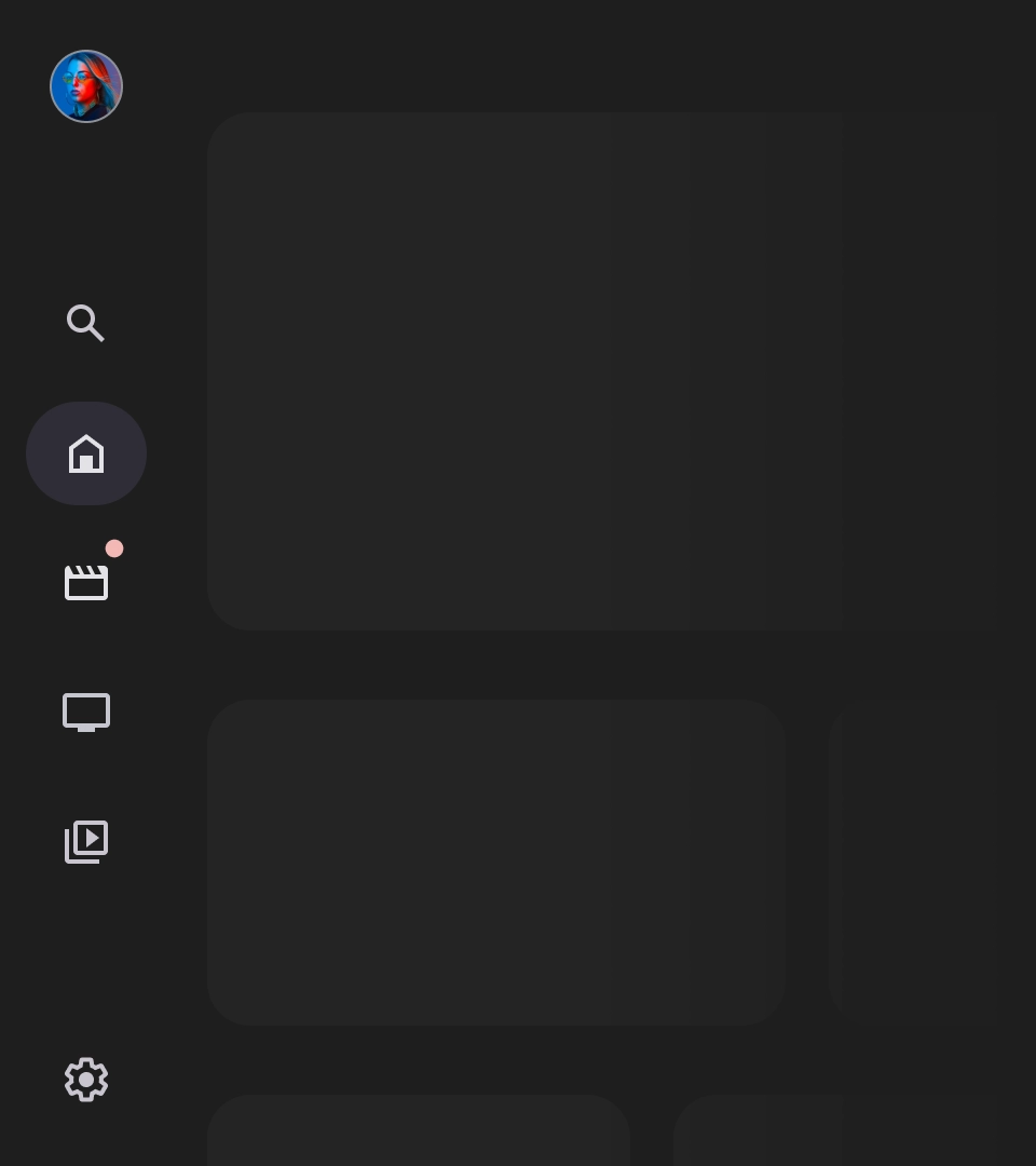
In contrast to the mobile navigation drawer, the navigation drawer on TV has both expanded and collapsed states visible to the user.
Resources
| Type | Link | Status |
|---|---|---|
| Design | Design source (Figma) | Available |
| Implementation |
Jetpack Compose (NavigationDrawer)
Jetpack Compose (ModalNavigationDrawer) |
Available |
Highlights
- Destinations are ordered according to user importance, with frequent destinations first and related destinations grouped together.
- A navigation rail is required for both standard and modal navigation drawers when collapsed.
Variants
There are two type of navigation drawer styles:
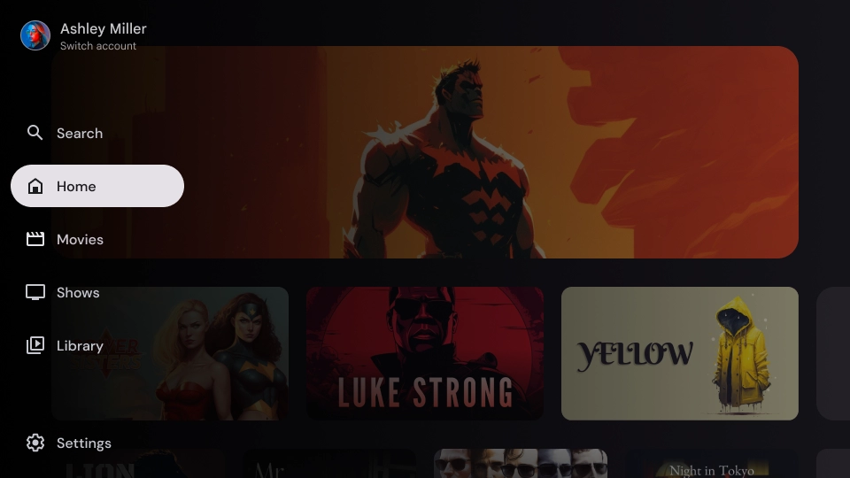
- Standard navigation drawer — Expands to create additional space for navigation, pushing the page content aside.
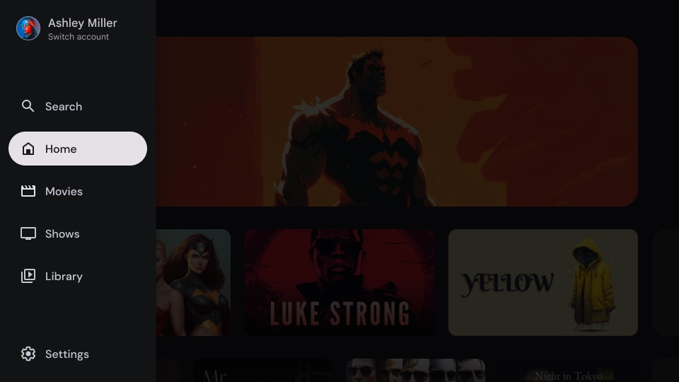
- Modal navigation drawer — Appears as an overlay on top of the app's content with a scrim that helps to improve readability when the drawer is expanded.
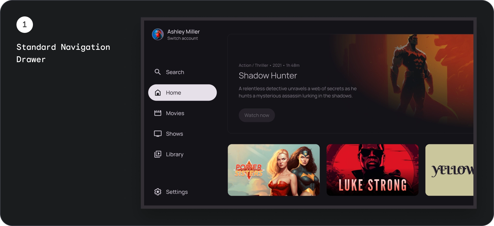
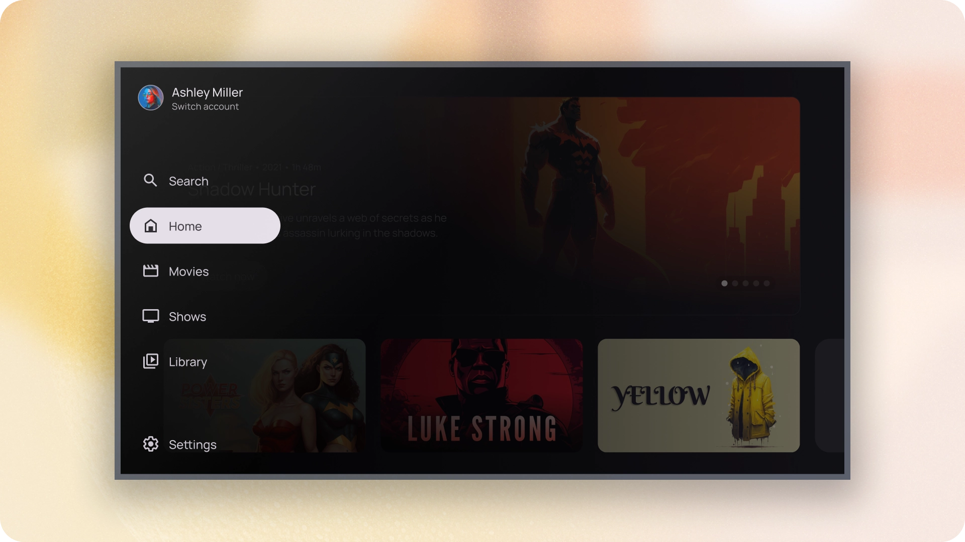
Standard navigation drawer
Anatomy
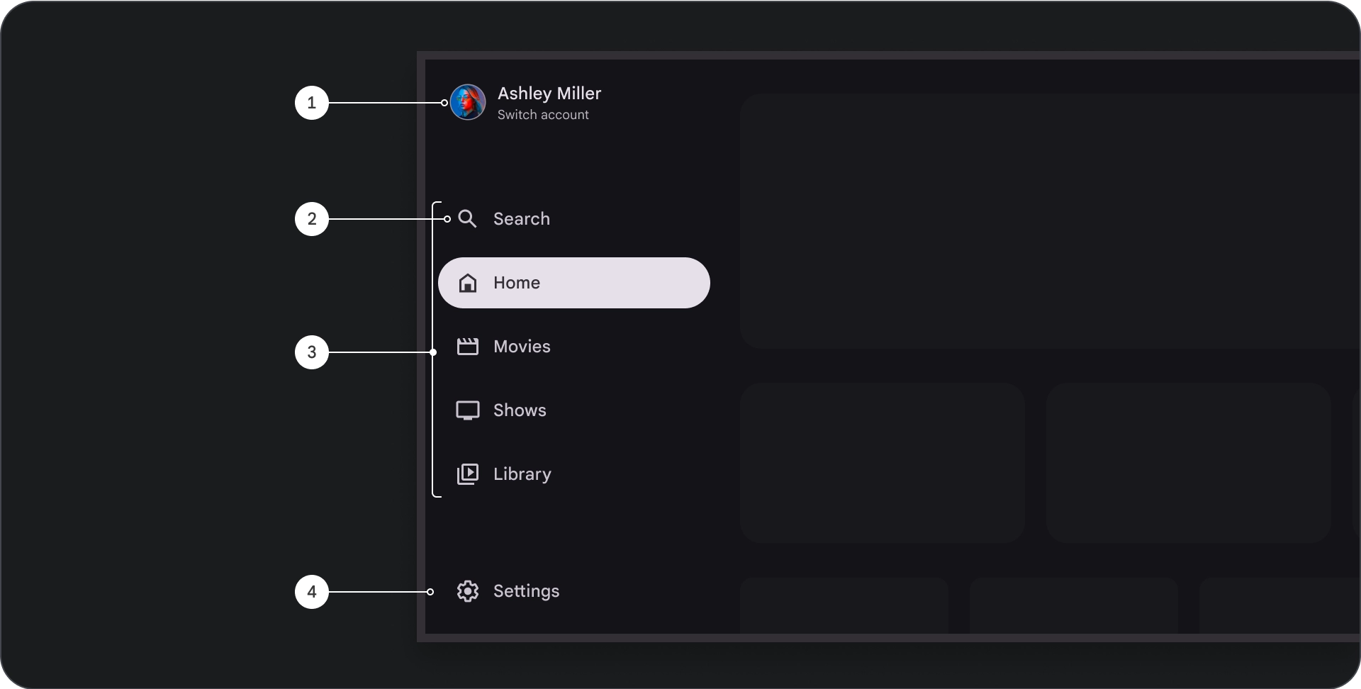
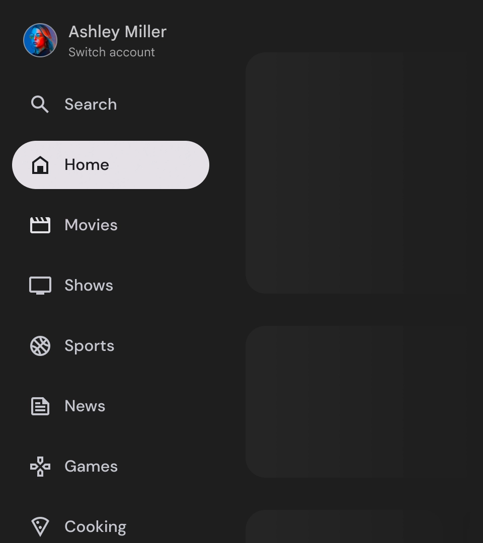
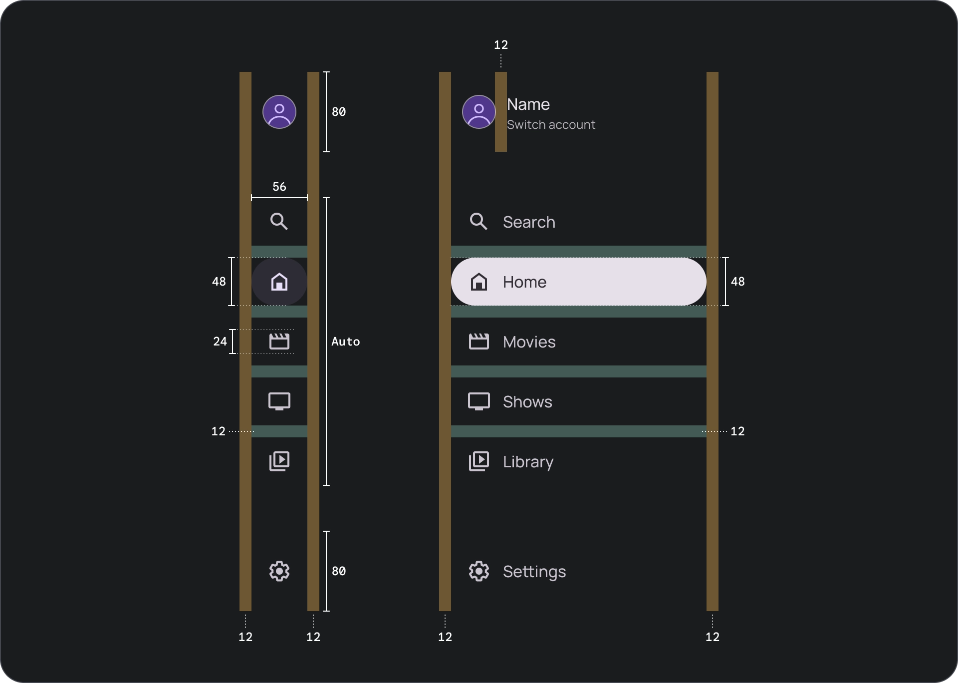
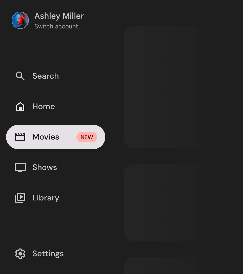
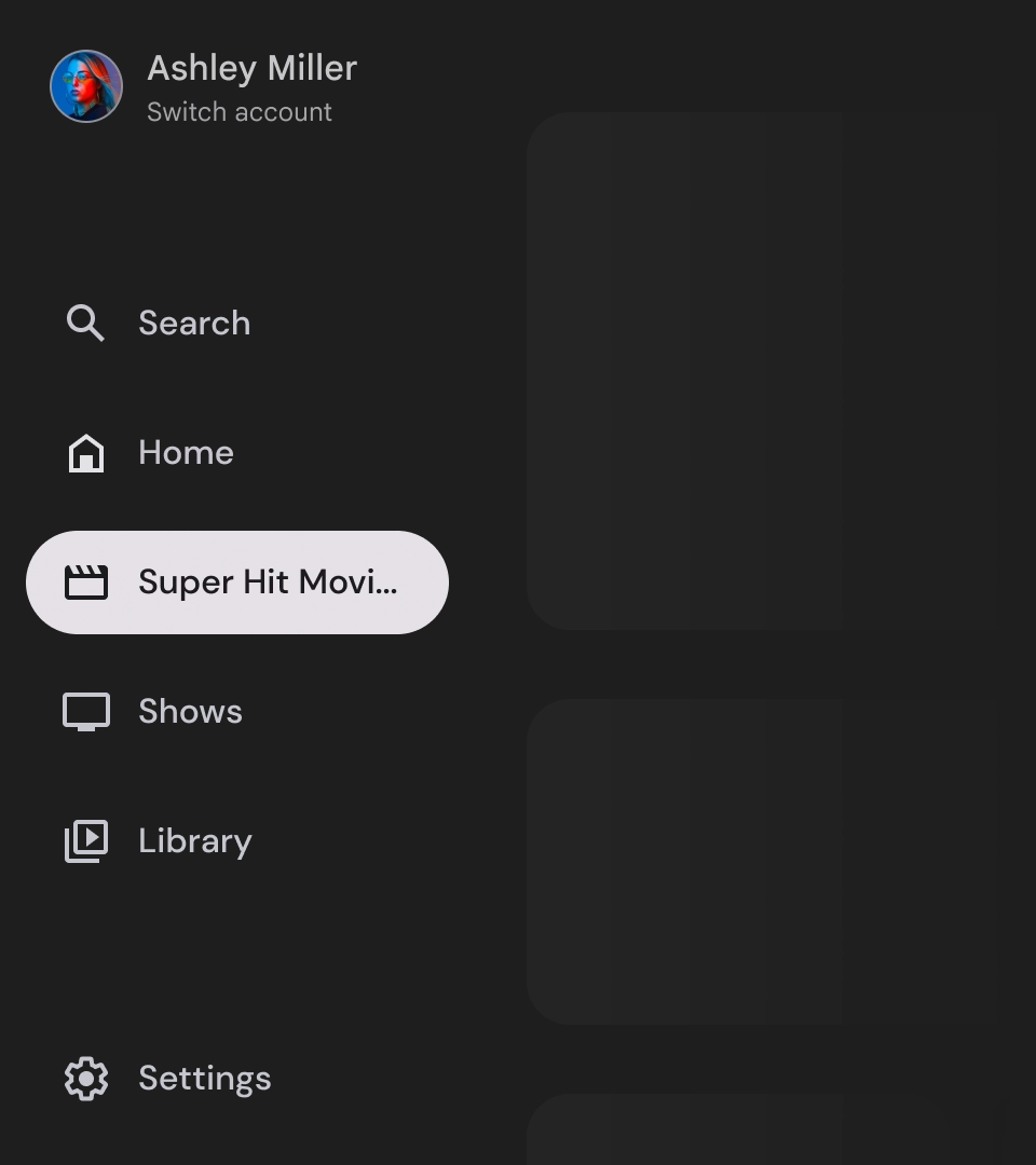
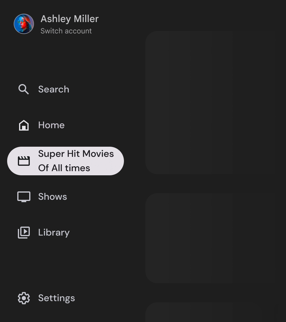
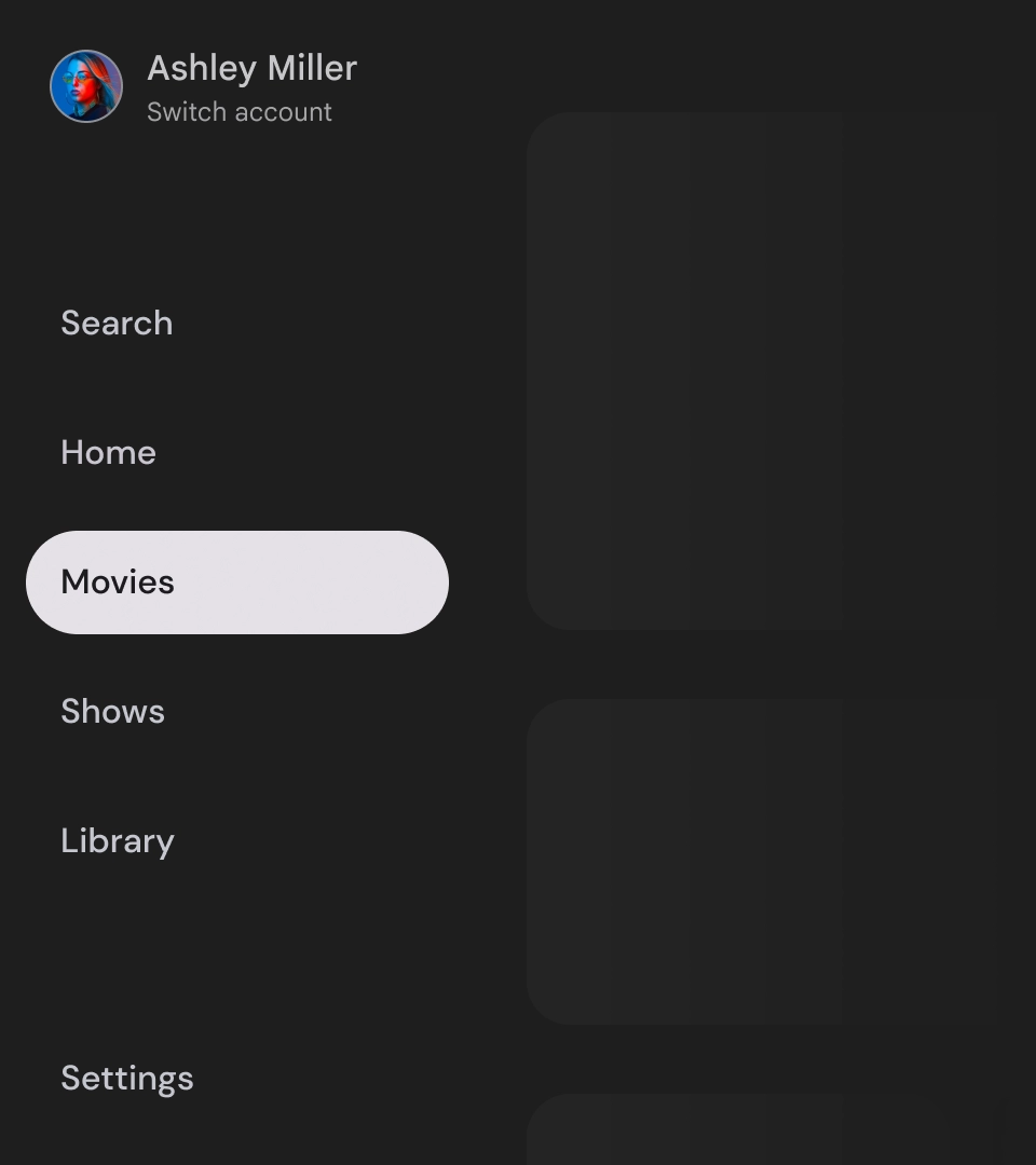
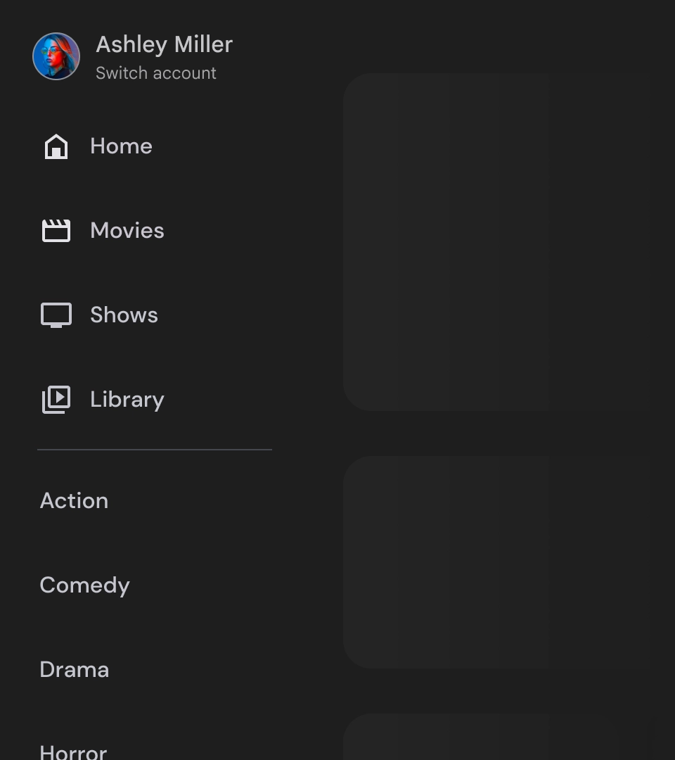
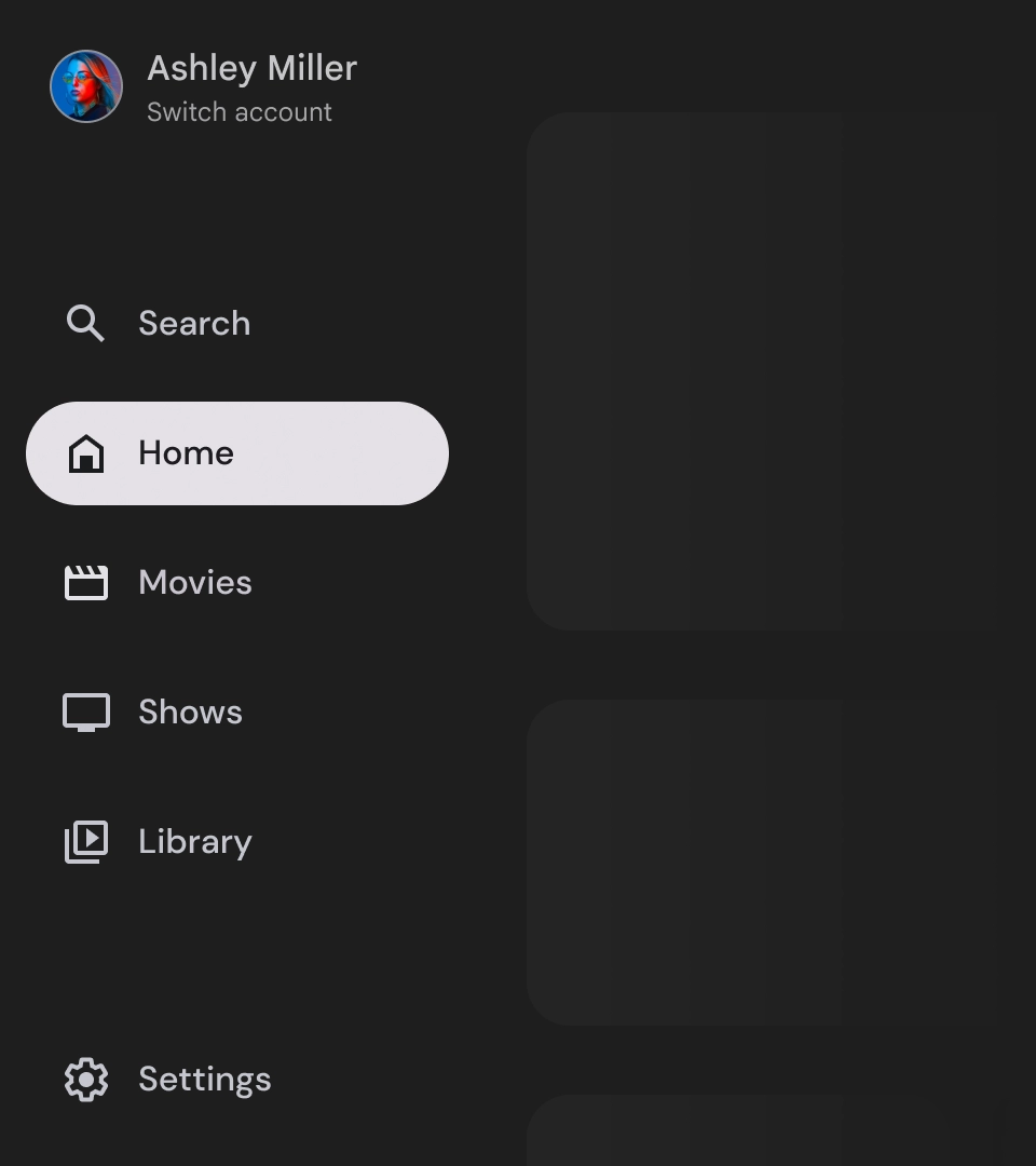
- Top section: Features the app logo. Serves as a button to switch profiles or to trigger search action. In the collapsed state, only the icon remains visible in the top container.
- Navigation item: Each item in the navigation rail features a combination of an icon and text, with only the icon visible in the collapsed state.
- Navigation rail: The Navigation Rail is a column that shows 3 to 7 app destinations, acting as the main menu. Each destination has a text label and an optional icon, with the option of grouping menu items for better contextuality.
- Bottom section: Can have one to three action buttons, which are ideal for pages like settings, help, or profile.
Behavior
- Navigation drawer expansion: When expanded the standard navigation drawers pushes the page content making space for the expanded version for the navigation.
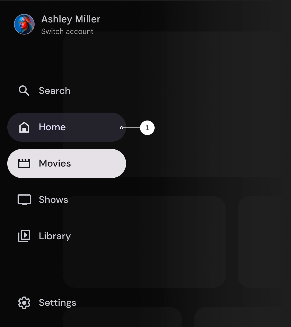
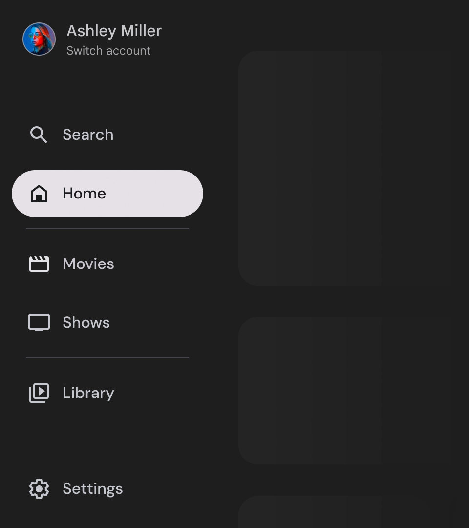
- Navigation updates: Moving from one nav item to another, the page automatically updates to the new destination.
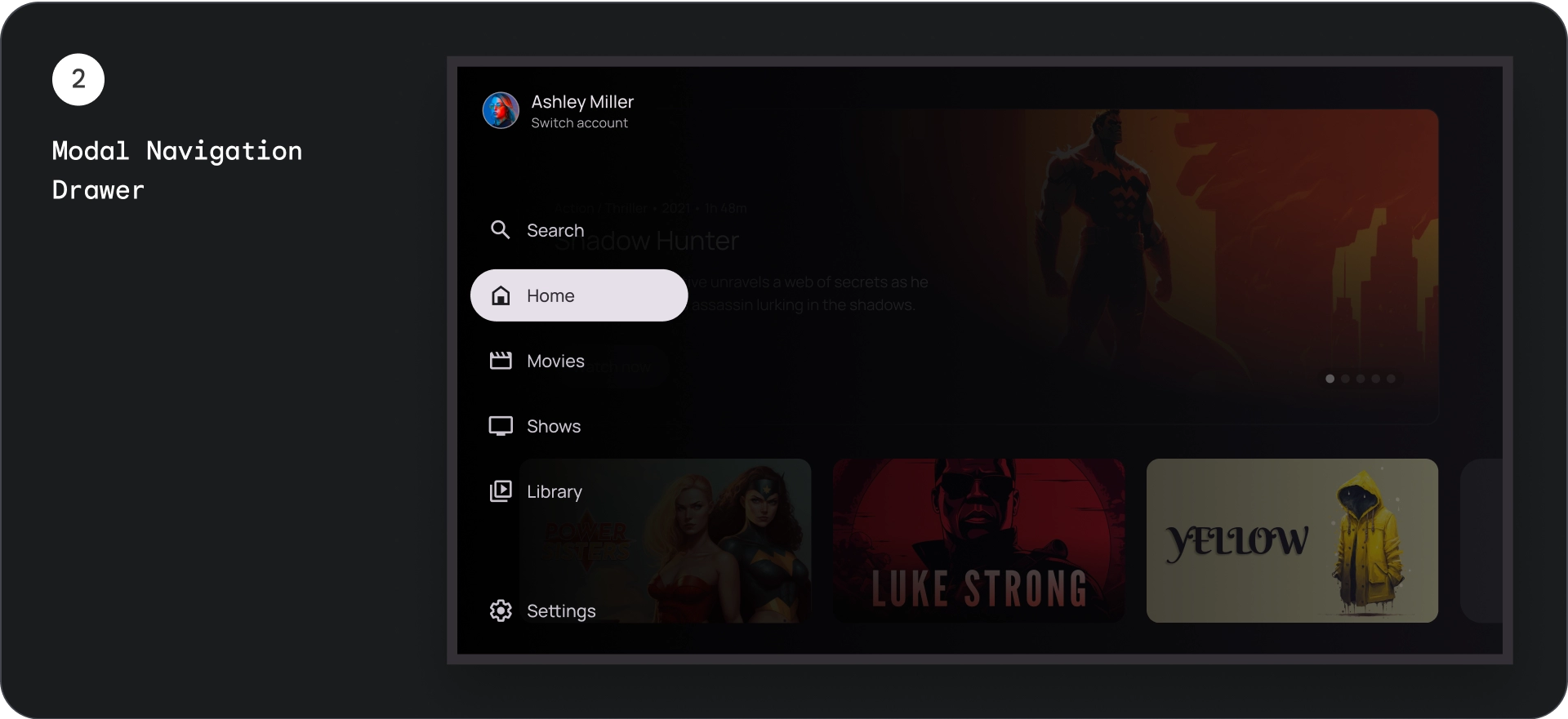
Modal navigation drawer
Anatomy
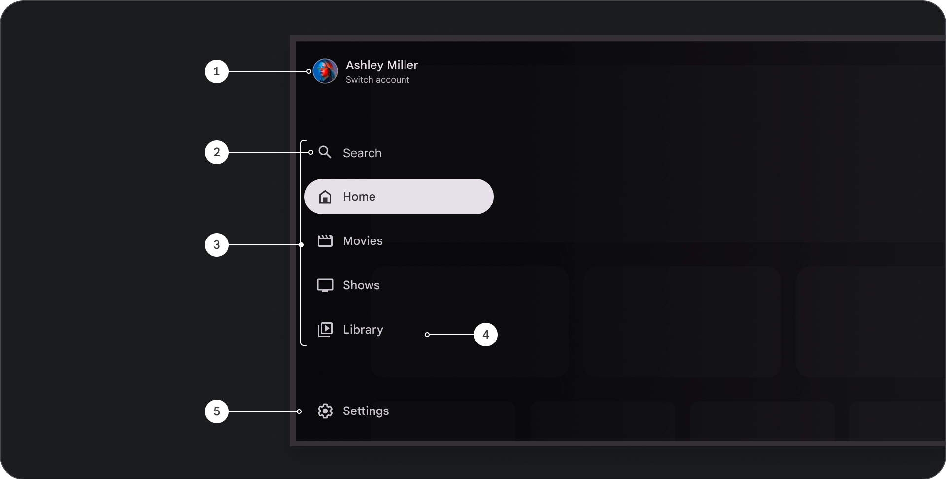
- Top section: Features the app logo. Serves as a button to switch profiles or to trigger a search action. In the collapsed state, only the icon remains visible in the top container.
- Navigation item: Each item in the navigation rail features a combination of an icon and text, with only the icon visible in the collapsed state.
- Navigation rail: Column that shows three to seven app destinations, acting as the main menu. Each destination has a text label and an optional icon, with the option of grouping menu items for better contextuality.
- Scrim: For better readability of navigation item text.
- Bottom section: Can have one to three action buttons, which are ideal for pages like settings, help, or profile.
Behavior
- Drawer expansion: Appears as an overlay on top of the app's content, with a scrim that improves readability when the drawer is expanded.
- Navigation updates: Occur when the user selects a navigation item.
Scrim
For the modal navigation drawer, a scrim behind the drawer ensures the drawer content is readable. You can use a gradient or solid surface behind the navigation drawer to create different variations of the UI.
Gradient scrim
Solid scrim
Spec

Usage
Active Indicator
The active indicator is a visual cue that highlights the navigation drawer destination that is displayed. The indicator is typically represented by a background shape that is visually distinct from the other items in the drawer. The active indicator helps users understand where they are in the app and which destination they are browsing. Ensure that the active indicator is clearly visible and easier to distinguish from the other items in the navigation drawer.
Dividers (optional)
Dividers can be used to separate groups of destinations within the navigation drawer for better organization. However, it's important to use them sparingly as too many dividers can create visual noise and add unnecessary cognitive overload for users.
Badges
Badges are visual cues that can be added to navigation items to provide additional information. For example, a badge could be used to indicate the number of new movies available in a streaming app. Use badges sparingly and only when necessary, as they can make the UI appear busy and cluttered. When using badges, ensure that they are clear and easier to understand and that they don't interfere with the user's ability to navigate the app.
Badge expanded
Badge collapsed
Labels
Labels in the navigation drawer should be clear and concise so that they are easier to read.
Caution
Don't
Don't
Don't
Navigation drawers are foundational elements that represent your app's hierarchy and should be used to list only five to six primary navigation destinations.
Do