Buttons help users initiate actions or flow. Choose from different types of buttons to inform emphasis.
Resources
| Type | Link | Status |
|---|---|---|
| Design | Design source (Figma) | Available |
| Implementation | Jetpack Compose | Available |
Highlights
- Choose the type of button based on the importance of the action. The more important the action is, the more emphasis on the button.
- Buttons should have clear labels to indicate the action they perform.
- Place buttons logically on the screen—where users likely expect to find them.
- Don't overuse buttons. Too many buttons on a screen disrupt the visual hierarchy.
Variants
There are six types of buttons:
- Filled button
- Outline button
- Icon button
- Outline icon button
- Long button
- Image button
Choose the type of button based on the importance of the action. The more important the action is, the more emphasis its button should have.
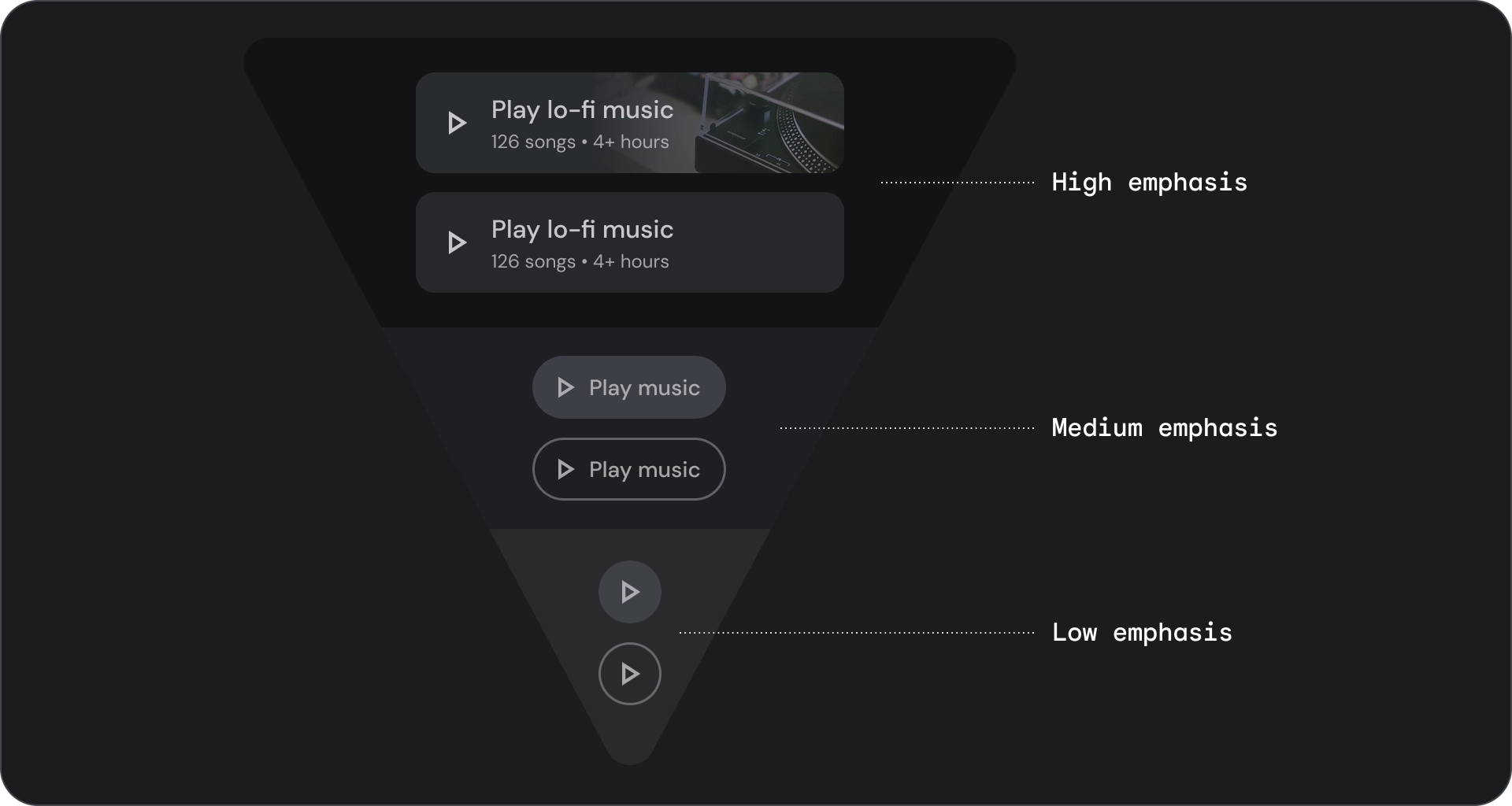
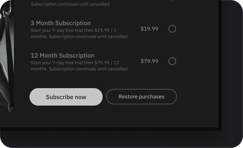
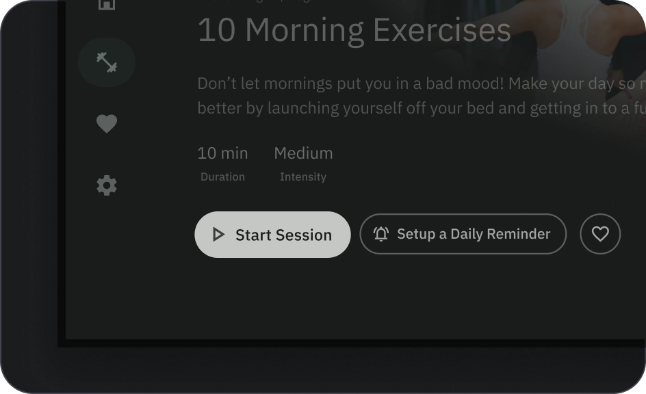
Filled and outline button
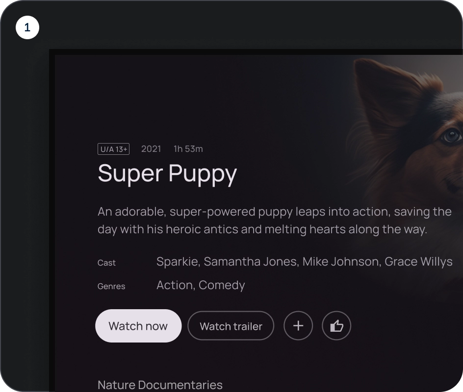
Filled buttons have the most visual impact and should be used for important, final actions that complete a flow, like Save, Join now, Confirm, or Download.
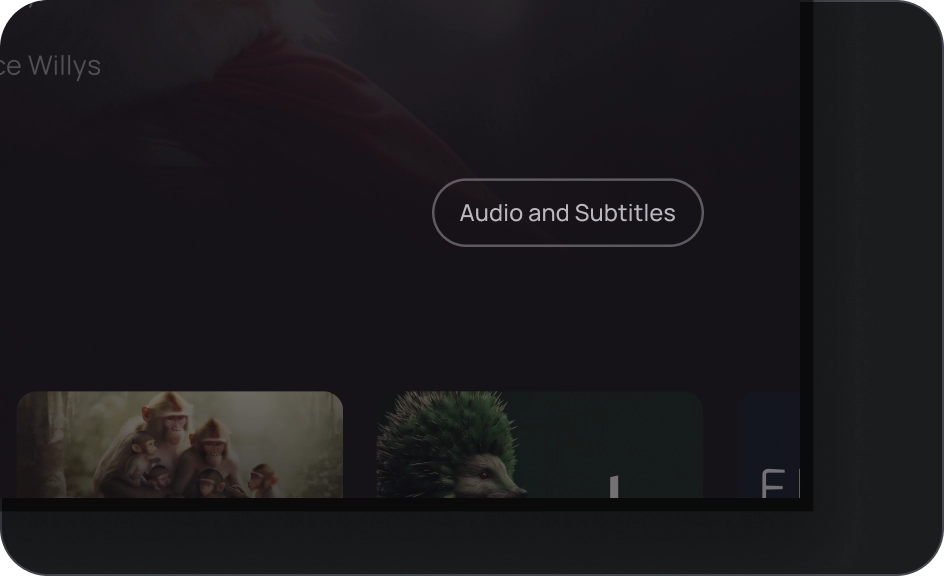
Outlined buttons are medium emphasis buttons. They contain actions that are important, but aren't the primary action in an app. Outlined buttons pair well with filled buttons to indicate an alternative, secondary action.
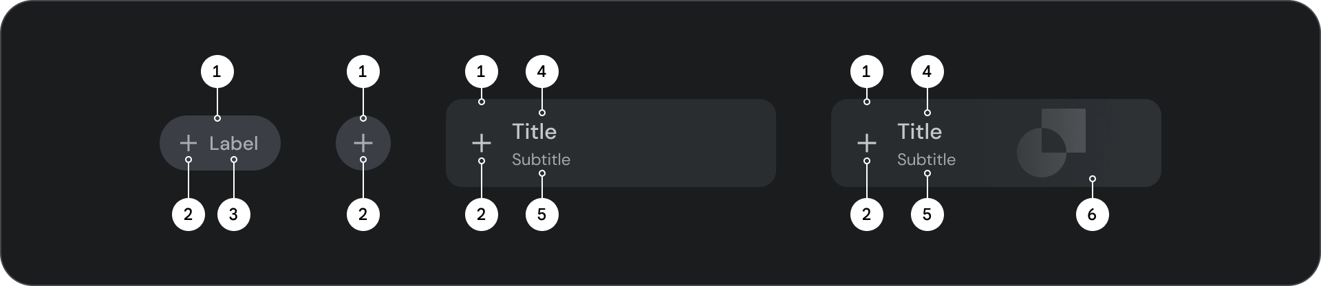
Anatomy
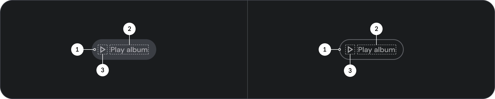
- Container
- Label text
- Icon (optional)
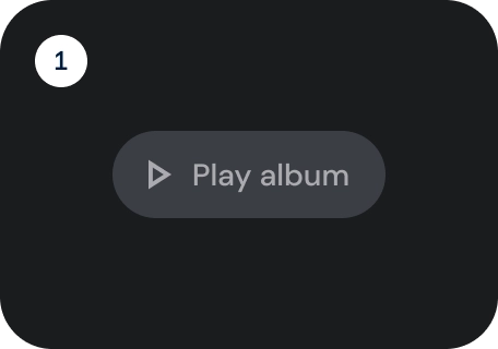
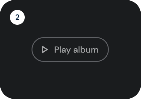
States
Visual representation of a component's status.
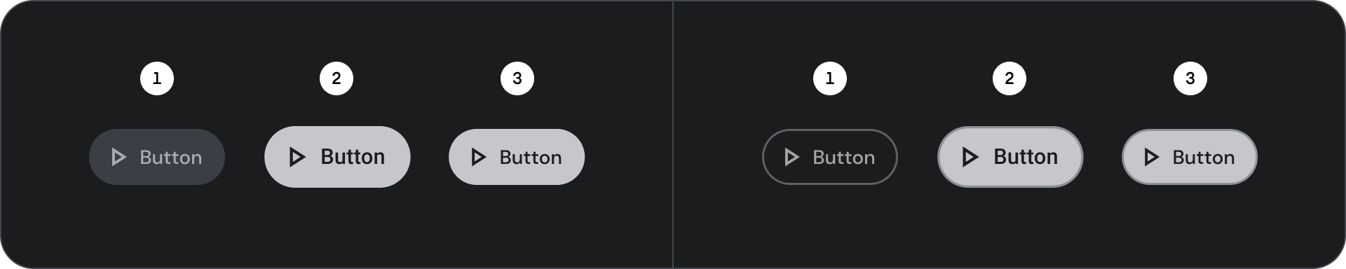
- Default
- Focused
- Pressed
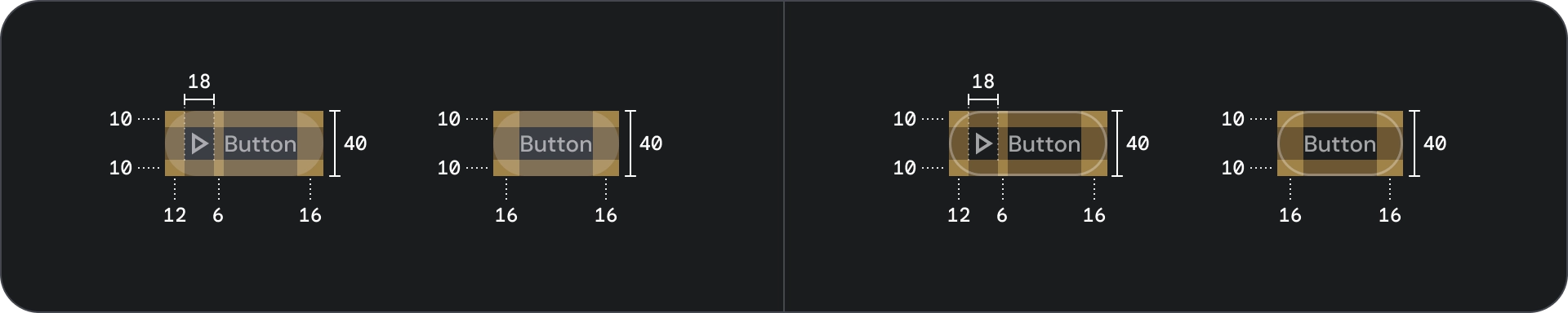
Specification
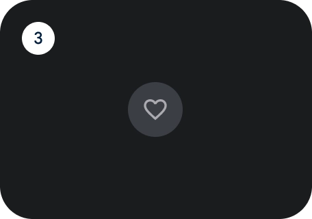
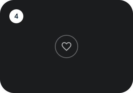
Icon and outline icon button
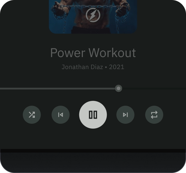
Use icon buttons to display actions in a compact layout. Icon buttons can represent opening actions such as opening an overflow menu or search, or represent binary actions that can be toggled on and off, such as favorite or bookmark. They are also used to play or pause media.
Icon buttons can be defined in three sizes: small, medium and large.
Anatomy
- Container
- Icon
States
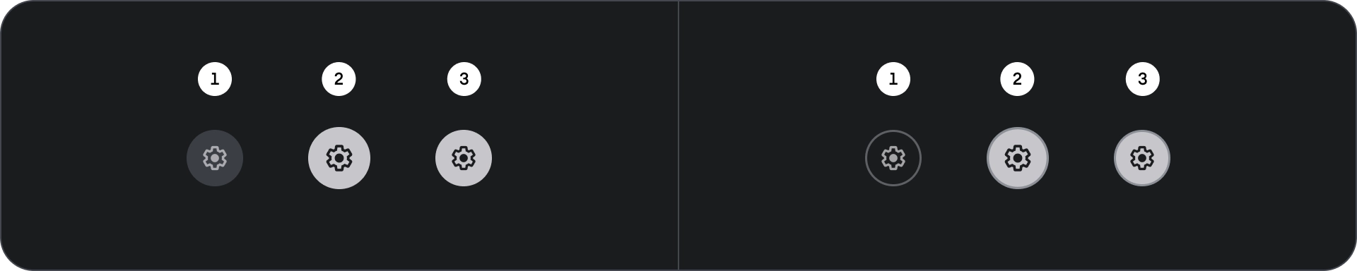
- Default
- Focused
- Pressed
States are visual representations used to communicate the status of a component or interactive element.
Spec
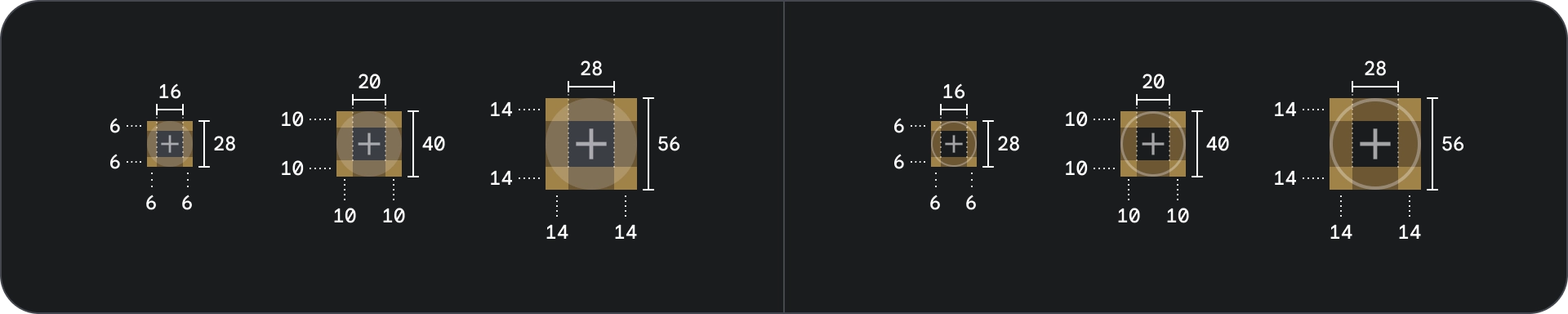
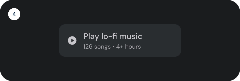
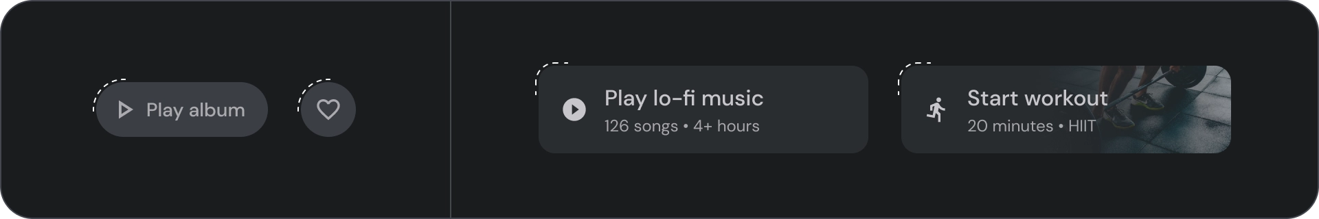
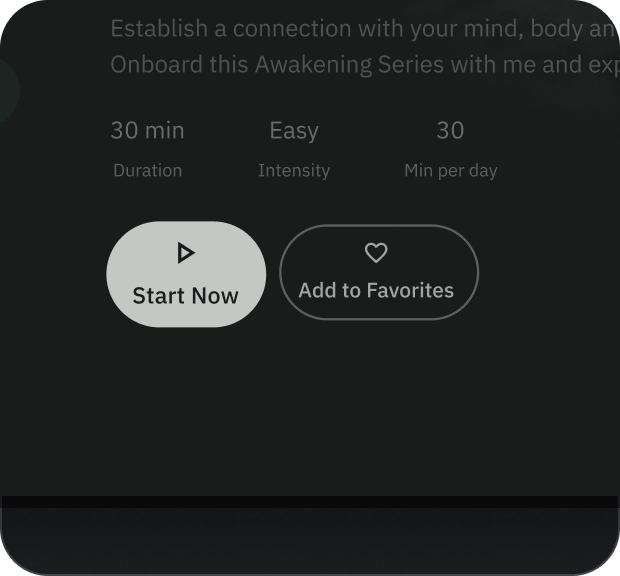
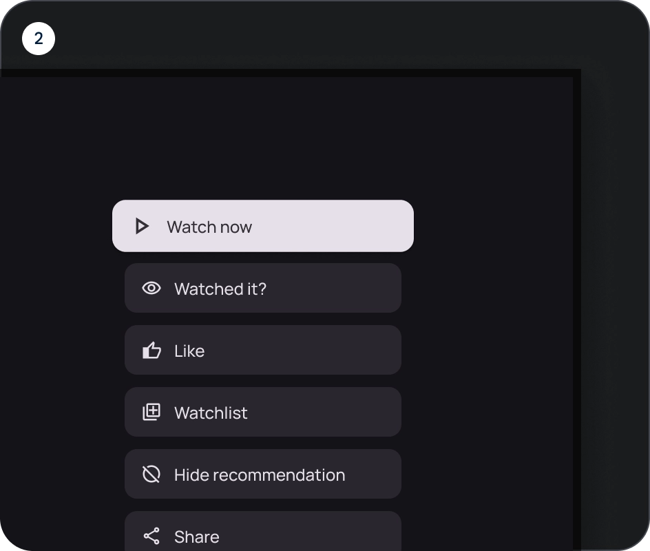
Wide button
Wide buttons are used for higher-emphasis than usual buttons. They contain actions that are important. Buttons that represent related options are grouped together. The group should share a common surface.
Anatomy
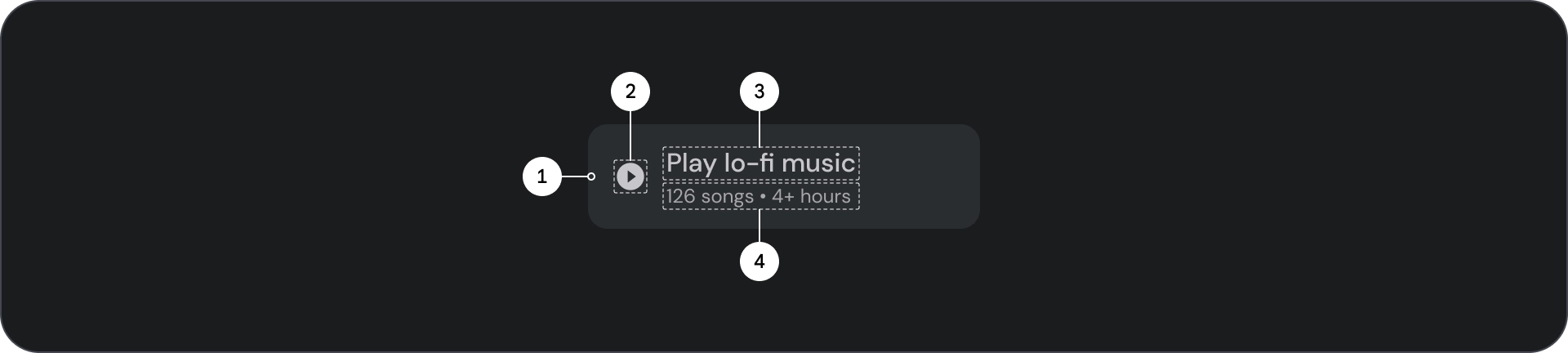
- Container
- Leading icon
- Title
- Subtitle
States
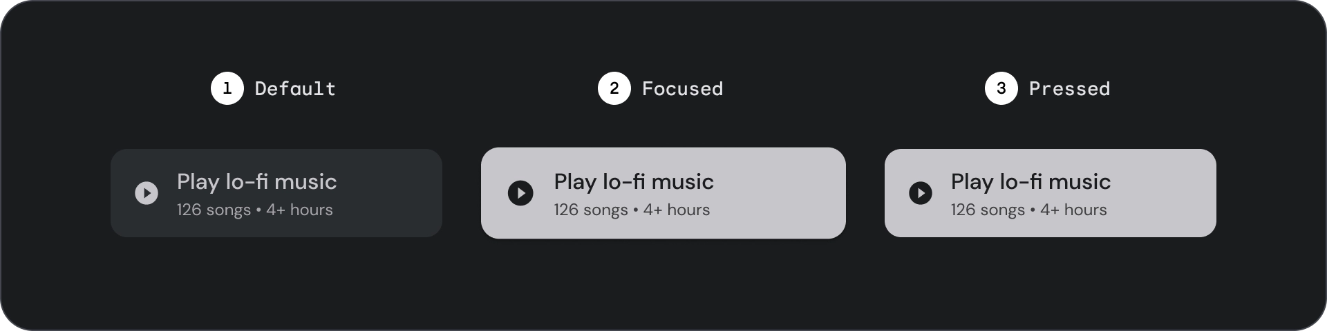
- Default
- Focused
- Pressed
States are visual representations used to communicate the status of a component or interactive element.
Specifications
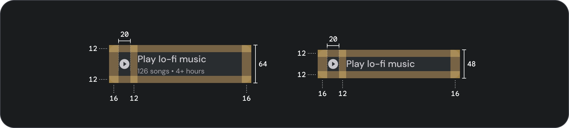
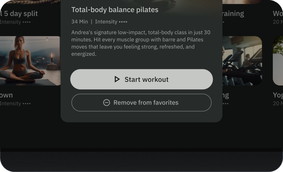
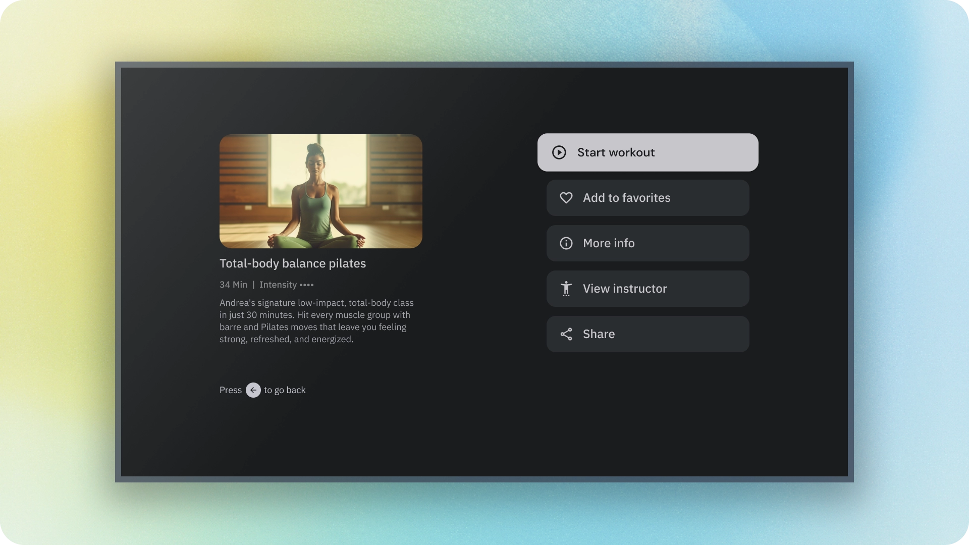
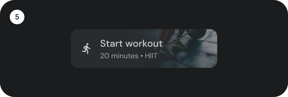
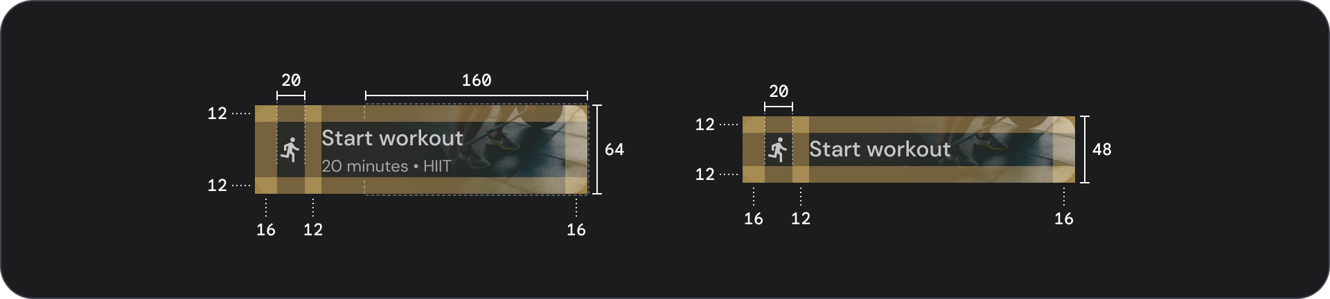
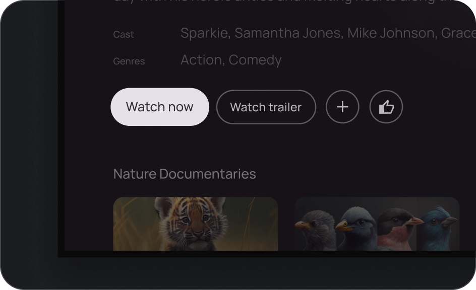
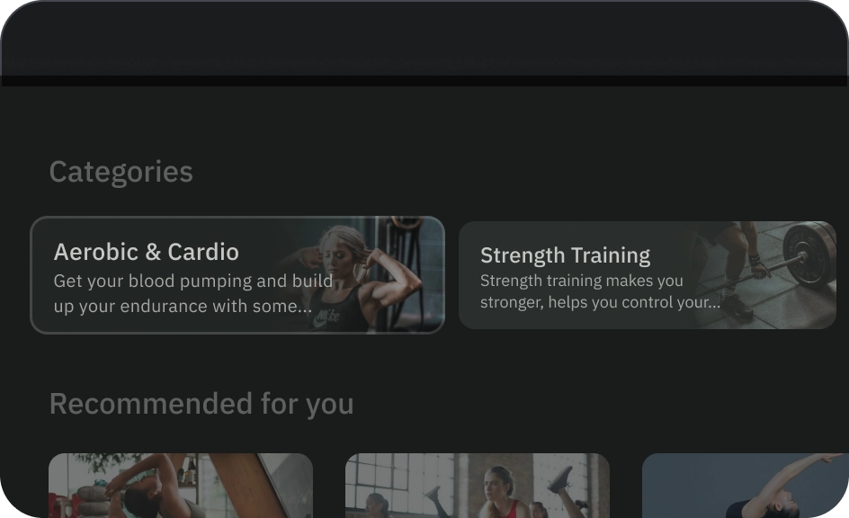
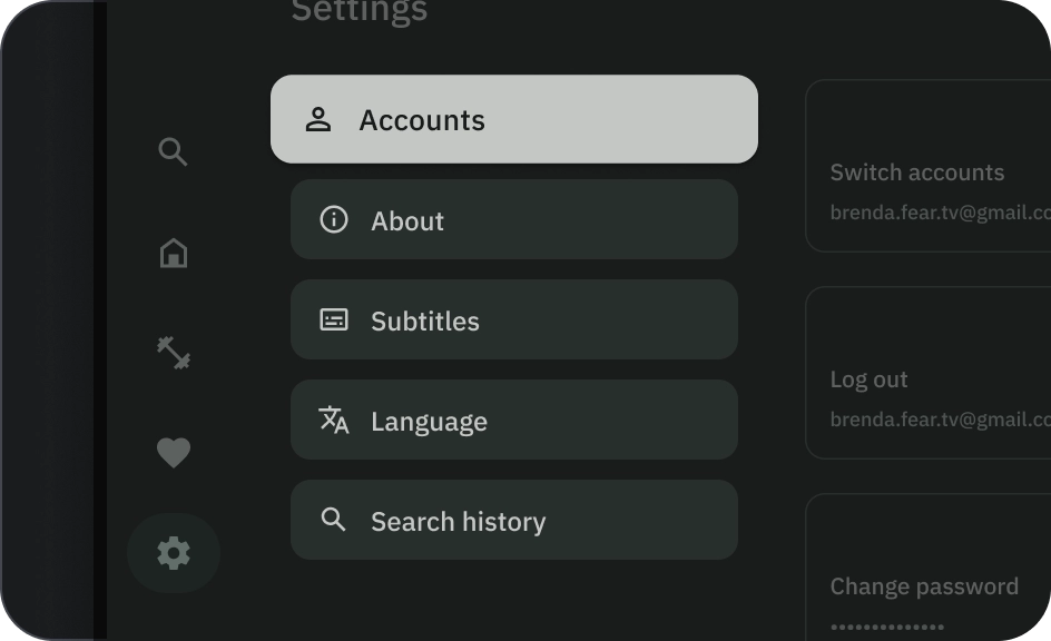
Image button
Image buttons are typically used to display thumbnails of the content that is available in the next level of navigation. They are usually grouped together with related actions, and the group should share a common surface.
Anatomy
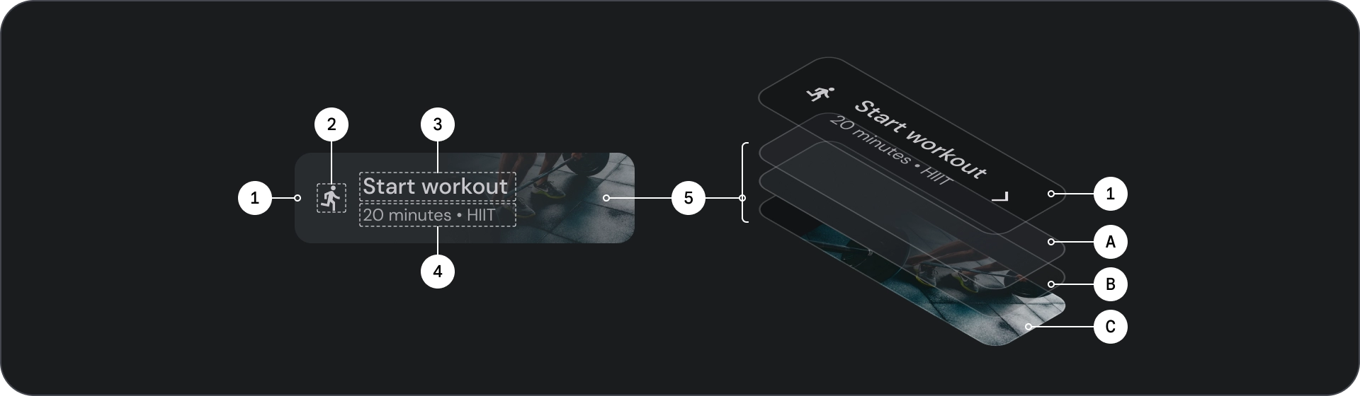
- Container
- Leading icon
- Title
- Subtitle
- Image layer, which consists of:
- Scrim (state overlay)
- Gradient (based on surface color)
- Image
States
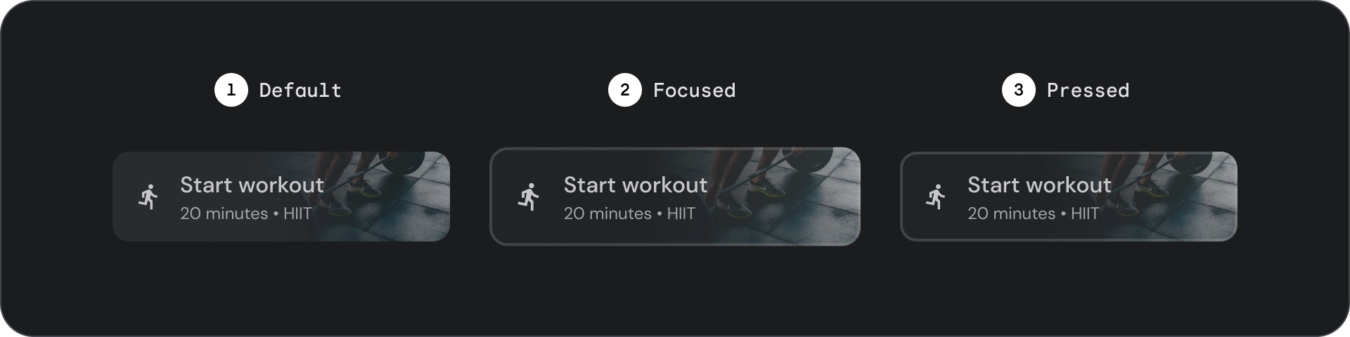
- Default
- Focused
- Pressed
States are visual representations used to communicate the status of a component or interactive element.
Spec
Usage
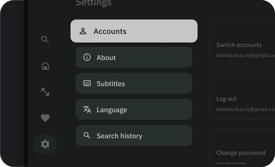
Buttons are generally used to communicate actions that a user can take. They are frequently found in UI elements such as dialogs, modal windows, forms, cards, and toolbars.
Buttons are just one option for representing actions in your UI. Don't overuse them. Too many buttons on a screen disrupts the visual hierarchy.
- Container
- Icon
- Label text
- Title
- Subtitle
- Image
Container
Buttons display a container around content. The container scales by 1.1x on focus, maintaining the internal padding. Here are some considerations for container:
- Set container width based on content with consistent padding.
- Set the container's relative position to the responsive layout grid.
- Use solid color containers for filled buttons.
- Use stroke and fill color on focus for outlined buttons. On focus, the container gets a fill color along with outline.
- For wide and image buttons, container width is set according to the layout grid.
- Container size, position, and alignment can change as its parent container scales.
Text and icon button containers have fully rounded corners. Wide and image button containers have rounded containers of 12dp.
Do
Caution
Icon
Icons visually communicate the button's action and help draw attention. They should be placed on the leading side of the button. Icons are always vertically centered within the container.
Do
Don't
Caution
Label text
Label text is the most important element of a button. It describes the action that occurs if a user taps a button.
Use sentence case for button label text, capitalizing the first word and proper nouns. Avoid wrapping text. For maximum legibility, label text should remain on a single line.
Do
Caution
Image
Image buttons always have a gradient overlay and scrim on top of the image in the background. The gradient overlay is set according to container color. The scrim changes according to state.
Button groups
Buttons appear together in a row or column to maintain consistent navigation between actions. The following sections describe considerations.
Inform hierarchy
Each screen should have one primary action that is represented by a prominent, typically wide, button. The button should be easier to see and understand. Other buttons should be less prominent and shouldn't distract users from the primary action.
The first button in the group acts as the primary action since focus lands on it first.
Maintain linear layout
- Row layout
- Column layout
Use variants logically
In column layout, single button variants should be maintained. In row layout, different variants can be clustered together in a button group but the logic should be clear. Filled and outline buttons can be used in the same group, but ensure clear hierarchy for actions.
Do
Don't
Caution