Layouts are structural templates that provide a framework for maintaining visual consistency across your application. By defining visual grids, spacing, and sections, layouts establish a cohesive and organized structure for the presentation of information and UI elements.
Highlights
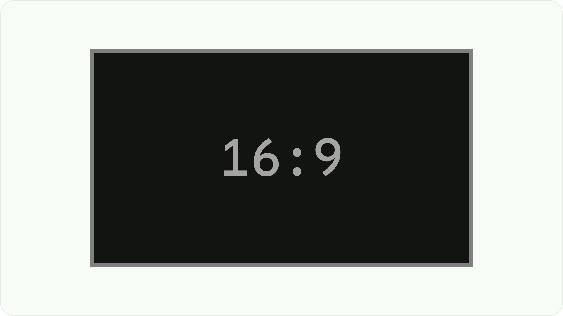
- Unlike web or mobile, TVs have a fixed screen aspect ratio of 16:9.
- Optimize layouts along horizontal and vertical axes for ease of use and control.
Principles
Guidelines to help you make design decisions when designing TV layouts.
Design for large screens
Since the popularization of HDTV, rectangular TVs with an aspect ratio of 16:9 have become the norm. Historically, televisions were manufactured in a square shape known as 4:3 or 1.33 to 1 aspect ratio.
Design on Android platform
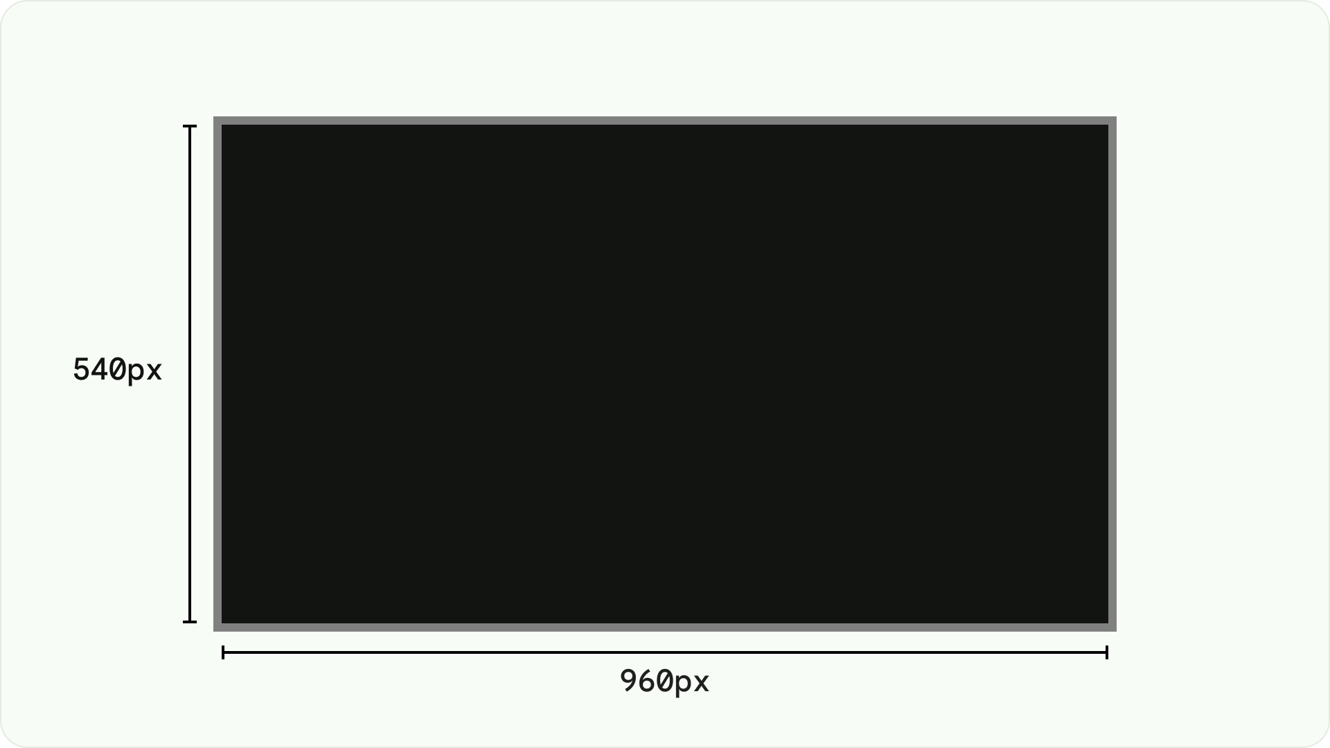
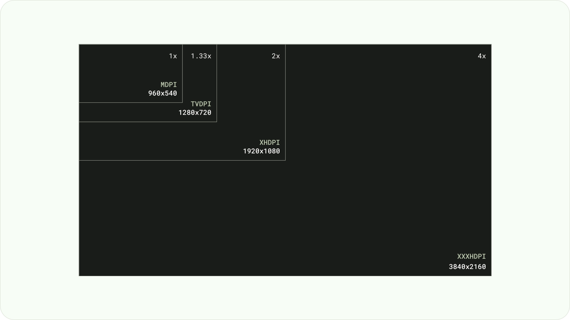
When designing, use dp to display elements uniformly on screens with different densities, as with any other Android-powered device. Always design at MDPI resolution at 960px * 540px.
At MDPI 1px = 1dp.
Assets need to aim for 1080p. This allows the Android system to downscale layout elements to 720p, if necessary.
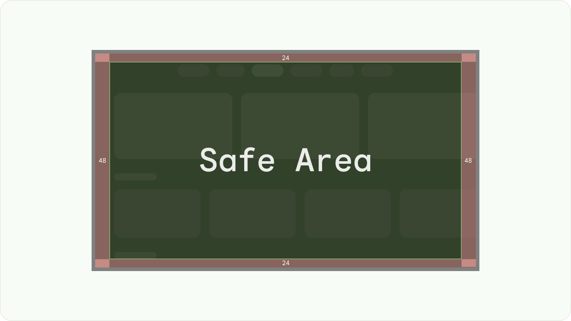
Ensure visibility and overscan safety
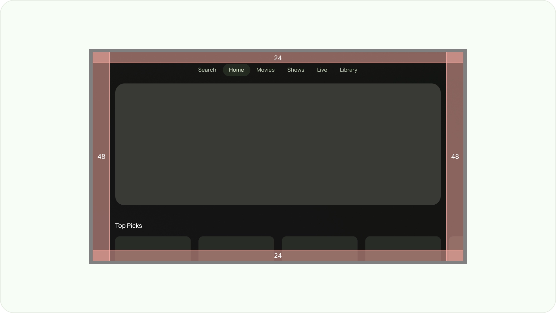
Ensure important elements are always visible to users. To do this, position the elements with a 5% margin of 48dp on the left and right sides, and 27dp on the top and bottom of a layout. This ensures that the layout's screen elements are within the overscan.
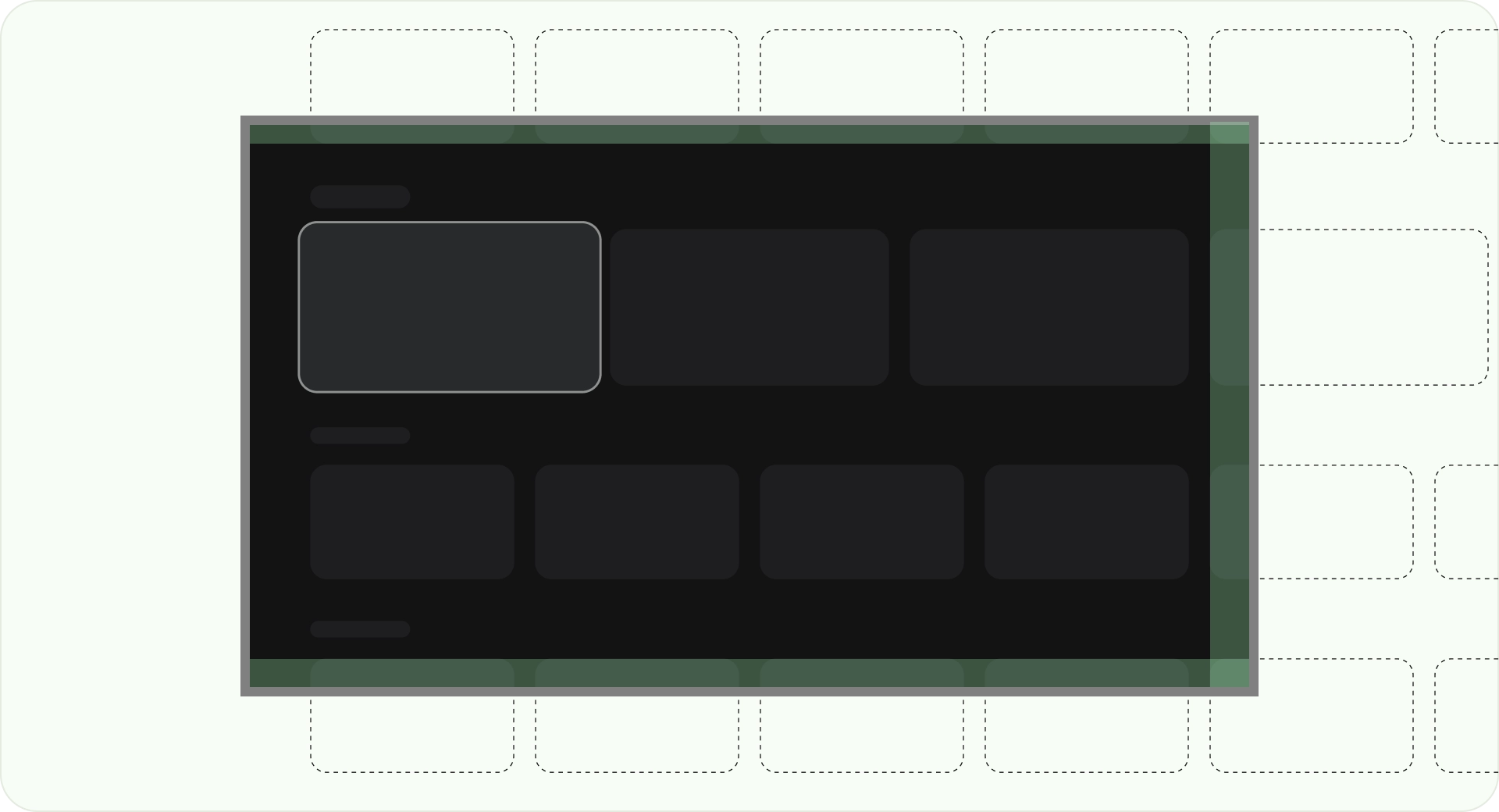
Fill the full screen
Don't adjust or clip background screen elements to the overscan safe area. Instead, allow partial display of offscreen elements. This ensures that all screens correctly display the background and offscreen elements.
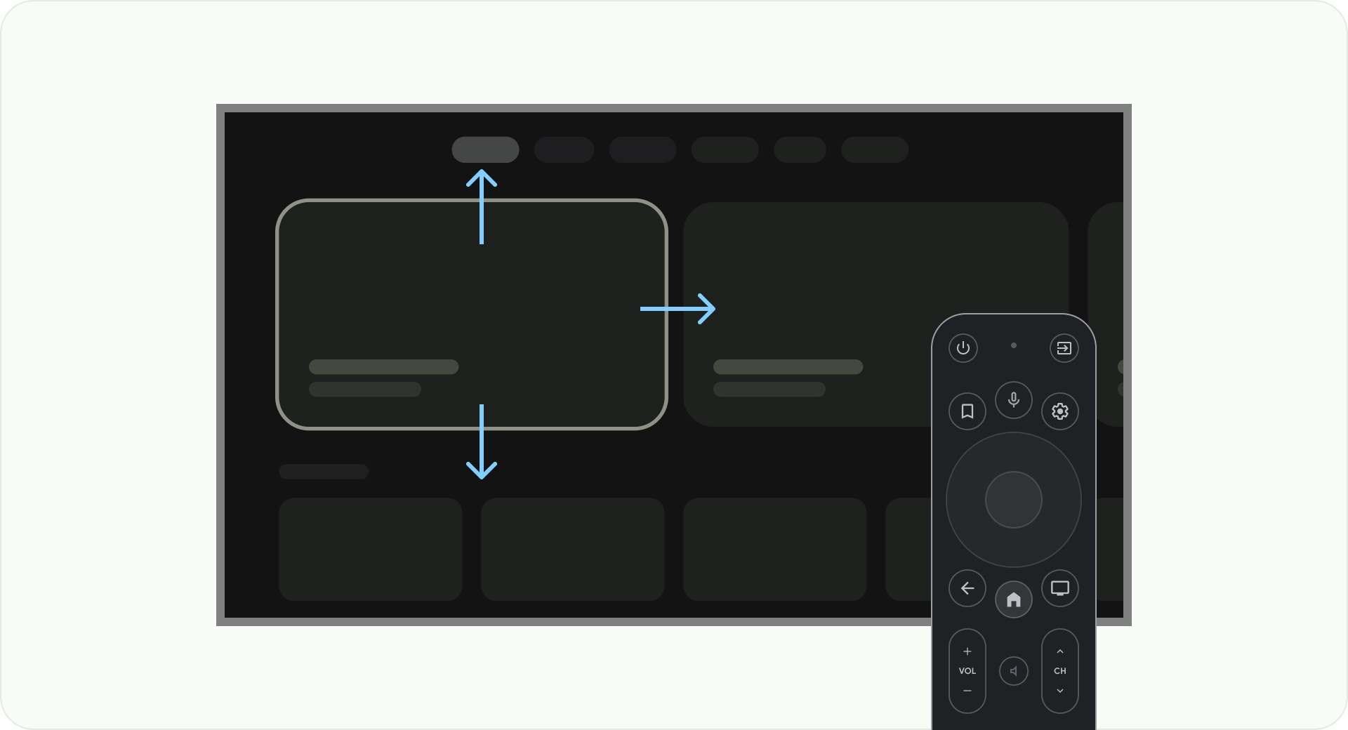
Optimize with axes
Consider how people use the remote control with their TV. Make sure your TV interface is simple to use with the remote. Design each direction (up, down, left, right) to have a clear purpose and navigation pattern to help users understand how to move through large groups of options.
Layout
TV screen sizes differ from device to device. Since a modern TV has a 16:9 aspect ratio, it is recommended to design your app with a 960px x 540px screen size. This ensures all elements can be resized proportionally for HD or 4K screens.
Overscan margins
Overscan margins are the spaces between content, and the left and right edges of the screen.
960 * ~5% = 48dp
540 * ~5% = 27dp round off to 24dp
These border margins protect primary elements from potential overscan issues. To keep your content and information safe, use a 5% margin layout (58dp on the sides and 28dp on the top and bottom edges).
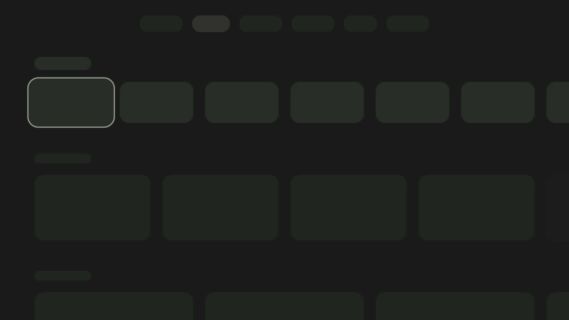
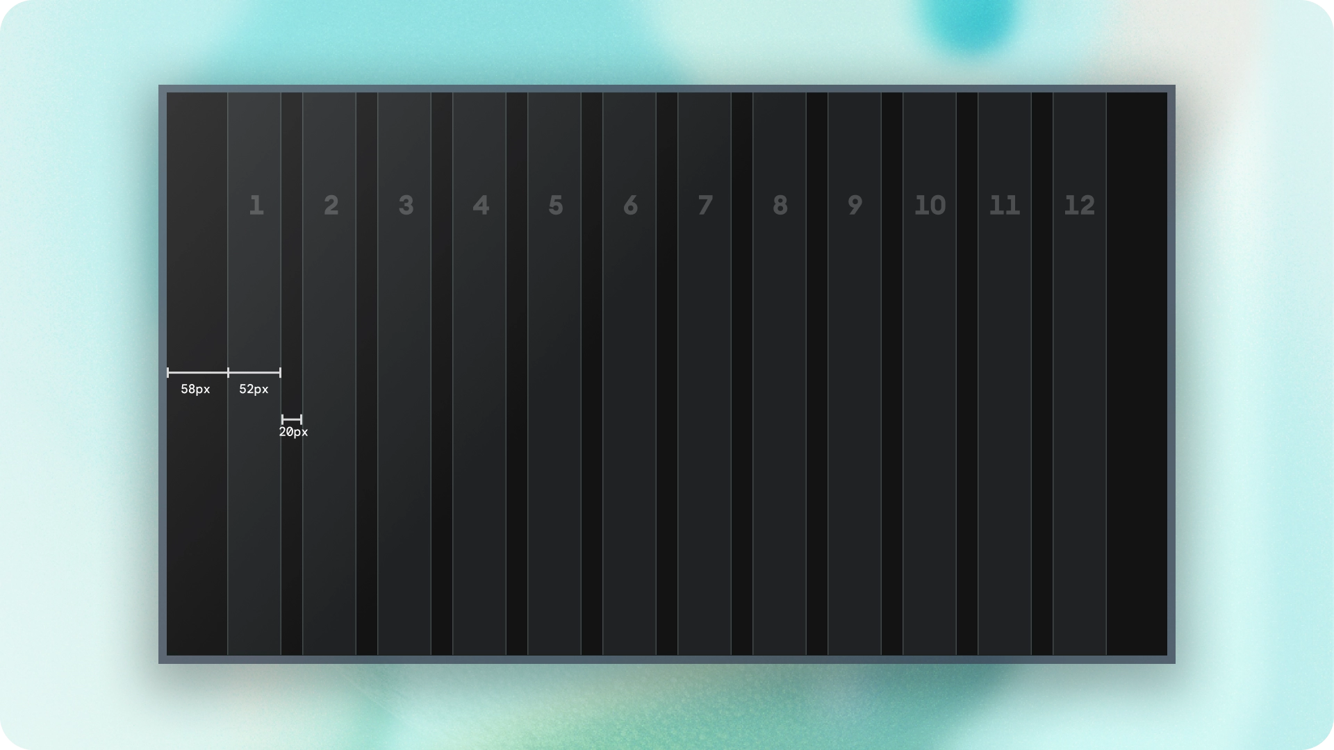
Columns and gutters
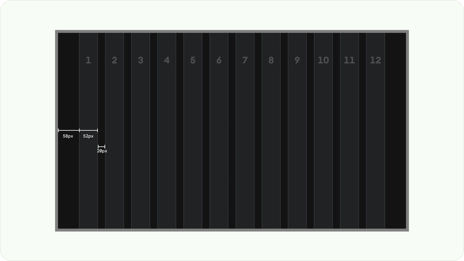
Content is put into areas of the screen that have columns and gutters. The grid system has 12 columns. Gutters are the spaces between the columns that help divide the content.
Use 12 columns that are 52dp wide with 20dp of space between them. There needs to be 58dp of space on both sides and 4dp of vertical spacing between lines.
Layout patterns
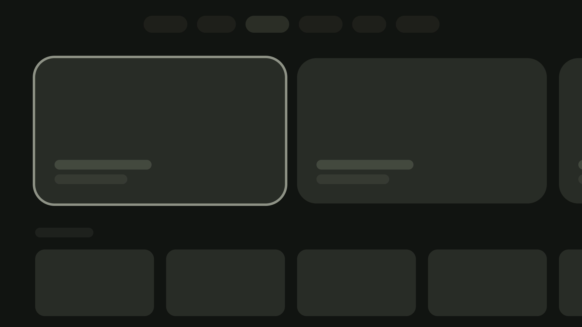
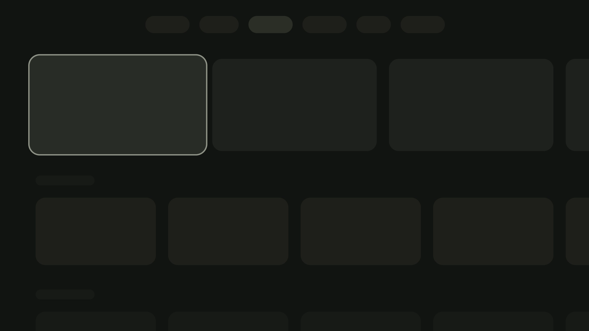
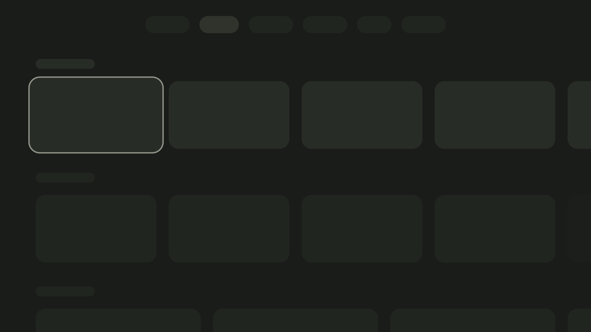
There are three layout patterns available depending on your intended purpose and display device: Horizontal Stack Layout, Vertical Stack Layout, and Grid Layout.
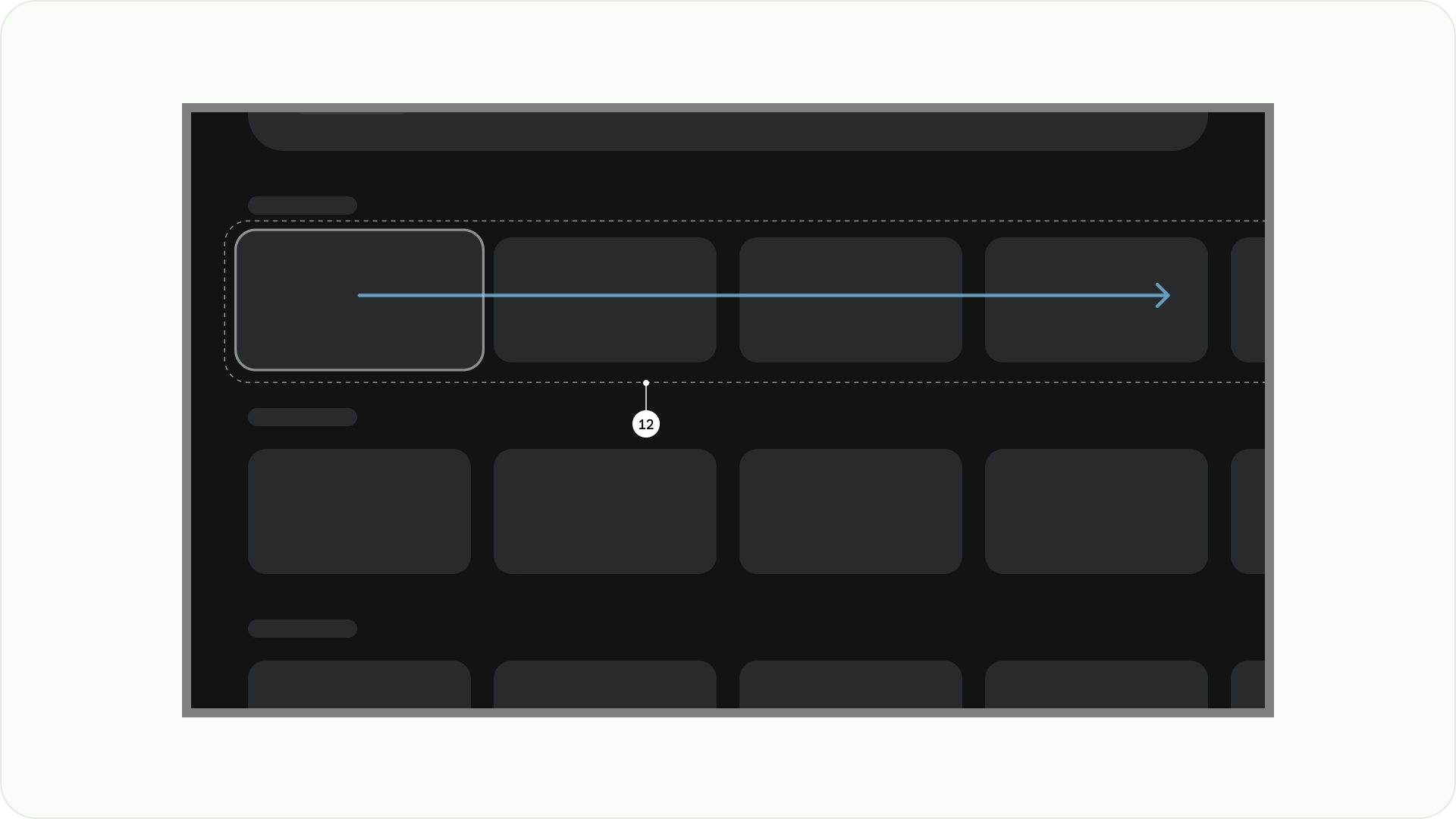
Horizontal Stack Layout
A Horizontal Stack Layout arranges components horizontally. They can vary in size, ratio, or format. This layout is often used to group content and components.
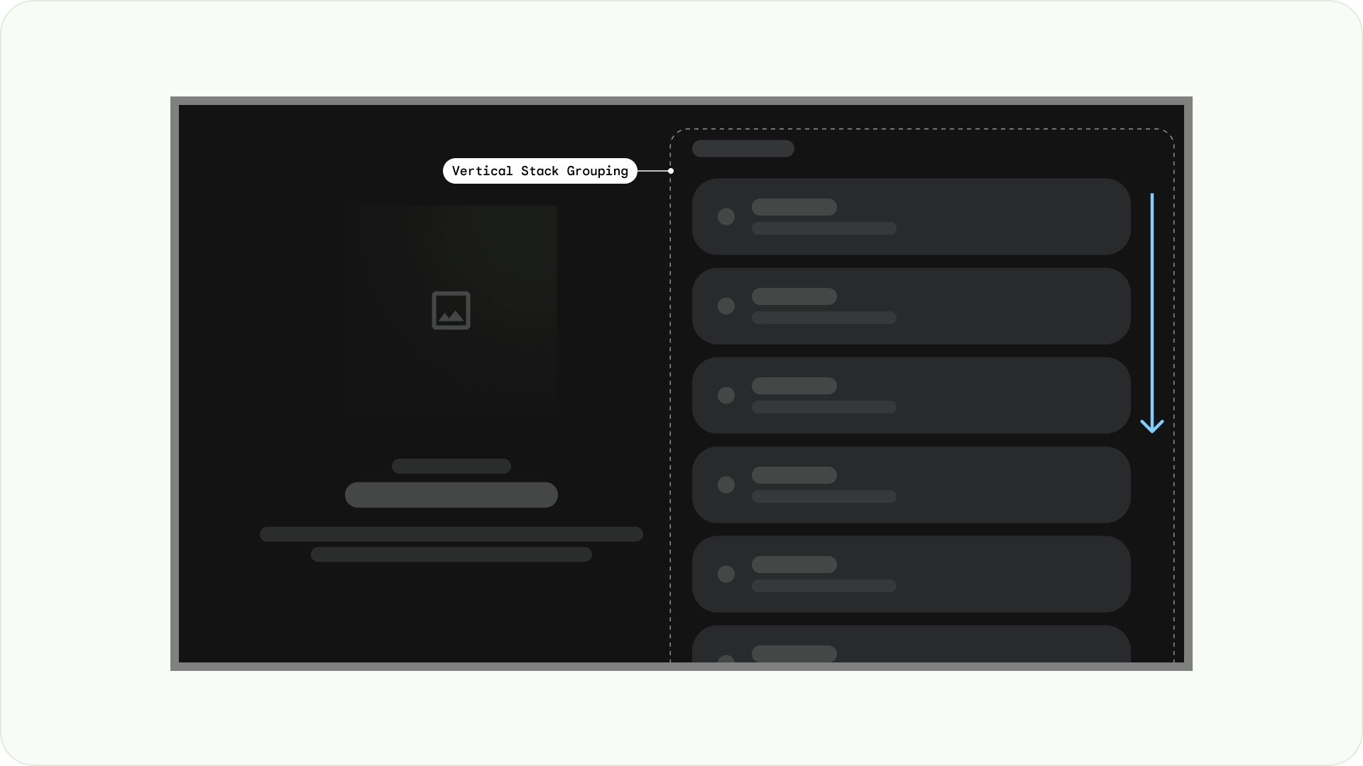
Vertical Stack Layout
A Vertical Stack Layout arranges components in a vertical manner, allowing for a flexible size, ratio, and format. It is commonly used to group various types of text, interactive components, and layout patterns together.
Grid Layout
A grid is a collection of intersecting columns and rows, and a Grid Layout displays content in this grid. It arranges content in a logical way, making it simple for users to navigate and browse.
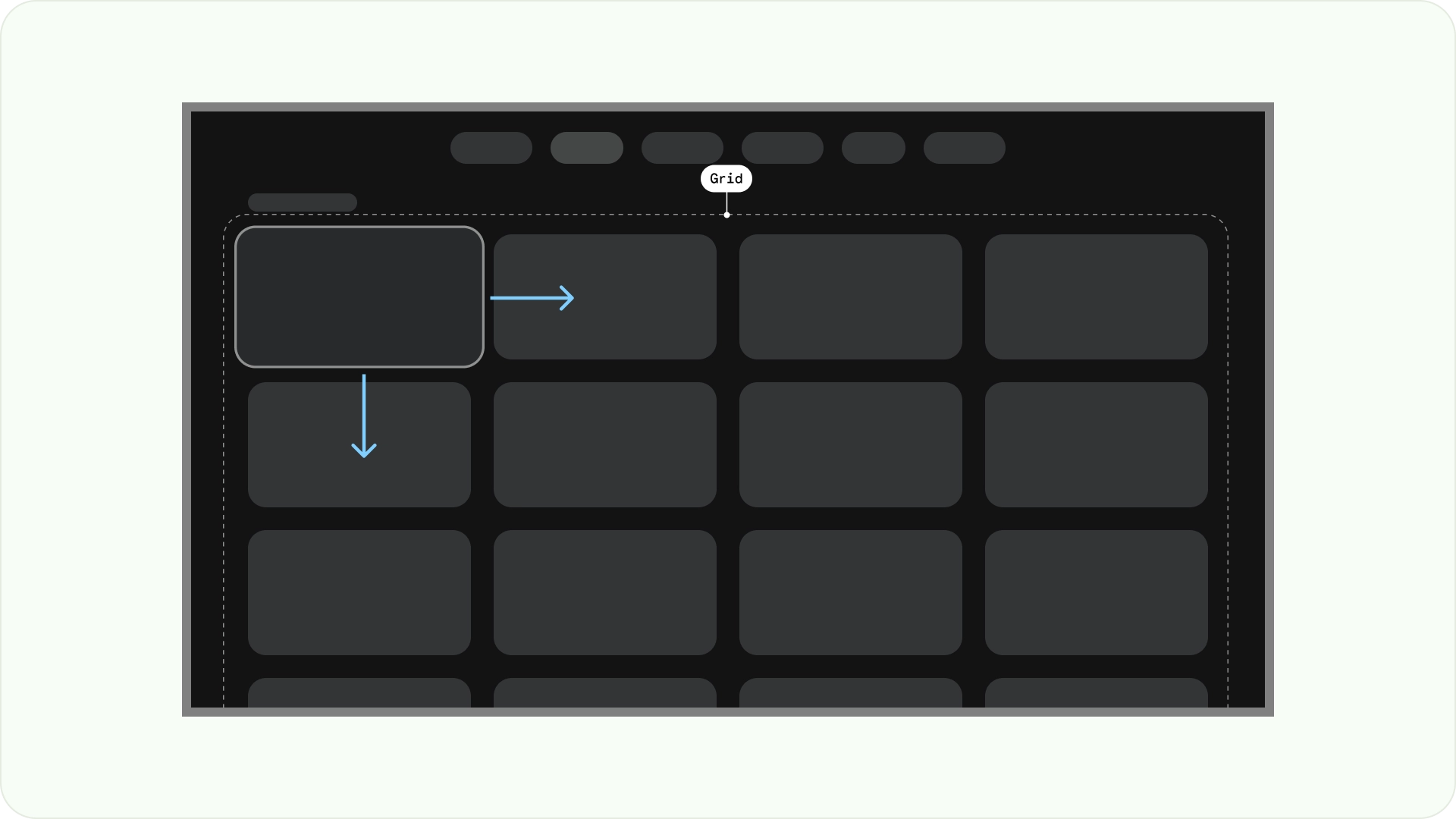
To prevent overlapping, it's important to consider the padding between items and the size increase of focused states. For instance, when a focused component (like a card) is highlighted. If you're utilizing our suggested Grid Layout (12 columns in 52dp, with gutters in 20dp), see Cards for recommended component layouts and previews.
Layout structures
Here are some layout structures to help you make better decisions when designing TV layouts. By dividing the TV screens horizontally, it can help separate different types of components, communicate information hierarchy and navigation logic. A pane can contain multiple unit columns. Each panel can host different layout patterns such as Stack Layout and Grid Layout.
Single-pane layout
A single-pane layout can help drive attention to primary content. Use it with content-forward experience and critical information pages.

Two-pane layout
A 2-pane layout performs better when the page shows hierarchical content. It is widely used on task-forward experiences.
Cognitive overload
Complicated and unclear content can lead to confusion, annoyance and a dip in engagement. Make your design scannable, uncluttered and present only essential information.
Avoid using too many panels to group contents. This creates unnecessary cognitive load and hierarchy to users.
Do
Don't
Express hierarchy and navigation
Panels visually separate and organize content. They help guide users, and can create a more intuitive interface that enhances the experience.
Do
Don't
Layout templates
Layout templates promote order, consistency, and familiarity. The design creates a comfortable UI experience that clearly communicates where the user is, and where they can go.
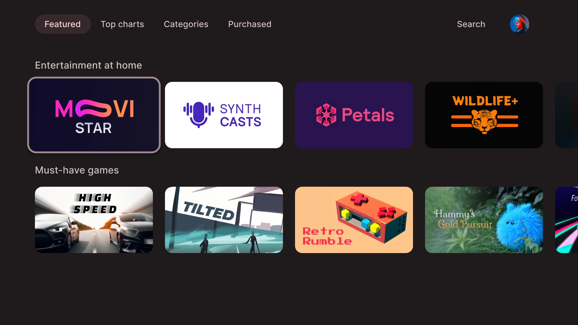
Browse
The browser template displays media content "clusters" or rows in a vertical stack. Users navigate up and down to browse the rows, and navigate right and left to browse content of a specific row.
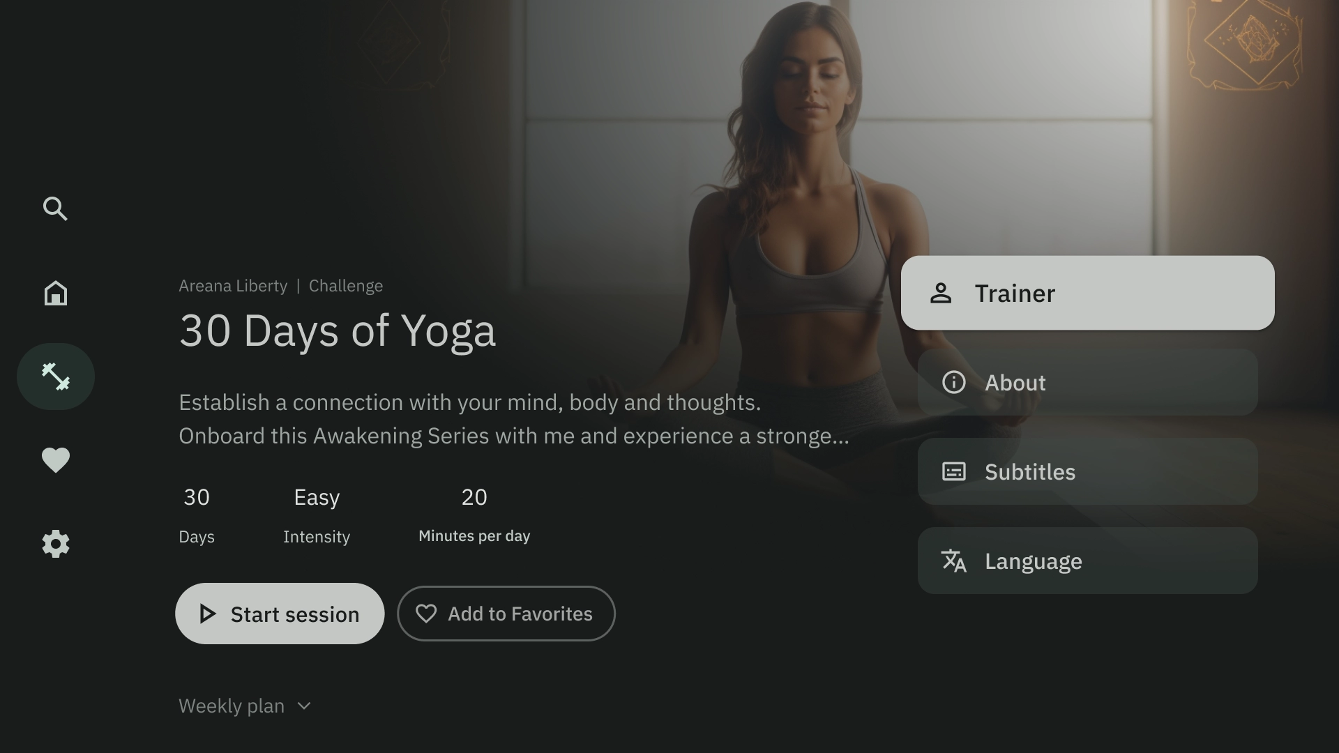
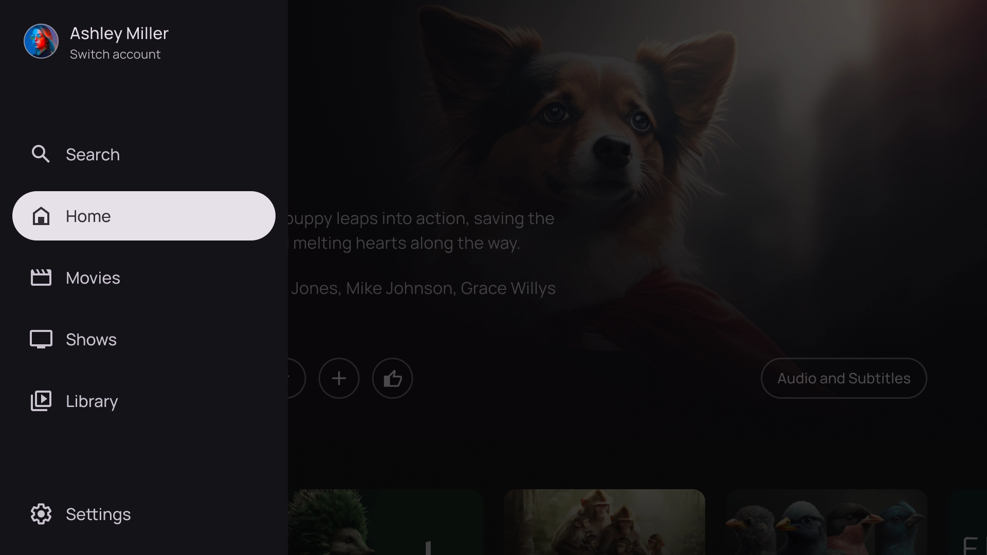
Left overlay
The left navigation template shows an overlay panel on the left side of the screen. It usually surfaces navigation or items that you can act on relevant to the content in the background.
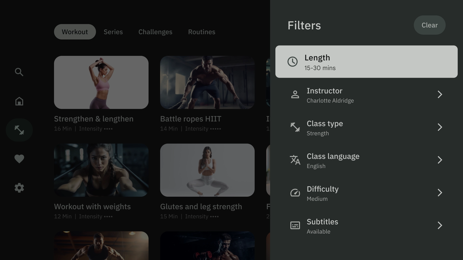
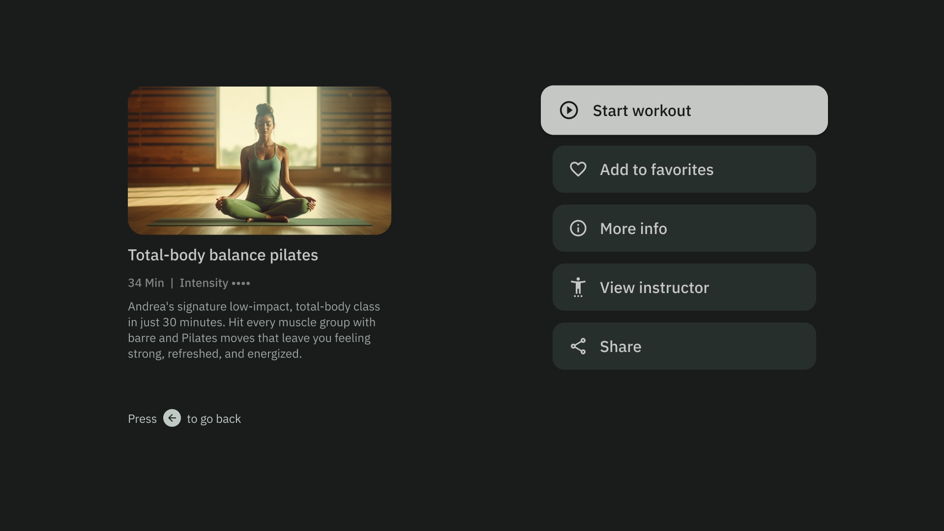
Right overlay
The right overlay template shows an overlay panel on the right side of the screen. It usually surfaces items that you acn act on independent to the content in the background.
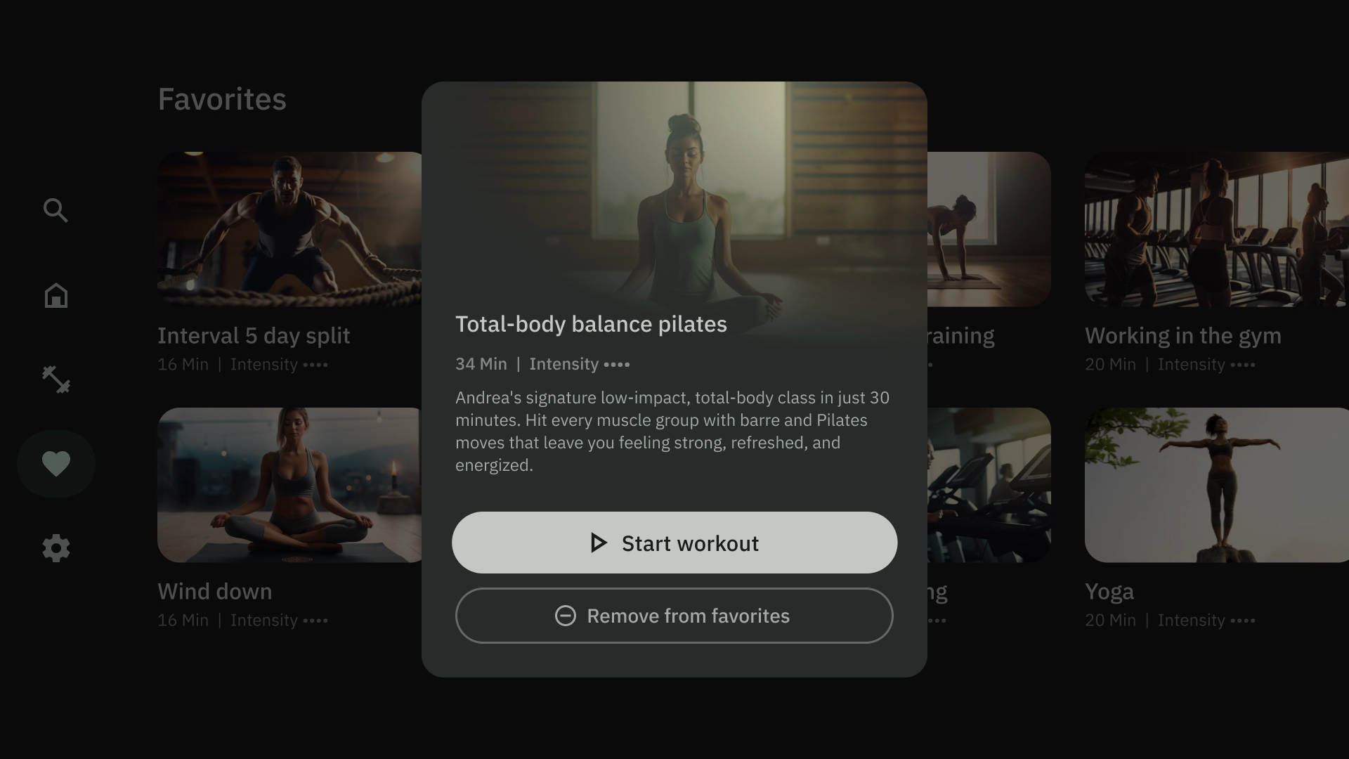
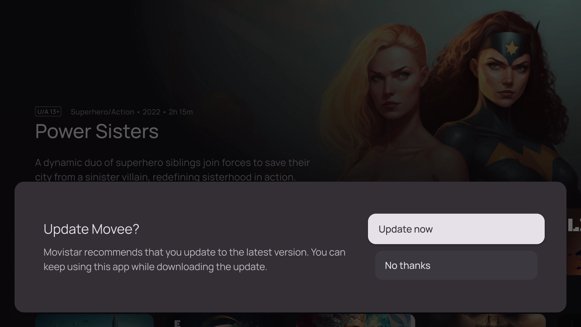
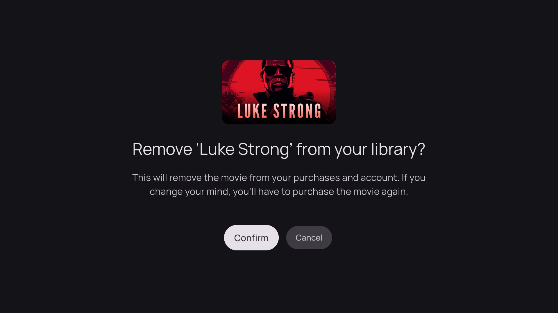
Center overlay
The center overlay template shows a modal element that overlays on top of an existing view. It is used to communicate urgent information or prompt a decision.
Bottom overlay
The bottom overlay template is commonly used for bottom sheets. Bottom sheets are surfaces containing complementary content anchored to the bottom of the screen. They let you create mini flows without losing the context of the current page.
Actions
The action template shows title and subtitle on the left, with options or actions on the right. Users are usually asked to make an option or perform an action with this template.
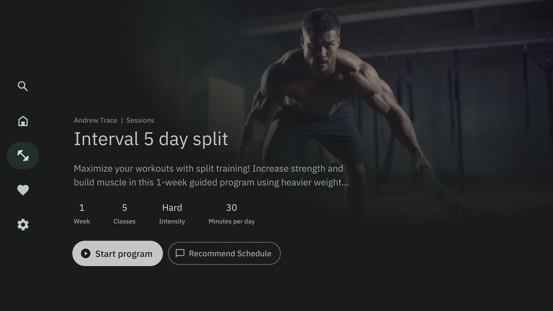
Content Details
The content detail template shows content in a Horizontal Stacked Layout. Content commonly includes title, metadata, short description, quick actions, and related information clusters.
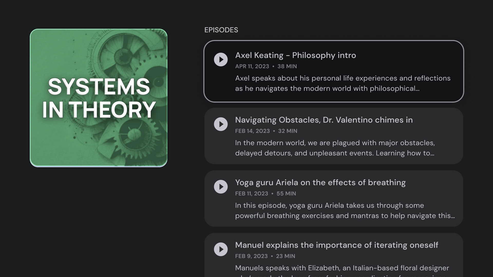
Compilation
The compilation template shows details of an item on the left side of the screen, such as a podcast, with its elements, for example its episodes, on the right panel.
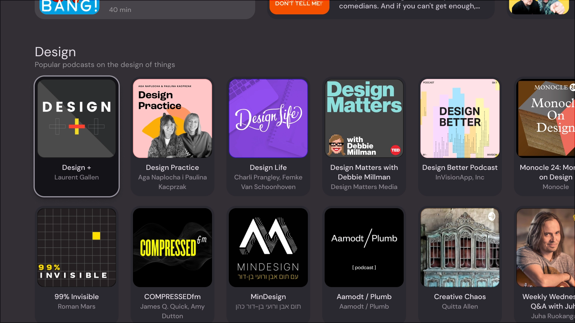
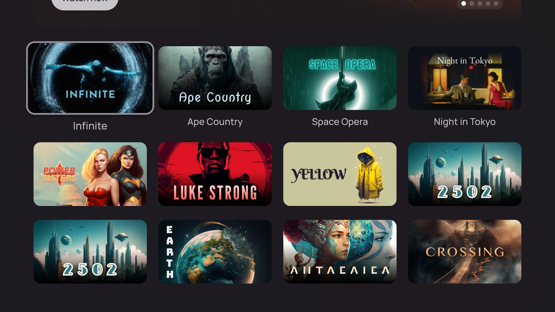
Grid
The grid template displays collections of content in an organized grid. It showcases content with clear remote navigation logic, and optimal browsing experience.
Alert
The alert template displays a full screen message. It usually requires an action to unblock the alert and go back to the previous screen.
Card columns
1 card layout
Card width — 844dp
2 card layout
Card width — 412dp
3 card layout
Card width — 268dp
4 card layout
Card width — 196dp
5 card layout
Card width — 124dp