
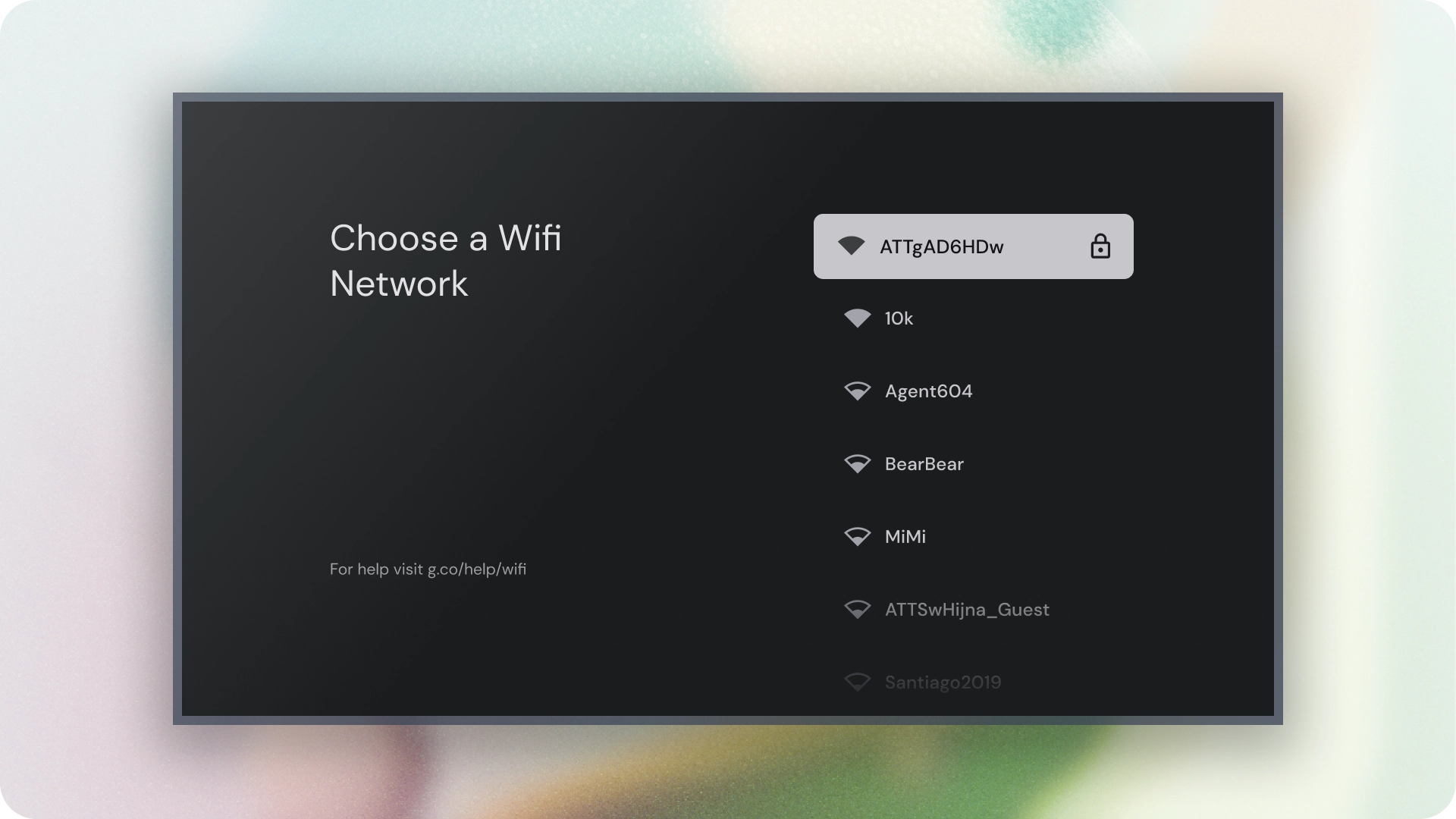
Lists are a visual representation of one or more related items. They are commonly used to display a collection of options.
Resources
| Type | Link | Status |
|---|---|---|
| Design | Design source (Figma) | Available |
| Implementation | Jetpack Compose | Available |
Highlights
- Lists are a continuous collection of text or images.
- Lists should feel natural and be scannable.
- Lists are made up of items containing primary and supplemental actions represented by icons and text.
Variants
There are three types of lists: one-line list, two-line list, and three-line list.
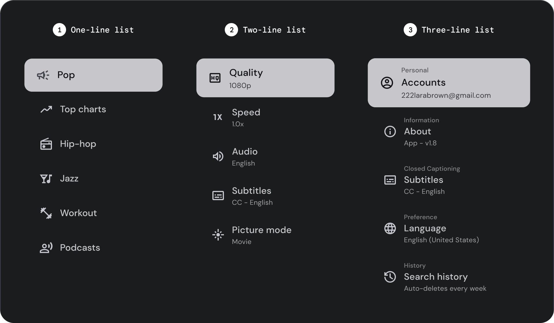
- One-line list: A single line to communicate each item. This simple design ensures each item is clearly distinct from the other.
- Two-line list: Uses two parallel lines to communicate each item. This structured design ensures natural readability and avoids cognitive overload.
- Three-line list: Uses three parallel lines to represent each item. This decorative design creates a high level of visual prominence.
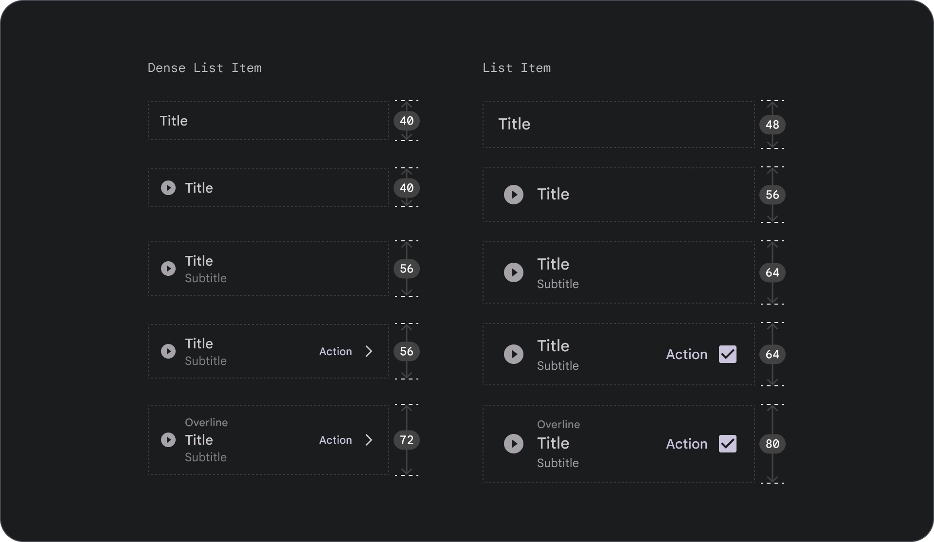
Anatomy
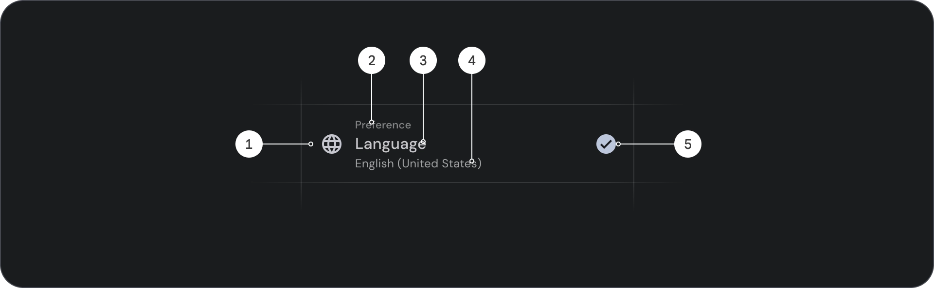
- Icon: A small graphic that represents a specific object or action, often used to visually communicate an idea or concept.
- Overline: A short line of text that appears above title or subtitle, often used to provide additional context or emphasis.
- Title: A large, bold line of text that serves as the main heading of a design element or page.
- Subtitle: A smaller line of text that provides additional information or context below a main title.
- Control: An interactive element that allows the user to input a decision.
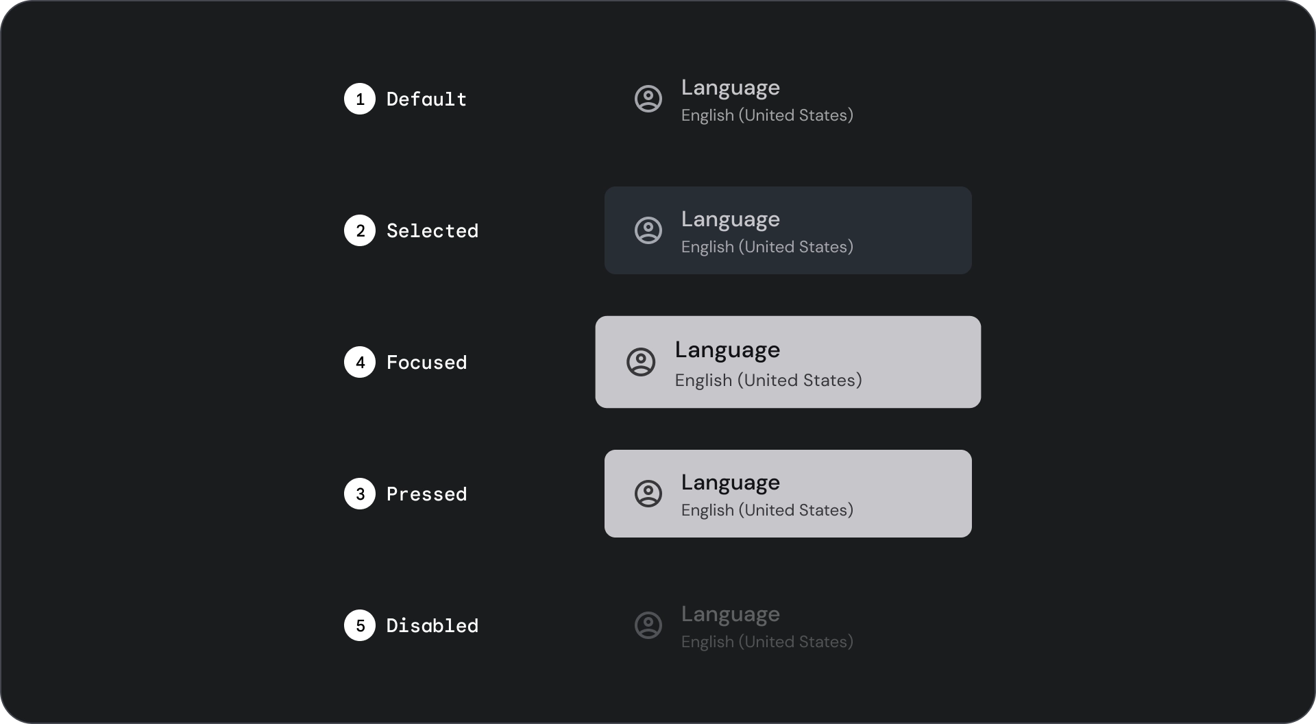
States
Spec

Usage
Lists are vertically organized groups of text and images. Optimized for reading comprehension, a list consists of a single continuous column of items. List items can contain primary and supplemental actions represented by icons and text.
Do
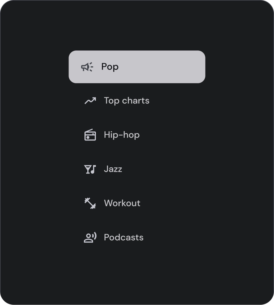
List items are not buttons. The items don't have containers. List items are, by default, unselected and unfocused.
Caution
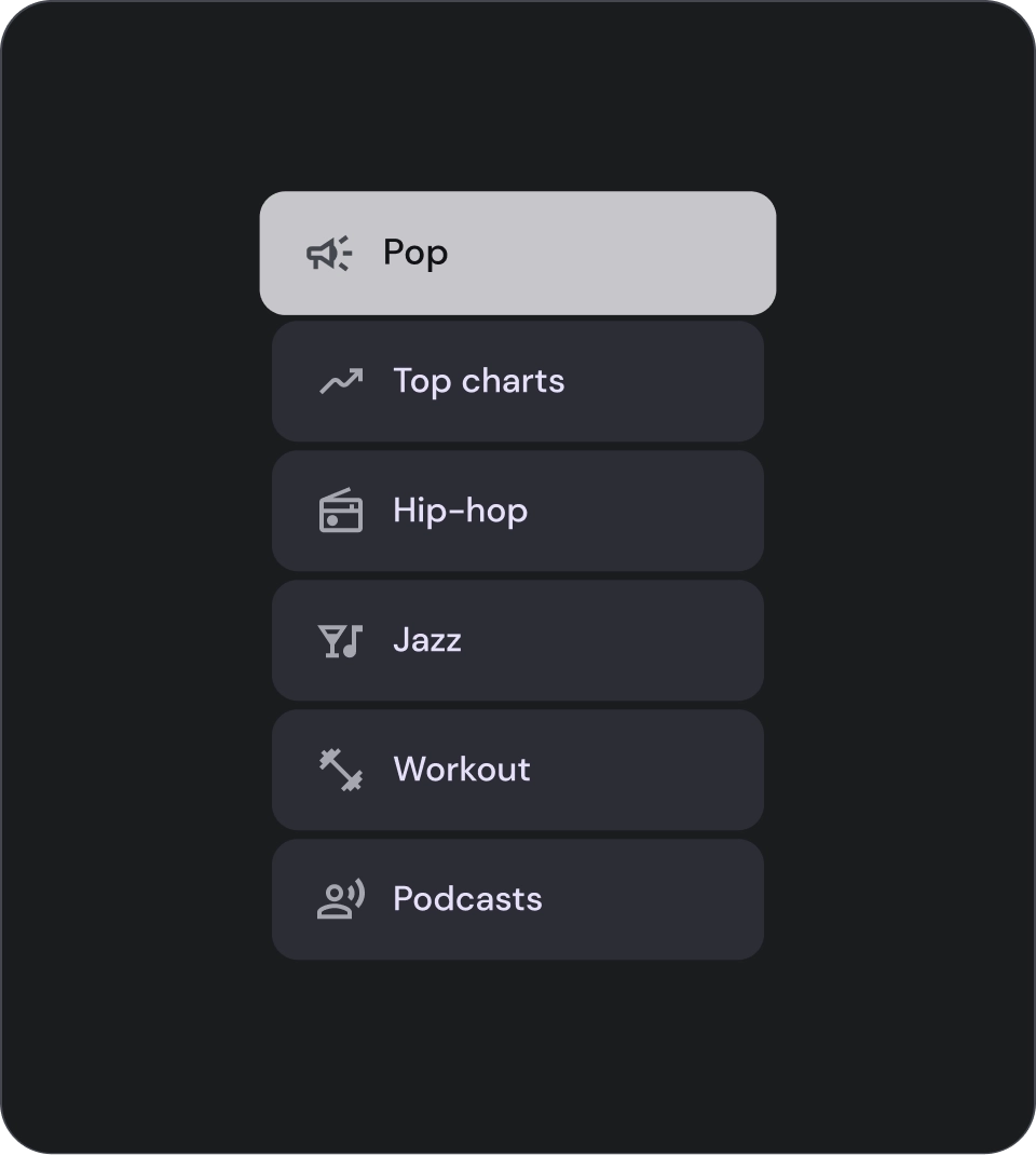
Use container background for list items only when necessary.
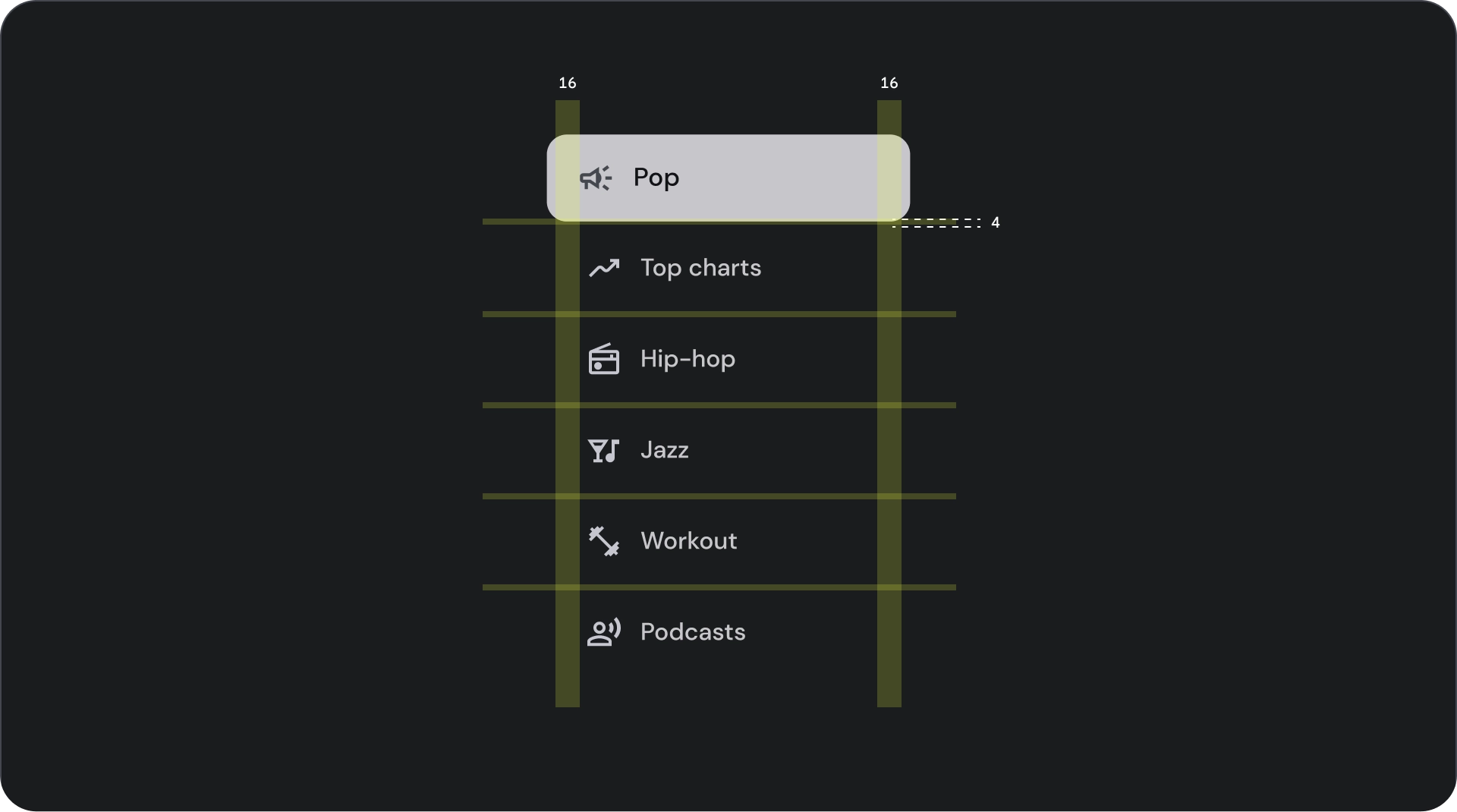
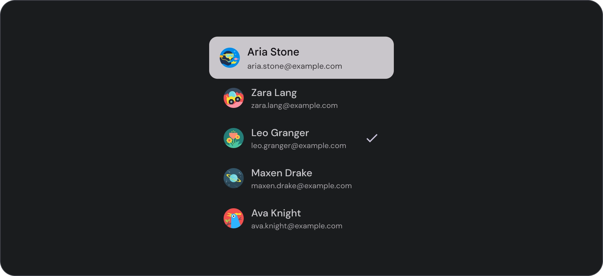
Selection controls
Controls display information and actions for list items. They can be aligned to the leading or trailing edge of the list item.
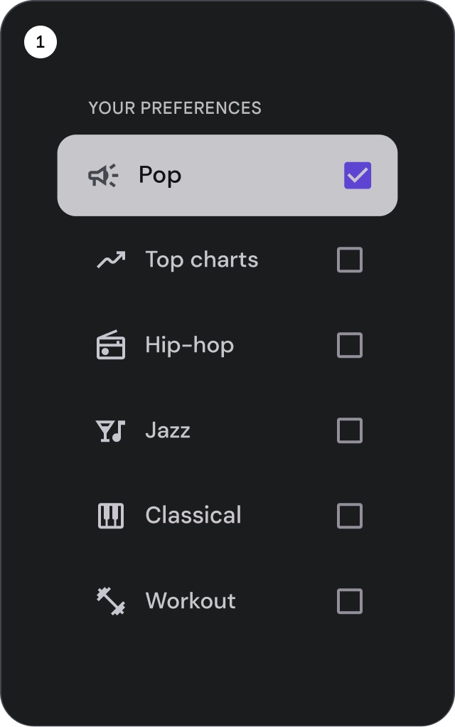
- Checkboxes: Select one or more list items.
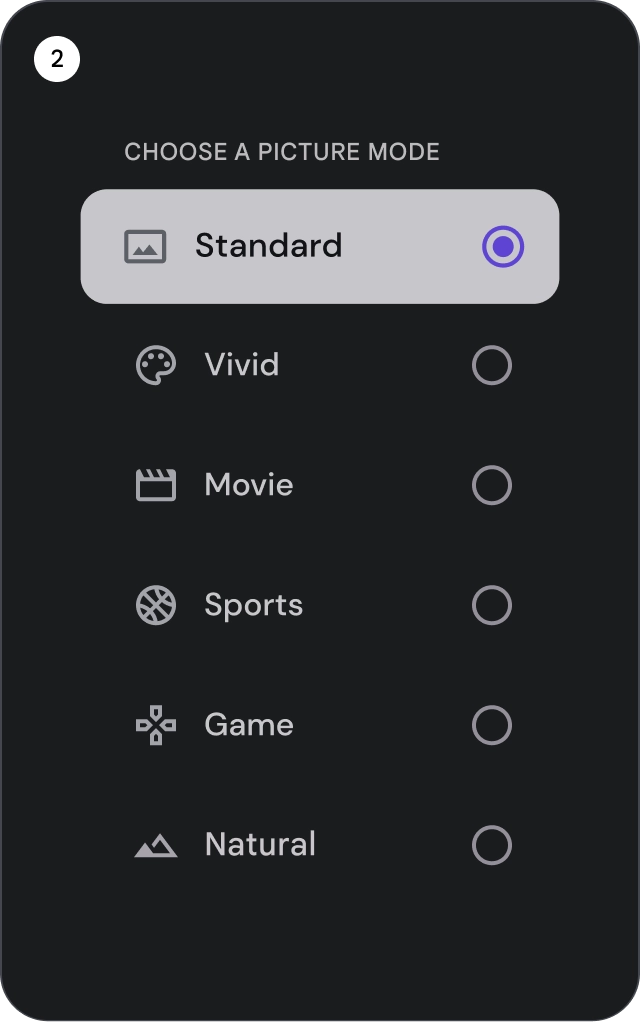
- Radio buttons: Select exactly one item in the list.
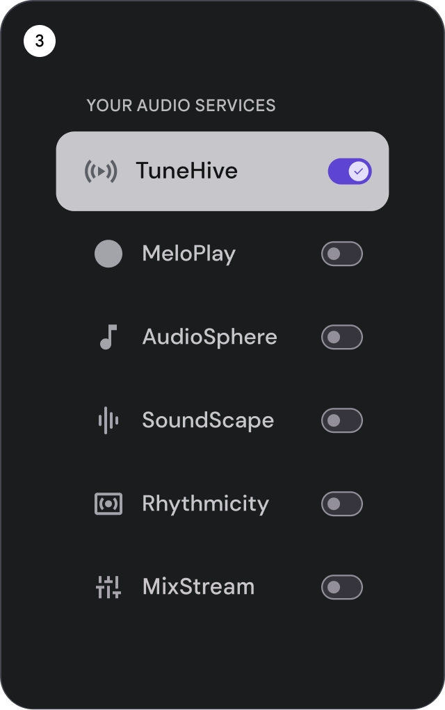
- Switches: Toggle a control on or off.
Do
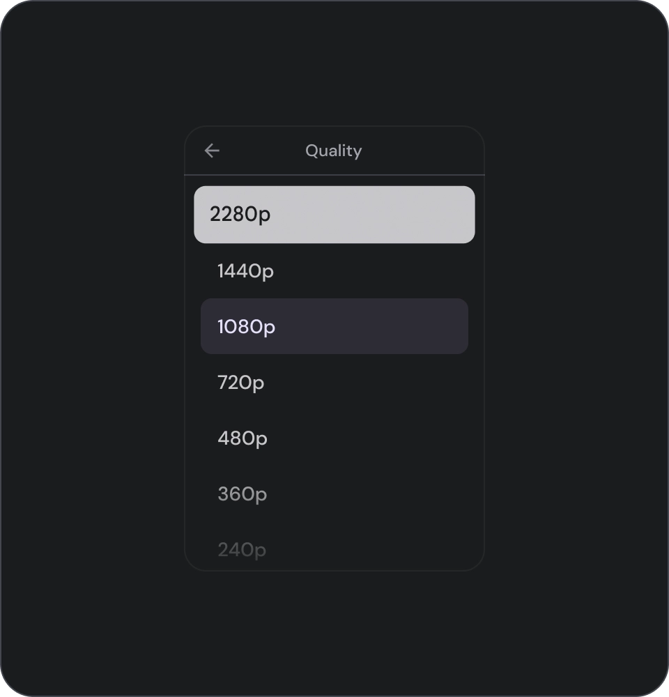
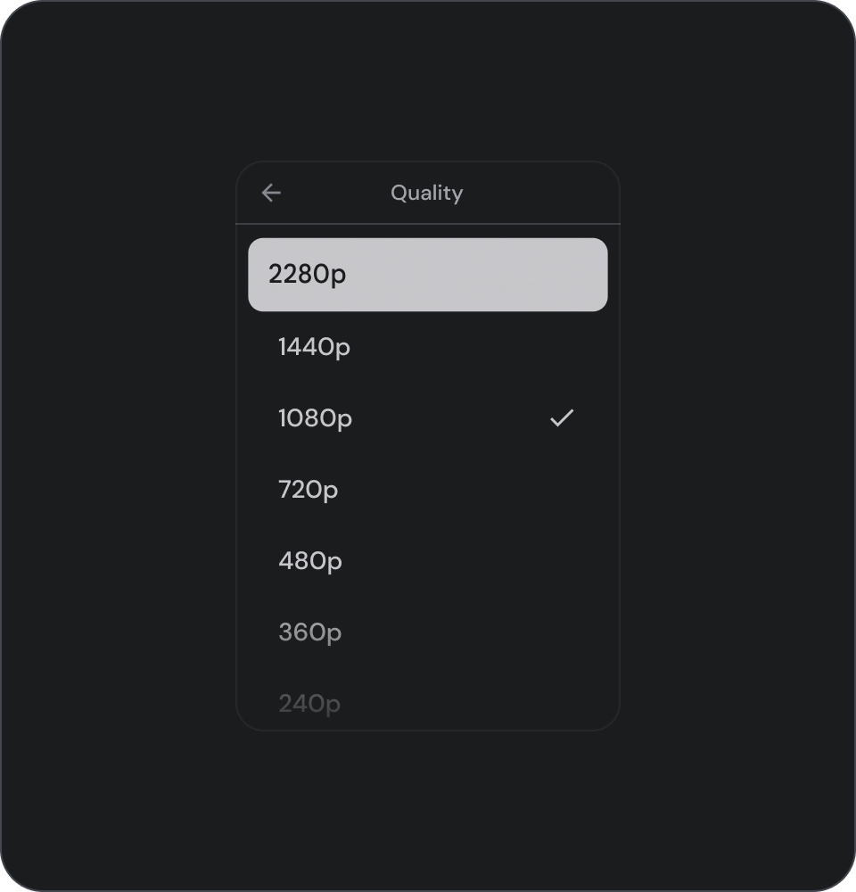
Use an icon selection indicator to clearly show the selected item in a list. This will help users easily identify which item they have selected and improve the overall user experience.
Don't
Avoid relying solely on the background color to indicate selection in a list.
Don't
Avoid placing buttons inside a list item as it can cause confusion about which element is currently in focus.
Icons
Do
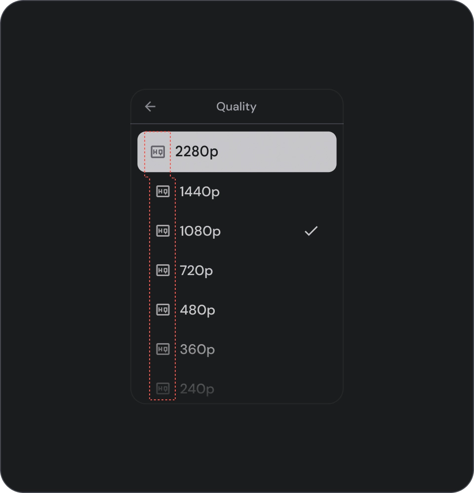
If you're showing the same type of content in the list, omit icons to reduce visual noise and improve the user experience. Avoid using icons in a list when they serve no purpose and don't provide additional information.
Don't
Avoid using the same icon for all items in a list. This can be visually overwhelming and confusing for users. Instead, use icons only when they add value or provide additional information.
Avatars and images
List items can include images in a circular crop to represent a person or entity.