
Android TV adheres to Google's Material color guidelines, ensuring a cohesive and visually appealing interface. It creates a highly immersive and engaging visual style tailored to the TV screen. This guide details applying the Material Design theme to an Android TV interface.
Highlights
- Android TV adheres to Google's Material color guidelines, but optimizes for TV.
- Build from dark themes, to create cinematic experiences.
- Use the Material Theme Builder to create a theme.
Color scheme
A color scheme helps you apply color to your UI in a meaningful way, creating harmony, brand consistency and scalability.
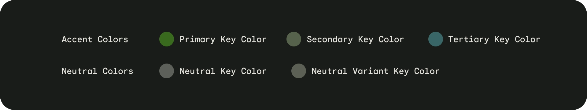
The foundation of a color scheme is the set of five key colors that individually relate to separate tonal palettes with thirteen or more tones. Specific tones from each tonal palette are assigned to color roles across a UI. Key colors are the foundation for creating any dynamic color scheme. You can create key colors based on one root color using the Material Theme Builder, or picking your own key colors.
With key colors established, Material's algorithm specifies the full spectrum of colors needed for expressing interaction states, errors, and accessible contrast.
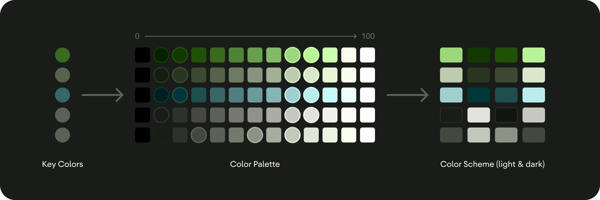
The Material theme builder generates both dark and light color schemes with the same color tokens, making it simple to switch between themes.
Color roles
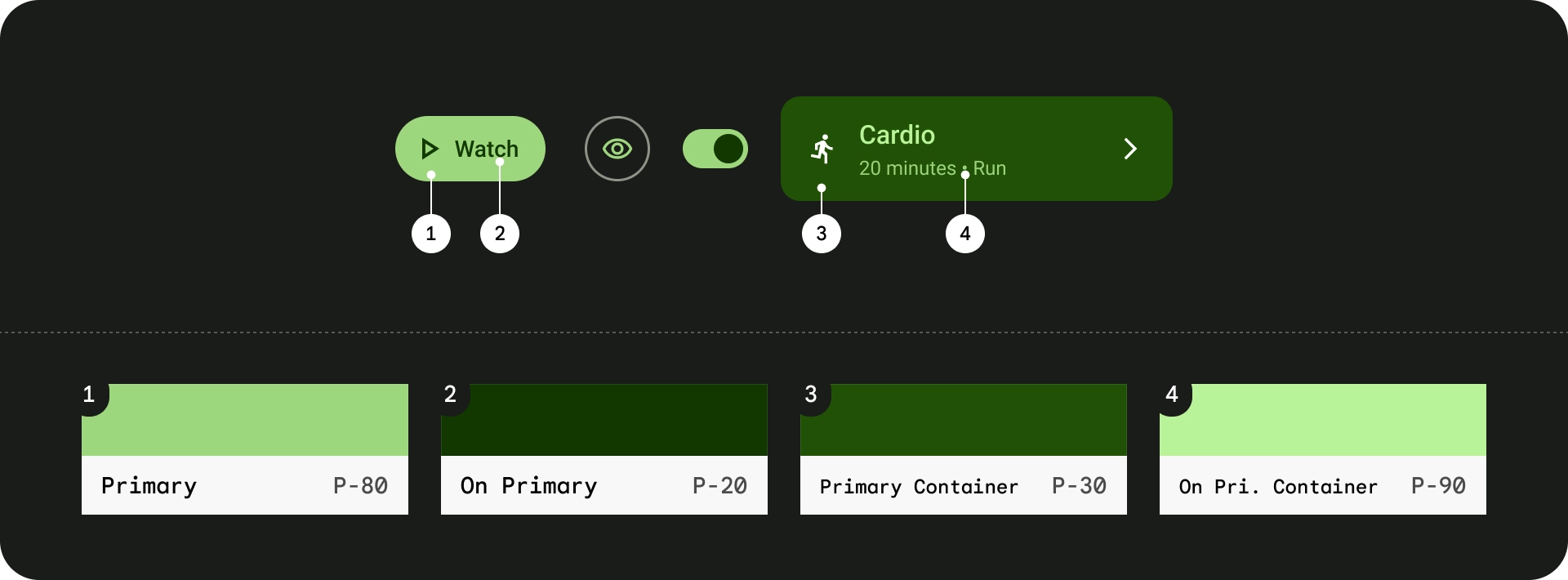
Primary
Primary roles are used for key components across the UI, such as prominent buttons, active states, and the tint of elevated surfaces.
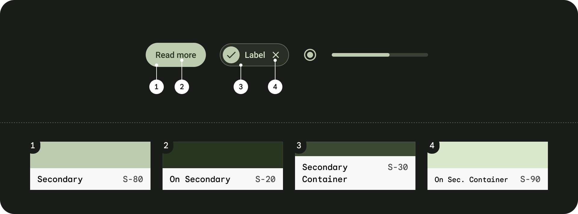
Secondary
Secondary roles are used for less prominent components in the UI, such as filter chips, and opportunities for additional for color expression.
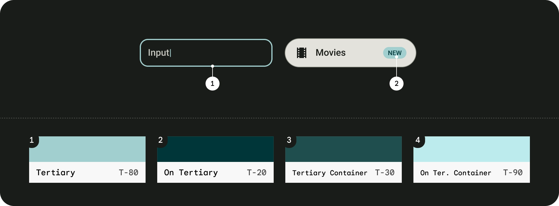
Tertiary
Tertiary roles are used for contrasting accents that can be used to balance primary and secondary colors or bring heightened attention to an element, such as an input field.
Surfaces
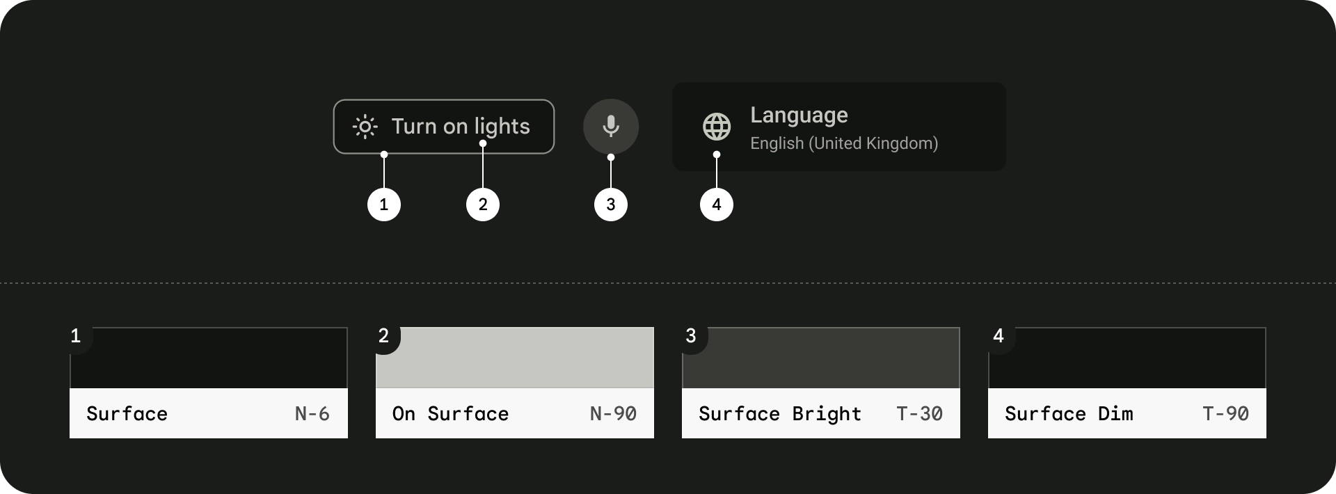
Neutral roles are used for surfaces and backgrounds, and high emphasis text and icons. Read more about surfaces in the Material Design guidelines.
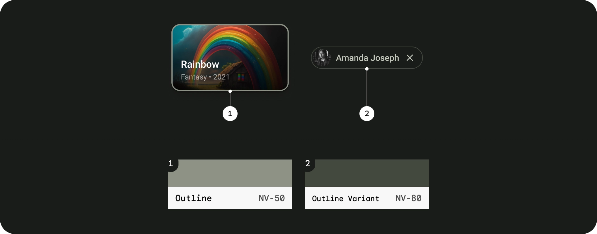
Outlines
Read more about outline roles in the Material Design guidelines.
Dynamic color
On Android Mobile, beginning with Android 12, users can generate individualized schemes through wallpaper selections and other customizations. Android TV does not support wallpaper, meaning user generated schemes are not supported and Android TV OS only broadcasts base palettes.
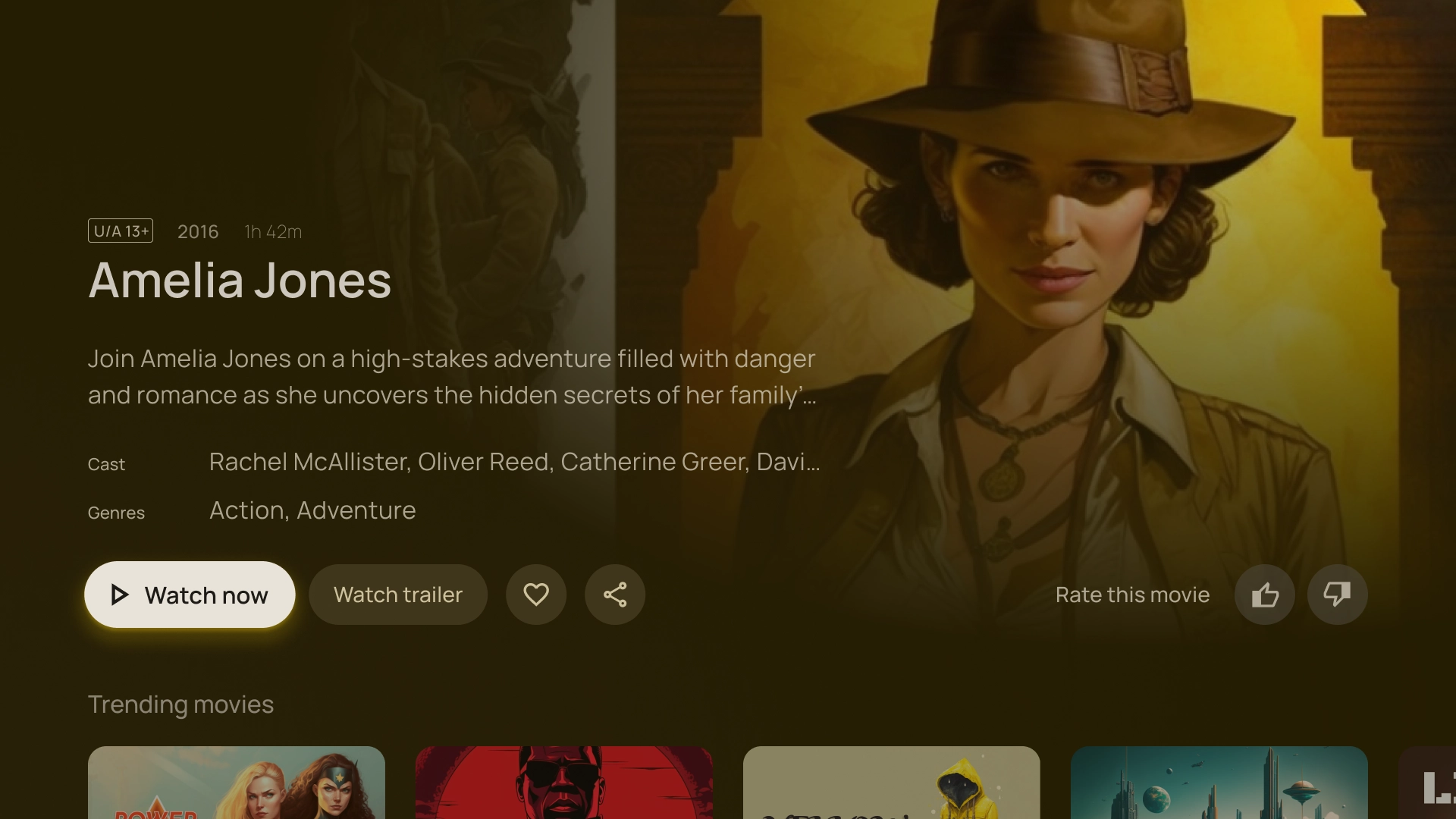
In place of user-generated schemes, you can use content-based color schemes to create dynamic and playful designs, based on content like movie posters, album art, and other hero images. For details, see content-based color schemes.
Using the Material color utilities developer libraries you can extract key colors directly from the image, or run your own color extraction algorithm to find a key color and then use the Material Color Utilities to generate a theme.
Here is an example of how colors are extracted from an image:
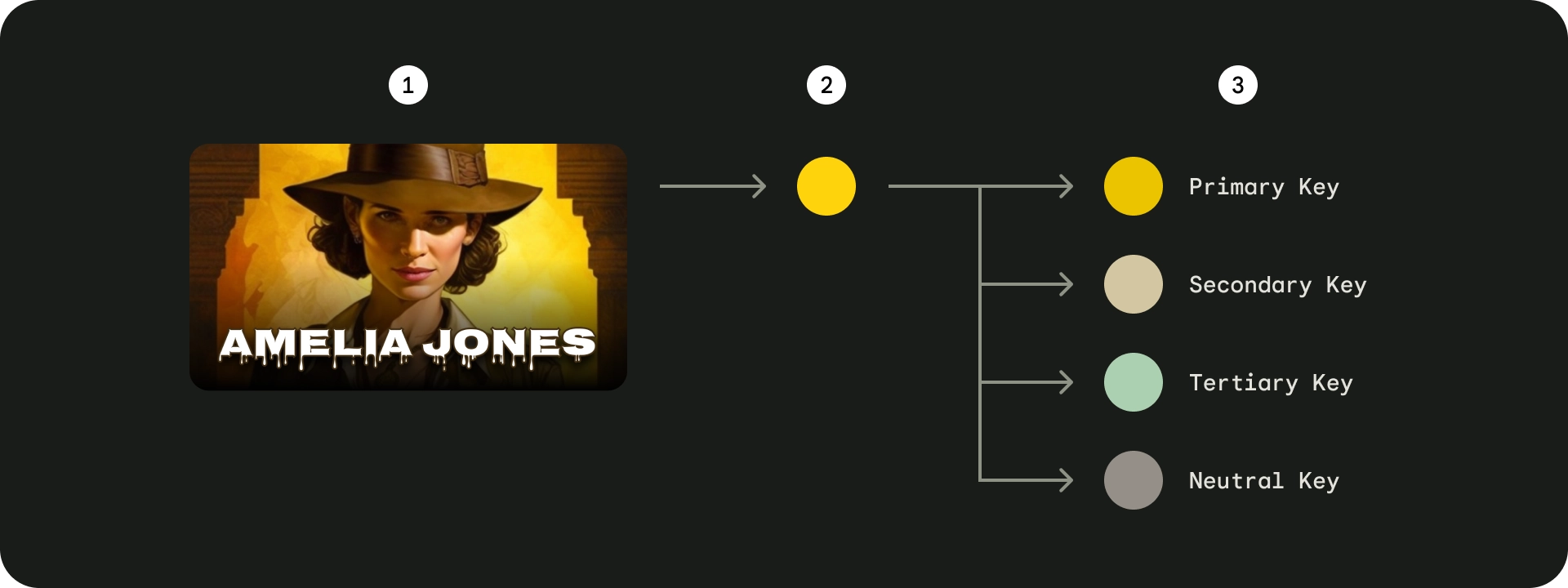
- Source image
- Extracted seed color
- Generated key colors
You can generate a color scheme using these key colors, or use the tones to apply them on your UI.
Accessibility
For accessibility considerations, see Accessibility best practices for Android TV